Border Security Tech Dashboard in Excel is a professionally designed, interactive analytics template built for border security agencies, homeland defense organizations, government contractors, and security consultants who need to consolidate surveillance technology data, threat detection records, sector performance metrics, and operational efficiency indicators into one centralized reporting hub. Whether you are tracking detection accuracy across technology types or evaluating response times by shift and border sector, this Border Security Tech Dashboard in Excel delivers the insights you need to make faster, smarter, and more strategic decisions.
Managing border security operations involves an enormous volume of data flowing from detection technologies, patrol teams, maintenance systems, and threat reporting channels deployed across vast geographic areas. Without a structured analytics tool, critical trends in threat categories, detection accuracy, false alarm rates, and operating costs can go unnoticed. This Border Security Tech Dashboard in Excel solves that challenge by providing five dedicated analysis pages, dynamic KPI cards, interactive charts with slicers, and a pivot-driven architecture that updates every visualization with a single click. Let us walk through everything this powerful Excel Dashboard has to offer.
Key Features of Border Security Tech Dashboard in Excel
This dashboard packs a robust set of features designed specifically for border security technology monitoring and operational analytics. Here is what makes it stand out:
The dashboard includes dynamic KPI cards on the overview page that display critical metrics such as Total Operating Cost, Total Records, Avg. Response Time, Avg. Detection Accuracy, and Total Resolved. These cards give decision-makers an instant snapshot of operational health across all border zones without needing to dig into raw data.
Interactive charts and visualizations are spread across all five dashboard pages, delivering analytical depth through visualizations like Total Operating Cost by Total Maintenance Cost, Total Records by Total Resolved by Threat Category, Avg. Detection Accuracy by Detection Method, and many more. Each chart is connected to pivot tables and responds dynamically to slicer selections.
The smart slicers and filters let you slice the data by threat category, severity level, escalation level, border sector, zone, technology type, detection method, and shift. This means you can instantly isolate the performance of a specific technology type in a particular zone, or compare response times across sectors and shifts.
The entire dashboard is pivot-powered, which means there are no complex formulas or VBA macros to maintain. All you need to do is enter your data in the Data sheet, click Refresh All from the Data tab in the Excel ribbon, and every chart, card, and analysis page updates automatically.
Dashboard Pages Explanation
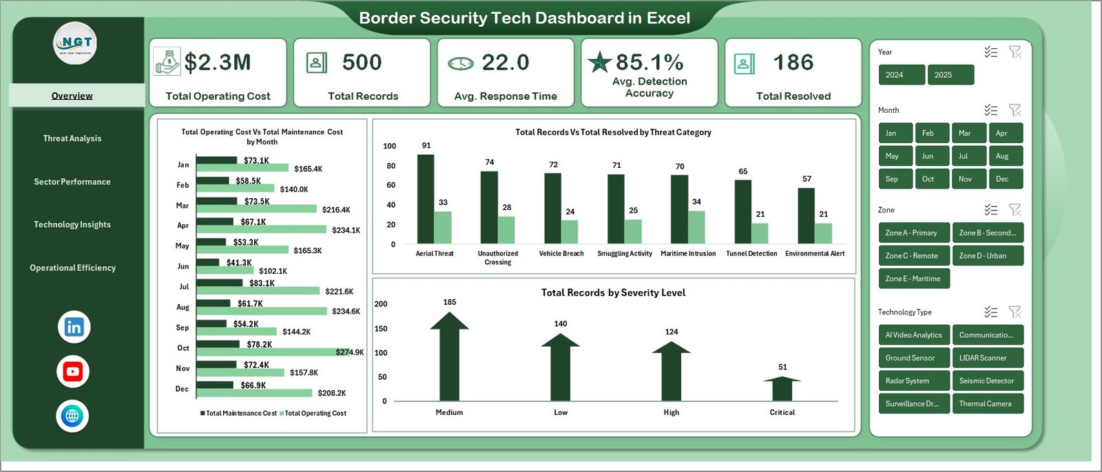
1 – Overview Page
The overview page is the command center of the Border Security Tech Dashboard in Excel. On the top, we have the below given cards to show the high-level information including Total Operating Cost, Total Records, Avg. Response Time, Avg. Detection Accuracy, and Total Resolved. We have created some charts to show the analysis and multiple slicers to apply the filter and see the filtered dashboard quickly.
The charts on this page provide visual analysis through Total Operating Cost by Total Maintenance Cost which compares the relationship between operating expenditures and maintenance spending across categories. Total Records by Total Resolved by Threat Category shows how many incidents were recorded versus successfully resolved for each threat type, helping identify categories with low resolution rates. Total Records by Severity Level breaks down the volume of security records across different severity classifications to highlight where the most critical threats are concentrated.
Border Security Tech Dashboard in Excel
2 – Threat Analysis
In this sheet tab, we have created the various analysis to provide deep insights into the nature and handling of border threats. Total Records by Threat Category visualizes the distribution of security incidents across different threat classifications, helping analysts identify which categories demand the most attention and resources. Total Operating Cost by Severity Level reveals how operational spending correlates with threat severity, enabling budget planners to understand cost drivers.
Total Records by Total Resolved by Escalation Level compares incident volumes against resolution counts at each escalation tier, highlighting bottlenecks in the escalation workflow. Avg. Detection Accuracy by Detection Method evaluates the effectiveness of each detection approach, from ground sensors to aerial surveillance, so teams can prioritize investments in the technologies delivering the highest accuracy.
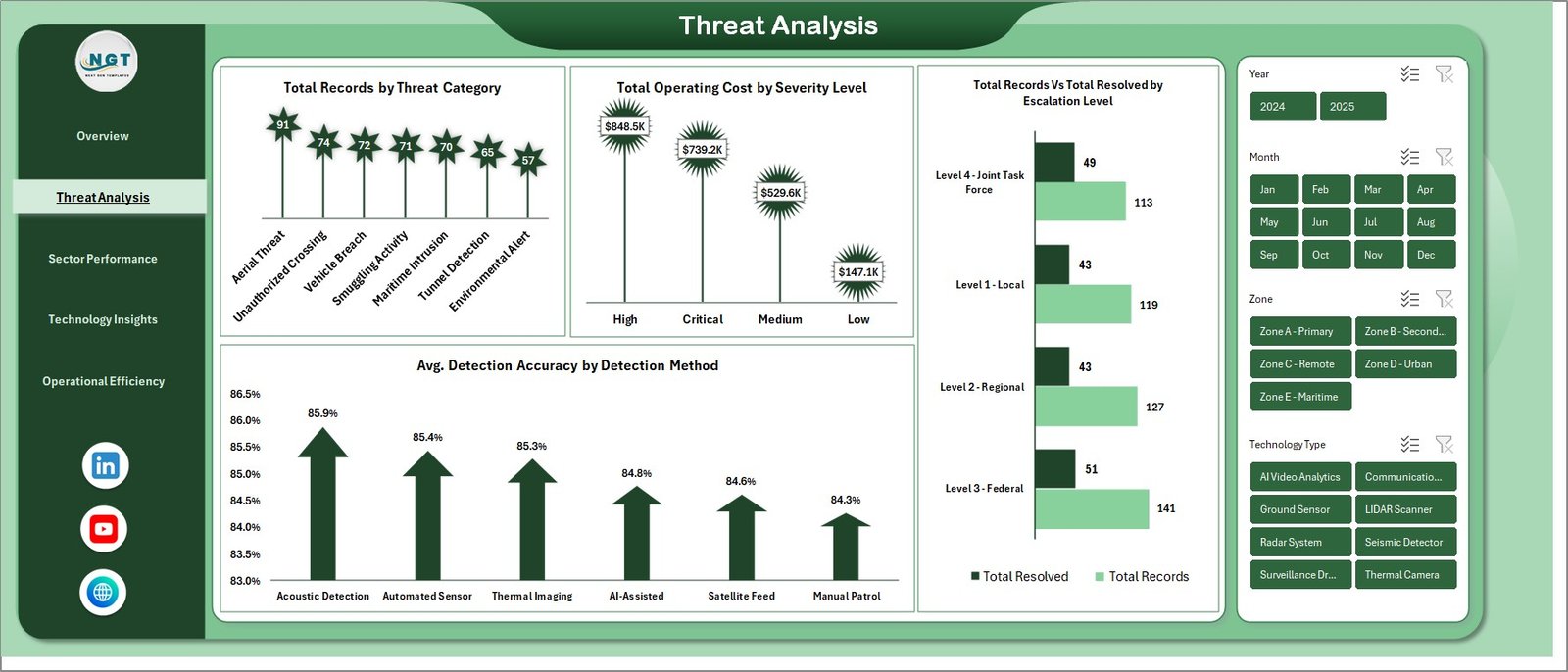
Threat Analysis
3 – Sector Performance
In this sheet tab, we have created the various analysis to evaluate how each border sector and zone is performing. Total Records by Border Sector shows the incident volume distribution across different sectors, identifying which border segments face the heaviest threat activity. Avg. Response Time by Border Sector compares how quickly each sector responds to detected incidents, helping operations managers pinpoint sectors that need faster deployment capabilities.
Total Personnel Deployed by Zone tracks staffing levels across geographic zones to ensure adequate coverage and identify understaffed areas. Avg. Detection Accuracy by Zone measures how accurately threats are being identified in each zone, revealing whether certain zones need technology upgrades or recalibration of existing equipment.
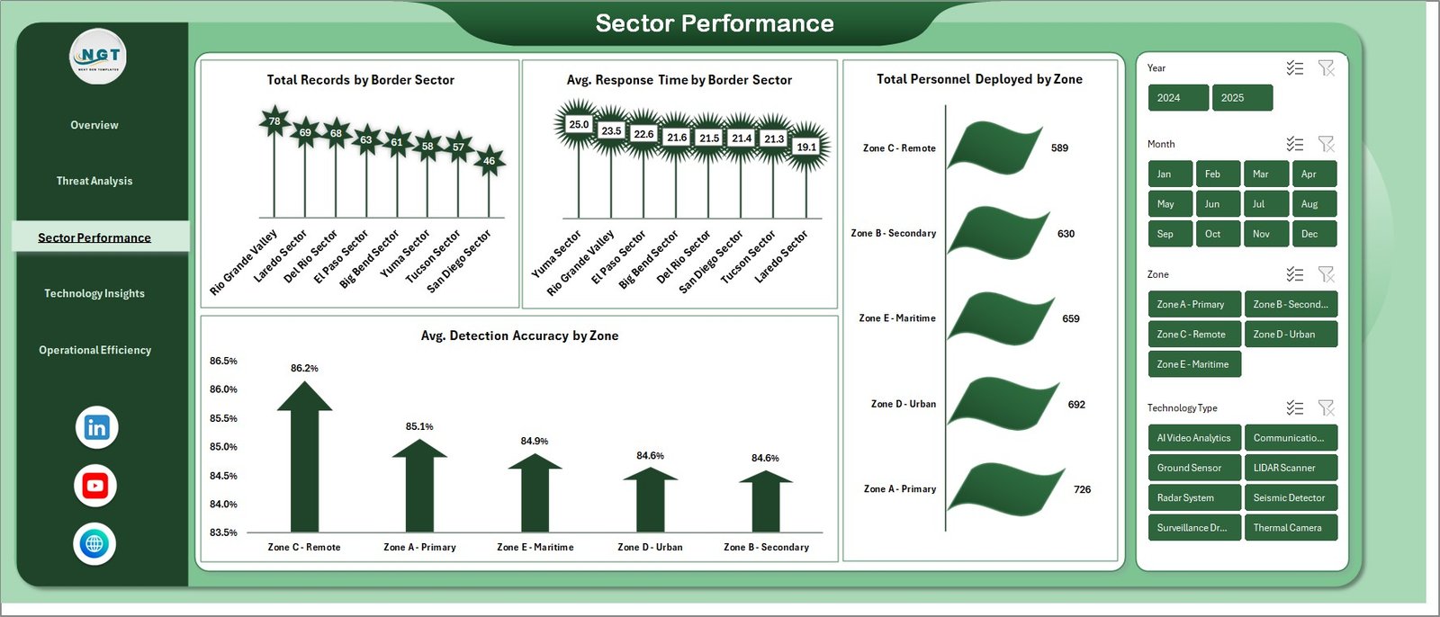
Sector Performance
4 – Technology Insights
In this sheet tab, we have created the various analysis to monitor the performance and cost-effectiveness of different surveillance and detection technologies. Avg. Detection Accuracy Vs Avg. False Alarm Rate by Technology Type is a powerful dual-metric comparison that shows how accurate each technology is alongside how often it triggers false alarms, enabling procurement teams to make informed investment decisions.
Total Records by Total Resolved by Technology Type compares incident detection and resolution performance for each technology, highlighting which systems are most effective at not just detecting but also helping resolve security events. Total Maintenance Cost by Technology Type reveals the ongoing maintenance burden of each technology platform, supporting lifecycle cost analysis and replacement planning.
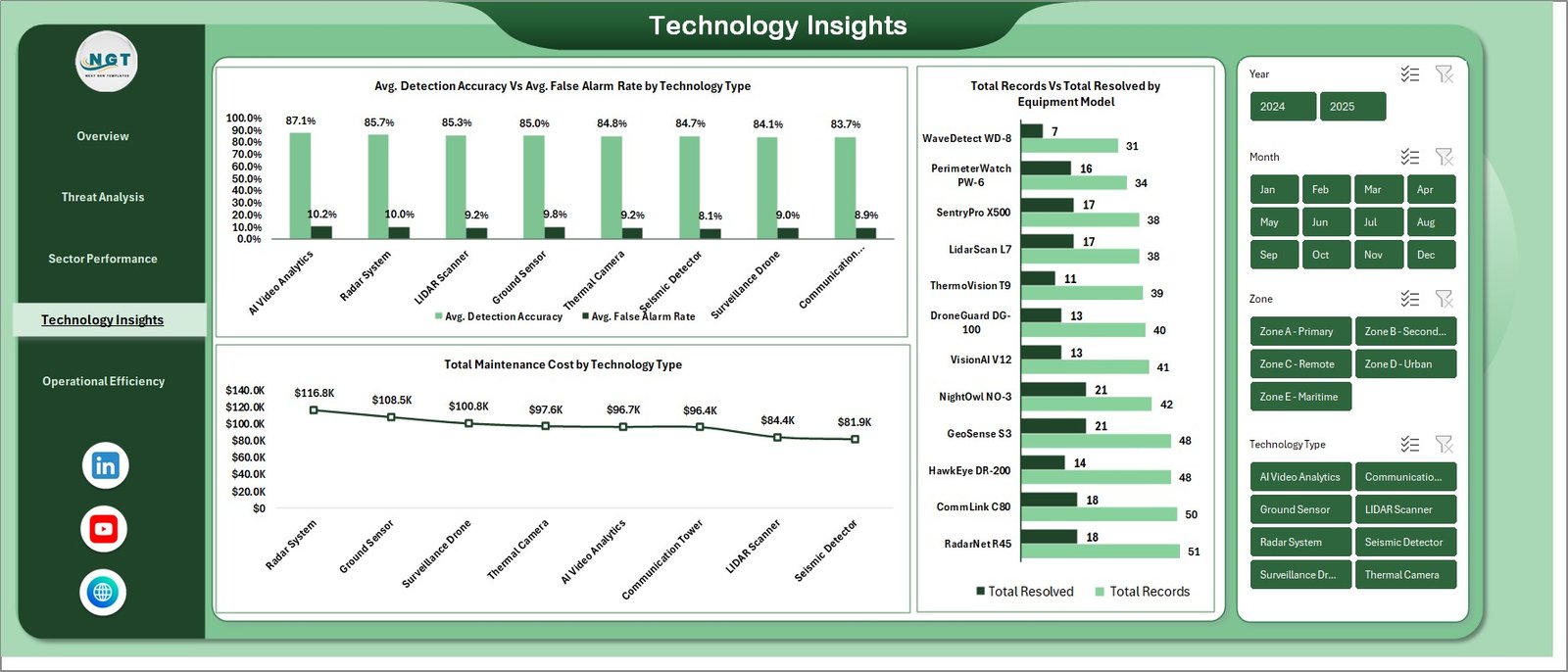
Technology Insights
5 – Operational Efficiency
In this sheet tab, we have created the various analysis to measure workforce efficiency and operational output. Avg. Response Time by Shift compares how quickly teams respond during different work shifts, helping managers identify whether night shifts, day shifts, or rotational schedules affect response performance. Total Personnel Deployed by Shift tracks staffing allocation across shifts to ensure balanced coverage and avoid under-deployment during high-risk periods.
Resolution % by Month provides a monthly trend view of incident resolution rates, allowing leadership to track whether operational improvements are translating into better outcomes over time and identify seasonal patterns in resolution performance.
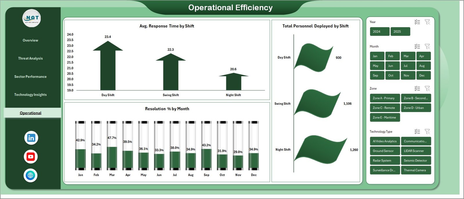
Operational Efficiency
6 – Data Sheet Tab
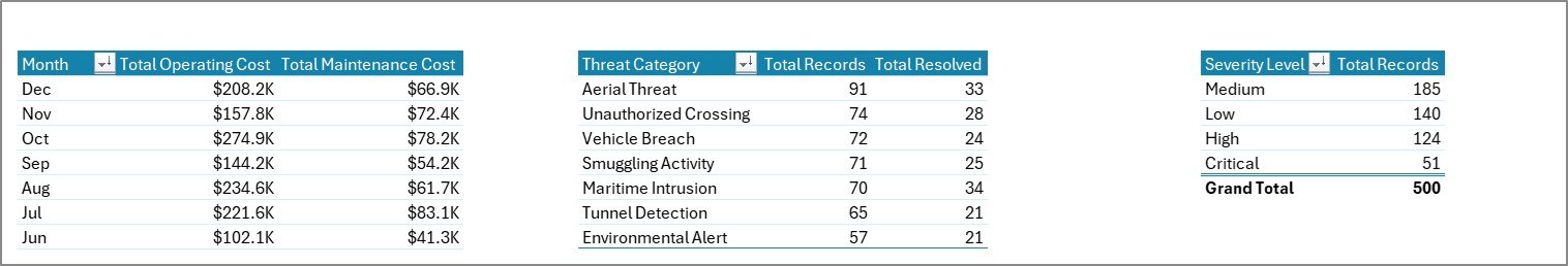
This is the Data sheet. Here you need to add the data in the same format. It follows a clean, structured tabular layout with columns for all operational fields including threat categories, severity levels, technology types, border sectors, zones, shifts, operating costs, maintenance costs, detection accuracy, false alarm rates, response times, personnel counts, and resolution status. Simply replace the sample data with your actual records, keeping the same column headers and format.
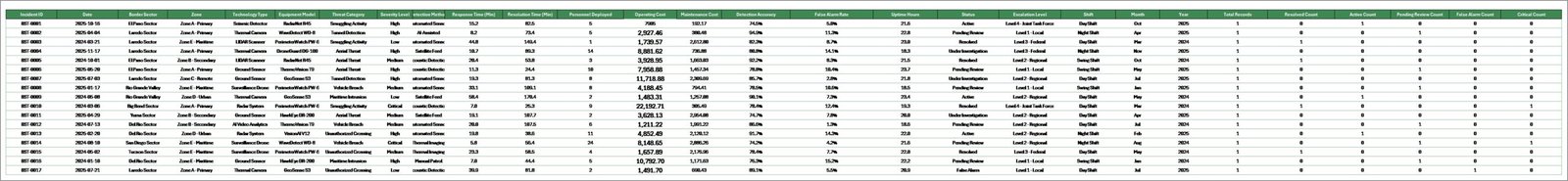
Data Sheet Tab
7 – Support Sheet
In this sheet we have created multiple pivot tables to create the entire dashboard dynamically. You can go to the Data tab in the Excel Ribbon and click on Refresh All after updating the data in the Data sheet. All the pivots will be refreshed and all the charts will be refreshed. You can keep this sheet hidden during regular use since it serves as the calculation engine behind the scenes.
Support Sheet Tab
Advantages of Border Security Tech Dashboard in Excel
One of the biggest advantages of this dashboard is its centralized operational visibility. Instead of reviewing separate reports for threats, sectors, technologies, and workforce shifts, you get everything consolidated into one workbook with five focused pages that cover every angle of border security operations.
The pivot-driven architecture eliminates the need for manual chart updates. Every time your data changes, a single Refresh All command propagates the updates across all pages, charts, and KPI cards. This drastically reduces the time spent on reporting and lets analysts focus on interpretation rather than data wrangling.
The dashboard is built entirely with native Excel features including pivot tables, pivot charts, slicers, and conditional formatting. There is no VBA or external dependencies, which means it works seamlessly on any version of Excel that supports pivot tables including Microsoft 365, Excel 2019, and Excel 2021.
The Technology Insights page provides a unique dual-metric comparison of Detection Accuracy versus False Alarm Rate by technology type, which is invaluable for evaluating the true ROI of surveillance investments and making informed procurement decisions.
Opportunities for Improvement
While the dashboard provides comprehensive analytics out of the box, there are several areas where users can extend its capabilities. Adding real-time data connections through Power Query to external databases or APIs could enable automated data feeds from surveillance systems, reducing manual data entry. Users with access to Power BI could also consider migrating the dashboard for cloud-based sharing and mobile accessibility.
The current template uses a structured Data sheet for input, but adding a data validation layer with dropdown lists and input constraints would help prevent entry errors, especially in fields like zone codes, threat categories, and severity levels. Incorporating a geographic map visualization using Excel’s built-in map chart feature could further enhance spatial analysis of threat hotspots and sector coverage gaps.
Best Practices for Using the Border Security Tech Dashboard in Excel
To get the most value from this dashboard, follow these best practices. First, maintain consistent data entry standards in the Data sheet. Use standardized threat category names, severity levels, technology type labels, and sector codes to ensure the pivot tables aggregate data accurately. Any typo or naming inconsistency will create duplicate entries in your charts.
Second, refresh the dashboard regularly. Set a routine such as daily or weekly to add new operational records and refresh all pivots. This keeps the KPI cards and trend charts current and relevant for leadership briefings.
Third, leverage slicers for audience-specific views. When presenting to different stakeholders, use slicers to filter the dashboard to show only the data relevant to their area of responsibility. For example, show a technology manager only the Technology Insights page filtered by their specific equipment type.
Fourth, protect the Support sheet from accidental edits by hiding or protecting it. The pivot tables in this sheet are the backbone of the dashboard, and accidental modifications could break the chart connections.
Explore Relevant Templates
If you found this Border Security Tech Dashboard in Excel useful, explore these related templates that can help you build comprehensive analytics for your organization:
- Circular Economy Startups Dashboard in Excel — Track sustainability metrics and startup KPIs with interactive visualizations.
- Online Universities KPI Dashboard in Excel — Monitor educational performance metrics with pivot-powered analytics.
- Space Education Programs KPI Dashboard in Excel — Analyze program effectiveness with structured KPI tracking.
- Inventory Management Dashboard in HTML — Browser-based inventory tracking with interactive charts and filters.
- Customer Satisfaction Dashboard in HTML — Monitor satisfaction scores and SLA performance with dynamic visualizations.
Frequently Asked Questions
What is the Border Security Tech Dashboard in Excel?
It is a ready-to-use Excel template with five interactive dashboard pages covering Overview, Threat Analysis, Sector Performance, Technology Insights, and Operational Efficiency. It features dynamic KPI cards, pivot charts, and slicers designed to help border security agencies monitor detection accuracy, operating costs, response times, and resolution rates from one centralized workbook.
What KPIs are tracked on the Overview page?
The overview page displays five key KPI cards: Total Operating Cost, Total Records, Avg. Response Time, Avg. Detection Accuracy, and Total Resolved. These provide an instant high-level snapshot of border security operational performance.
How does the Technology Insights page help evaluate equipment?
The Technology Insights page includes a dual-metric chart comparing Avg. Detection Accuracy against Avg. False Alarm Rate by Technology Type. This helps procurement teams identify which technologies deliver the best accuracy with the fewest false positives, along with maintenance cost analysis for lifecycle planning.
Do I need VBA or macros to use this dashboard?
No. The entire dashboard is built using native Excel features including pivot tables, pivot charts, slicers, and conditional formatting. No VBA or macros are required, making it compatible with all modern versions of Excel.
How do I update the dashboard with my own data?
Navigate to the Data sheet, replace the sample data with your actual border security operational records following the same column structure, then go to the Data tab in the Excel Ribbon and click Refresh All. Every chart and KPI card across all five pages will update automatically.
Who is this dashboard designed for?
This template is ideal for border security agencies, homeland defense departments, government contractors, defense analysts, security consultants, and academic researchers who need to track and visualize border security technology performance, threat detection, and operational data.
Conclusion
The Border Security Tech Dashboard in Excel is a powerful, pivot-driven analytics template that transforms raw border security data into clear, actionable insights across five dedicated dashboard pages — Overview, Threat Analysis, Sector Performance, Technology Insights, and Operational Efficiency. Whether you are monitoring detection accuracy by technology type, analyzing threat distribution by category and severity, evaluating sector-level response times, or tracking monthly resolution trends, this dashboard gives you everything you need in one professional Excel workbook. Click here to Purchase the Border Security Tech Dashboard in Excel and take control of your border security analytics today.
Visit our YouTube channel for step-by-step video tutorials on Excel dashboards and templates: Youtube.com/@PK-AnExcelExpert