Managing a brand becomes easier when you track the right data at the right time. Companies run ads, launch campaigns, promote products, and build brand awareness every day. However, teams often struggle when they store all this information in different spreadsheets or disconnected systems. As a result, they lose visibility, waste time, and make decisions based on guesswork instead of facts.
A Brand Management Dashboard in Excel solves these problems. It gives you a simple, visual, and clear way to monitor every brand activity. You can track your campaigns, product categories, revenue, spending, awareness scores, preference scores, and more. With everything available in one interactive dashboard, your team stays informed and confident.
In this detailed article, you will learn everything about the Brand Management Dashboard in Excel. You will explore its features, advantages, pages, use cases, best practices, and frequently asked questions. You will also see how this dashboard helps teams make smarter, faster, and more informed branding decisions.
Click to Purchases Brand Management Dashboard in Excel
What Is a Brand Management Dashboard in Excel?
A Brand Management Dashboard in Excel is a ready-to-use analytical tool that tracks your brand’s performance. It converts raw data into interactive charts, cards, slicers, tables, and reports. This dashboard helps marketing managers, brand strategists, product teams, and leadership understand how the brand performs across different regions, campaigns, and product lines.
You can track metrics such as:
-
Revenue
-
Spend
-
CPM
-
Cost per unit
-
Brand Awareness Score
-
Brand Consideration Score
-
Brand Preference Score
-
Conversion rate
-
Regional performance
-
Monthly performance
Because the dashboard runs in Excel, you can use it without any coding knowledge. You only update the data, refresh the pivot tables, and the insights come alive automatically.
Why Do You Need a Brand Management Dashboard?
Brand management requires clarity. Without data, you cannot measure the impact of campaigns or brand strategies. Therefore, a dashboard becomes essential for:
-
Understanding customer perception
-
Tracking brand growth
-
Taking timely decisions
-
Comparing campaign performance
-
Improving budget utilization
-
Identifying high-performing product categories
-
Spotting areas that need improvement
Because the dashboard presents everything visually, you stay informed and aligned with business goals.
Key Features of the Brand Management Dashboard in Excel
The Brand Management Dashboard in Excel comes with a set of powerful features that help you explore brand performance easily. Below are the main features included in the dashboard.
1. Page Navigator Panel
The dashboard has a Page Navigator located on the left side. It helps you move between pages quickly. You can jump to:
-
Overview
-
Brand Analysis
-
Product Category Analysis
-
Campaign Objective Analysis
-
Month Analysis
-
Data
The navigation stays visible across all pages to improve the user experience.
2. Five Analytical Pages
The Brand Management Dashboard consists of five detailed analysis pages, each offering different insights. Every page includes:
-
A right-side slicer panel
-
Interactive charts
-
Metrics and KPIs
-
Dynamic filtering
Let’s explore each page in detail.
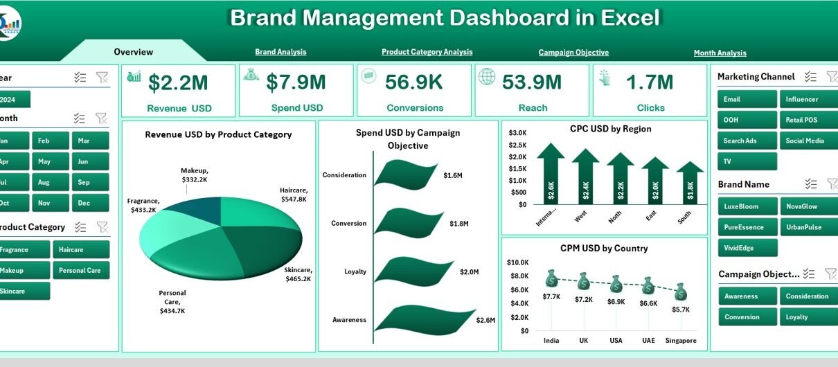
Overview Page: What Insights Can You See Here?
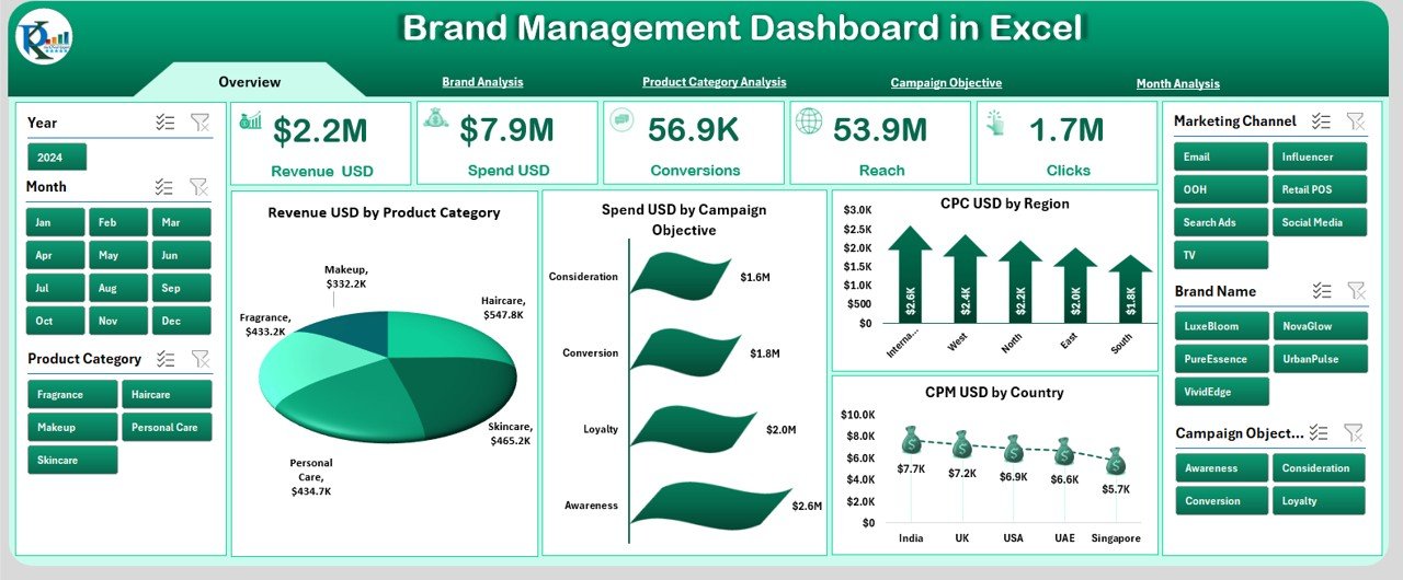
The Overview Page works as the dashboard’s main screen. It gives you a summary of brand performance.
Key Elements on This Page
✔️ Slicer Panel on the Right
You can filter data by:
-
Region
-
Country
-
Product Category
-
Brand Name
-
Month
-
Campaign Objective
These filters adjust the charts in real time.
✔️ KPI Cards
There are five KPI cards that give quick insights:
-
Revenue (USD)
-
Spend (USD)
-
CPU (Cost per Unit)
-
CPM (Cost per Thousand Impressions)
-
Overall Brand Performance Score
✔️ Overview Charts
This page includes four strong visual charts:
-
Revenue (USD) by Product Category
-
Spend (USD) by Campaign Objective
-
CPU (USD) by Region
-
CPU (USD) by Country
These visuals show performance differences across product lines and markets.
Click to Purchases Brand Management Dashboard in Excel
Brand Analysis Page: How Does Each Brand Perform?
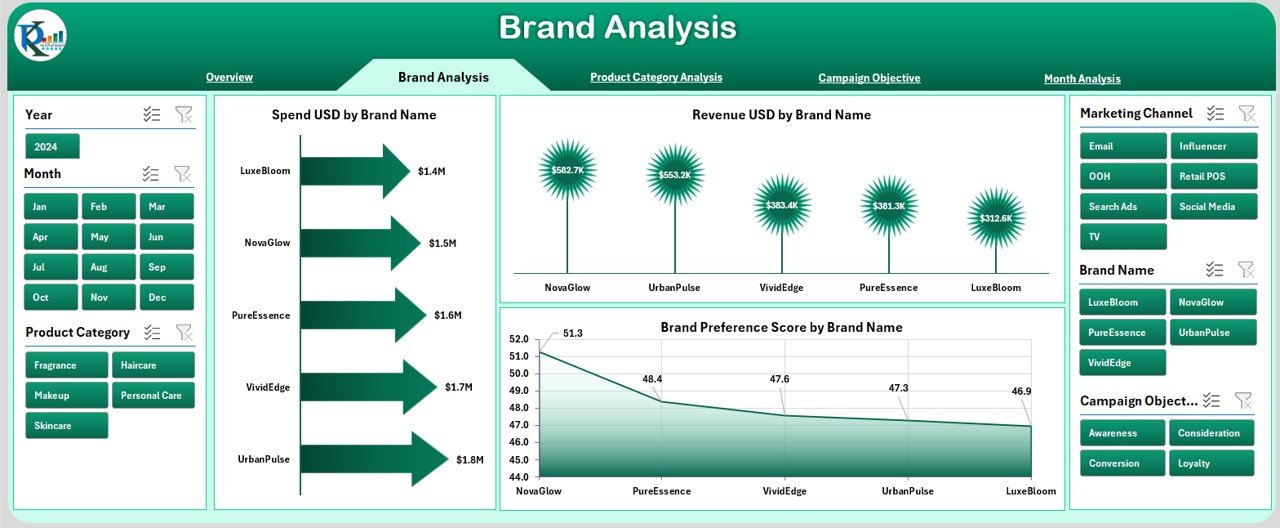
The Brand Analysis Page helps you study individual brand performance in detail.
What You Get on This Page
-
Right-side slicer for brand filtering
-
Three analytical charts
-
Detailed comparison between brands
Charts on This Page
-
Spend (USD) by Brand Name
-
Revenue (USD) by Brand Name
-
Brand Preference Score by Brand Name
These visuals help you identify:
-
High-revenue brands
-
Underperforming brands
-
Brands with strong or weak preference
-
Spend-to-revenue ratios
This page is useful for brand managers who want to understand the true value of each brand in the portfolio.
Product Category Analysis Page: Which Categories Drive Success?

Different product categories perform differently based on consumer needs, marketing strategies, and pricing. Therefore, this page gives detailed insights into each product segment.
Charts Included
-
Spend (USD) by Product Category
-
Conversion Rate by Product Category
-
Brand Consideration Score by Product Category
These insights help you:
-
Identify high-spend categories
-
Analyze category-level conversions
-
Understand customer consideration levels
You can also compare product categories side-by-side for better planning.
Campaign Objective Analysis Page: Which Campaigns Deliver the Most Value?
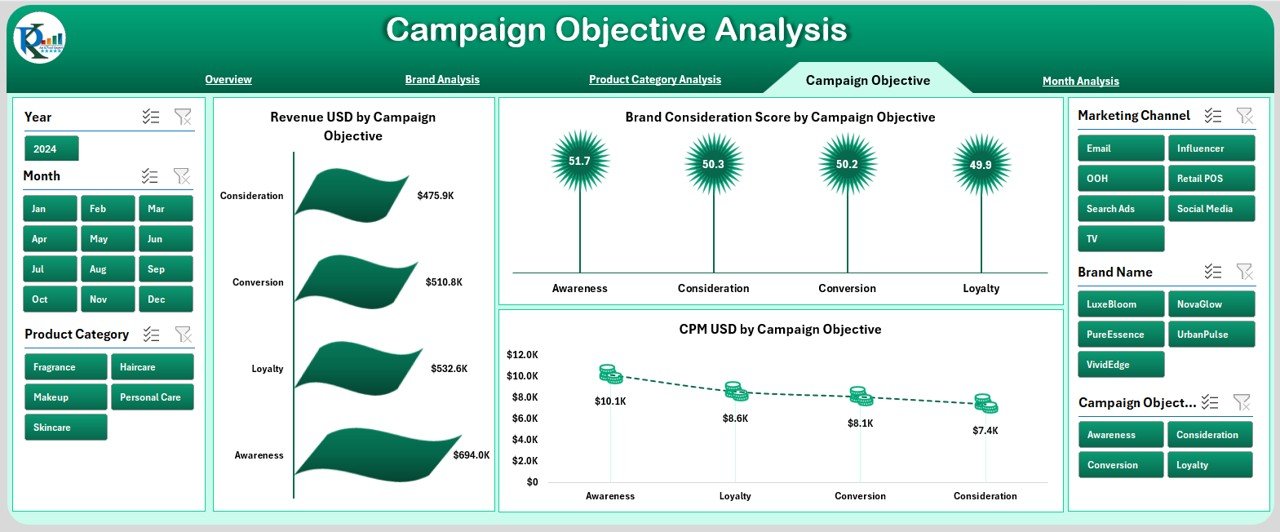
Campaigns often have different objectives. Some aim to build awareness, while others aim to increase conversions. This page helps you measure the effectiveness of campaigns based on objectives.
Charts Included
-
Revenue (USD) by Campaign Objective
-
Brand Consideration Score by Campaign Objective
-
CPM (USD) by Campaign Objective
These visuals allow you to answer important questions:
-
Which campaign type drives the most revenue?
-
Which objectives cost more to execute?
-
Which objectives improve brand perception?
You can allocate your marketing budget wisely using these insights.
Month Analysis Page: How Does the Brand Perform Over Time?
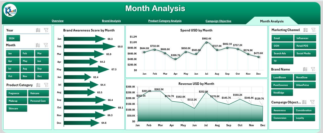
Time-based analysis helps you see trends, seasonal behavior, and overall progress. This page focuses on monthly performance.
Click to Purchases Brand Management Dashboard in Excel
Charts Included
-
Brand Awareness Score by Month
-
Spend (USD) by Month
-
Revenue (USD) by Month
These charts help teams:
-
Track month-to-month growth
-
Compare spend and revenue
-
Identify high-performing months
-
Understand seasonal demand
This page is useful for forecasting and budgeting decisions.
Support Sheets: Data and Structure
To keep the dashboard running smoothly, the Excel file includes:
✔️ Data Sheet
This sheet stores all raw data, including:
-
Revenue
-
Spend
-
Campaign details
-
Product category
-
Region
-
Scores (Awareness, Consideration, Preference)
-
Conversion rate
-
Month
When you update this sheet, the entire dashboard updates automatically.
Advantages of Using a Brand Management Dashboard in Excel
Using a Brand Management Dashboard offers many business advantages. Below are the most important benefits.
1. Enables Better Decision Making
The dashboard gives real-time insights that help teams take smarter decisions without delays.
2. Improves Marketing Performance
You can track what works, what fails, and where improvements are needed.
3. Enhances Budget Efficiency
You see which campaigns create value and which campaigns waste money.
4. Boosts Collaboration
Teams use a single dashboard, so everyone stays aligned.
5. Saves Time
All data stays in one place, so you spend less time searching and more time analyzing.
6. Helps You Track Customer Perception
Awareness, consideration, and preference scores tell you how the market views your brand.
7. Reduces Errors
Automated charts and pivot tables reduce manual mistakes.
8. Supports Long-Term Brand Growth
When you measure your brand regularly, you grow faster and smarter.
Best Practices for Using a Brand Management Dashboard in Excel
To get better results from the dashboard, follow these best practices.
1. Update Data Regularly
Refresh your data weekly or monthly to keep insights accurate.
2. Use Clean and Structured Data
Organize the data sheet properly to avoid calculation issues.
3. Apply Slicers for Deep Insights
Use slicers to filter by region, month, brand, or product category.
4. Compare Spend and Revenue Together
This helps you understand the ROI of campaigns.
5. Track Scores Monthly
Brand awareness, preference, and consideration scores show how customers behave over time.
6. Use Conditional Formatting
Highlight important changes to improve clarity.
7. Share the Dashboard With Your Team
Encourage collaboration for more accurate brand planning.
8. Review Campaign Objectives Closely
Understand which objectives perform well and which need changes.
Conclusion
A Brand Management Dashboard in Excel gives you full control over your brand’s performance. It helps you track revenue, spending, campaigns, product categories, and customer perception. Because the dashboard uses clean charts and interactive filters, you see everything clearly and take confident decisions. When you update it regularly and follow best practices, it becomes a powerful tool that supports long-term brand growth.
Brand management becomes easier, faster, and more effective when you use a dashboard built for real-world decision-making. With this Excel dashboard, you stay informed, organized, and ready to improve the brand performance at every step.
Frequently Asked Questions (FAQs)
1. What is a Brand Management Dashboard in Excel?
It is an interactive Excel tool that tracks brand performance using charts, slicers, and KPIs.
2. Who should use this dashboard?
Brand managers, marketing teams, product teams, analysts, and leadership.
3. Do I need advanced Excel skills to use it?
No. You only update the data sheet and refresh the pivot tables.
4. Can I customize the charts?
Yes. You can change colors, add filters, update labels, and modify layout.
5. How often should I update the data?
Update weekly or monthly for accurate insights.
6. Which metrics can I track?
You can track revenue, spend, awareness, consideration, preference, CPM, CPU, and more.
7. Can I use this dashboard for multiple brands?
Yes. The dashboard includes brand-level analysis pages.
8. Does this dashboard help with decision-making?
Yes. It gives clear insights to improve campaigns, budgeting, and brand strategy.
Visit our YouTube channel to learn step-by-step video tutorials
