Business continuity is no longer just a compliance requirement—it has become a strategic necessity. Organizations face increasing risks from cyberattacks, natural disasters, system outages, and operational failures. Without a clear continuity plan and monitoring system, these disruptions can cause huge financial losses and damage to reputation.
This is where a Business Continuity Dashboard in Power BI proves its value. It helps business leaders track continuity metrics, analyze performance, and ensure resilience. Unlike static reports, this interactive dashboard provides real-time insights, trend analysis, and data-driven decision support.
Click to Purchases Business Continuity Dashboard in Power BI
In this article, you will learn:
-
What a Business Continuity Dashboard is
-
Why organizations need one
-
How it works in Power BI
-
Key features and advantages
-
Opportunities for improvement
-
Best practices to implement successfully
-
Frequently asked questions
Let’s dive in.
What Is a Business Continuity Dashboard in Power BI?
A Business Continuity Dashboard is a reporting tool that monitors critical activities ensuring business resilience during unexpected disruptions. It consolidates continuity test results, incidents, downtime costs, and recovery metrics into one view.
When built in Power BI, the dashboard becomes even more powerful. Power BI allows dynamic filtering, interactive visuals, and real-time updates. Managers can view metrics by department, incident type, or test result and quickly identify areas that need attention.
Instead of analyzing multiple spreadsheets, decision-makers gain a centralized view of their continuity performance.
Structure of the Business Continuity Dashboard
The Business Continuity Dashboard in Power BI consists of five key pages. Each page focuses on a different dimension of continuity performance.
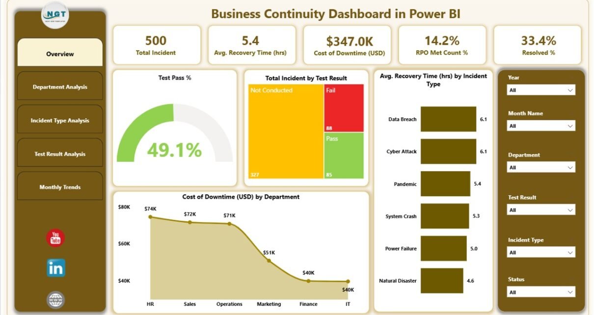
Overview Page
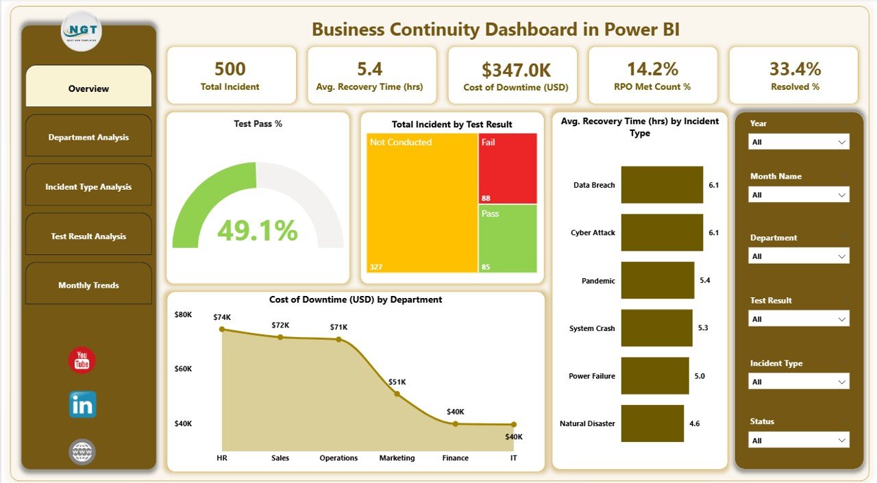
The Overview page serves as the starting point. It provides a snapshot of critical metrics through cards and charts.
-
Five KPI cards show high-level results.
Charts include:
- Test Pass %
- Total Incidents by Test Result
- Average Recovery Time (hrs) by Incident Type
- Cost of Downtime (USD) by Department
- Average Recovery Time by Incident Type
This page gives executives an instant health check of continuity readiness.
Click to Purchases Business Continuity Dashboard in Power BI
Department Analysis
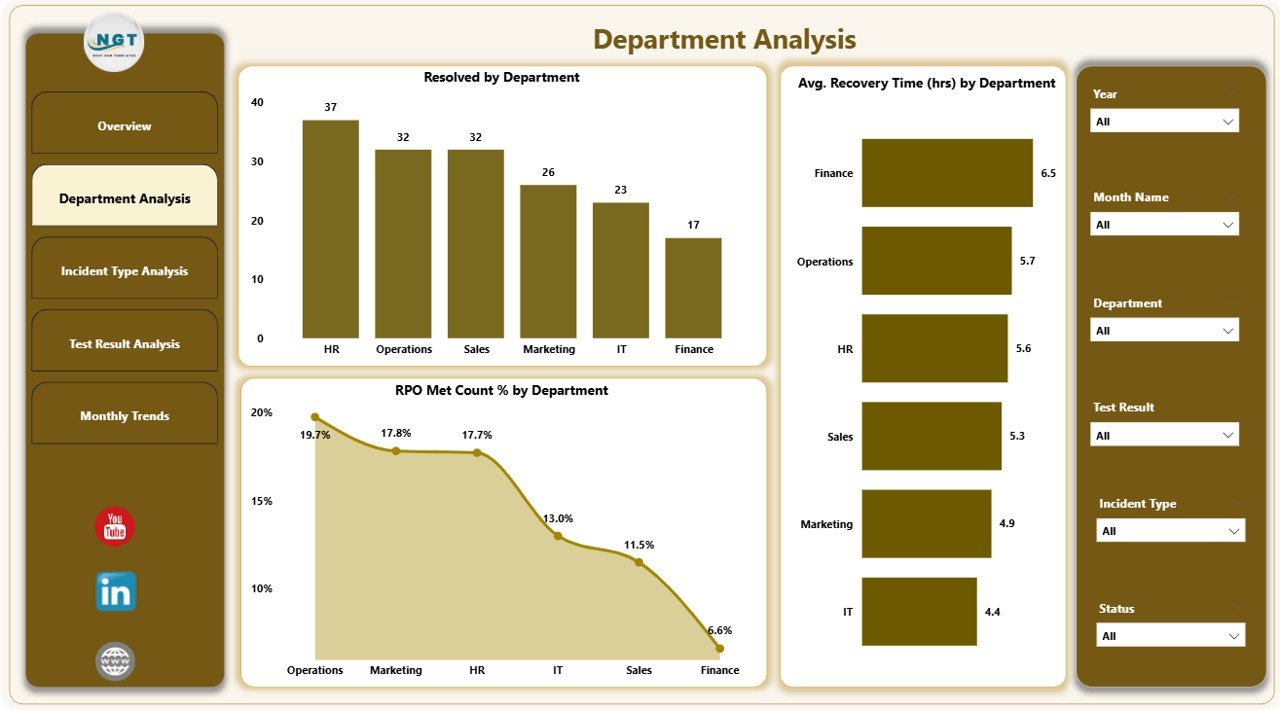
The Department Analysis page drills down into how different business units perform.
Charts include:
- Resolved Cases by Department
- Average Recovery Time (hrs) by Department
- RPO Met Count % by Department
This section helps leaders compare resilience across departments and identify weak spots.
Incident Type Analysis
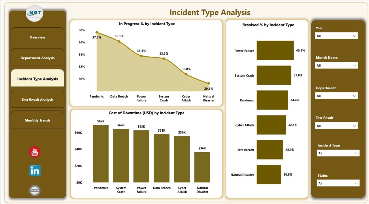
Incidents can vary by category—system failure, cyberattack, natural disaster, or process breakdown. This page focuses on incident-level insights.
Charts include:
- In Progress % by Incident Type
- Resolved % by Incident Type
- Cost of Downtime (USD) by Incident Type
It helps teams understand which incident types cause the most damage and require improvement.
Test Result Analysis
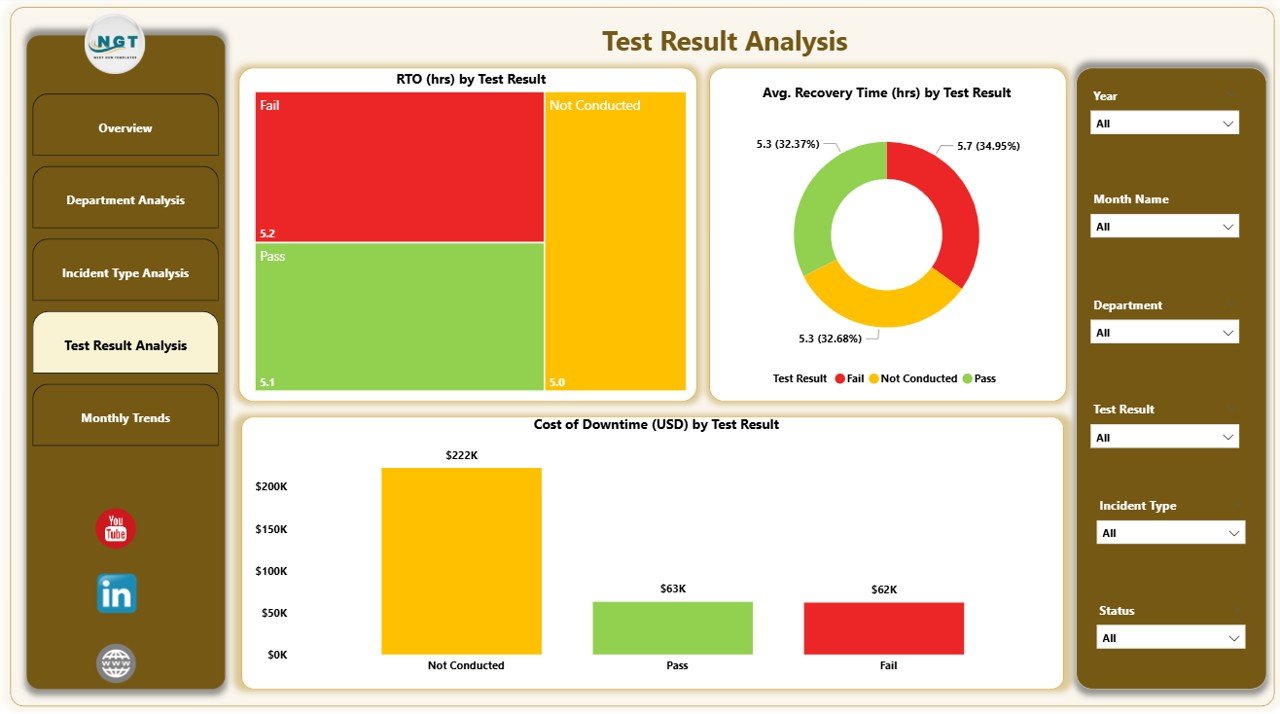
Continuity tests reveal whether recovery plans work effectively.
Charts include:
- RTO (hrs) by Test Result
- Average Recovery Time (hrs) by Test Result
- Cost of Downtime (USD) by Test Result
This page highlights whether recovery targets (RPO & RTO) are being met.
Monthly Trends
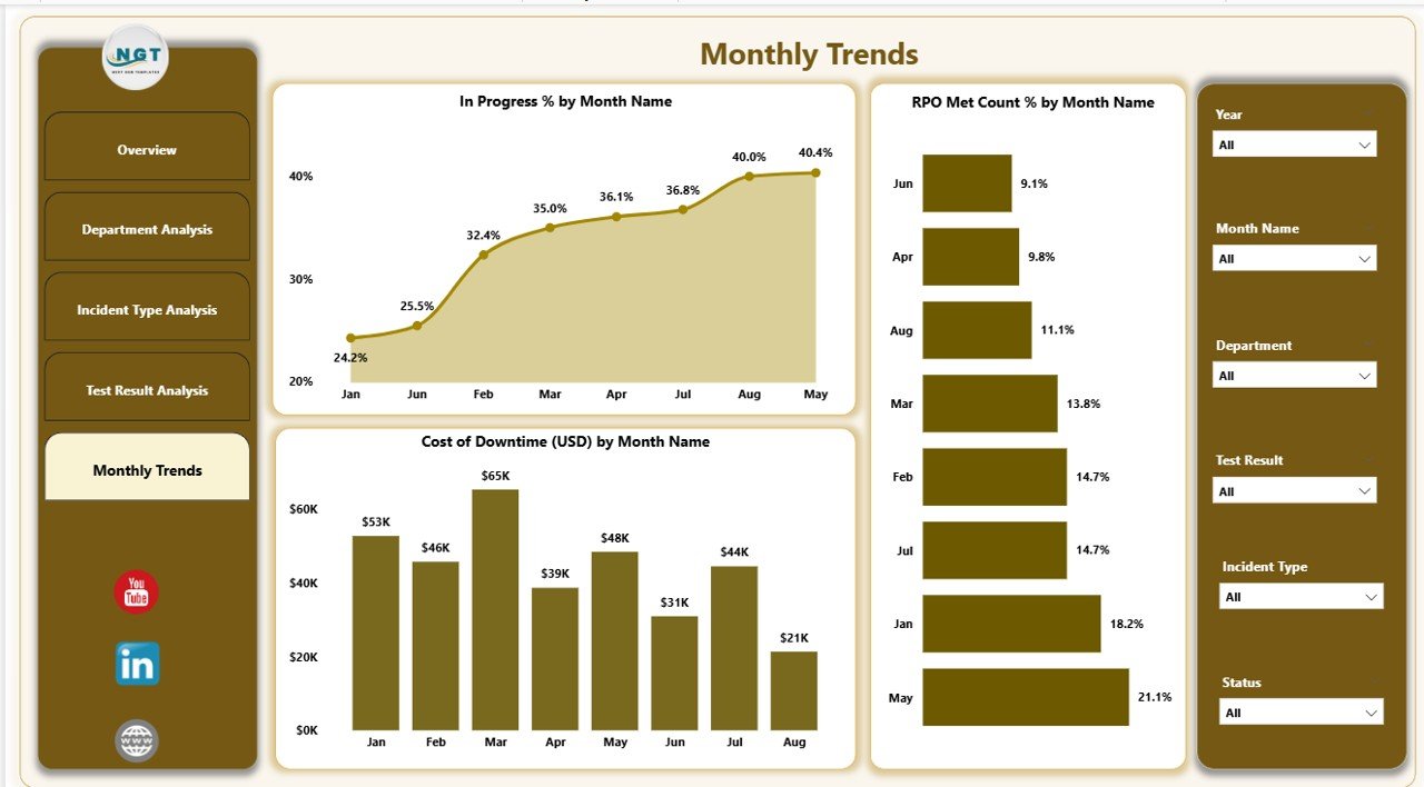
The Monthly Trends page tracks continuity metrics over time.
Charts include:
- In Progress % by Month
- RPO Met Count % by Month
- Cost of Downtime (USD) by Month
With this data, leaders can monitor improvements, seasonal patterns, or recurring weaknesses.
Why Do Organizations Need a Business Continuity Dashboard?
A Business Continuity Dashboard provides far more than just reports. It acts as an early warning system, a performance tracker, and a decision-support tool.
Key reasons include:
-
Centralized Monitoring – Consolidates all continuity data in one dashboard.
-
Real-Time Insights – Power BI updates help track incidents as they happen.
-
Faster Decision-Making – Visual KPIs make it easy to identify risk areas.
-
Regulatory Compliance – Supports audits and ensures continuity standards.
-
Financial Impact Tracking – Displays downtime cost by department and incident type.
Advantages of a Business Continuity Dashboard in Power BI
Implementing this dashboard delivers several benefits:
1. Clear Visibility
Decision-makers see performance across incidents, departments, and time periods in one place.
2. Reduced Downtime
Tracking recovery times helps organizations act faster, reducing financial losses.
3. Better Risk Management
Incident type analysis shows which risks are most common or most damaging.
4. Enhanced Accountability
Departments are measured on RPO, RTO, and resolution percentages, encouraging ownership.
5. Cost Optimization
Leaders can identify high downtime cost areas and prioritize investments.
6. Compliance Readiness
Auditors and regulators require proof of continuity testing. The dashboard provides reliable evidence.
Opportunities for Improvement
Even though a Business Continuity Dashboard in Power BI is powerful, organizations can enhance it further.
-
Integration with Real-Time Systems – Linking with monitoring tools like ServiceNow, Jira, or cloud alerts improves accuracy.
-
Automated Alerts – Adding Power BI alerts for missed RPO or RTO saves response time.
-
Predictive Analytics – Machine learning can forecast incident likelihood or downtime impact.
-
Scenario Simulation – Dashboards can include what-if analysis for disaster recovery planning.
-
Mobile Optimization – Ensuring accessibility for executives on tablets and phones improves usability.
Best Practices for the Business Continuity Dashboard
To maximize value, follow these practices:
✅ Define Clear KPIs – Use metrics such as recovery time, downtime cost, and RPO met %.
✅ Standardize Data Sources – Collect incident and test data consistently.
✅ Use Slicers for Flexibility – Allow filtering by month, department, or incident type.
✅ Focus on Storytelling – Arrange visuals logically: overview → drill-down → trends.
✅ Review Regularly – Update metrics after every incident or continuity test.
✅ Train Users – Teach managers how to interact with Power BI visuals.
✅ Secure Data – Apply role-based access to sensitive continuity information.
How This Dashboard Supports Decision-Making
A well-designed dashboard is more than a reporting tool; it enables smarter decisions:
-
Executives use the overview to check resilience status.
-
Department Heads monitor performance within their teams.
-
Continuity Managers identify weak processes and adjust recovery strategies.
-
Finance Teams estimate downtime costs to allocate resources effectively.
In short, the dashboard turns raw data into actionable intelligence.
Conclusion
A Business Continuity Dashboard in Power BI provides organizations with a real-time, interactive, and comprehensive view of their resilience readiness. By tracking incidents, test results, downtime costs, and recovery times, leaders can make informed decisions, reduce risks, and improve operational stability.
With the right design and best practices, this dashboard becomes not only a compliance tool but also a strategic advantage. Organizations that monitor continuity performance consistently are better prepared to survive and thrive in today’s unpredictable business environment.
Frequently Asked Questions (FAQs)
1. What is a Business Continuity Dashboard?
A Business Continuity Dashboard is a reporting system that tracks resilience metrics such as recovery time, downtime costs, and test results to ensure business continuity during disruptions.
2. Why use Power BI for continuity dashboards?
Power BI provides interactive visuals, real-time updates, and easy integration with Excel or other systems, making it the ideal tool for monitoring business continuity.
3. What KPIs are commonly tracked?
Common KPIs include:
-
Recovery Time Objective (RTO)
-
Recovery Point Objective (RPO)
-
Downtime Costs
-
Test Pass %
-
Resolution % by department or incident type
4. Can this dashboard help with audits?
Yes. The dashboard provides evidence of continuity testing, incident handling, and recovery performance, making it highly valuable for compliance audits.
5. How often should continuity dashboards be updated?
Ideally, update after every incident, test, or at least monthly. Real-time integration with monitoring tools ensures accuracy.
6. Who benefits from using this dashboard?
Executives, department heads, continuity managers, IT teams, and finance leaders all gain insights for better decision-making.
7. Can predictive analytics be added?
Yes. Power BI can integrate with AI models to forecast incidents, downtime risks, or financial impacts, adding even more value.
Visit our YouTube channel to learn step-by-step video tutorials
Click to Purchases Business Continuity Dashboard in Power BI
Watch the step-by-step video tutorial: