The Cargo Drone Startups Dashboard in Power BIis growing fast. Startups in this space now handle medical deliveries, industrial transport, last-mile logistics, and remote area supply chains. Because of this growth, companies need a better way to track performance, control cost, monitor safety, and understand market trends.
Click to Purchases Cargo Drone Startups Dashboard in Power BI
That is exactly where the Cargo Drone Startups Dashboard in Power BI becomes useful.
Instead of reviewing scattered reports, multiple spreadsheets, and disconnected systems, this dashboard brings everything together in one place. As a result, startup founders, operations teams, analysts, and investors can quickly understand business performance and make better decisions.
In this article, you will learn what the Cargo Drone Startups Dashboard in Power BI is, why it matters, what insights it offers, and how each page helps users track important business metrics. Along the way, we will also explore its advantages, best practices, and frequently asked questions.
Why Is the Cargo Drone Industry Growing So Quickly?
Cargo drone startups are changing how goods move from one place to another. These companies use unmanned aerial vehicles to deliver packages faster, reduce dependency on traditional transport, and reach areas that are difficult to access.
Today, cargo drone companies support many industries, such as:
- Healthcare and medical supplies
- E-commerce and retail delivery
- Food and grocery logistics
- Emergency response operations
- Industrial spare part transport
- Rural and remote region delivery
Because competition is increasing, startups must track revenue, operating costs, fleet size, funding, compliance, and delivery performance. Without a strong reporting system, it becomes hard to grow in a controlled and profitable way.
Therefore, a dashboard built in Power BI gives companies a clear and interactive way to manage operations.
What Is the Cargo Drone Startups Dashboard in Power BI?
The Cargo Drone Startups Dashboard in Power BI is an interactive business intelligence solution designed to analyze and monitor the performance of cargo drone companies. It collects key business data and transforms it into simple visuals, KPI cards, and filtered reports.
With this dashboard, users can:
- Track company revenue and operating cost
- Monitor fleet size and delivery success
- Analyze funding raised by region and country
- Review safety and compliance indicators
- Compare drone types and funding stages
- Understand market and financial trends
Moreover, Power BI makes the dashboard dynamic. Users can apply slicers and filters to focus on the exact part of the business they want to review. So, instead of spending hours preparing reports, users can get answers in seconds.
Why Do Cargo Drone Startups Need a Power BI Dashboard?
Cargo drone startups usually manage several moving parts at once. They need to grow revenue, raise funding, expand fleets, ensure safe operations, and maintain regulatory approval. If leaders cannot see all of these metrics together, they may miss important warning signs or business opportunities.
A Power BI dashboard solves this problem because it offers:
- Real-time style visual analysis
- Easy trend tracking
- Faster decision-making
- Better financial control
- Stronger operational monitoring
- Clear investor-ready reporting
In other words, the dashboard does not only show numbers. It tells the story behind those numbers.
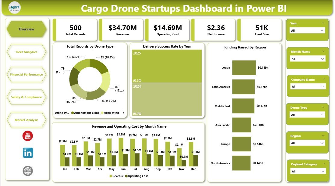
How Does the Overview Page Help You Understand Business Performance Quickly?
The Overview Page works as the main summary page of the dashboard. It displays high-level business indicators at the top and gives users a quick snapshot of startup performance.
Which KPI Cards Appear on the Overview Page?
The top section of the page includes the following KPI cards:
- Total Records
- Revenue
- Operating Cost
- Net Income
- Fleet Size
These cards help users understand the overall size, performance, and operational scale of the business. Since they appear at the top, users can instantly review the most important metrics before diving into detailed analysis.
Which Charts Appear on the Overview Page?
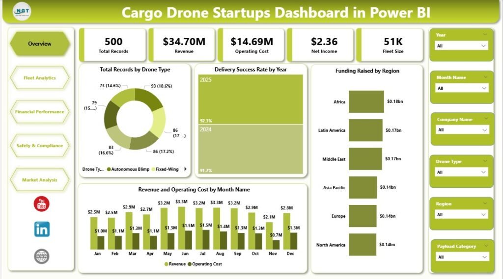
The Overview Page includes these visuals:
Total Records by Drone Type
This chart shows how many records belong to each drone type, making it easier to understand the distribution of operational data across the fleet.
It also helps users identify which drone models dominate the business and where the company focuses most of its activity.
Delivery Success Rate by Year
This chart highlights yearly delivery performance and shows whether operations are becoming more reliable over time.
As a result, users can quickly spot improvement trends, performance drops, or years that need deeper review.
Click to Purchases Cargo Drone Startups Dashboard in Power BI
Funding Raised by Region
This visual presents the amount of funding raised across different regions, helping users compare where investment interest is strongest.
It also supports strategic planning by showing which markets attract more capital and startup expansion opportunities.
Revenue and Operating Cost by Month Name
This chart compares monthly income and expenses to help users monitor profitability patterns throughout the year.
Therefore, it becomes easier to identify high-cost months, strong revenue periods, and seasonal business changes.
Why Are Slicers Important on the Overview Page?
The slicers allow users to filter the dashboard quickly and focus on specific views. Because of that, decision-makers can analyze selected periods, regions, drone types, or business segments without building separate reports.
This makes the page interactive, user-friendly, and much more practical for daily business use.
How Does the Fleet Analytics Page Improve Operational Visibility?
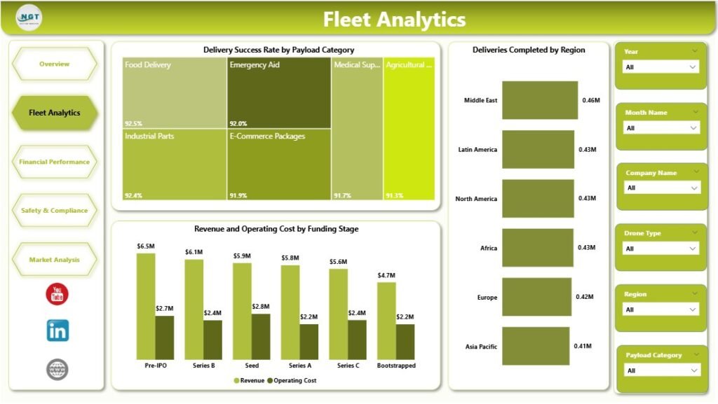
The Fleet Analytics page focuses on cargo drone operations. Since fleet efficiency directly affects customer satisfaction and profitability, this page gives a deeper look into performance.
Which Charts Are Included in Fleet Analytics?
Delivery Success Rate by Payload Category
This visual compares delivery success across different payload categories, helping users understand which cargo types perform better in operations.
It also helps identify whether certain payloads create more delivery challenges or lower success rates.
Deliveries Completed by Region
This chart shows the number of completed deliveries in each region, making regional operational performance easy to measure.
Because of this, companies can identify top-performing regions and areas where delivery activity needs improvement.
Revenue and Operating Cost by Funding Stage
This visual compares income and expenses across funding stages such as Seed, Series A, or later growth rounds.
It helps users understand whether financial efficiency improves as the startup matures and scales its operations.
Why Is Fleet Analytics Important?
Fleet performance is one of the most important parts of any cargo drone startup. If deliveries fail, costs rise. If routes underperform, profit drops. If certain payload categories create repeated issues, the company must act quickly.
Therefore, this page helps operations teams answer questions such as:
- Which regions complete the most deliveries?
- Which payload categories perform best?
- Are costs rising too quickly at a given funding stage?
- Is fleet scale improving operations or adding waste?
How Does the Financial Performance Page Support Smarter Business Decisions?
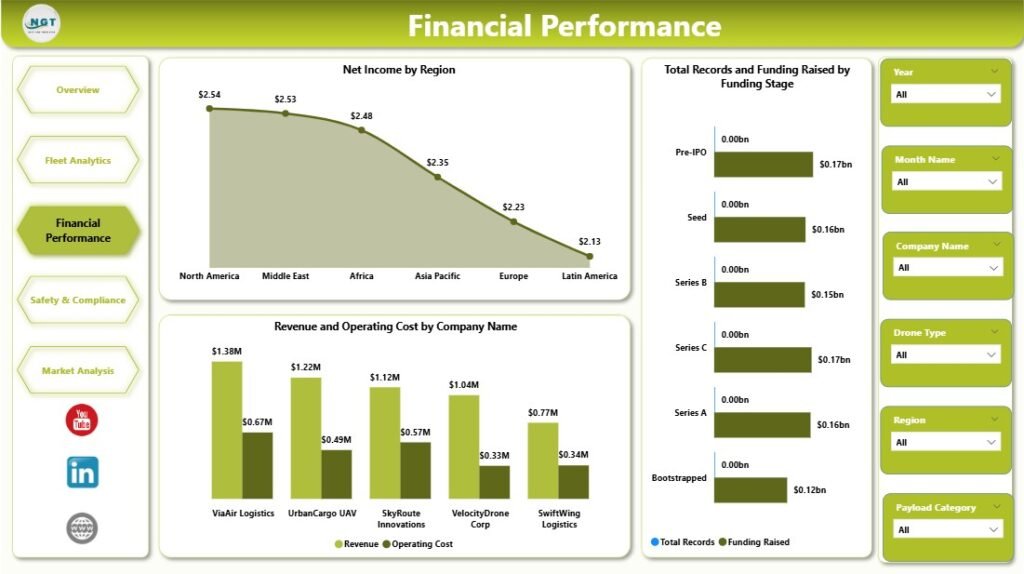
Every startup needs a strong handle on money. The Financial Performance page helps leaders review profitability, funding progress, and company-level comparisons in a more detailed way.
Which Charts Appear on the Financial Performance Page?
Net Income by Region
This chart displays profit levels across different regions, helping users understand where the business earns the most value.
It also highlights weaker regions that may need cost control, pricing review, or operational changes.
Total Records and Funding Raised by Funding Stage
This visual compares record count and funding amount across different startup stages.
As a result, users can see how business growth and investment progress move together over time.
Revenue and Operating Cost by Company Name
This chart compares each company’s income and cost side by side for a direct performance review.
It helps users identify the most efficient companies, the highest earners, and businesses with heavy cost pressure.
Why Does This Page Matter for Startups and Investors?
Financial reporting is critical for both internal leadership and external stakeholders. Founders need to control spending. Finance teams need to monitor trends. Investors want to see performance clearly.
Because of this, the Financial Performance page becomes valuable for:
- Profitability analysis
- Company benchmarking
- Investor reporting
- Cost tracking
- Funding-stage comparisons
- In short, it turns raw financial data into useful business insights.
Click to Purchases Cargo Drone Startups Dashboard in Power BI
How Does the Safety and Compliance Page Help Reduce Business Risk?
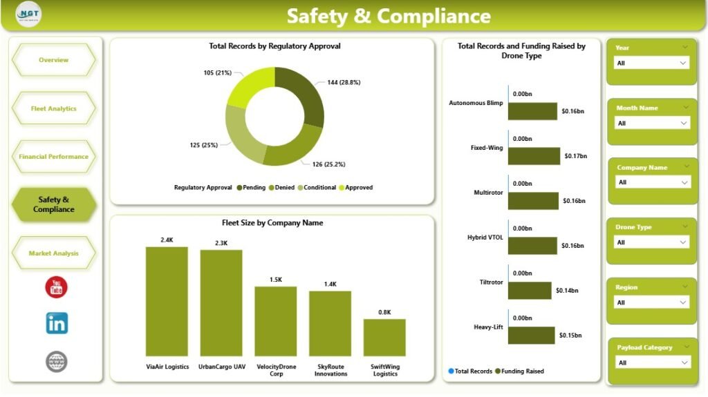
Safety and compliance are not optional in the drone industry. They are essential. Cargo drone startups must follow aviation rules, maintain approvals, and manage risk carefully. That is why the Safety and Compliance page is such an important part of the dashboard.
Which Charts Are Included on This Page?
Total Records by Regulatory Approval
This visual shows how records are distributed by regulatory approval status.
It helps users understand the compliance position of operations and quickly identify areas needing regulatory attention.
Total Records and Funding Raised by Drone Type
This chart compares operational volume and funding by drone type for a broader strategic view.
It shows whether certain drone models attract more funding and whether they also support more business activity.
Fleet Size by Company Name
This visual displays the number of drones owned or operated by each company.
It allows users to compare scale across companies and identify leaders in fleet expansion.
Why Is Safety and Compliance So Important?
A startup may grow fast, but if it ignores regulations and safety standards, growth can stop immediately. Therefore, companies must monitor compliance closely and make sure they meet required approvals.
This page helps users answer important questions:
- Which operations hold proper approvals?
- Which drone types support safe and scalable growth?
- Which companies manage larger fleets?
- Does funding align with compliant fleet expansion?
Because of these insights, leaders can reduce risk while planning future growth.
<div style=”text-align:center; width:100%; margin:20px 0;”> <img src=”[Image-4]” alt=”Safety and Compliance” style=”max-width:100%; height:auto; display:block; margin:0 auto;”> <p style=”font-size:14px; font-weight:bold; margin-top:8px;”>Safety and Compliance</p> </div>
What Can You Learn from the Market Analysis Page?
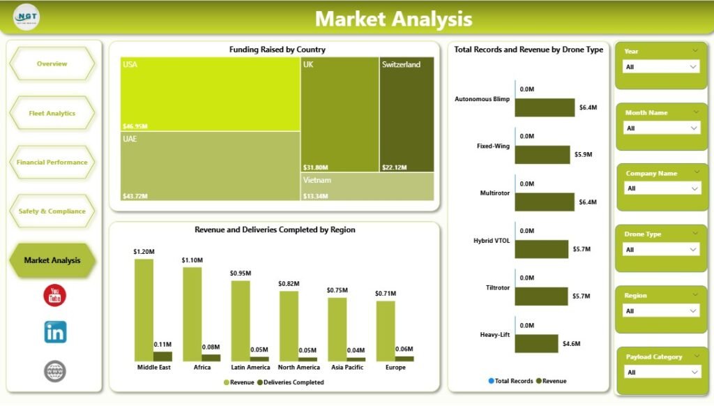
The Market Analysis page focuses on broader business opportunities. While operations and finance matter, startups also need to understand geography, demand, and product-market fit. This page helps them do exactly that.
Which Charts Are Included in Market Analysis?
Funding Raised by Country
This chart displays the funding amount by country, making it easy to compare investor activity across markets.
It helps businesses identify which countries show strong capital support for cargo drone startups.
Total Records and Revenue by Drone Type
This visual compares operational volume and revenue across different drone types.
It helps users understand which drone models support more activity and generate stronger returns.
Revenue and Deliveries Completed by Region
This chart combines revenue and completed deliveries to compare business performance by region.
Therefore, users can identify regions that generate strong income and regions where delivery volume drives growth.
Why Is Market Analysis Useful?
Startups must know where to expand, where to raise money, and where demand is strongest. This page supports those decisions by showing how performance varies across countries, regions, and drone types.
For example, companies can use this page to decide:
- Which countries deserve more market entry focus
- Which drone type creates the strongest revenue opportunity
- Which region performs well in both deliveries and earnings
- Where investor interest looks highest
What Are the Main Advantages of the Cargo Drone Startups Dashboard in Power BI?
Using this dashboard offers many business benefits. Since the cargo drone industry moves quickly, companies need a reporting solution that saves time and improves visibility.
Advantages of Cargo Drone Startups Dashboard in Power BI
- Centralized Reporting
All major business metrics appear in one place, so users do not need to open multiple files or systems. - Faster Decision-Making
Visual insights help leaders react quickly to financial changes, regional trends, and operational issues. - Improved Financial Control
Revenue, operating cost, and net income stay visible, which makes budgeting and profit tracking easier. - Better Fleet Monitoring
Delivery success, payload performance, and fleet size help teams understand operational efficiency. - Stronger Compliance Tracking
Regulatory approval metrics support safer planning and risk reduction. - Clear Market Insights
Country, region, and drone-type comparisons reveal where opportunities are strongest. - Interactive User Experience
Slicers and filters let users explore data from many angles without technical complexity. - Investor-Friendly Presentation
The dashboard provides a clean and professional way to present business growth and performance.
What Are the Best Practices for the Cargo Drone Startups Dashboard in Power BI?
Click to Purchases Cargo Drone Startups Dashboard in Power BI
A good dashboard becomes even more powerful when users follow the right approach. So, if you want to get the best results, follow these best practices.
Best Practices for the Cargo Drone Startups Dashboard in Power BI
- Use Clean and Updated Data
Always make sure your source data stays accurate, complete, and updated regularly. - Track Core KPIs Consistently
Focus on essential metrics like revenue, operating cost, delivery success, fleet size, and funding. - Apply Filters Wisely
Use slicers to study trends by year, region, drone type, and funding stage for deeper insights. - Review Monthly Trends
Compare revenue and cost by month to catch seasonal changes and spending issues early. - Monitor Compliance Often
Do not wait for audits. Review regulatory approval and fleet-related safety indicators regularly. - Compare Regions and Countries
Geographic analysis helps identify strong markets and underperforming locations quickly. - Benchmark Company Performance
Use company-level comparisons to identify top performers and areas that need action. - Share the Dashboard with Decision-Makers
When leadership, finance, and operations teams view the same data, decisions become more aligned.
Who Can Benefit from This Dashboard?
This dashboard works well for many types of users in the cargo drone ecosystem.
Ideal Users Include:
- Cargo drone startup founders
- Business analysts
- Finance teams
- Operations managers
- Logistics planners
- Aviation consultants
- Investors and venture capital teams
- Compliance and safety officers
Since the dashboard combines financial, operational, safety, and market data, it supports both daily management and long-term strategy.
How Can This Dashboard Improve Business Growth?
Growth needs visibility. When startups understand their numbers clearly, they can make better decisions with confidence.
For example, this dashboard can help businesses:
- Improve delivery performance
- Reduce operating cost
- Increase profitability
- Allocate funding more wisely
- Expand to stronger regions
- Invest in the right drone types
- Strengthen regulatory readiness
- Present better reports to investors
Therefore, the dashboard does not just track the business. It supports business growth directly.
Conclusion
The Cargo Drone Startups Dashboard in Power BI is a practical and powerful tool for modern drone businesses. It helps users monitor high-level KPIs, explore fleet performance, review financial health, manage compliance, and analyze market opportunities.
Because the cargo drone industry is evolving quickly, companies need a dashboard that turns raw data into useful insights. This solution does exactly that. It saves time, improves visibility, and supports smarter decisions across the business.
Whether you want to track revenue, compare regions, analyze drone types, or monitor regulatory approval, this dashboard gives you a clear and interactive way to do it. As a result, startups can grow with more control, better strategy, and stronger reporting.
Frequently Asked Questions with Answers
1. What is the Cargo Drone Startups Dashboard in Power BI?
It is an interactive dashboard that helps users analyze cargo drone startup data, including revenue, costs, fleet size, funding, compliance, and delivery performance.
2. Why should cargo drone companies use Power BI?
Power BI helps companies convert raw data into simple visuals and reports. Because of that, users can make faster and better business decisions.
3. What are the key metrics in this dashboard?
The main metrics include Total Records, Revenue, Operating Cost, Net Income, Fleet Size, Delivery Success Rate, and Funding Raised.
4. How does the dashboard help with fleet analysis?
It shows delivery success by payload category, deliveries completed by region, and cost versus revenue by funding stage, which supports better operational decisions.
5. Can this dashboard help with financial analysis?
Yes, it helps users review net income by region, compare revenue and cost by company, and study funding progress by startup stage.
6. Why is the Safety and Compliance page important?
It helps users monitor regulatory approval, compare fleet size, and review drone type activity, which supports safer and more compliant operations.
7. What can businesses learn from the Market Analysis page?
They can understand funding by country, compare revenue by drone type, and track deliveries and earnings by region.
8. Who can use this Power BI dashboard?
Startup founders, finance teams, analysts, logistics managers, compliance officers, and investors can all benefit from it.
9. Is this dashboard useful for investors?
Yes, because it presents startup performance, funding trends, and profitability in a clear and professional format.
10. How does this dashboard support business growth?
Cargo Drone Startups Dashboard in Power BIIt improves reporting, reveals market opportunities, tracks operational performance, and helps companies make data-driven decisions faster.
Visit our YouTube channel to learn step-by-step video tutorials
Click to Purchases Cargo Drone Startups Dashboard in Power BI