The cement industry works in a highly competitive and fast-moving environment. Every day, companies track production, quality, energy efficiency, safety performance, logistics, and sales numbers. As plants expand and operations grow, leaders struggle to monitor all KPIs in one place. Because of this, a Cement Industry KPI Dashboard in Power BI becomes a powerful tool that simplifies visibility, improves decisions, and helps every department stay aligned.
In this detailed guide, you will learn everything about building and using a Cement Industry KPI Dashboard in Power BI. You will also explore its layout, pages, slicers, cards, trend charts, calculations, KPI definitions, advantages, best practices, and answers to common questions.
Let’s dive in.
Click to Purchases Cement Industry KPI Dashboard in Power BI
What Is a Cement Industry KPI Dashboard in Power BI?
A Cement Industry KPI Dashboard in Power BI is a ready-to-use reporting system that visualizes all key metrics of a cement plant. It connects with an Excel-based data source and shows production KPIs, efficiency KPIs, quality KPIs, safety KPIs, logistics KPIs, and plant performance trends.
This dashboard brings all KPIs into a single system. Therefore, managers can track performance daily, monthly, and yearly without checking multiple reports. Since Power BI provides slicers, filters, drill-through options, and trend charts, the dashboard becomes an interactive platform for decision-makers.
Why Do Cement Plants Need a KPI Dashboard?
Cement plants deal with large-scale operations. Therefore, they require strong visibility. A Power BI dashboard gives plant managers a clear picture of:
-
Daily production trends
-
Energy consumption patterns
-
Raw material efficiency
-
Safety performance
-
Logistics movements
-
Cost control metrics
-
Equipment utilization
-
Quality KPIs like fineness, clinker factor, residue, etc.
Since the dashboard auto-updates and shows real-time visuals, it improves clarity and speed in decision-making.
Click to Purchases Cement Industry KPI Dashboard in Power BI
Structure of the Cement Industry KPI Dashboard in Power BI
This dashboard contains three powerful pages:
-
Summary Page
-
KPI Trend Page
-
KPI Definition Page
Each page serves a unique purpose. Below you will find a detailed explanation of every page.
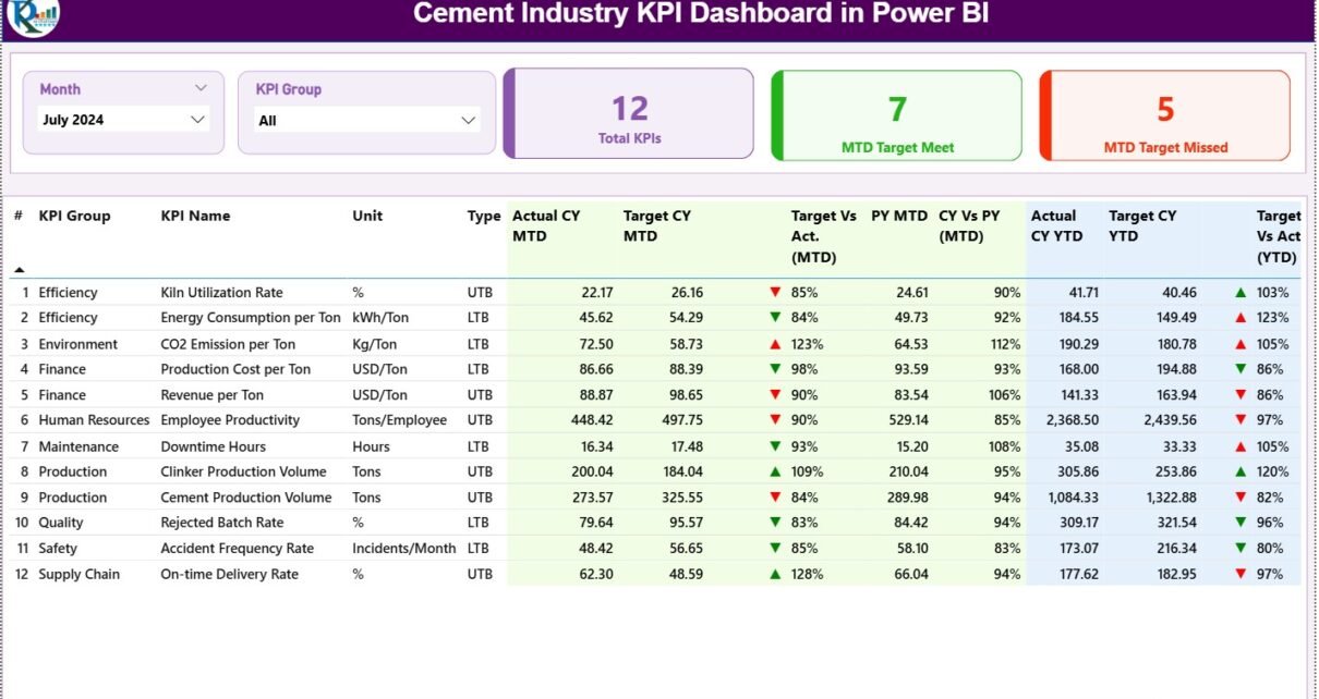
1. Summary Page – Your Main Control Panel
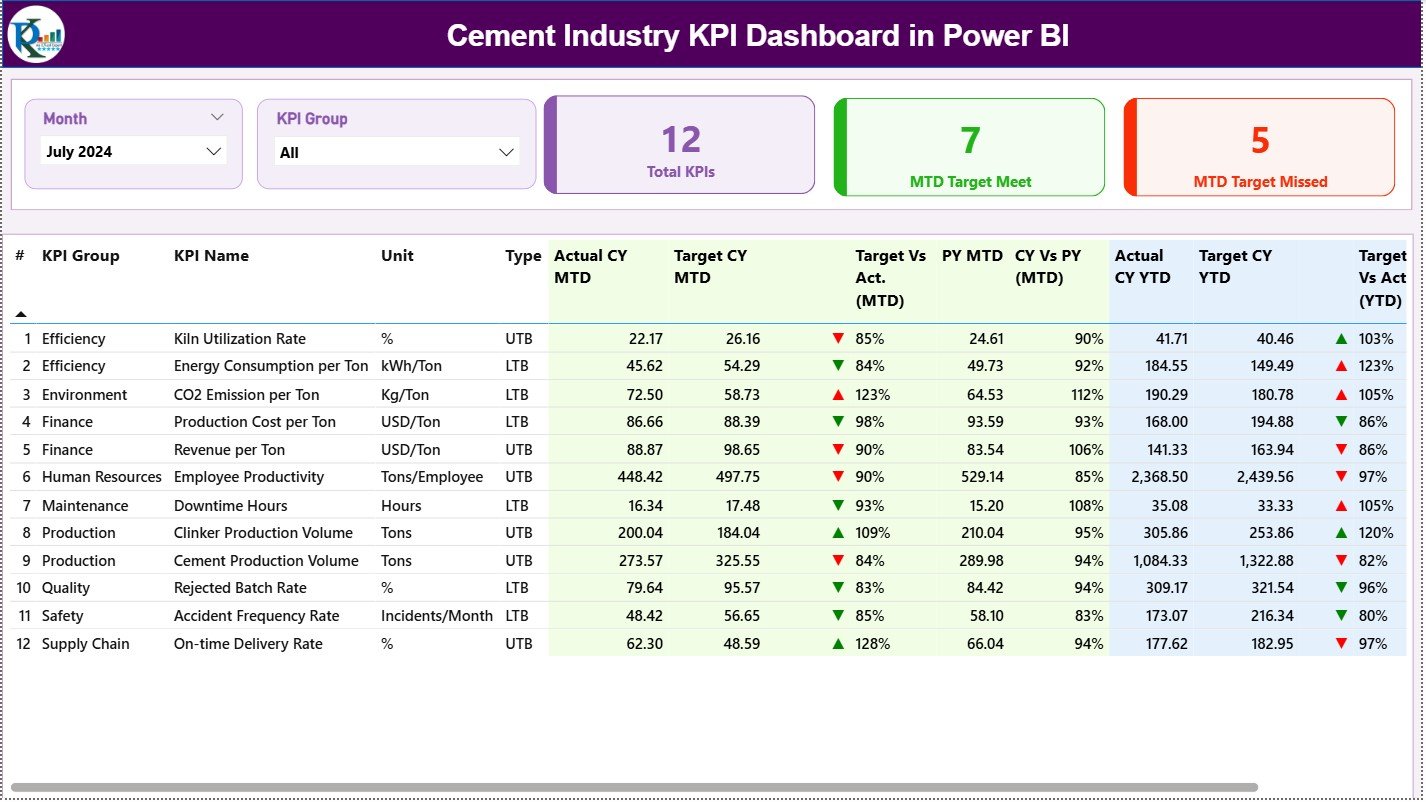
The Summary Page acts as the home page of the dashboard. It shows KPI performance at a glance. You can navigate, filter, and analyze all KPIs in seconds.
Top Section – Slicers for Easy Control
At the top, the dashboard uses two slicers:
-
Month Slicer – to select the reporting month
-
KPI Group Slicer – to filter KPIs by category such as Production, Quality, Safety, Energy, and Logistics
These slicers help users switch between months or KPI groups without opening multiple reports.
KPI Cards – Quick Insights
Below the slicers, the dashboard displays three important cards:
-
Total KPIs Count
-
MTD Target Met Count
-
MTD Target Missed Count
These cards show the overall health of the plant instantly. When leaders see more KPIs in the “met” category, they know operations are moving in the right direction.
Detailed KPI Table – Complete Visibility
The main section of the Summary Page contains a full KPI table. This table includes:
-
KPI Number
-
KPI Group
-
KPI Name
-
Unit of Measurement
-
Type (LTB – Lower the Better / UTB – Upper the Better)
-
Actual CY MTD
-
Target CY MTD
-
MTD Icon (▲ or ▼ with green/red color)
-
Target vs Actual (MTD %)
-
PY MTD
-
CY vs PY (MTD %)
-
Actual CY YTD
-
Target CY YTD
-
YTD Icon
-
Target vs Actual (YTD %)
-
PY YTD
-
CY vs PY (YTD %)
This table helps users compare monthly and yearly progress. Since the icons use color indicators, users can quickly identify which KPIs are doing well and which require attention.
Click to Purchases Cement Industry KPI Dashboard in Power BI
2. KPI Trend Page – Visual Trend Analysis
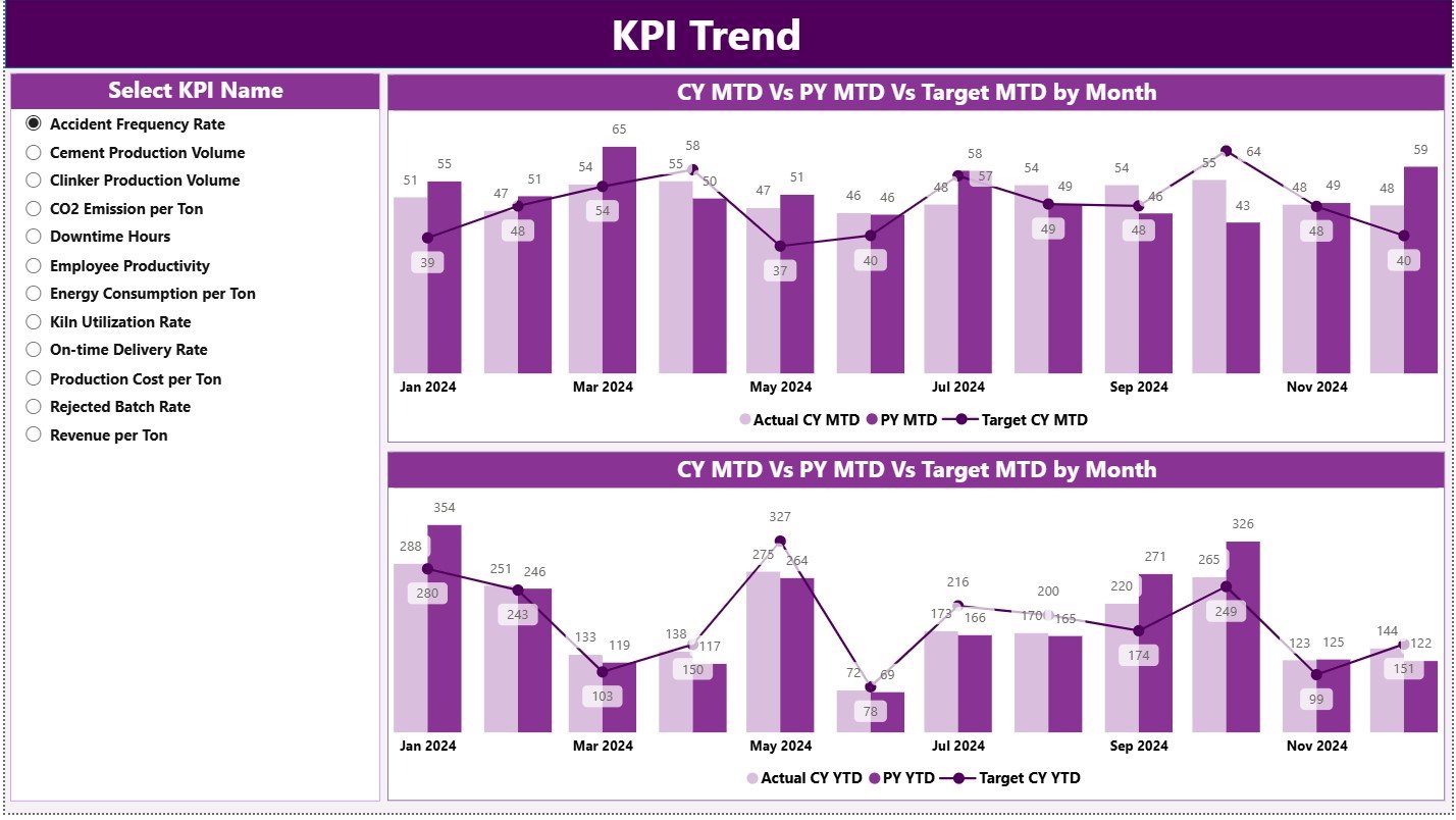
The KPI Trend Page gives a deeper view of KPI patterns over time. You can select one KPI from the slicer, and the dashboard updates automatically.
What You See on the Trend Page
-
Combo Chart 1: MTD Actual CY, MTD Target CY, and MTD Actual PY
-
Combo Chart 2: YTD Actual CY, YTD Target CY, and YTD Actual PY
These charts help users understand:
-
How performance improved from last year
-
Whether targets are realistic
-
How fast KPIs are moving
-
Whether operations are stable or fluctuating
Since the trend charts use lines and bars together, users get clearer insights.
3. KPI Definition Page – Drill-Through for Detailed Understanding
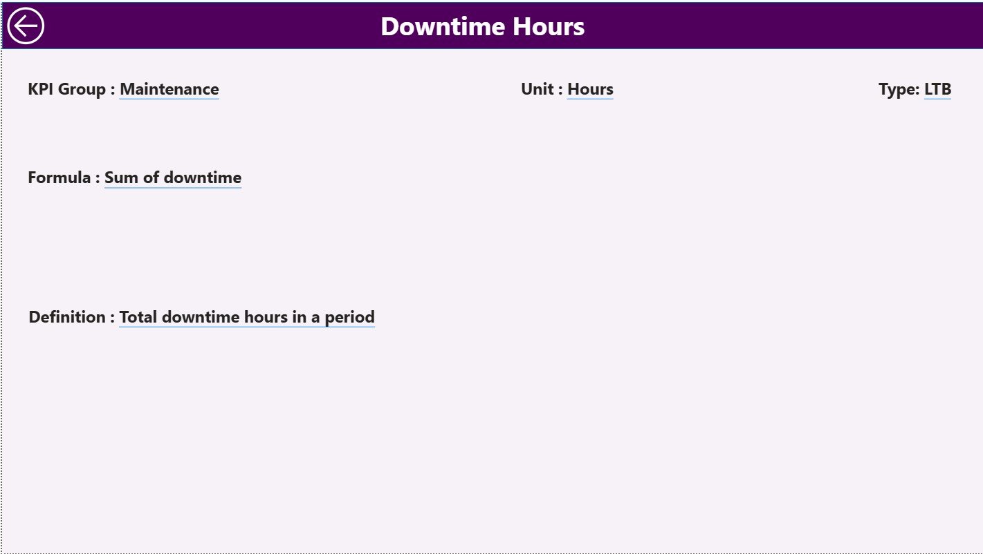
This is a hidden drill-through page, but it is extremely important. From the Summary Page, users can right-click on any KPI to open its definitions and formulas.
This page includes:
-
KPI Number
-
KPI Group
-
KPI Name
-
Unit
-
Formula
-
Definition
-
Type (LTB or UTB)
Since team members often need to understand KPI logic, this page helps maintain clear communication across departments.
Users can return to the main page using the Back Button on the top-left corner.
Excel Data Structure – The Backbone of the Dashboard
This Power BI dashboard connects with an Excel file that contains three worksheets:
1. Input_Actual Sheet
This sheet stores:
-
KPI Name
-
Month (first date of the month)
-
MTD Actual
-
YTD Actual
Since Power BI reads this sheet directly, users must ensure proper data entry.
2. Input_Target Sheet
This sheet stores:
-
KPI Name
-
Month
-
MTD Target
-
YTD Target
The dashboard compares actual numbers against targets based on this sheet.
3. KPI Definition Sheet
This sheet includes:
-
KPI Number
-
KPI Group
-
KPI Name
-
Unit
-
Formula
-
Definition
-
KPI Type (LTB or UTB)
Since Power BI uses the KPI definition sheet for drill-through details, users must fill it properly for accuracy.
Click to Purchases Cement Industry KPI Dashboard in Power BI
Advantages of Cement Industry KPI Dashboard in Power BI
A Cement Industry KPI Dashboard gives companies stronger control, better visibility, and faster decision-making. Here are the biggest advantages:
1. Brings All KPIs into One Platform
The cement industry handles many critical KPIs. This dashboard brings them together so that managers can monitor everything from one screen.
2. Improves Decision-Making Speed
Since the dashboard provides instant visuals, teams make quick and confident decisions.
3. Highlights Problems Early
Because the system shows red/green indicators, problem areas become visible immediately.
4. Reduces Manual Reporting Work
You stop creating reports manually. The dashboard updates automatically whenever the Excel file updates.
5. Improves Cross-Department Communication
Since the KPI definition page explains formulas and logic, teams understand KPIs clearly.
6. Helps in Monthly Reviews and Audit Reporting
Powerful charts and data comparisons support management reviews and audit presentations.
7. Supports Data-Driven Culture
The dashboard encourages every team member to use data before taking action.
Click to Purchases Cement Industry KPI Dashboard in Power BI
Best Practices for the Cement Industry KPI Dashboard in Power BI
To get the most value from your dashboard, use the following best practices:
1. Keep Data Clean and Structured
Always enter data in the correct format. Incorrect dates or text values can break visuals.
2. Use Standard KPI Definitions
Use the same formula for fuel consumption, clinker factor, energy efficiency, etc., across all plants.
3. Maintain a Clear KPI Type (LTB/UTB)
Correctly mark Lower-the-Better or Upper-the-Better KPIs. It helps in accurate red/green indicators.
4. Review Target Values Every Quarter
Plant conditions change. Therefore, you must adjust target numbers based on realistic performance.
5. Use Consistent Naming Conventions
Keep KPI names consistent across Actual and Target sheets to avoid match errors.
6. Protect the KPI Definition Sheet
Restrict editing access, because incorrect formulas lead to wrong insights.
7. Use Slicers Regularly
Switch months, groups, and KPI names frequently to explore detailed insights.
8. Track Trends, Not Just Static Numbers
Trends show whether performance is improving or declining, which helps in forecasting.
9. Use the Drill-Through Feature
Encourage managers to check formulas and definitions before taking decisions.
10. Update Excel Data Before Reviews
Always enter actual and target values before monthly review meetings to ensure accurate analysis.
How Does This Dashboard Support Cement Plant Operations?
This dashboard supports multiple functions inside a cement company, such as:
-
Production – Clinker output, cement output, run hours
-
Quality – Fineness, residue, 28-day strength
-
Energy – Electrical consumption, thermal consumption
-
Maintenance – MTBF, MTTR
-
Safety – Near misses, incidents, training completion
-
Logistics – Dispatch volume, loading efficiency
-
Sales – Orders, delivery performance
Since every department views the same dashboard, the company achieves better alignment.
What Makes This Dashboard Unique?
The Cement Industry KPI Dashboard in Power BI stands out because:
-
It works with simple Excel files
-
Anyone can update the data
-
It uses icons for instant understanding
-
It includes MTD, YTD, and PY comparison
-
It provides drill-through logic
-
It requires no technical background to use
This makes it suitable for plant heads, quality managers, energy managers, safety officers, and top management.
Conclusion
A Cement Industry KPI Dashboard in Power BI changes the way cement companies track performance. It simplifies monitoring, highlights issues early, improves decisions, and builds transparency across teams. With three powerful pages—Summary, KPI Trends, and KPI Definition—the dashboard becomes a complete reporting system for cement plants.
Since the dashboard connects with Excel sheets, updating data becomes extremely easy. Every KPI stays clear, updated, and easy to interpret. This helps management meetings, daily discussions, and long-term planning.
When cement companies use data-driven dashboards, they grow faster, control cost better, and improve operational excellence at every level.
Click to Purchases Cement Industry KPI Dashboard in Power BI
Frequently Asked Questions (FAQs)
1. What is a Cement Industry KPI Dashboard in Power BI?
It is a reporting tool that shows production, quality, safety, energy, and efficiency KPIs using Power BI visuals and Excel data sources.
2. Who uses this type of dashboard?
Plant heads, production managers, quality managers, energy teams, safety teams, logistics heads, and top management use this dashboard.
3. Does the dashboard update automatically?
Yes. When you refresh Power BI after updating the Excel file, all visuals update instantly.
4. Can I add more KPIs to the dashboard?
Yes. You can add new KPIs by entering new rows in the Actual, Target, and KPI Definition sheets.
5. What visuals are used in the dashboard?
The dashboard uses cards, tables, combo charts, icons, slicers, and drill-through pages.
6. How do I track KPI performance?
Use the MTD and YTD icons, Target vs Actual %, and CY vs PY % to check KPI status.
7. Do I need advanced Power BI knowledge to use this?
No. Anyone can use it because the dashboard works with simple Excel inputs.
Click to Purchases Cement Industry KPI Dashboard in Power BI
Visit our YouTube channel to learn step-by-step video tutorials
Watch the step-by-step video tutorial: