In today’s digital world, civic engagement platforms play a vital role in connecting communities, managing campaigns, and driving meaningful social impact. However, managing large volumes of data across campaigns, regions, and platforms can feel overwhelming.
So, how can organizations track engagement, monitor performance, and make smarter decisions effortlessly?
The answer lies in a Civic Engagement Platforms Dashboard in Power BI — a powerful, interactive solution designed to turn complex data into clear and actionable insights.
In this comprehensive guide, you will explore everything about this dashboard, including its features, benefits, use cases, and best practices.
Click to Purchases Civic Engagement Platforms Dashboard in Power BI
What is a Civic Engagement Platforms Dashboard in Power BI?
A Civic Engagement Platforms Dashboard in Power BI is a dynamic reporting tool that helps organizations monitor and analyze community participation, campaign effectiveness, and fundraising performance.
Moreover, it combines multiple data sources into a single interactive interface. As a result, decision-makers can quickly identify trends, measure success, and optimize strategies.
Why Do You Need This Dashboard?
Without a centralized dashboard, organizations often struggle with:
- Scattered data across multiple systems
- Delayed reporting and decision-making
- Lack of visibility into campaign performance
- Difficulty tracking engagement metrics
However, with Power BI, you can solve these challenges efficiently.
Key Features of Civic Engagement Platforms Dashboard
This dashboard comes with multiple pages, each designed to provide specific insights. Let’s explore each one in detail.
📊 Overview Page: What Does It Show?
The Overview Page provides a high-level summary of all critical metrics. It helps users quickly understand overall performance.
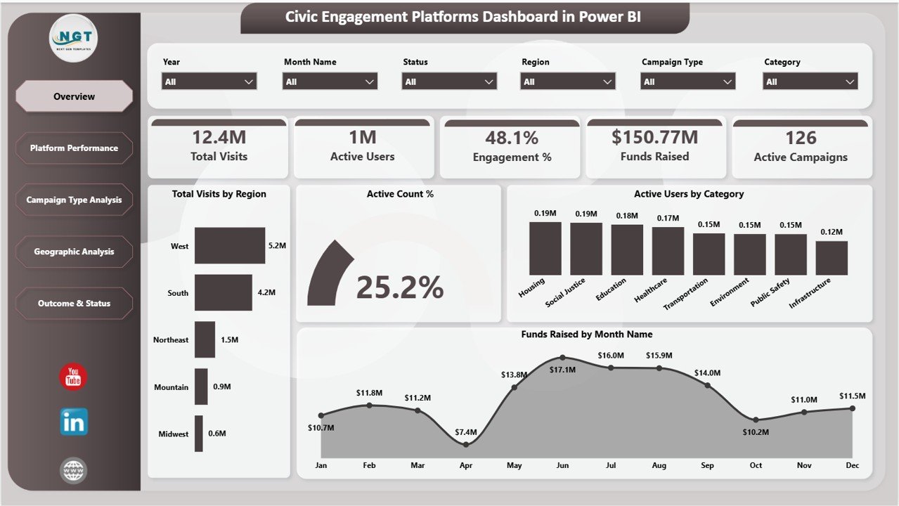
🔹 Key KPI Cards
At the top of the dashboard, you will find five essential KPI cards:
- Total Visits – Displays the total number of platform visits.
- Active Users – Shows how many users actively engage with the platform.
- Engagement % – Measures user interaction levels.
- Funds Raised – Highlights total fundraising performance.
- Active Campaigns – Indicates ongoing campaigns.
These KPIs give you a quick snapshot of your platform’s performance.
📈 Charts on Overview Page
1. Total Visits by Region
This chart shows how visits are distributed across different regions. It helps identify which regions drive the most traffic.
Additionally, it allows organizations to focus their outreach efforts on high-performing or underperforming regions.
2. Active Count %
This visual represents the percentage of active users within the total audience. It helps measure platform engagement effectiveness.
Moreover, it highlights whether users actively participate or remain passive.
3. Active Users by Category
This chart breaks down users based on categories such as Education, Healthcare, Social Justice, etc. It helps understand audience interests.
As a result, organizations can tailor campaigns according to specific audience segments.
4. Funds Raised by Month
This chart tracks monthly fundraising trends over time. It helps identify peak fundraising periods.
Therefore, organizations can plan campaigns strategically during high-performing months.
🚀 Platform Performance: How Do Platforms Compare?
The Platform Performance Page focuses on analyzing performance across different platforms.
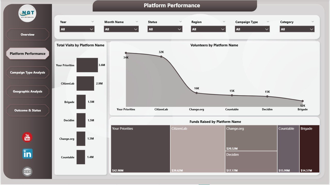
Key Insights
🔹 Total Visits by Platform
This chart shows how different platforms contribute to overall traffic. It helps identify the most effective platforms.
Additionally, it enables better allocation of marketing resources.
🔹 Volunteers by Platform
This visual displays the number of volunteers across platforms. It helps measure platform effectiveness in driving participation.
As a result, organizations can prioritize platforms that attract more volunteers.
🔹 Funds Raised by Platform
This chart highlights fundraising performance across platforms. It helps determine which platforms generate the most revenue.
Therefore, organizations can focus on high-performing platforms for fundraising campaigns.
📊 Campaign Type Analysis: Which Campaign Works Best?
The Campaign Type Analysis Page helps evaluate the performance of different campaign types.
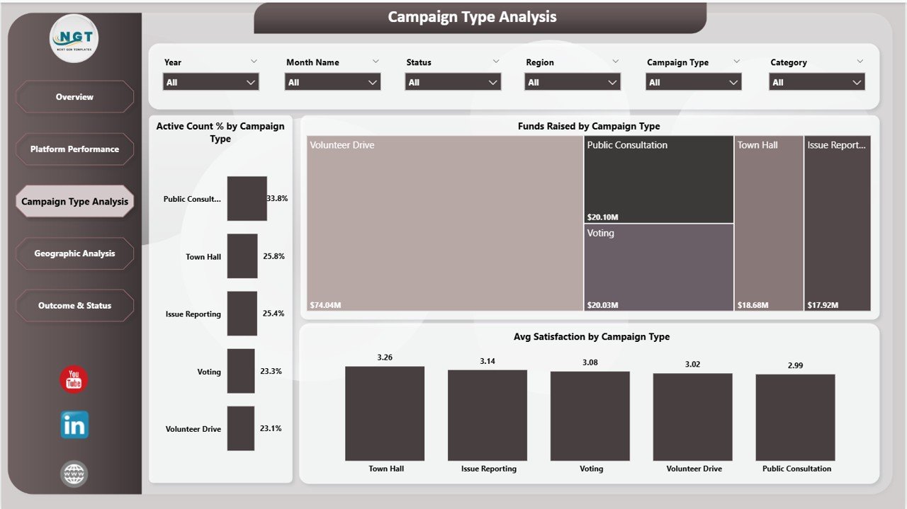
Key Insights
🔹 Active Count % by Campaign Type
This chart shows engagement levels across different campaign types. It helps identify which campaigns attract more active users.
Moreover, it enables organizations to refine campaign strategies.
🔹 Funds Raised by Campaign Type
This visual compares fundraising performance across campaign types. It helps identify the most profitable campaigns.
As a result, organizations can focus on high-return initiatives.
🔹 Avg Satisfaction by Campaign Type
This chart measures user satisfaction across campaigns. It helps understand audience perception.
Therefore, organizations can improve campaign quality and user experience.
🌍 Geographic Analysis: Where Does Engagement Come From?
The Geographic Analysis Page focuses on regional insights.

Key Insights
🔹 Volunteers by Region
This chart shows volunteer distribution across regions. It helps identify areas with high participation.
Additionally, it highlights regions that need more outreach.
🔹 Funds Raised by Region
This visual displays fundraising performance by region. It helps identify top-performing regions.
As a result, organizations can allocate resources effectively.
🔹 Engagement % by Region
This chart measures engagement levels across regions. It helps understand regional behavior.
Therefore, organizations can design region-specific strategies.
📌 Outcome & Status: What Are the Results?
The Outcome & Status Page focuses on campaign outcomes and performance trends.
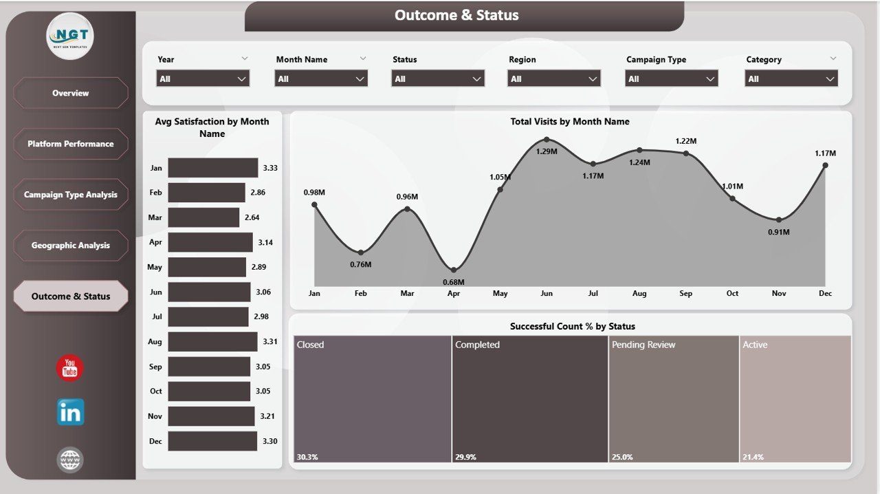
Key Insights
🔹 Avg Satisfaction by Month Name
This chart tracks satisfaction levels over time. It helps identify trends in user experience.
Additionally, it highlights months with high or low satisfaction.
🔹 Total Visits by Month Name
This visual shows monthly traffic trends. It helps analyze seasonal patterns.
As a result, organizations can plan campaigns accordingly.
🔹 Successful Count % by Status
This chart measures campaign success rates. It helps evaluate performance effectiveness.
Therefore, organizations can improve strategies for better outcomes.
✅ Advantages of Civic Engagement Platforms Dashboard
Using this dashboard offers multiple benefits:
- Real-Time Insights – Monitor performance instantly
- Better Decision-Making – Data-driven strategies improve outcomes
- Improved Engagement Tracking – Understand user behavior effectively
- Centralized Data – All metrics in one place
- Enhanced Campaign Performance – Optimize campaigns easily
⚡ Best Practices for Civic Engagement Platforms Dashboard
To get the best results, follow these best practices:
🔹 Keep Data Updated
Always ensure your data refreshes regularly to maintain accuracy.
🔹 Use Clear KPIs
Focus on the most important metrics to avoid confusion.
🔹 Optimize Visuals
Avoid clutter and use simple, clean visuals.
🔹 Apply Filters Smartly
Use slicers to analyze data efficiently.
🔹 Monitor Trends
Track changes over time to identify patterns.
📊 How This Dashboard Helps Decision-Making?
This dashboard empowers organizations to:
- Identify high-performing campaigns
- Optimize resource allocation
- Improve fundraising strategies
- Enhance community engagement
- Make faster and smarter decisions
As a result, organizations can maximize their impact and achieve better outcomes.
🏁 Conclusion
The Civic Engagement Platforms Dashboard in Power BI is more than just a reporting tool. It is a complete solution that transforms data into meaningful insights.
Whether you are managing campaigns, tracking volunteers, or analyzing fundraising performance, this dashboard provides everything you need in one place.
Therefore, if you want to improve decision-making, boost engagement, and maximize impact, this dashboard is the perfect solution.
Click to Purchases Civic Engagement Platforms Dashboard in Power BI
❓ Frequently Asked Questions (FAQs)
1. What is a Civic Engagement Dashboard?
It is a tool that helps organizations track community participation, campaigns, and engagement metrics.
2. Why should I use Power BI for this dashboard?
Power BI offers interactive visuals, real-time insights, and easy data integration.
3. Who can use this dashboard?
Nonprofits, government organizations, campaign managers, and community leaders can use it.
4. Can I customize this dashboard?
Yes, you can modify KPIs, visuals, and data sources as per your needs.
5. How often should I update the data?
You should update data regularly, preferably daily or weekly.
6. Does this dashboard support multiple platforms?
Yes, it integrates data from multiple engagement platforms.
7. What are the key KPIs in this dashboard?
Total Visits, Active Users, Engagement %, Funds Raised, and Active Campaigns.
Click to Purchases Civic Engagement Platforms Dashboard in Power BI
Visit our YouTube channel to learn step-by-step video tutorials