Insurance companies deal with thousands of claims every month. Because of this, claim teams must review performance regularly, track settlement timelines, reduce delays, and improve customer satisfaction. However, many organizations still use manual reports, which slow down decision-making, hide data errors, and create confusion.
A Claim Settlement KPI Dashboard in Power BI solves these problems. It converts raw claim data into clean visuals, helps teams understand performance instantly, and supports fast business decisions. Moreover, the dashboard works with an Excel-based dataset, so analysts can maintain the data easily.
In this detailed guide, you will learn what this dashboard includes, how each page works, why it creates value, and how you can use it to optimize the entire claim-settlement process.
Click to Purchases Claim Settlement KPI Dashboard in Power BI
What Is a Claim Settlement KPI Dashboard in Power BI?
A Claim Settlement KPI Dashboard in Power BI is a ready-to-use analytical tool that tracks monthly and yearly performance of claim-related KPIs. It brings all operational, financial, and process-efficiency metrics into one structured view.
Teams use this dashboard to:
-
Monitor claim settlement trends
-
Compare performance with targets
-
Identify delays quickly
-
Analyze monthly and yearly variations
-
Improve service delivery and customer experience
Because the dashboard works in Power BI, users can slice, filter, drill through, and explore the data in seconds. And since the data source is an Excel file, organizations can update performance numbers without technical complexity.
Why Do Organizations Need a Claim Settlement KPI Dashboard?
Insurance operations often involve multiple teams, processes, workflows, and approval cycles. When these workflows lack visibility, issues such as delays, cost leakages, rework, and customer dissatisfaction increase.
A Power BI dashboard gives leaders a real-time view of claim performance. As a result, they understand:
-
How fast teams process claims
-
Which categories show delays
-
Whether current performance meets monthly and yearly targets
-
How claims perform compared to the previous year
-
Which KPIs need attention immediately
This level of clarity helps organizations make confident, data-driven decisions.
How Does the Claim Settlement KPI Dashboard in Power BI Work?
The dashboard includes three interactive pages, each designed to give structured insights. Let’s explore each page in detail.
Click to Purchases Claim Settlement KPI Dashboard in Power BI
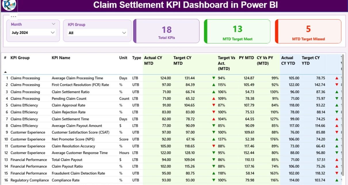
1. Summary Page: Your Complete Monthly and Yearly KPI View
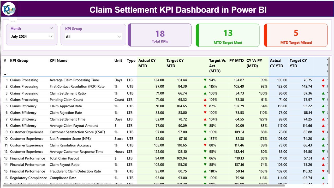
The Summary Page is the main page of the dashboard. It highlights all major KPIs and gives a quick overview of performance. Anyone can understand claim metrics in seconds because the page uses slicers, cards, tables, and conditional formatting to explain performance clearly.
Top Filters: Month & KPI Group
At the top, the dashboard has two important slicers:
-
Month Selector – Choose the reporting month.
-
KPI Group Selector – Filter KPIs based on category.
When you change the slicer, the entire dashboard updates instantly. Therefore, analyzing specific claim categories becomes very easy.
Performance Cards
Below the slicer, three cards summarize the dashboard:
-
Total KPIs Count
-
MTD Target Met Count
-
MTD Target Missed Count
These cards help you understand how many KPIs perform well this month and how many need attention.
Detailed KPI Performance Table
The main section of the dashboard shows a detailed table with all KPI values. This table contains insights that executives need for monthly review meetings.
You can track the following:
-
KPI Number – Unique sequence number of each KPI
-
KPI Group – Category or department of the KPI
-
KPI Name – The performance indicator
-
Unit – Measurement unit (Days, %, Count, etc.)
-
Type – LTB (Lower the Better) or UTB (Upper the Better)
-
Actual CY MTD – Current Year Month-to-Date actual value
-
Target CY MTD – Current Year MTD target
-
MTD Icon – Arrow indicator (▲ or ▼) showing KPI status
-
Target vs Actual (MTD) – Percentage comparison based on the formula:
Actual MTD / Target MTD -
PY MTD – Previous Year Month-to-Date actual value
-
CY vs PY (MTD) – Percentage change using the formula:
Current Year MTD / Previous Year MTD
You also get Year-to-Date (YTD) performance:
-
Actual CY YTD
-
Target CY YTD
-
YTD Icon – Status arrow
-
Target vs Actual (YTD) – Actual YTD / Target YTD
-
PY YTD – Last year’s YTD value
-
CY vs PY (YTD) – Current YTD / Previous YTD
Because the table includes both MTD and YTD performance, claim leaders can compare short-term and long-term results easily.
Click to Purchases Claim Settlement KPI Dashboard in Power BI
2. KPI Trend Page: Visualizing MTD and YTD Movements
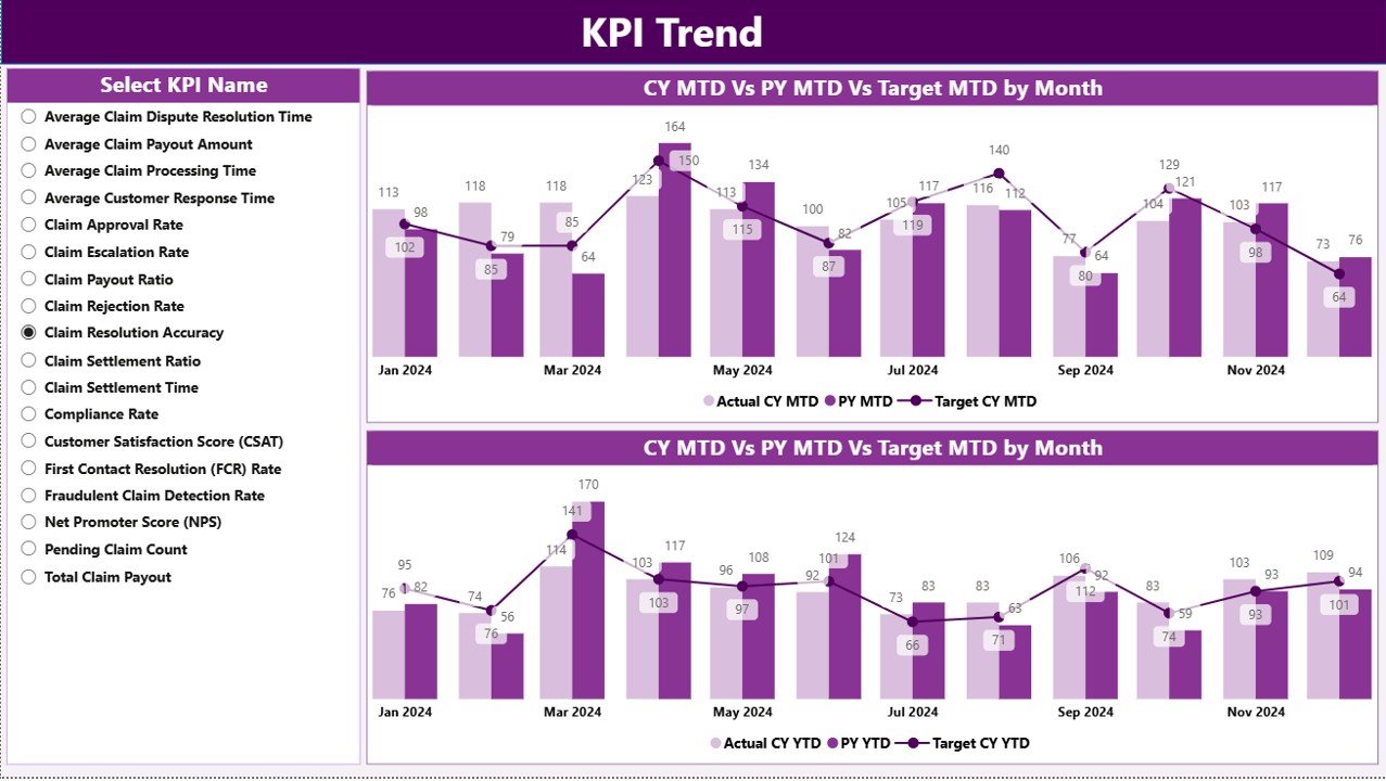
The KPI Trend Page helps teams understand how each KPI performs over the months. Trends reveal patterns that tables often do not show.
Here, the dashboard uses two combo charts:
1️⃣ MTD Trend Chart – Displays Current Year, Previous Year, and Target MTD values
2️⃣ YTD Trend Chart – Displays Current Year, Previous Year, and Target YTD values
You can select any KPI name from the slicer on the left side, and the charts update instantly.
Trend charts help you identify:
-
Seasonal fluctuations
-
Growth or decline patterns
-
Improvement or deterioration compared to last year
-
Whether targets need revision
-
Months with potential operational gaps
As a result, you can take early action before issues impact the claim settlement process.
3. KPI Definition Page (Drill-Through): Understanding Each KPI Clearly
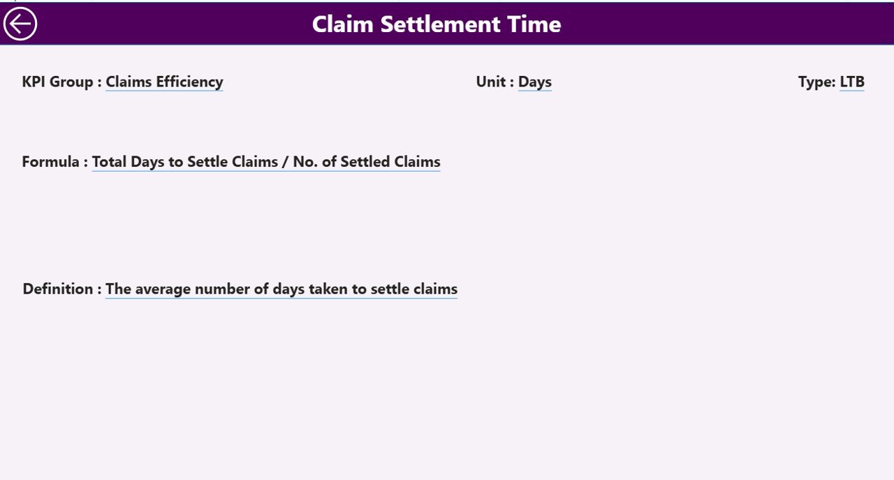
This page provides complete transparency into how each KPI works. It explains:
-
KPI Number
-
KPI Group
-
KPI Name
-
Unit
-
Formula
-
Definition
-
Type (LTB or UTB)
You can open this page by using the drill-through option from the Summary Page. Because of this feature, users understand the logic behind each KPI before reviewing performance.
A Back Button on the top left allows you to return to the Summary Page easily.
Excel Data Structure Behind the Dashboard
Click to Purchases Claim Settlement KPI Dashboard in Power BI
The dashboard runs on a structured Excel file, which contains three worksheets. Each sheet captures specific information.
1. Input_Actual Sheet
Here you enter:
-
KPI Name
-
Month (use the first day of each month)
-
MTD Numbers
-
YTD Numbers
This sheet stores the actual performance values.
2. Input_Target Sheet
Here you enter:
-
KPI Name
-
Month
-
MTD Target
-
YTD Target
This sheet stores the target values for each KPI.
3. KPI Definition Sheet
This sheet explains the KPI completely:
-
KPI Number
-
KPI Group
-
KPI Name
-
Unit
-
Formula
-
Definition
-
KPI Type (LTB or UTB)
The dashboard uses this sheet to calculate KPI status and logic.
What KPIs Can You Track in Claim Settlement Dashboard?
Even though every insurance company has unique processes, common KPIs include:
-
Average Claim Settlement Time
-
Claim Approval Time
-
Claim Rejection Rate
-
Pending Claims
-
Claim Processing Cost
-
First-Time Resolution Rate
-
Fraud Detection Response Time
-
Customer Satisfaction Score
-
Claims per Adjuster
-
Percentage of Claims Closed within SLA
Because you can customize the Excel file easily, the dashboard works for any insurance domain including:
-
Health Insurance
-
Motor Insurance
-
Property Insurance
-
Life Insurance
-
Travel Claims
Advantages of Claim Settlement KPI Dashboard in Power BI
1. Faster Decision-Making
The dashboard shows all important KPIs in one place. Leaders understand performance quickly and take decisions without delays.
2. Better Visibility of Delays
MTD and YTD comparisons highlight trouble areas. You see which KPIs fall behind and which ones achieve targets.
3. Improved Accountability
Teams know their performance numbers every month. As a result, they take ownership of the outcomes.
4. Clear Comparison with Previous Year
The dashboard compares current performance with last year. This helps organizations measure real progress.
5. Easy Updates through Excel
Because the data source is Excel, anyone can update numbers without technical skills.
6. Drill-Through Clarity
Managers can click any KPI and view its complete logic. This creates transparency and improves trust in the reporting process.
How This Dashboard Improves Claim Processing Quality
1. Identifies Delays Quickly
The MTD and YTD icons highlight issues before they become bigger problems.
2. Helps Improve SLA Compliance
Teams track settlement timelines more closely and prevent SLA violations.
3. Reveals Performance Patterns
Trend charts show which months require more support, staffing, or training.
4. Supports Leadership Reviews
Executives use the summary page for monthly meetings. Discussions become more objective and data-driven.
Best Practices for Using the Claim Settlement KPI Dashboard in Power BI
1. Update Data Consistently
Add actual and target numbers monthly without breaks. Continuous data strengthens the trend analysis.
2. Use LTB and UTB Logic Correctly
Always classify KPIs properly.
For example:
-
Claim Settlement Time → Lower the Better
-
Customer Satisfaction Score → Upper the Better
Correct classification ensures accurate status indicators.
3. Review Icons and Colors Regularly
Make sure arrow symbols and colors reflect the latest business logic. This helps users interpret performance instantly.
4. Validate Previous Year Data
Previous year numbers improve accuracy of CY vs PY comparison. Always cross-check them.
5. Train Teams to Use Drill-Through Feature
Teams should understand KPI formula and definition before analyzing performance.
6. Refresh Dashboard Before Review Meetings
Refresh the dataset and verify calculations to avoid outdated numbers during presentations.
Conclusion
The Claim Settlement KPI Dashboard in Power BI transforms the way insurance companies track performance. It simplifies data analysis, brings clarity to every KPI, and helps leaders understand operations instantly. With structured Excel sheets, interactive visuals, and powerful drill-through capabilities, this dashboard supports smarter decisions and a faster settlement cycle.
Therefore, organizations that want to improve SLA compliance, customer experience, and claim accuracy should use this dashboard as a central performance tool.
Frequently Asked Questions (FAQs)
1. What is a Claim Settlement KPI Dashboard in Power BI?
It is a ready-to-use analytics dashboard that tracks claim performance through MTD, YTD, and trend-based visuals.
2. Who can use this dashboard?
Claim managers, insurance analysts, customer service teams, audit teams, and leadership teams use this dashboard.
3. What data source does the dashboard use?
It uses an Excel file with Actual numbers, Target numbers, and KPI definitions.
4. Can I add more KPIs to this dashboard?
Yes, you can add any number of KPIs by updating the Excel sheets.
5. Does the dashboard support drill-through?
Yes, you can view KPI formulas and definitions through the hidden KPI Definition page.
6. Can this dashboard work monthly and yearly?
Absolutely. The dashboard includes both MTD and YTD views.
7. Do I need coding knowledge to maintain the dashboard?
No. You only need to update numbers in Excel.
8. Can I customize the visuals?
Yes, you can modify charts, colors, slicers, and layout in Power BI Desktop.
Visit our YouTube channel to learn step-by-step video tutorials