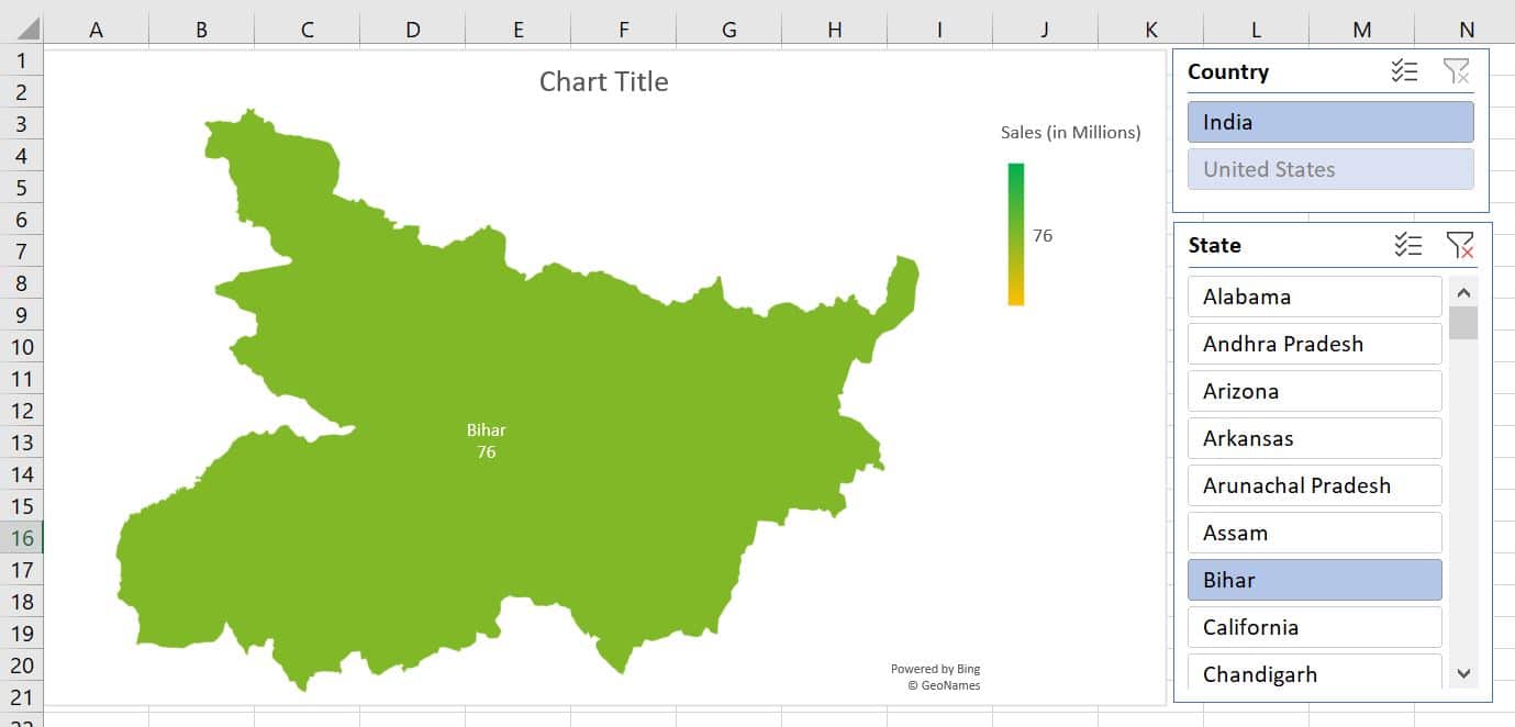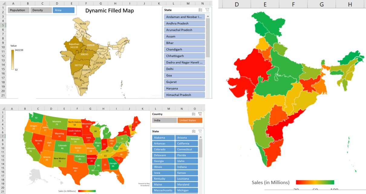
In the article, You will learn how to create a dynamic filled map in Microsoft Excel. Filled Map is available with Office 365 subscription. You can display the Region, country, or state-level data in a filled map.
Visit our YouTube channel to learn step-by-step video tutorials
Watch the step by step video tutorial:
Dynamic Filled map in Excel
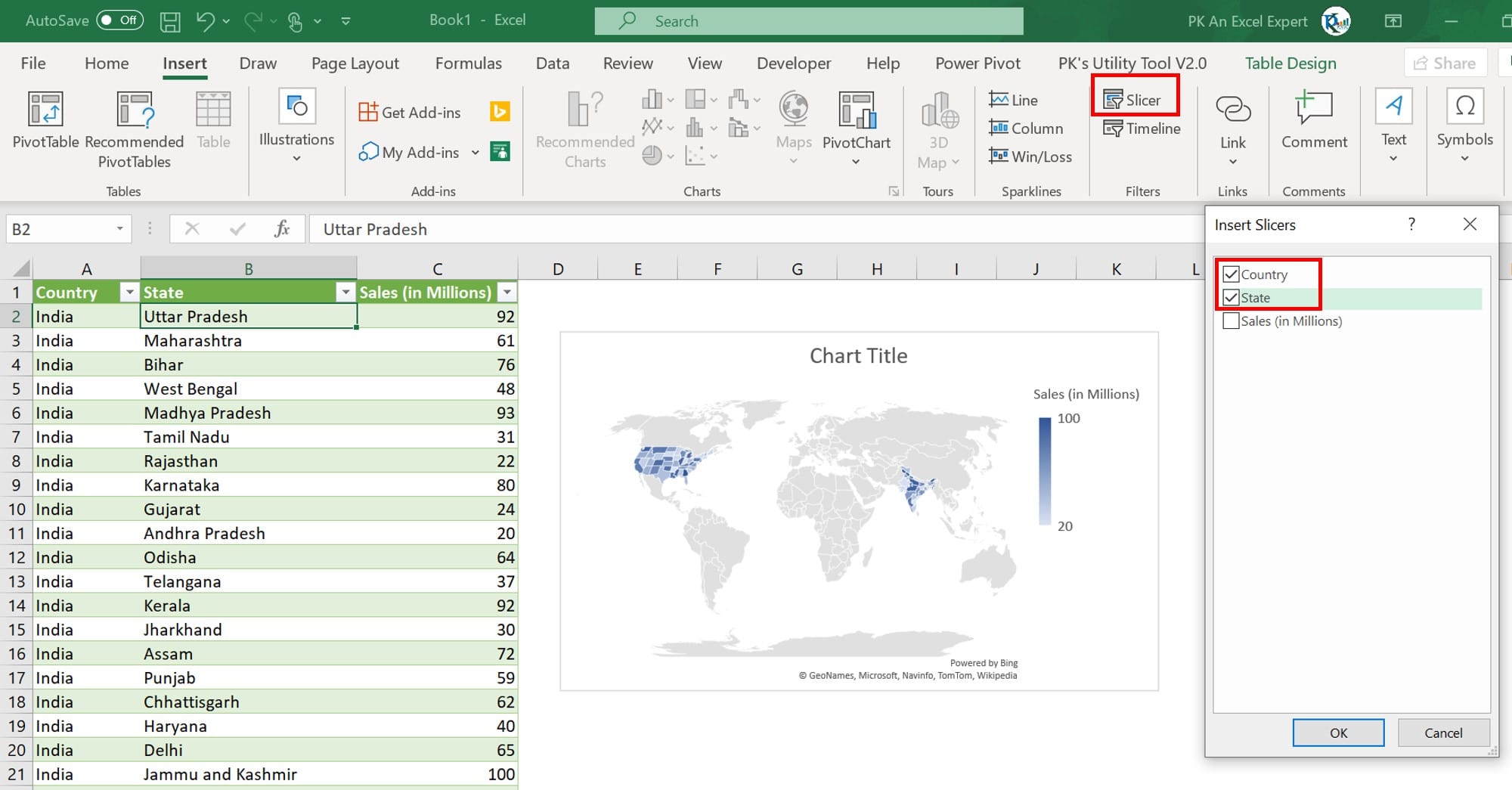
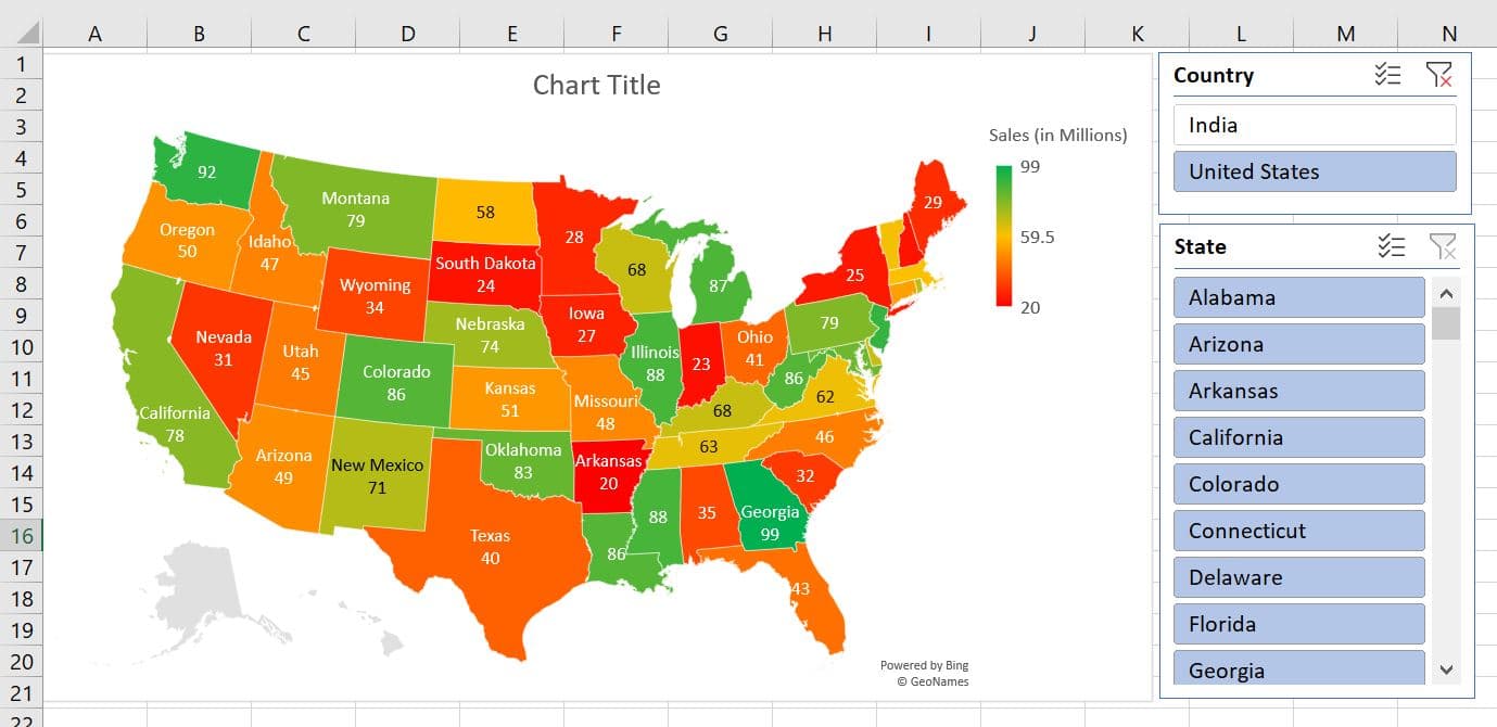
In the example, we have taken Sales Data as Country, State, and Sales in millions. You can change the data type as “Geography” available in the Data tab.
- Select the State and Sales column.
- Go to insert tab>>Charts>>Maps>>Insert filled map
- Select the table and insert Country and State Slicers.
- Select the Chart and Slicers together using ctrl key and mouse.
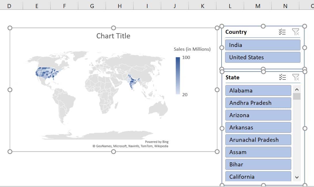
- Cut (press Ctrl+X) the selected hart and Slicers and paste on new worksheet
- Chart the size of the chart, make it bigger.
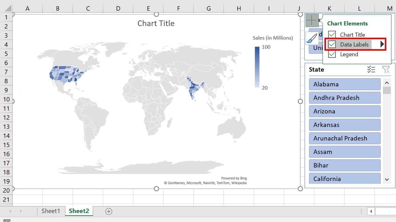
- Click on Chart Elements button (+button) and check Data labels
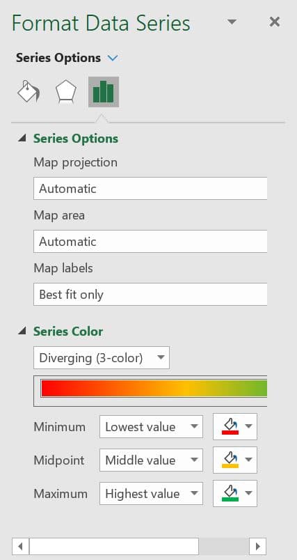
- Right-click on the chart and click on Format Data Series.
- In the data series window, select Map levels as “Best fit only”.
- In the series color, select Diverging (3-color) and fill Red, Amber, and Green in Minimum, Midpoint and Maximum respectively
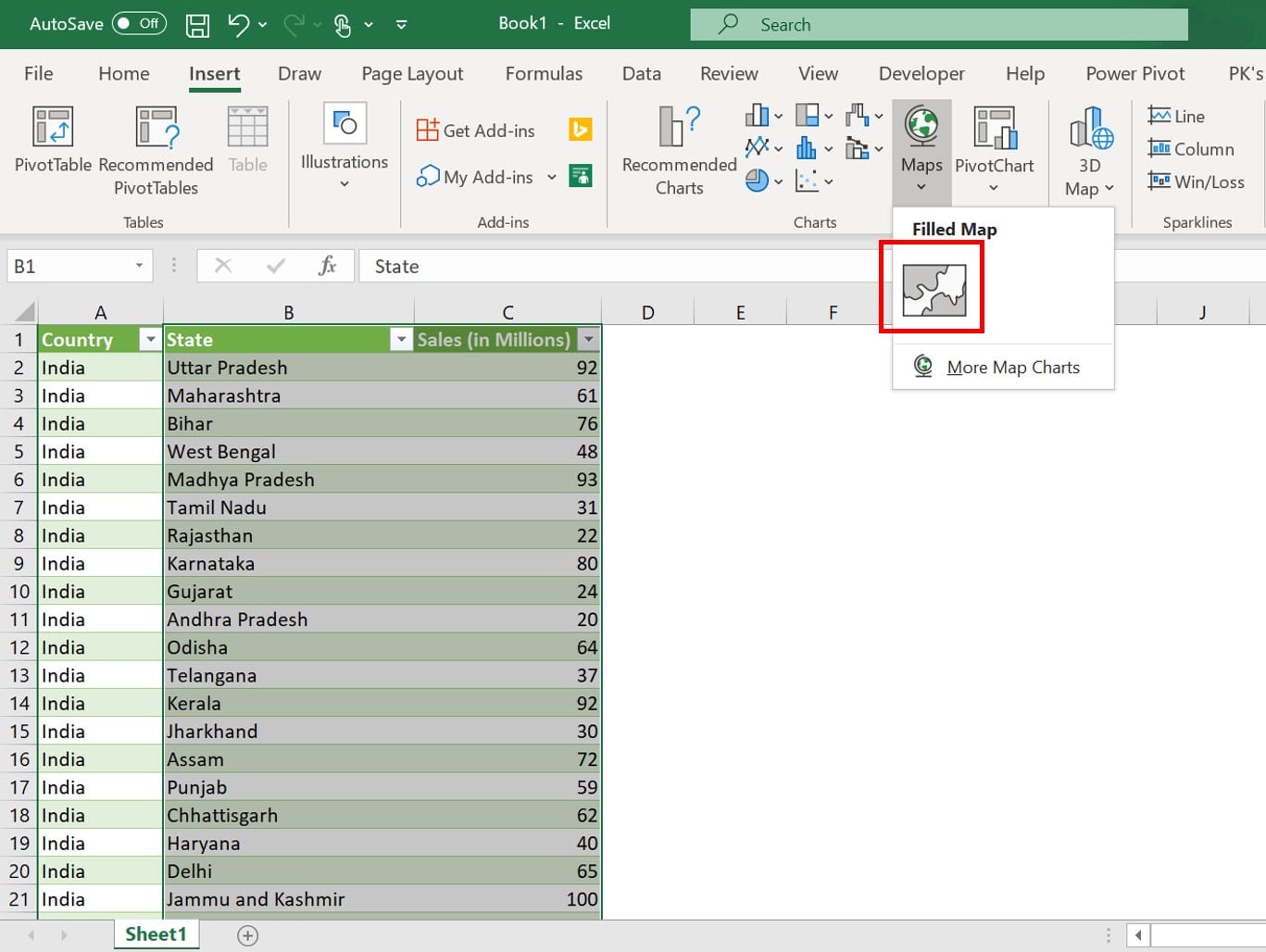
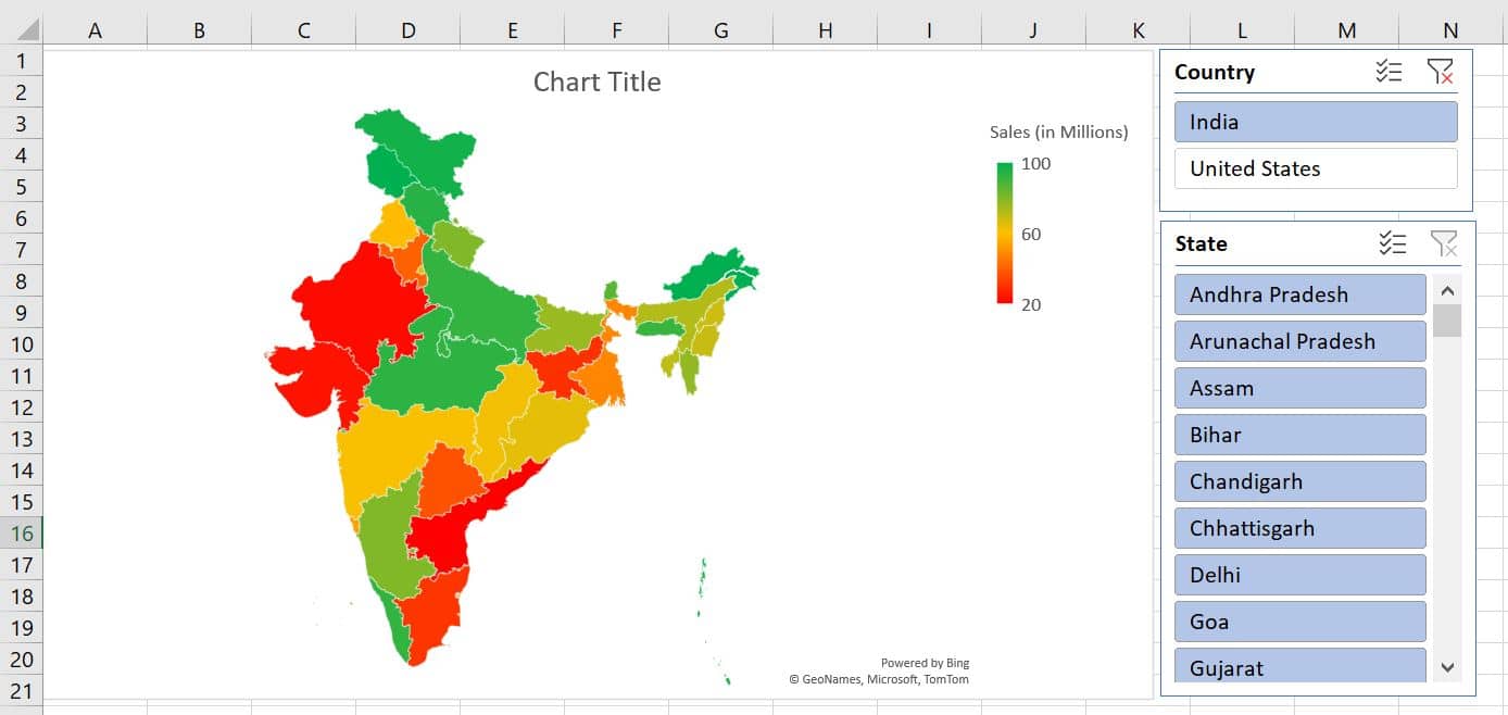
- Our Map is ready, If in the country slicer you will select India then our map will look like this-
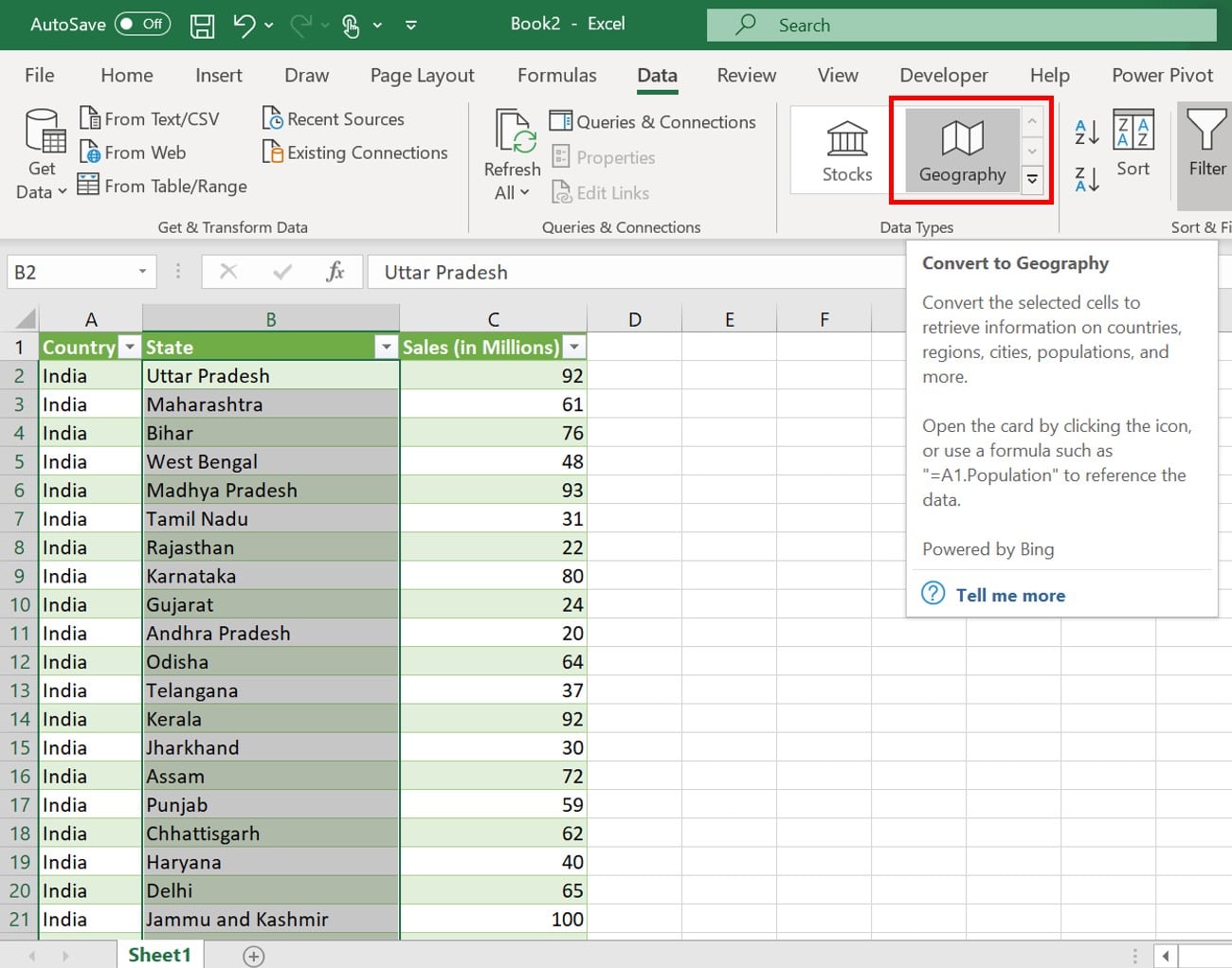
- If in the country slicer you will select the United States then our map will look like this-
- If we will select any state then change will be changed to the state level-