Managing community services without clear data visibility always creates confusion, delays, and missed opportunities. Moreover, community programs usually involve multiple service types, diverse beneficiary groups, staff roles, funding sources, and monthly performance targets. However, when this information stays scattered across raw spreadsheets, decision-making becomes slow and reactive.
That is exactly why a Community Services Dashboard in Excel becomes a powerful and practical solution.
In this detailed guide, you will learn what a Community Services Dashboard in Excel is, how it works, why community organizations need it, its page-wise structure, key features, advantages, best practices, and frequently asked questions. Additionally, this article uses clear language, real-world logic, and actionable explanations so you can apply it immediately.
Click to Purchases Community Services Dashboard in Excel
What Is a Community Services Dashboard in Excel?
A Community Services Dashboard in Excel is a centralized reporting and performance-tracking tool designed to monitor community service activities using structured data and interactive visuals.
Instead of reviewing multiple Excel sheets or static reports, organizations use this dashboard to track:
-
Beneficiaries served
-
Service completion status
-
Budget allocation and actual costs
-
Staff involvement
-
Monthly trends
Because this dashboard runs entirely in Microsoft Excel, it remains:
-
Easy to use
-
Cost-effective
-
Highly flexible
-
Suitable for organizations of all sizes
As a result, nonprofit organizations, local governments, NGOs, and community service providers gain instant clarity and control over their operations.
Why Do Community Organizations Need a Community Services Dashboard?
Community service programs operate under tight budgets and high accountability. Therefore, organizations must track performance accurately and communicate impact clearly.
Here’s why a Community Services Dashboard in Excel becomes essential:
-
It replaces manual reporting with visual insights
-
It improves transparency for stakeholders and donors
-
It highlights service gaps and underperforming areas
-
It supports data-driven planning and budgeting
-
It saves time spent on repetitive analysis
Most importantly, it helps organizations serve communities better by turning raw data into meaningful insights.
How Does a Community Services Dashboard in Excel Work?
The dashboard works by connecting structured data from a Data Sheet and transforming it into interactive visuals across multiple analysis pages.
Here’s how the workflow looks:
-
Data Entry
All service records, beneficiaries, budgets, costs, staff roles, and dates get stored in a structured data sheet. -
Data Processing
Excel formulas, pivot tables, and calculated fields summarize the raw data. -
Visualization
Charts, cards, and slicers display insights dynamically. -
Filtering & Navigation
Right-side slicers and a left-side page navigator allow users to explore data instantly.
As a result, users can analyze performance from multiple perspectives without editing formulas or rebuilding reports.
Click to Purchases Community Services Dashboard in Excel
Key Features of the Community Services Dashboard in Excel
This ready-to-use dashboard includes thoughtfully designed features that make analysis simple and effective.
1. Page Navigator
-
Located on the left side
-
Allows quick navigation between all analytical pages
-
Improves user experience and dashboard usability
Because of this feature, users never get lost while exploring insights.
2. Interactive Right-Side Slicers
Each analysis page includes right-side slicers that allow filtering by:
-
Service Type
-
Beneficiary Group
-
Staff Role
-
Location
-
Month
Therefore, users can analyze performance dynamically without changing data.
3. Multi-Page Analytical Structure
The dashboard includes 5 powerful analysis pages, each focused on a specific operational dimension.
Let’s explore them in detail.
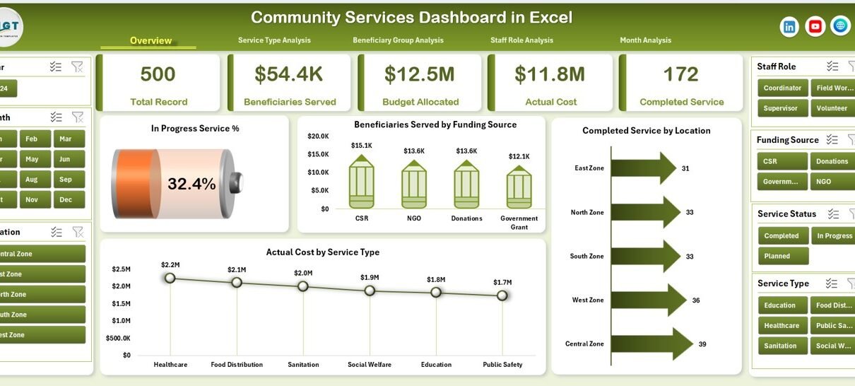
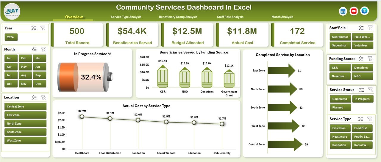
Overview Page – What Does the Overview Page Show?
The Overview Page serves as the main snapshot of community service performance.
Key Elements of the Overview Page
KPI Cards
-
High-level performance indicators
-
Instant summary of overall activity
Charts Included
-
In-Progress Service %
-
Beneficiaries Served by Funding Source
-
Completed Service by Location
-
Actual Cost by Service Type
Because everything appears on one screen, decision-makers get immediate clarity.
Why Is the Overview Page Important?
-
It shows overall performance at a glance
-
It supports executive-level reporting
-
It helps identify red flags quickly
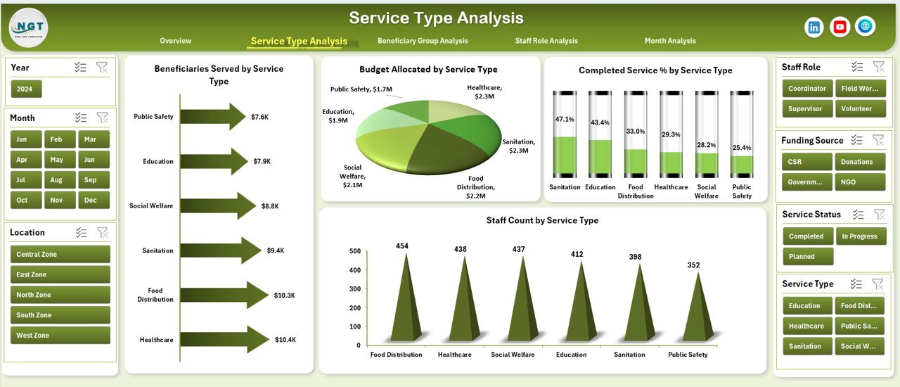
Service Type Analysis – How Do Different Services Perform?
The Service Type Analysis page focuses on performance by service category.
Charts Included
-
Beneficiaries Served by Service Type
-
Budget Allocated by Service Type
-
Completed Service % by Service Type
-
Staff Count by Service Type
Why This Page Matters
-
It highlights high-impact service programs
-
It identifies underfunded or overstaffed services
-
It supports resource reallocation decisions
As a result, organizations can prioritize services that deliver maximum community impact.
Beneficiary Group Analysis – Who Are You Serving the Most?
The Beneficiary Group Analysis page helps organizations understand whom they are serving.
Charts Included
-
Beneficiaries Served by Beneficiary Group
-
Budget Allocated by Beneficiary Group
-
In-Progress Services by Beneficiary Group
-
Actual Cost by Beneficiary Group
Why This Page Is Critical
-
It ensures equitable service distribution
-
It reveals underserved community groups
-
It supports inclusive planning strategies
Therefore, organizations can align services with real community needs.
Click to Purchases Community Services Dashboard in Excel
Staff Role Analysis – How Are Human Resources Utilized?
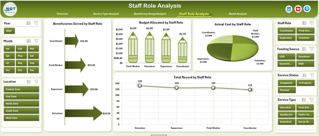
Staff capacity plays a vital role in community service delivery. Hence, the Staff Role Analysis page focuses on workforce insights.
Charts Included
-
Beneficiaries Served by Staff Role
-
Budget Allocated by Staff Role
-
Total Records by Staff Role
-
Actual Cost by Staff Role
Benefits of This Analysis
-
It improves staff workload balance
-
It identifies high-performing roles
-
It supports staffing optimization
As a result, organizations improve efficiency without increasing costs.
Month Analysis – How Does Performance Change Over Time?
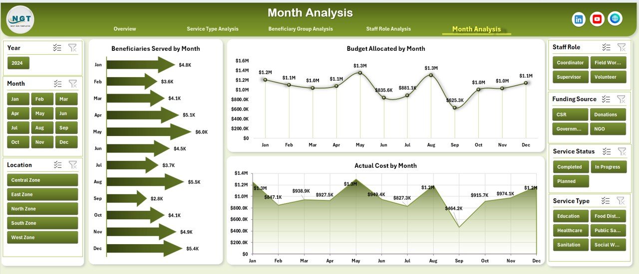
The Month Analysis page tracks trends and seasonality.
Charts Included
-
Beneficiaries Served by Month
-
Budget Allocated by Month
-
Actual Cost by Month
Why Monthly Analysis Matters
-
It reveals seasonal demand patterns
-
It supports monthly planning and forecasting
-
It improves budget control
Therefore, leaders can anticipate future needs proactively.
Support Sheet and Data Sheet – Why Are They Important?
Support Sheet
-
Stores helper calculations and mappings
-
Keeps the dashboard clean and organized
Data Sheet
-
Acts as the single source of truth
-
Stores all service records in tabular format
-
Feeds all pivot tables and charts
Because of this structure, users can update data without breaking the dashboard.
Advantages of a Community Services Dashboard in Excel
Using a Community Services Dashboard in Excel offers multiple benefits.
Key Advantages
-
✅ Centralized performance tracking
-
✅ Real-time insights with slicers
-
✅ Easy-to-use Excel interface
-
✅ No additional software cost
-
✅ Improved transparency and accountability
-
✅ Faster decision-making
-
✅ Better stakeholder reporting
Most importantly, it helps organizations maximize community impact.
Click to Purchases Community Services Dashboard in Excel
Opportunities for Improvement
Even a powerful dashboard benefits from continuous improvement.
Areas for Enhancement
-
🔹 Add geographic maps for location-based analysis
-
🔹 Include year-over-year comparisons
-
🔹 Integrate automated data imports
-
🔹 Add target vs actual benchmarks
-
🔹 Expand KPIs based on program maturity
By refining the dashboard over time, organizations increase its strategic value.
Best Practices for the Community Services Dashboard in Excel
To get maximum value, follow these best practices.
1. Maintain Clean Data
-
Use standardized service names
-
Avoid duplicate records
-
Validate numeric fields regularly
2. Update Data Consistently
-
Schedule monthly or weekly updates
-
Assign data ownership clearly
3. Use Slicers Wisely
-
Limit slicers to meaningful dimensions
-
Avoid cluttering the dashboard
4. Focus on Actionable Metrics
-
Track metrics that support decisions
-
Remove vanity metrics
5. Review Insights Regularly
-
Conduct monthly review meetings
-
Share insights with stakeholders
By following these practices, the dashboard becomes a true decision-support tool.
Who Can Use a Community Services Dashboard in Excel?
This dashboard suits a wide range of users, including:
-
Nonprofit organizations
-
Community development teams
-
NGOs and social enterprises
-
Local government departments
-
Program managers and coordinators
-
Donor reporting teams
Because Excel remains widely accessible, adoption stays easy.
Conclusion – Is a Community Services Dashboard in Excel Worth It?
Absolutely.
A Community Services Dashboard in Excel transforms complex community service data into clear, actionable insights. It improves visibility, accountability, and efficiency across service delivery, budgeting, and staffing.
Moreover, because it runs in Excel, it remains affordable, flexible, and scalable. As a result, organizations focus less on reporting and more on serving communities effectively.
If your organization aims to track impact, optimize resources, and make data-driven decisions, this dashboard becomes an essential tool.
Frequently Asked Questions (FAQs)
1. What is the main purpose of a Community Services Dashboard in Excel?
The main purpose is to track, analyze, and visualize community service performance in one centralized and interactive Excel dashboard.
2. Can small nonprofits use this dashboard effectively?
Yes, small nonprofits benefit greatly because the dashboard requires no expensive software and works entirely in Excel.
3. Does the dashboard support filtering by month and service type?
Yes, right-side slicers allow filtering by month, service type, beneficiary group, staff role, and more.
4. Can I customize the charts and KPIs?
Absolutely. Because it is built in Excel, you can modify charts, add KPIs, or change layouts easily.
5. How often should data be updated?
Most organizations update data monthly, although weekly updates work well for high-volume programs.
6. Does this dashboard help with donor reporting?
Yes, it provides clear visuals and summaries that support transparent and professional donor reports.
7. Is technical expertise required to use the dashboard?
No advanced skills are required. Basic Excel knowledge is enough to use and maintain the dashboard.
Visit our YouTube channel to learn step-by-step video tutorials