In today’s consulting world, data drives every decision. Whether you manage clients, projects, or performance metrics, the ability to visualize information clearly determines how effectively your firm operates. That’s where the Consulting Dashboard in Power BI becomes invaluable.
This article explores how this Power BI-based dashboard helps consulting firms track operations, monitor revenue, and measure client satisfaction — all in one centralized, interactive system. You’ll learn how the dashboard works, its structure, benefits, and the best practices for making the most of it.
Click to Purchases Consulting Dashboard in Power BI
What Is a Consulting Dashboard in Power BI?
A Consulting Dashboard in Power BI is a dynamic analytics solution designed for consulting firms to manage performance across multiple dimensions — including client satisfaction, project completion rates, revenue generation, and consultant efficiency.
Instead of juggling dozens of Excel sheets or static reports, this dashboard brings everything together in one Power BI file. It automatically connects to an Excel-based dataset, processes key metrics, and converts them into actionable visuals that help leaders and consultants make informed business decisions.
With its user-friendly visuals, drill-down capabilities, and real-time updates, the dashboard provides a 360° view of consulting operations, ensuring every decision aligns with business goals.
Why Use Power BI for Consulting Analytics?
Power BI is a powerful data visualization platform from Microsoft that enables users to create interactive dashboards and reports without complex programming.
When applied to consulting, Power BI:
-
Consolidates client, project, and financial data into one system.
-
Converts raw numbers into interactive charts and KPIs.
-
Offers drill-down views to analyze consultants, departments, or regions.
-
Allows for trend tracking and forecasting through monthly insights.
-
Makes sharing performance insights with stakeholders easy and secure.
With Power BI, consulting firms no longer have to wait for manual updates or static reports. Instead, they can monitor live data, spot trends instantly, and adapt strategies proactively.
Structure of the Consulting Dashboard in Power BI
The Consulting Dashboard in Power BI consists of five main pages, each designed to provide a different analytical perspective. Every page includes intuitive slicers for filtering data by time, consultant, department, or region.
Let’s explore each page in detail.
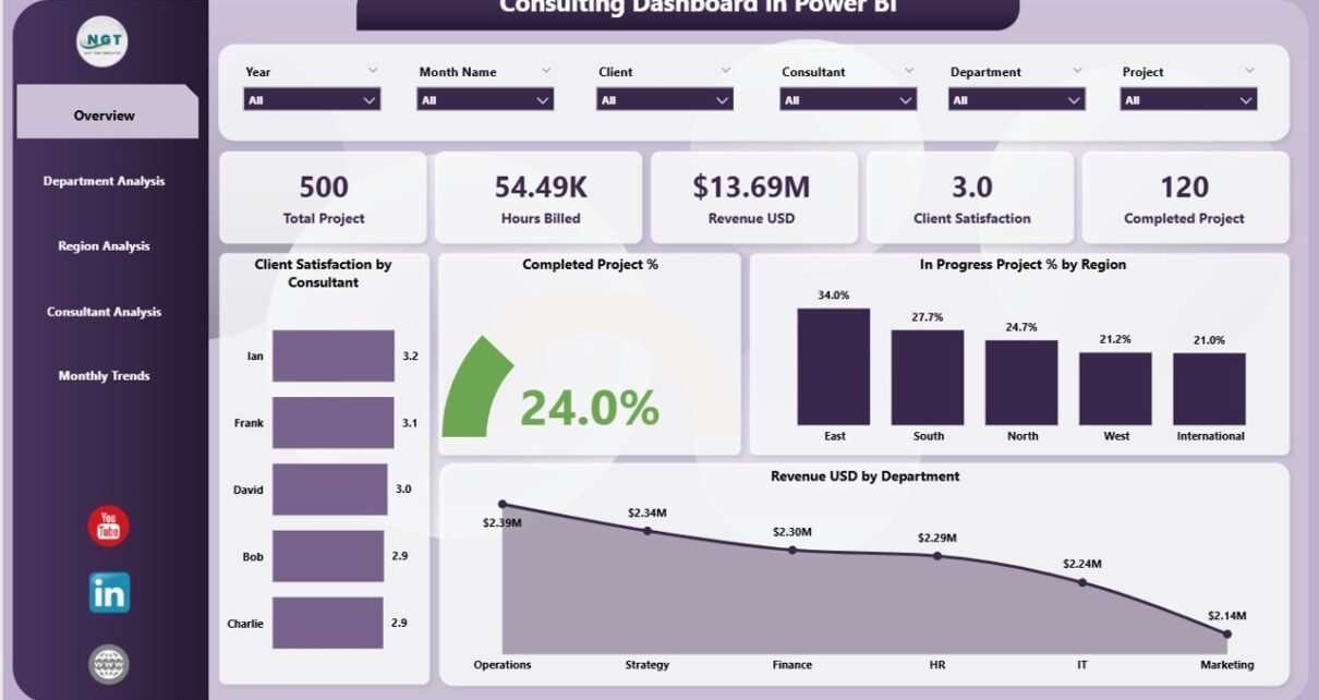
1️⃣ Overview Page – The Control Center
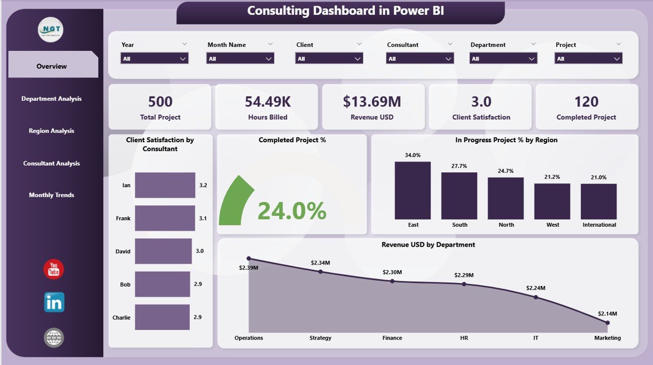
The Overview Page serves as the main interface — your central hub for monitoring consulting performance at a glance.
It features:
-
Five Key Metric Cards: These display KPIs such as total revenue, project completion rate, average client satisfaction, and more.
-
Client Satisfaction by Consultant: A visual chart showcasing which consultants are maintaining high client satisfaction levels.
-
Completed Projects (%) by Region: Displays the proportion of projects completed successfully across different regions.
-
In Progress Projects (%) by Region: Highlights ongoing projects to help managers balance workloads.
-
Revenue (USD) by Department: Provides a snapshot of departmental performance in financial terms.
Together, these visuals create a quick yet comprehensive understanding of overall firm performance.
2️⃣ Department Analysis Page – Comparing Departmental Efficiency
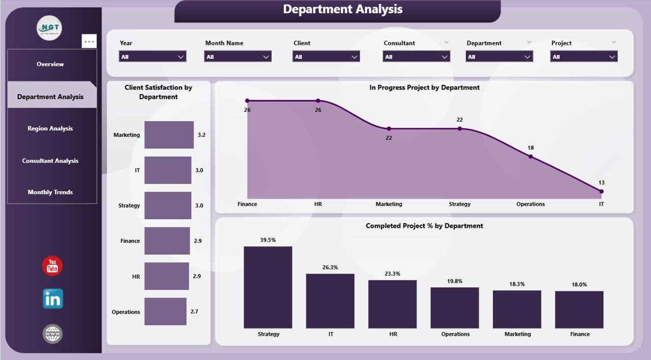
The Department Analysis Page helps identify which departments perform best and where improvements are needed.
Click to Purchases Consulting Dashboard in Power BI
Key visuals on this page include:
-
Client Satisfaction by Department: Helps identify departments delivering the highest quality service.
-
Completed Projects (%) by Department: Reveals which teams consistently meet or exceed deadlines.
-
In Progress Projects by Department: Displays departments with ongoing workloads, aiding resource allocation.
Managers can use this page to assess productivity, balance workloads, and optimize project planning based on department strengths and weaknesses.
3️⃣ Region Analysis Page – Tracking Regional Performance
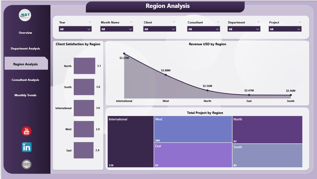
The Region Analysis Page provides a geographical breakdown of consulting performance.
It includes:
-
Client Satisfaction by Region: Identifies areas with the highest customer satisfaction rates.
-
Revenue (USD) by Region: Highlights which regions contribute the most revenue.
-
Total Projects by Region: Offers insights into how many consulting projects each region handles.
With this data, leadership teams can easily identify high-performing territories, analyze underperforming markets, and plan expansion strategies effectively.
4️⃣ Consultant Analysis Page – Measuring Individual Performance
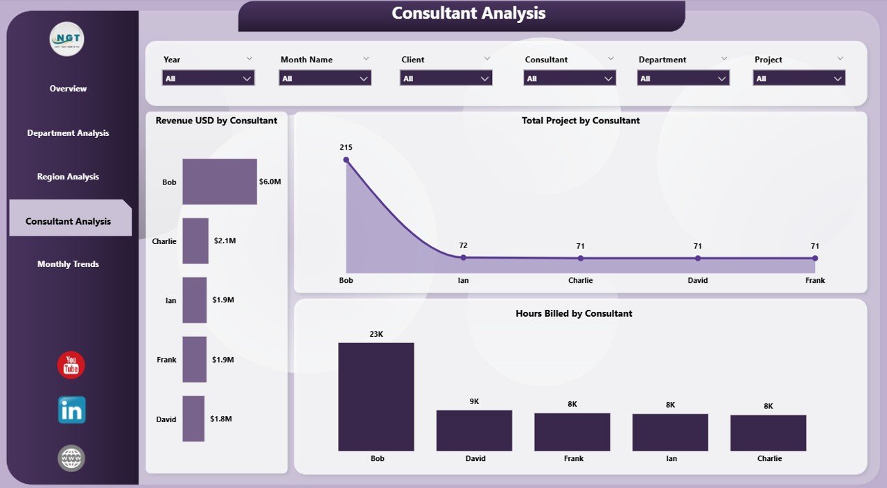
The Consultant Analysis Page focuses on individual consultant metrics, making it easier to recognize top performers and areas requiring support or training.
It includes:
-
Revenue (USD) by Consultant: Displays revenue generated by each consultant.
-
Total Projects by Consultant: Shows how many projects each consultant has managed.
-
Hours Billed by Consultant: Measures productivity based on billable hours.
This analysis supports performance reviews, incentive programs, and resource optimization. By linking financial outcomes with consultant contributions, the firm gains a clearer picture of employee impact.
5️⃣ Monthly Trends Page – Monitoring Long-Term Progress
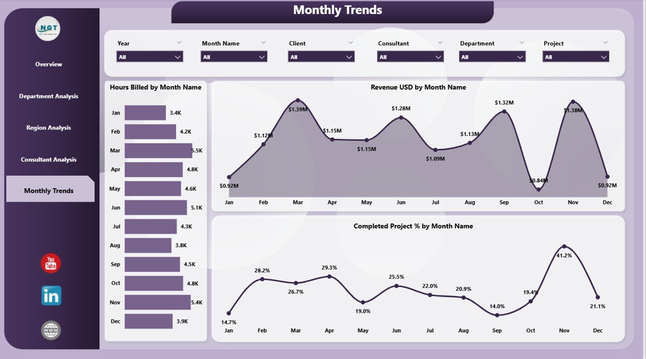
The Monthly Trends Page tracks performance over time.
It visualizes:
-
Hours Billed by Month: Tracks workload trends throughout the year.
-
Revenue (USD) by Month: Displays monthly revenue progression to identify growth or decline patterns.
-
Completed Project (%) by Month: Monitors consistency in delivery and completion rates.
This page empowers decision-makers to forecast upcoming trends, detect seasonal fluctuations, and plan strategies for upcoming quarters.
Click to Purchases Consulting Dashboard in Power BI
Key Metrics in the Consulting Dashboard
To ensure meaningful analysis, the Consulting Dashboard tracks essential Key Performance Indicators (KPIs) such as:
-
Total Revenue (USD): Measures income generated from consulting projects.
-
Project Completion Rate (%): Tracks the ratio of completed projects versus planned ones.
-
Client Satisfaction (%): Measures client happiness through survey feedback.
-
Billable Hours: Indicates consultant efficiency.
-
In Progress Projects: Helps monitor workload distribution.
-
Departmental Revenue: Identifies profit-driving departments.
-
Regional Contribution: Highlights where business thrives geographically.
These KPIs collectively provide a balanced view of business health and operational efficiency.
Advantages of Consulting Dashboard in Power BI
Using a Consulting Dashboard in Power BI offers several advantages that directly impact productivity, profitability, and decision-making.
1. Real-Time Data Visualization
Power BI connects directly to Excel or other databases, ensuring dashboards always display the latest information. Users can refresh data with a single click and make instant data-driven decisions.
2. Centralized Performance Management
All consulting metrics — client satisfaction, revenue, and project status — are consolidated in one dashboard. This eliminates data silos and promotes cross-departmental alignment.
3. Improved Client Relationship Tracking
By visualizing satisfaction levels and project performance, consultants can pinpoint client pain points and take proactive steps to enhance service quality.
4. Enhanced Productivity and Accountability
Consultant-level insights encourage healthy competition and accountability. Teams can easily identify high achievers and those who need additional support.
5. Easy-to-Understand Insights
The dashboard uses visual storytelling — charts, bars, and line graphs — making complex data simple and actionable. Even non-technical managers can interpret results quickly.
6. Customization Flexibility
Power BI allows full customization — users can add filters, modify visuals, or integrate new KPIs without advanced coding.
How to Use the Consulting Dashboard in Power BI
Here’s how consulting firms can make the most of this dashboard:
-
Connect the Data Source:
Link your Excel or database file containing project, consultant, and revenue data. -
Refresh Data Regularly:
Schedule automatic refreshes to keep data updated in real-time. -
Use Slicers for Analysis:
Utilize slicers on each page to view metrics by consultant, department, or month. -
Track KPIs Monthly:
Monitor MTD (Month-to-Date) and YTD (Year-to-Date) trends for performance evaluation. -
Drill Down into Data:
Click visuals to explore deeper insights, such as identifying which consultants drive the most revenue or which regions show declining satisfaction. -
Share with Stakeholders:
Use Power BI Service to share live dashboards with management and clients securely.
Best Practices for the Consulting Dashboard in Power BI
To get the maximum benefit, follow these best practices:
-
Ensure Data Accuracy: Always validate your Excel source data before loading it into Power BI.
-
Standardize KPI Definitions: Use consistent KPI formulas across departments for reliable comparisons.
-
Leverage Filters Wisely: Apply filters and slicers to focus on relevant timeframes or consultants.
-
Use Conditional Formatting: Apply color-coded visuals (green for good, red for poor) to make performance status instantly visible.
-
Automate Data Refresh: Set scheduled refreshes to avoid manual updates.
-
Maintain a Clean Layout: Avoid overcrowding visuals; ensure the dashboard remains visually balanced.
-
Create a Story Flow: Arrange pages logically — from overview to deeper analysis — to make navigation intuitive.
Opportunities for Improvement
Even the best dashboards can evolve. Here are areas consulting teams can explore for future improvements:
-
Integration with CRM Systems: Linking CRM tools can enhance client data analysis.
-
Predictive Analytics: Using Power BI’s AI features to forecast client churn or project delays.
-
Mobile Optimization: Ensuring dashboard accessibility on tablets and smartphones for consultants on the go.
-
Automated Alerts: Setting up Power BI notifications for KPIs that fall below thresholds.
-
Benchmarking Tools: Comparing performance across similar consulting practices or market segments.
These enhancements can help the dashboard mature from descriptive analytics to predictive and prescriptive insights.
Conclusion
The Consulting Dashboard in Power BI empowers consulting firms to transition from static reporting to dynamic, real-time analytics. It unifies client satisfaction data, project performance, and revenue insights into a single visual platform.
By adopting this dashboard, consulting leaders can:
-
Make faster, more informed decisions.
-
Identify trends before they escalate into problems.
-
Reward top-performing consultants and optimize underperforming areas.
Ultimately, this dashboard turns data into strategic intelligence — ensuring consulting firms remain agile, competitive, and client-focused.
Frequently Asked Questions (FAQs)
1. What is the main purpose of a Consulting Dashboard in Power BI?
It helps consulting firms monitor project performance, client satisfaction, and revenue metrics in real-time, all within a single visual interface.
2. How does Power BI improve consulting analytics?
Power BI enables interactive data visualization, automated data refresh, and customizable reports, reducing manual reporting time and improving decision-making accuracy.
3. Can I connect multiple Excel files to the dashboard?
Yes, you can connect multiple files or databases in Power BI and merge them into one unified dataset using Power Query.
4. Do I need technical knowledge to use this dashboard?
Not at all. Power BI’s drag-and-drop interface and ready-made visuals make it accessible even to non-technical users.
5. How often should the dashboard be updated?
You can set automatic refresh schedules in Power BI or update manually, depending on your organization’s workflow.
6. Can I customize KPIs in this dashboard?
Yes. Power BI allows you to modify existing KPIs or add new ones based on your firm’s goals and available data.
7. Is this dashboard suitable for small consulting firms?
Absolutely. Whether you’re a boutique consultancy or a large firm, the dashboard scales easily and can be tailored to your needs.
8. How can I share the dashboard with clients?
You can publish the dashboard to Power BI Service and share it securely via dashboards or reports with role-based access.
Visit our YouTube channel to learn step-by-step video tutorials