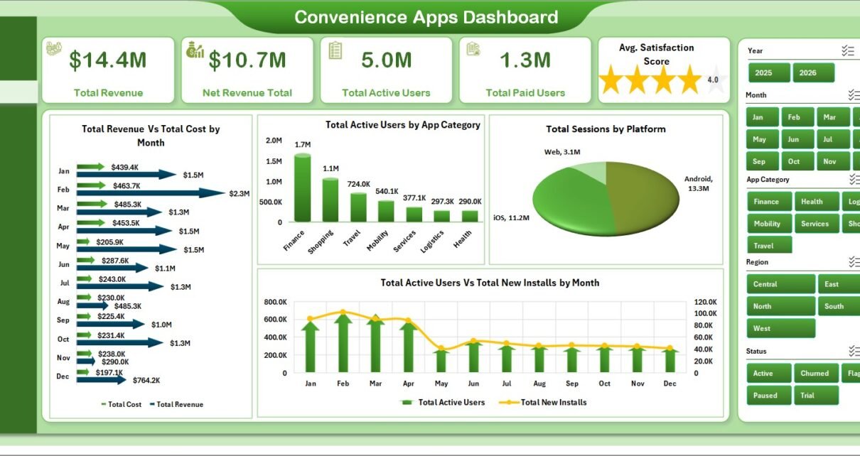
The Convenience Apps Dashboard in Excel is a ready-to-use workbook for app operators who need to track revenue, users, sessions, installs, crashes, support tickets, conversion, and customer satisfaction without building a reporting model from scratch. The file includes 5 KPI cards, 5 dashboard pages, 18 chart views, a Data Sheet, and a pivot-driven Support Sheet. For teams that already export data from app stores, subscription systems, analytics tools, or support platforms, this Excel dashboard can turn raw records into a management-ready report in minutes.
Microsoft Excel remains one of the most widely used business reporting tools because it supports tables, slicers, PivotTables, charts, and refreshable analysis in one familiar environment. Microsoft explains how PivotTables help summarize and analyze data quickly in its PivotTable documentation. This template uses the same native Excel workflow: update the Data Sheet, click Data > Refresh All, and review the refreshed dashboard pages.
Key Features of Convenience Apps Dashboard in Excel
- 5 top-level KPI cards for Total Revenue, Net Revenue Total, Total Active Users, Total Paid Users, and Avg. Satisfaction Score.
- 5 dashboard pages covering Overview, Usage Trends, Revenue Mix, App Insights, and Support Quality.
- 18 chart views across revenue, cost, active users, installs, sessions, platforms, plans, regions, crashes, tickets, conversion, and satisfaction.
- Interactive slicers so users can filter reports quickly during review meetings.
- Data Sheet input structure for replacing sample app data in the same format.
- Support Sheet with pivot tables that drives the dashboard dynamically and can be kept hidden.
- No macros required because it uses native Excel tables, PivotTables, slicers, and charts.
Dashboard Pages Explanation
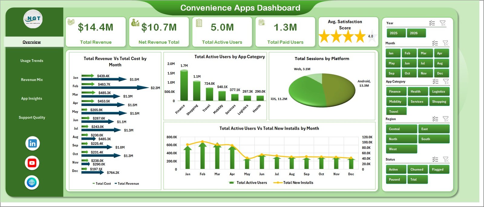
1. Overview Page
The Overview Page is the executive summary. It gives product managers and founders a quick view of revenue, net revenue, active users, paid users, and satisfaction score before they drill into deeper pages.
Total Revenue Vs Total Cost by Month: This chart compares revenue and cost month by month. It helps teams understand whether growth is profitable or whether operating costs are rising faster than revenue.
Total Active Users by App Category: This chart compares active users across app categories. It shows which categories are getting traction and where product teams may want to invest more attention.
Total Sessions by Platform: This chart breaks session volume across platforms such as iOS, Android, web, or desktop. It helps teams identify where users are most active.
Total Active Users Vs Total New Installs by Month: This trend view compares retained usage with new acquisition. It helps answer whether installs are turning into active users.
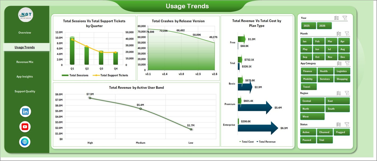
2. Usage Trends
The Usage Trends page helps teams understand engagement, support pressure, release quality, plan profitability, and revenue by user scale. Total Sessions Vs Total Support Tickets by Quarter shows whether higher usage is creating more support demand. Total Crashes by Release Version helps teams identify releases that may need investigation. Total Revenue Vs Total Cost by Plan Type compares profitability by plan, and Total Revenue by Active User Band shows which user bands contribute the most revenue.
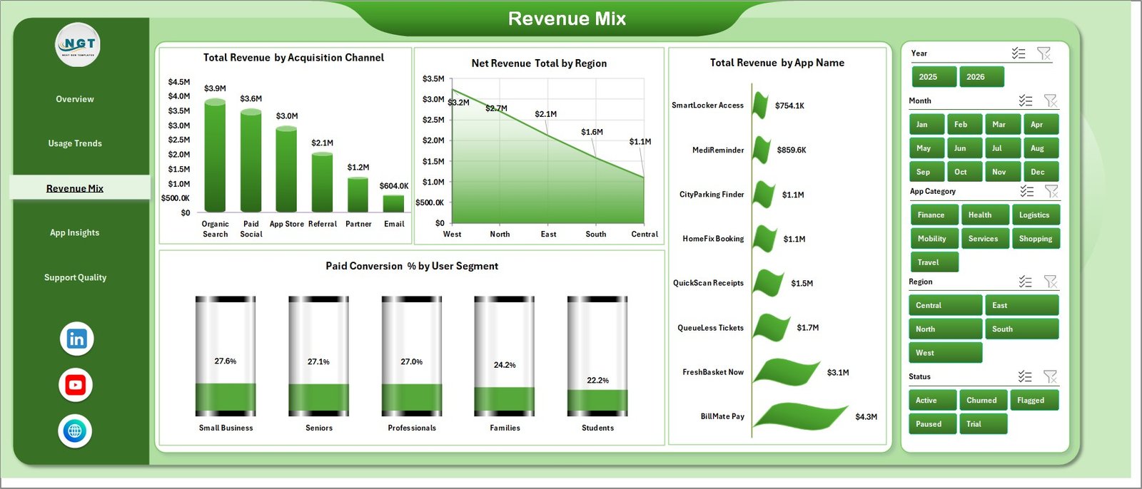
3. Revenue Mix
The Revenue Mix page explains how revenue is distributed. Total Revenue by Acquisition Channel compares revenue from channels such as organic, paid, referral, partner, or app store traffic. Net Revenue Total by Region shows regional contribution after cost or deductions. Total Revenue by App Name ranks app-level revenue contribution. Paid Conversion % by User Segment shows which audience segments convert best.
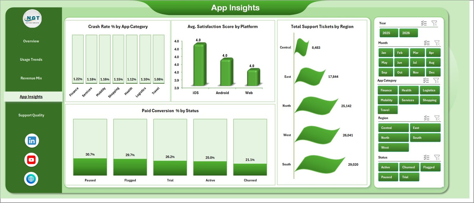
4. App Insights
The App Insights page connects app quality, customer satisfaction, and commercial performance. Crash Rate % by App Category shows which categories may have stability risk. Avg. Satisfaction Score by Platform compares customer experience by platform. Total Support Tickets by Region identifies where support demand is concentrated. Paid Conversion % by Status shows which lifecycle statuses convert best.
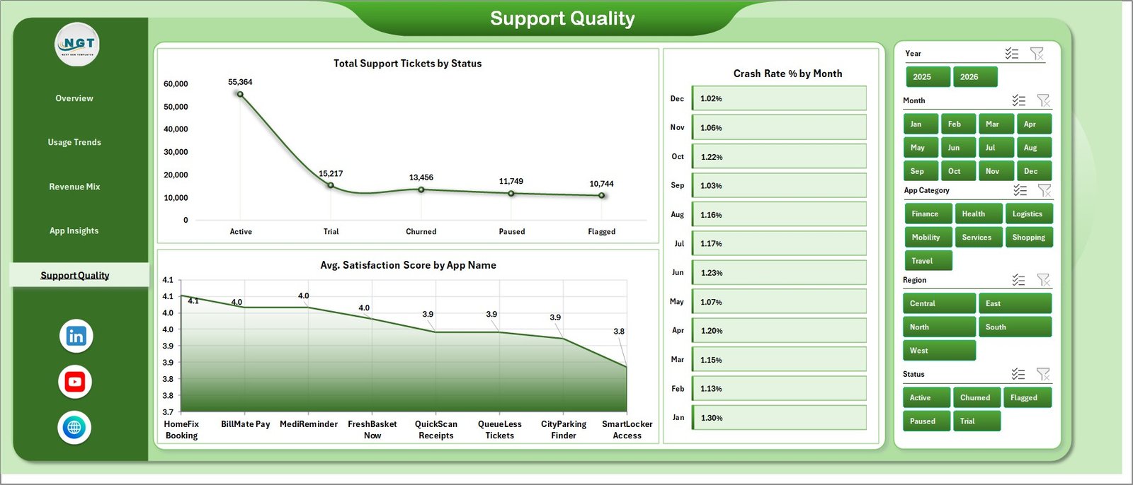
5. Support Quality
The Support Quality page is useful for support managers and QA teams. Total Support Tickets by Status explains workload across open, pending, closed, or resolved statuses. Crash Rate % by Month helps teams monitor stability trends over time. Avg. Satisfaction Score by App Name reveals which apps are delighting users and which need attention.
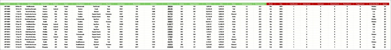
6. Data Sheet Tab
The Data Sheet is the input area for your app performance records. Add the data in the same format, keep the column structure intact, and use it as the source for every pivot and chart in the workbook.
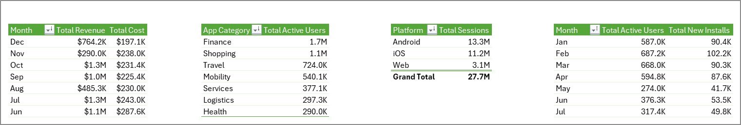
7. Support Sheet
The Support Sheet contains multiple pivot tables that create the dashboard dynamically. After updating the Data Sheet, go to the Data tab in the Excel Ribbon and click Refresh All. All pivots and charts will refresh. You can keep this sheet hidden during normal use.
Convenience Apps Dashboard in Excel vs. Google Sheets vs. Paid CRM/SaaS – Feature Comparison
| Feature | Convenience Apps Dashboard in Excel | Google Sheets Alternative | Paid App Analytics SaaS |
|---|---|---|---|
| Cost | $17.99 one-time | Low software cost, but build time required | $50-$500+ per month |
| Platform | Microsoft Excel | Google Sheets | Vendor cloud app |
| Setup time | Under 10 minutes after download | 30-90 minutes if created manually | Hours or days of configuration |
| Real-time team collaboration | Available through OneDrive or SharePoint | Native collaboration | Usually available with paid seats |
| Mobile access | Excel mobile with limits | Google Sheets mobile | Usually available |
| Customizable fields | Fully editable workbook | Editable, but formulas can break | Limited by vendor settings |
| Share with link | Possible through Microsoft cloud storage | Native link sharing | Often requires login |
| Year-1 cost at 5 users | $17.99 total | Low tool cost plus build time | $3,000-$30,000+ |
| App quality tracking | Crash rate, support tickets, satisfaction | Manual setup needed | Usually available in higher plans |
Who Should Use This Template
This template is best for app founders, product managers, mobile app analysts, SaaS teams, subscription app operators, support leaders, and Excel consultants who need a practical dashboard for recurring app performance reviews. It is especially useful for small and mid-sized teams that export app and support data monthly and want a clean Excel report instead of another subscription tool.
It is not designed to replace a real-time event analytics platform, crash monitoring SDK, customer support platform, billing system, or app store console. If your workflow requires live API sync, user-level event streams, attribution modeling, or push notification automation, use this Excel dashboard as a reporting companion after data export.
Real-World Use Cases
Priya, product manager: She refreshes the workbook every Monday and uses the Overview Page to report active users, paid users, installs, and satisfaction in the product stand-up.
Daniel, app marketing analyst: He uses Revenue Mix to compare acquisition channels, regions, app names, and paid conversion by segment before reallocating campaign budget.
Meera, support operations lead: She reviews Support Quality and App Insights to connect crash rates, ticket volume, and satisfaction scores before planning quality fixes.
Advantages of Convenience Apps Dashboard in Excel
Fast reporting: The workbook gives teams a ready-made structure instead of starting from a blank spreadsheet.
Lower cost: A one-time purchase is easier to approve than another monthly analytics subscription.
Operational coverage: It combines revenue, usage, quality, support, conversion, and satisfaction in one place.
Editable design: Users can modify charts, labels, colors, slicers, fields, and formulas to match their own reporting process.
Opportunities for Improvement
The dashboard does not include live data connectors, automated API refresh, role-based permissions, user-level behavioral funnels, or in-app event instrumentation. Teams with advanced analytics maturity can connect exported data through Power Query or use this workbook as a lightweight reporting layer for leadership reviews.
Best Practices
- Keep field names and column order consistent when replacing sample data.
- Refresh all pivots after every data update.
- Validate revenue, cost, paid user, crash rate, and satisfaction definitions before presenting results.
- Keep the Support Sheet hidden after setup, but do not delete it.
- Save a backup before changing pivot source fields or dashboard layouts.
Explore Relevant Templates
Convenience Apps Dashboard in Excel – purchase the dashboard template on NextGenTemplates.
Content Personalization Startups Dashboard in Excel – useful for marketing and personalization analytics.
SaaS Customer Success Dashboard in Excel – customer health, MRR, renewals, and support analytics.
Browse all Excel Dashboard templates.
Frequently Asked Questions
What does the Convenience Apps Dashboard in Excel track?
It tracks revenue, net revenue, active users, paid users, satisfaction score, sessions, installs, platforms, app categories, plan types, acquisition channels, regions, crashes, release versions, support tickets, user segments, and statuses.
Do I need macros to use this dashboard?
No. The workbook uses Excel tables, PivotTables, slicers, and charts. You do not need to enable macros.
How do I update the dashboard?
Replace the sample records in the Data Sheet, keep the same structure, then click Data > Refresh All in Excel.
Can I hide the Support Sheet?
Yes. The Support Sheet contains pivot tables, so you can keep it hidden, but you should not delete it.
Is this useful for mobile apps and web apps?
Yes. It works for mobile apps, web apps, local service apps, delivery apps, utility apps, and subscription apps that track usage, revenue, quality, and support data.
Does it connect directly to Firebase, Google Play, App Store Connect, Stripe, or Zendesk?
No direct connector is included. Export data from your systems, paste it into the Data Sheet, and refresh the workbook.
About the Author
Built by PK – Microsoft Certified Professional with 15+ years of Excel, Google Sheets, and Power BI experience. Founder of NextGenTemplates, reaching 300K+ subscribers across YouTube channels. Every template is hand-built and tested before release.
Conclusion
The Convenience Apps Dashboard in Excel is a practical way to bring app revenue, user growth, paid conversion, platform usage, crash rate, support tickets, and satisfaction analysis into one editable workbook. If your team wants a clean monthly dashboard without paying for a separate analytics subscription, this template gives you a strong starting point.
Click here to purchase the Convenience Apps Dashboard in Excel
Visit our YouTube channel for step-by-step Excel, Power BI, and dashboard tutorials: Youtube.com/@PKAnExcelExpert
Last updated: May 20, 2026