In today’s fast-paced business environment, delivering outstanding customer service is not optional—it’s a necessity. But how do you know if your service team is performing well? That’s where a Customer Service and Support Performance KPI Dashboard in Excel becomes your best friend.
This article walks you through everything you need to know about this Excel-based KPI dashboard, from its key features and advantages to best practices for using it effectively.
Click to Purchases Customer Service and Support Performance KPI Dashboard in Excel
What Is a Customer Service and Support KPI Dashboard in Excel?
A Customer Service and Support KPI Dashboard in Excel is a powerful tracking tool that helps businesses monitor the performance of their customer service teams. It uses predefined Key Performance Indicators (KPIs) to present data in a clear, visual, and actionable way. Built entirely in Excel, it requires no additional software or expensive systems.
This dashboard enables managers to assess metrics like response time, resolution time, customer satisfaction, and ticket volume, all from a single file.
Key Features of the Dashboard
This ready-to-use Excel template contains seven structured worksheet tabs:
Home Sheet
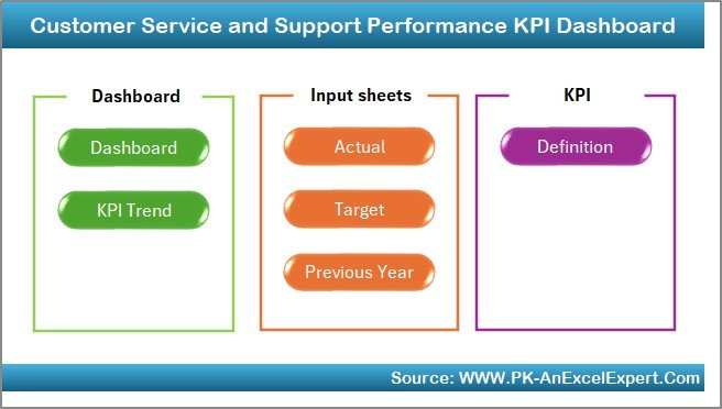
- Acts as a navigation center.
- Contains six buttons that quickly take you to other sheets.
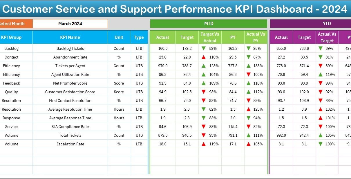
Dashboard Sheet
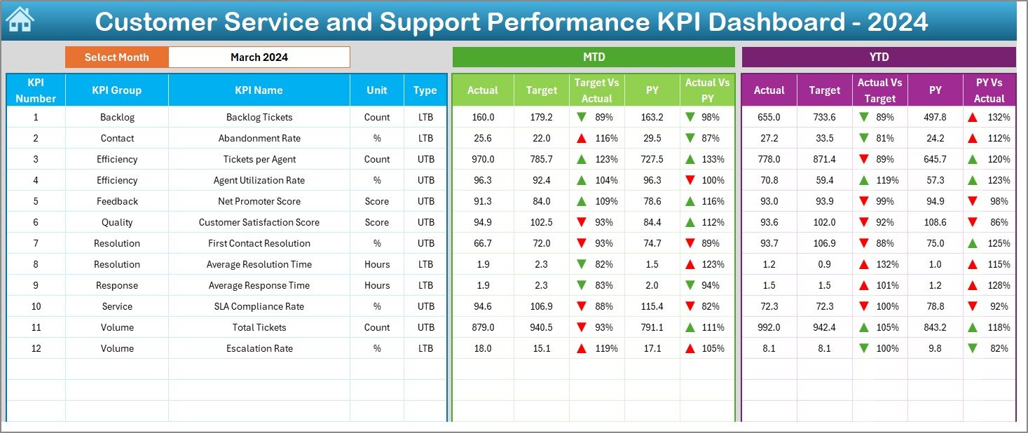
- The heart of the system.
- Choose a month from the dropdown in cell D3.
- Automatically updates all numbers on the sheet based on the selected month.
Displays:
- MTD (Month-to-Date) Actual, Target, and Previous Year data.
- YTD (Year-to-Date) Actual, Target, and Previous Year data.
- Conditional formatting with arrows showing increase ↑ or decrease ↓ vs. targets and previous year.
KPI Trend Sheet
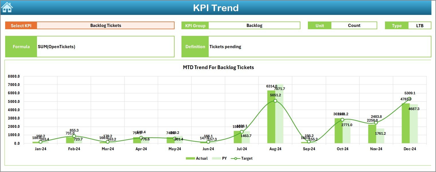
- Select a KPI from cell C3.
- View group, unit, type (LTB or UTB), formula, and definition.
Includes trend charts for:
- MTD
- YTD
- Comparison between Actual, Target, and Previous Year
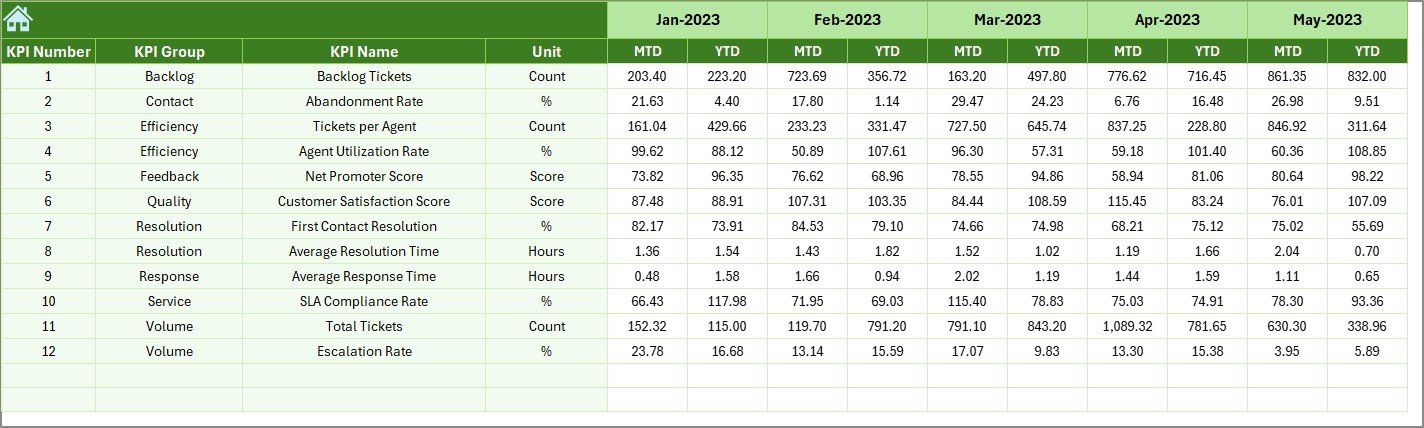
Actual Numbers Input Sheet
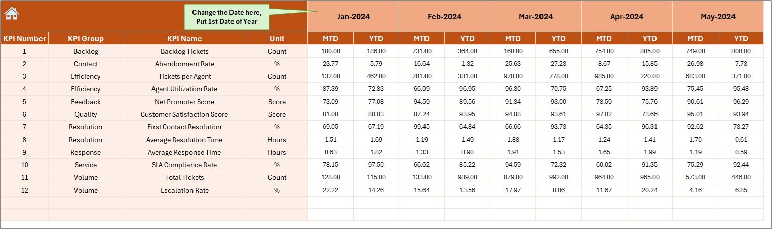
- Input MTD and YTD data per month.
- Set the first month in cell E1 to define the starting point of the fiscal year.
Click to Purchases Customer Service and Support Performance KPI Dashboard in Excel
Target Sheet
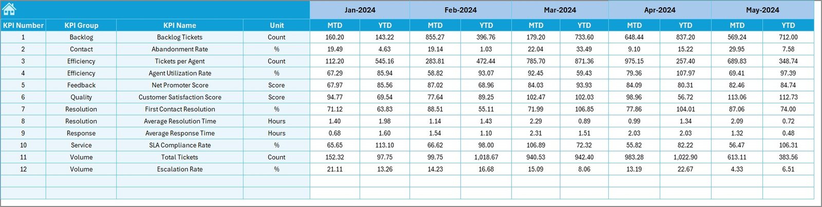
- Enter monthly target numbers for each KPI.
- Supports both MTD and YTD values.
Previous Year Numbers Sheet
Input historical data for benchmarking.
- Mirrors current year input format for easy comparison.
KPI Definition Sheet
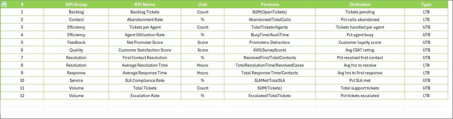
- Enter definitions for all KPIs.
- Includes columns for:
- KPI Group
- KPI Name
- Unit
- Formula
- Type (LTB or UTB)
Why Use a KPI Dashboard for Customer Service?
Having a visual dashboard helps in:
✅ Making Data-Driven Decisions: See real-time progress against goals.
✅ Identifying Bottlenecks: Spot inefficiencies before they become bigger issues.
✅ Improving Team Performance: Transparent metrics drive accountability.
✅ Benchmarking: Compare with previous months or years.
Advantages of Customer Service KPI Dashboards in Excel
1. Easy to Use
You don’t need complex software. Excel is familiar and user-friendly.
2. Fully Customizable
Change KPIs, units, targets, and months easily.
3. Cost-Effective
No need for monthly subscriptions or IT support.
4. Portable
Send it via email, store it on cloud platforms, or access it offline.
5. Visual Insights
Charts, slicers, and conditional formatting provide quick understanding.
Essential KPIs to Track in the Dashboard
- First Response Time (Lower the Better)
- Average Resolution Time (Lower the Better)
- Customer Satisfaction Score (CSAT) (Upper the Better)
- Ticket Volume (Monitor trends)
- Escalation Rate (Lower the Better)
- Repeat Contact Rate (Lower the Better)
- Tickets Resolved within SLA (Upper the Better)
Each KPI includes definitions, formulas, and visual trends in the dashboard.
How to Get Started
- Download the Template
- Open the File and Visit the Home Sheet
- Set the Starting Month in the Actual Numbers Input sheet (cell E1)
- Enter Your Data in Actual, Target, and Previous Year sheets
- Watch the Dashboard Update Automatically
Best Practices for the Customer Service KPI Dashboard
Click to Purchases Customer Service and Support Performance KPI Dashboard in Excel
1. Keep Data Updated Monthly
Set a routine to update actuals and targets every month.
2. Align KPIs with Business Goals
Don’t add every possible metric—focus on what aligns with your support goals.
3. Use Conditional Formatting to Highlight Trends
Green for positive trends, red for negatives, arrows to show direction.
4. Review KPI Definitions Regularly
Ensure definitions are still relevant and understood by all users.
5. Involve the Support Team
Let your team see the dashboard—it builds trust and clarity.
Who Can Benefit from This Dashboard?
💼 Customer Support Managers: Measure performance effortlessly.
🏢 Call Centers: Monitor agent effectiveness.
📈 Business Analysts: Gather insights and recommend improvements.
📄 Executives: Get a bird’s-eye view of service quality.
What Makes This Excel Dashboard Unique?
- Interactive charts and dropdown filters
- Supports both MTD and YTD metrics
- Easy input format with auto-calculation
- Clear visual storytelling using arrows and color coding
- Works fully offline with no plugin required
Conclusion
A Customer Service and Support Performance KPI Dashboard in Excel isn’t just a tool—it’s your secret weapon to improve service quality, respond faster, and keep customers happy. This simple yet powerful dashboard helps you monitor your team’s performance with precision and clarity.
By using this Excel dashboard regularly, you can reduce churn, boost customer satisfaction, and meet your service goals. Best of all, it requires no special skills or software—just Excel and your team’s data.
Frequently Asked Questions (FAQs)
1. What are the most important customer service KPIs?
The top ones include First Response Time, Resolution Time, CSAT, SLA Compliance, and Escalation Rate.
2. Can I customize the KPIs in this Excel dashboard?
Yes. The KPI Definition sheet allows full customization—you can change names, units, formulas, and types.
3. Do I need Excel expertise to use this dashboard?
No. It’s user-friendly and includes dropdowns and automated updates.
4. Is this dashboard suitable for small businesses?
Absolutely. Small teams benefit the most from low-cost, high-impact tools like this one.
5. How often should I update the dashboard?
You should update the actual and target data monthly to get accurate performance tracking.
6. What does LTB and UTB mean in KPI Type?
LTB stands for “Lower the Better” (e.g., Resolution Time), and UTB means “Upper the Better” (e.g., CSAT).
Click to Purchases Customer Service and Support Performance KPI Dashboard in Excel
Visit our YouTube channel to learn step-by-step video tutorials
Watch the step-by-step video tutorial: