In today’s hyper-competitive market, exceptional customer service is no longer a luxury—it is a necessity. Companies that provide quick, reliable, and empathetic support stand out and gain a loyal customer base. However, ensuring consistent service quality can be challenging. This is where a Customer Service and Support Quality Assurance KPI Dashboard in Excel becomes a game-changer.
This article explores everything you need to know about building, using, and benefiting from a KPI dashboard tailored specifically for customer service and support quality assurance. Whether you are a small business owner, support team manager, or data analyst, this guide will help you make the most of your support operations.
Click to Purchases Customer Service and Support Quality Assurance KPI Dashboard in Excel
What Is a Customer Service and Support Quality Assurance KPI Dashboard?
A Customer Service and Support Quality Assurance KPI Dashboard is an interactive Excel-based template that helps you track, analyze, and improve performance across customer service and support functions. It visualizes real-time data for key metrics like first response time, resolution rate, customer satisfaction, complaint handling, and more.
Instead of manually crunching numbers or switching between tools, this dashboard centralizes your data and provides dynamic reports with one click. It simplifies decision-making and ensures your support team consistently meets quality standards.
Why Do You Need a KPI Dashboard for Customer Service Quality Assurance?
Customer service teams handle high volumes of queries, often across multiple channels. Monitoring service quality without a structured system leads to:
-
Inconsistent performance tracking
-
Missed service-level agreements (SLAs)
-
Inadequate staff accountability
-
Poor customer experiences
A KPI dashboard solves these issues by:
-
Centralizing metrics in one place
-
Visualizing performance trends across months
-
Highlighting gaps between actuals and targets
-
Promoting data-driven decisions for service improvement
Key Features of the Customer Service and Support Quality Assurance KPI Dashboard
This ready-to-use Excel template comes with 7 well-structured worksheets, each serving a unique function. Let’s explore them in detail.
Home Sheet (Index Page)
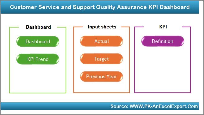
The Home sheet acts as a control center with buttons that let users jump directly to any of the six analytical sheets. This navigation feature saves time and enhances usability.
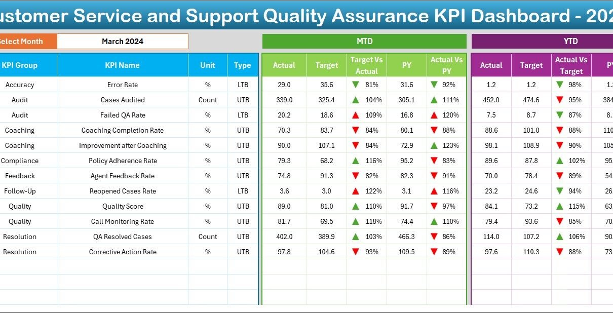
Dashboard Sheet (Interactive KPIs Summary)
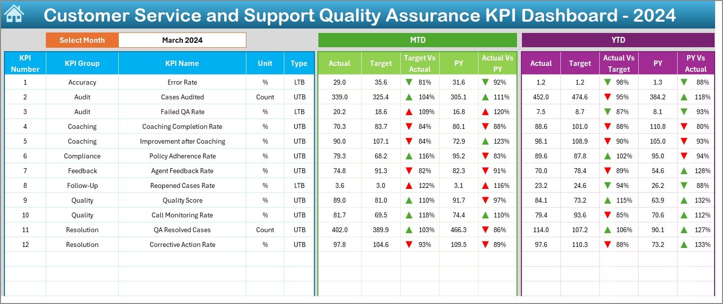
This is the core of the tool. It provides:
-
Monthly Selector (D3): Choose any month to update all KPI metrics.
-
MTD Section: View Actual, Target, and Previous Year values for each KPI with visual indicators (arrows) showing performance trends.
-
YTD Section: Evaluate year-to-date progress across all KPIs.
-
Conditional Formatting: Instantly highlights whether KPIs are improving or declining with arrows and color codes.
This sheet gives you a quick overview of where your service stands today and how it compares to targets and last year’s benchmarks.
Click to Purchases Customer Service and Support Quality Assurance KPI Dashboard in Excel
KPI Trend Sheet
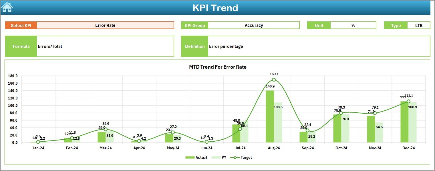
This sheet allows users to select any KPI from a dropdown (C3) and view its:
-
KPI Group and Unit
-
KPI Type: Lower the Better (LTB) or Upper the Better (UTB)
-
Formula and Short Definition
-
Trend Charts: Visualize MTD and YTD performance trends over time
This is useful for spotting consistent performance issues or celebrating steady improvements.
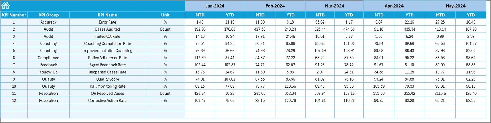
Actual Numbers Input Sheet
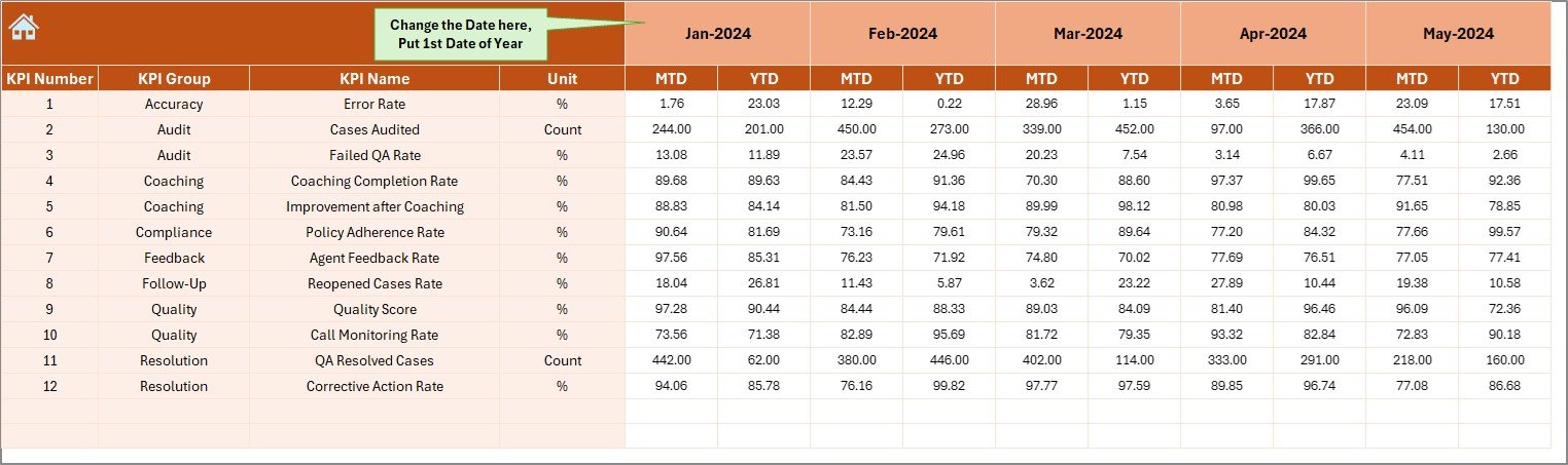
Here, you manually input actual performance data:
-
MTD and YTD Values
-
Month Selector (E1): Set the starting month of the fiscal year
-
Realistic monthly inputs help generate accurate analysis in the dashboard
Target Sheet
In this sheet, you define the target values for each KPI:
-
Monthly MTD and YTD goals
-
Aligns service expectations and allows comparison with actual performance
Previous Year Numbers Sheet
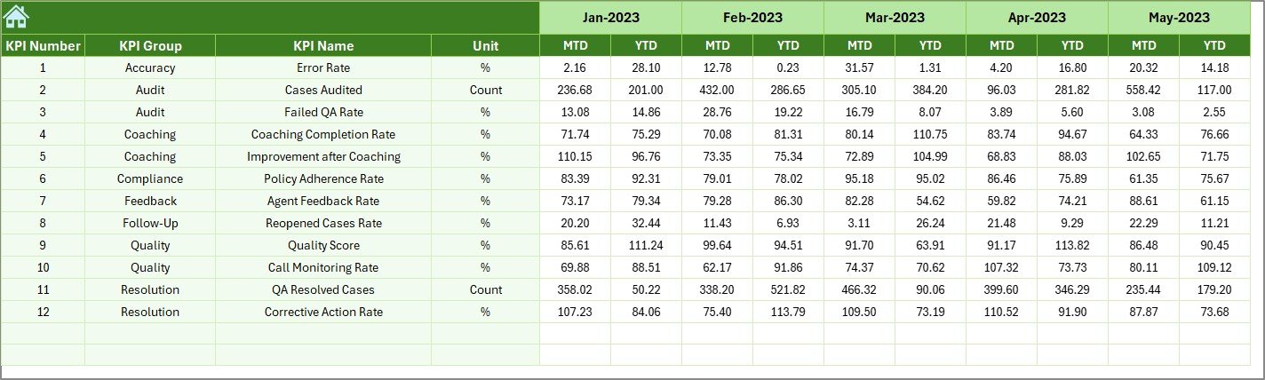
This sheet stores past year’s MTD and YTD values for each KPI. It helps:
-
Compare growth or decline
-
Identify seasonality or repeat issues
-
Set more realistic goals for the future
KPI Definition Sheet
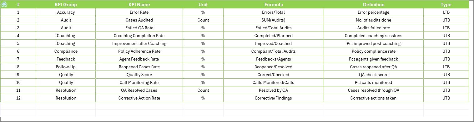
Document all KPI details in one place, including:
-
KPI Group
-
KPI Name
-
Unit
-
Formula
-
Definition
This sheet ensures transparency and helps onboard new team members by giving them a clear understanding of each metric.
Advantages of Using This Dashboard
Using a structured Excel dashboard offers numerous benefits. Let’s explore the major ones:
✅ Improves Decision-Making
You get all the data you need to make quick and accurate decisions. No more delays caused by data scattered across sheets or systems.
📊 Real-Time Tracking
Dynamic charts and drop-down filters allow you to analyze performance anytime with minimal effort.
💡 Spot Weak Points Easily
Color-coded conditional formatting helps you instantly detect underperforming KPIs and take corrective actions.
🧩 Customization Friendly
Being Excel-based, you can add or modify KPIs, charts, and filters without any coding skills.
📁 Better Record-Keeping
Keep historical records of performance and track progress across months or even years.
👥 Boosts Team Accountability
When KPIs are clearly visible and measurable, team members are more motivated to meet and exceed them.
Click to Purchases Customer Service and Support Quality Assurance KPI Dashboard in Excel
Top KPIs to Track in Customer Service and Support Quality
Here are some essential KPIs typically tracked using this dashboard:
-
First Response Time – How quickly the team replies to the customer’s first query
-
Average Resolution Time – The average time taken to resolve issues
-
Customer Satisfaction Score (CSAT) – Based on feedback or surveys
-
Net Promoter Score (NPS) – Measures customer loyalty
-
Tickets Resolved in First Contact – Tracks efficiency
-
Escalation Rate – High values indicate quality gaps
-
Customer Retention Rate – Directly affected by support quality
-
Employee Productivity – Calls or tickets handled per agent
Best Practices for Using a Quality Assurance KPI Dashboard
To get the most out of your KPI dashboard, follow these practical tips:
🎯 Set SMART KPIs
Ensure each KPI is Specific, Measurable, Achievable, Relevant, and Time-bound.
📅 Update Data Monthly
Regular updates keep your dashboard accurate and relevant.
📣 Involve the Support Team
Share the dashboard with your agents. Let them understand what’s being measured and why.
🔄 Compare with Previous Year
Always look at last year’s performance to detect seasonal patterns and set benchmarks.
📌 Keep Definitions Clear
Each KPI should have a simple definition in the KPI Definition tab to avoid confusion.
🛠️ Use Color Coding Consistently
Apply conditional formatting rules logically—red for below target, green for above target, for example.
🔍 Review Trends, Not Just Numbers
Don’t just look at one month. Use the trend chart to see long-term patterns.
How to Customize This Excel KPI Dashboard?
One of the biggest benefits of this tool is how customizable it is. You can:
-
Add new KPIs in the KPI Definition sheet
-
Extend monthly data for future years in the Actual/Target Sheets
-
Replace sample data with real service data
-
Modify chart types or styles in the Dashboard Sheet
-
Add new filters for agent, region, or channel breakdowns
Conclusion
Delivering excellent customer service requires constant monitoring and smart interventions. A Customer Service and Support Quality Assurance KPI Dashboard in Excel gives you the control, insights, and structure needed to improve performance continuously.
From reducing resolution time to increasing customer satisfaction, this dashboard ensures that nothing slips through the cracks. You don’t need advanced software or a large IT team—just Excel and this smart template.
Whether you’re starting from scratch or improving your current process, this tool empowers you to build a high-performing support function based on data, not guesswork.
Frequently Asked Questions (FAQs)
❓ What KPIs are most important for customer service quality?
Some of the most critical KPIs include First Response Time, Resolution Time, Customer Satisfaction (CSAT), Net Promoter Score (NPS), Escalation Rate, and First Call Resolution.
❓ Can I use this dashboard without advanced Excel skills?
Yes. This dashboard is user-friendly and designed with drop-downs, charts, and auto-updating formulas. Basic Excel knowledge is enough.
❓ How often should I update the actual and target values?
You should update the Actual, Target, and Previous Year values monthly to keep the insights accurate and actionable.
❓ Is this dashboard suitable for small businesses?
Absolutely. Whether you have 3 agents or 30, this Excel dashboard helps monitor performance and scale your service quality.
❓ Can I add more KPIs or modify existing ones?
Yes. The structure is flexible. Just enter new KPIs in the KPI Definition tab and update the data sheets accordingly.
❓ What makes this better than using software like Zendesk or Freshdesk reports?
While tools like Zendesk offer built-in analytics, this Excel dashboard gives complete control, customization, and offline access, making it perfect for managers who prefer tailored reporting.
Visit our YouTube channel to learn step-by-step video tutorials