Cyber threats continue to grow every year. Therefore, organizations now need a structured and data-driven approach to monitor cyber risks. However, manual reports, static spreadsheets, and scattered data often fail to provide real-time insights. That is exactly where the Cyber Risk Management KPI Dashboard in Power BI plays a critical role.
This ready-to-use dashboard helps organizations track, analyze, and improve cyber security performance using clearly defined KPIs. Moreover, it converts raw cyber risk data into actionable visual insights, allowing decision-makers to act faster and smarter.
In this article, you will learn what the Cyber Risk Management KPI Dashboard in Power BI is, how it works, its key features, advantages, best practices, and frequently asked questions.
Click to Purchases Cyber Risk Management KPI Dashboard in Power BI
What Is a Cyber Risk Management KPI Dashboard in Power BI?
A Cyber Risk Management KPI Dashboard in Power BI is an interactive reporting solution designed to monitor cyber risk performance through measurable KPIs. It connects with structured Excel data and presents monthly and yearly cyber risk metrics in a single visual dashboard.
Instead of reviewing multiple files, teams can instantly:
-
Track KPI performance
-
Compare actual vs target values
-
Identify risk trends
-
Analyze year-over-year cyber performance
As a result, organizations gain better control over cyber risk exposure and ensure continuous improvement.
Why Do Organizations Need a Cyber Risk Management KPI Dashboard?
Cyber security teams handle large volumes of data every month. However, without a proper dashboard:
-
Risks stay hidden
-
Trends remain unclear
-
Decision-making slows down
Therefore, a Cyber Risk KPI Dashboard becomes essential because it:
-
Centralizes cyber risk data
-
Highlights performance gaps
-
Supports proactive risk mitigation
-
Improves accountability across teams
Most importantly, it enables leadership teams to monitor cyber risk health at a glance.
Click to Purchases Cyber Risk Management KPI Dashboard in Power BI
How Does the Cyber Risk Management KPI Dashboard in Power BI Work?
The dashboard uses Excel as the data source and Power BI for visualization. First, users update the Excel input sheets. Then, Power BI automatically refreshes visuals based on the latest data.
Data Flow Process:
-
Enter actual cyber risk values
-
Enter target cyber risk values
-
Define KPI structure and rules
-
Refresh Power BI dashboard
-
Analyze insights instantly
Because of this approach, the dashboard remains simple to maintain and easy to scale.
Key Features of Cyber Risk Management KPI Dashboard in Power BI
The dashboard includes three structured pages, each designed for a specific purpose.
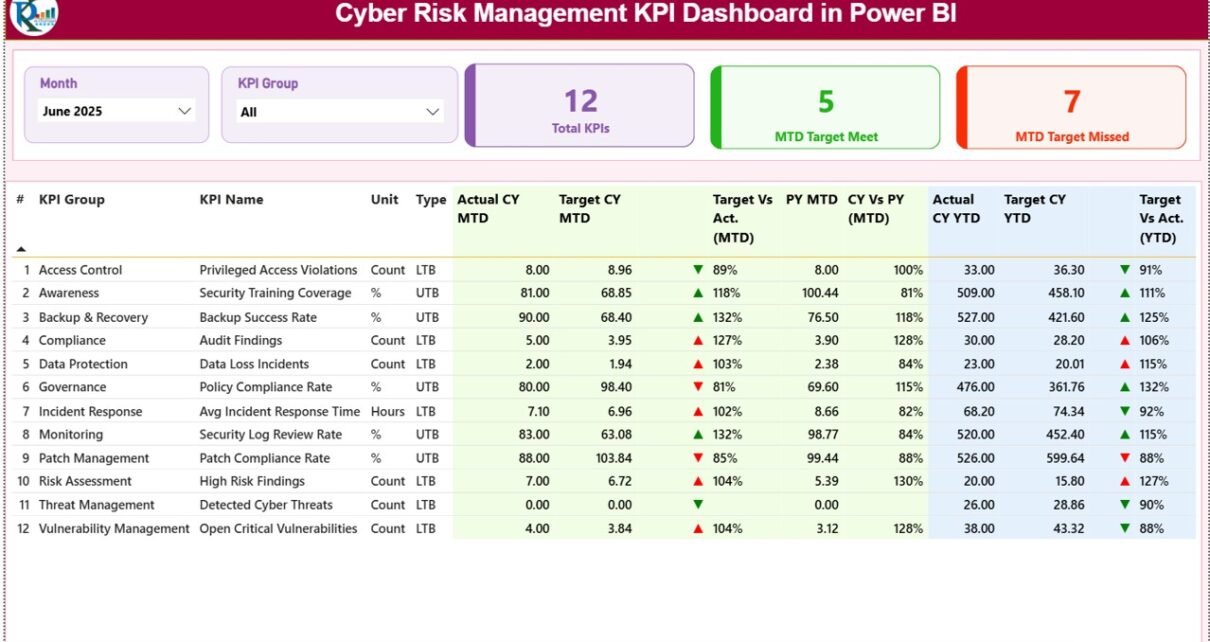
What Is Included in the Summary Page of the Cyber Risk KPI Dashboard?
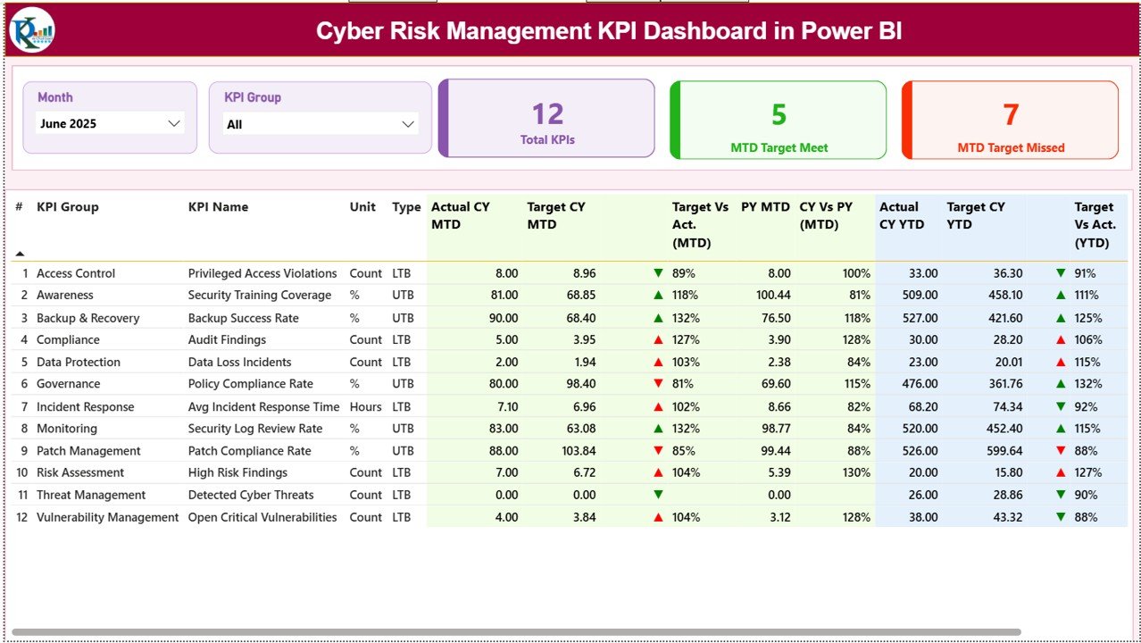
The Summary Page acts as the central control panel of the dashboard.
Key Elements on the Summary Page:
Interactive Slicers
-
📅 Month slicer
-
📊 KPI Group slicer
These slicers allow users to filter cyber risk performance dynamically.
KPI Cards at the Top
The dashboard displays three high-level cards:
-
Total KPIs Count
-
MTD Target Met Count
-
MTD Target Missed Count
These cards provide an instant overview of cyber risk performance.
Detailed KPI Performance Table
Below the cards, the dashboard displays a detailed KPI performance table with the following columns:
-
KPI Number – Sequential KPI identification
-
KPI Group – Cyber risk category
-
KPI Name – Name of the KPI
-
Unit – Measurement unit
-
Type – LTB (Lower the Better) or UTB (Upper the Better)
Current Year MTD Performance
-
Actual CY MTD
-
Target CY MTD
-
MTD Icon (▲ / ▼ with green or red color)
-
Target vs Actual (MTD %)
Previous Year Comparison (MTD)
-
PY MTD
-
CY vs PY (MTD %)
Current Year YTD Performance
-
Actual CY YTD
-
Target CY YTD
-
YTD Icon (▲ / ▼)
-
Target vs Actual (YTD %)
Previous Year Comparison (YTD)
-
PY YTD
-
CY vs PY (YTD %)
Because of this layout, users can identify cyber risk deviations instantly.
Click to Purchases Cyber Risk Management KPI Dashboard in Power BI
How Does the KPI Trend Page Help in Cyber Risk Analysis?
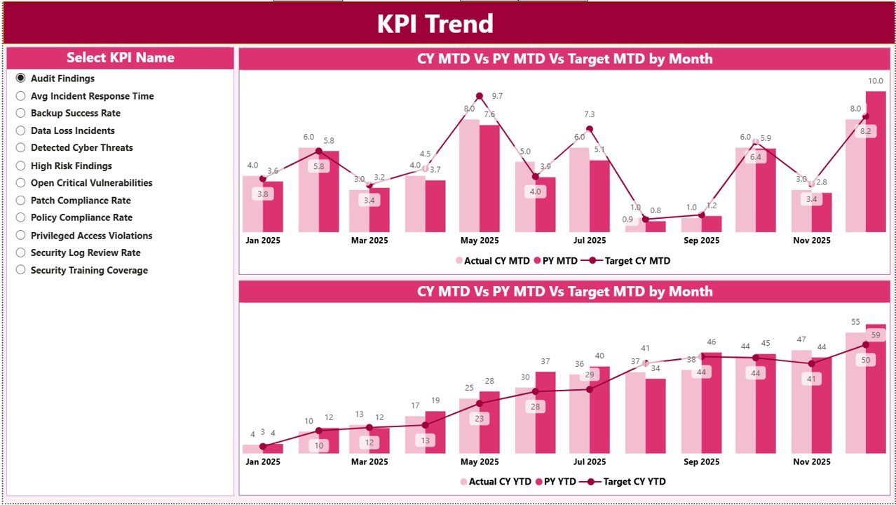
The KPI Trend Page focuses on trend analysis, which plays a crucial role in cyber risk management.
Features of the KPI Trend Page:
-
Two combo charts for:
-
MTD performance
-
YTD performance
-
-
Actual vs Target vs Previous Year comparison
-
KPI Name slicer on the left
With this page, users can:
-
Identify rising cyber risks
-
Track long-term improvements
-
Compare performance trends visually
As a result, organizations can shift from reactive to proactive cyber risk management.
What Is the Purpose of the KPI Definition Page?
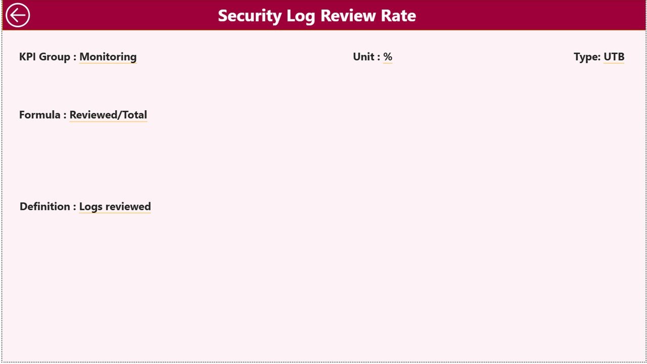
The KPI Definition Page acts as a drill-through page.
Key Highlights:
-
Hidden from the main navigation
-
Accessible via drill-through from the Summary Page
-
Displays:
-
KPI Formula
-
KPI Definition
-
Measurement logic
-
KPI Type (LTB or UTB)
-
This page ensures:
-
KPI transparency
-
Consistent interpretation
-
Better communication across teams
To return to the Summary Page, users simply click the Back button on the top-left corner.
Click to Purchases Cyber Risk Management KPI Dashboard in Power BI
How Is Excel Used as the Data Source?
The dashboard uses a structured Excel file with three worksheets.
What Is the Input_Actual Sheet Used For?
This sheet stores actual cyber risk performance values.
Required Columns:
-
KPI Name
-
Month (first date of the month)
-
MTD Actual
-
YTD Actual
Users only need to update this sheet monthly.
What Is the Input_Target Sheet Used For?
This sheet captures target cyber risk values.
Required Columns:
-
KPI Name
-
Month (first date of the month)
-
MTD Target
-
YTD Target
Because of this setup, target comparisons remain consistent.
What Is the KPI Definition Sheet Used For?
This sheet defines the structure of each KPI.
Required Columns:
-
KPI Number
-
KPI Group
-
KPI Name
-
Unit
-
Formula
-
Definition
-
Type (LTB or UTB)
This ensures standardized KPI reporting across the dashboard.
Click to Purchases Cyber Risk Management KPI Dashboard in Power BI
Advantages of Cyber Risk Management KPI Dashboard in Power BI
Let’s explore the major advantages.
📊 Centralized Cyber Risk Monitoring
The dashboard brings all cyber KPIs into one single view, eliminating scattered reports.
⚡ Faster Decision-Making
Because visuals update instantly, leaders can act without delays.
🎯 Clear Target Tracking
Actual vs target comparisons help teams focus on gaps immediately.
📈 Trend-Based Insights
MTD and YTD trends support long-term cyber risk planning.
🔍 Improved Transparency
KPI definitions and formulas remain visible and standardized.
🧠 Reduced Manual Effort
Automation reduces dependency on manual reporting.
Click to Purchases Cyber Risk Management KPI Dashboard in Power BI
Best Practices for Cyber Risk Management KPI Dashboard in Power BI
To get the best results, follow these best practices.
✔ Define KPIs Clearly
Always align KPIs with cyber risk objectives.
✔ Maintain Clean Data
Ensure accurate and timely Excel updates.
✔ Review KPIs Monthly
Regular reviews help detect early warning signs.
✔ Use LTB and UTB Correctly
Apply KPI types consistently for correct insights.
✔ Limit KPIs to What Matters
Focus on meaningful KPIs instead of tracking everything.
✔ Train Users
Ensure teams understand how to interpret dashboard visuals.
Who Can Use This Cyber Risk KPI Dashboard?
This dashboard suits:
-
Cyber Security Teams
-
Risk Management Teams
-
IT Governance Teams
-
CISOs and IT Heads
-
Compliance and Audit Teams
Because of its flexibility, organizations of all sizes can use it.
Conclusion: Why Cyber Risk Management KPI Dashboard in Power BI Matters
Cyber risks evolve constantly. Therefore, organizations need real-time visibility and control. The Cyber Risk Management KPI Dashboard in Power BI delivers exactly that.
By combining structured Excel inputs with interactive Power BI visuals, this dashboard empowers organizations to:
-
Monitor cyber risks effectively
-
Compare performance accurately
-
Improve cyber security maturity continuously
Ultimately, it transforms cyber risk management from reactive reporting to proactive strategy.
Frequently Asked Questions (FAQs)
❓ What is a Cyber Risk Management KPI Dashboard?
It is a Power BI dashboard that tracks cyber risk KPIs using actual, target, and trend-based metrics.
❓ Can I customize the KPIs?
Yes, you can add, remove, or modify KPIs using the Excel data source.
❓ Do I need Power BI Service to use this dashboard?
No, you can use it directly in Power BI Desktop.
❓ How often should data be updated?
You should update data monthly for accurate MTD and YTD analysis.
❓ Is Excel knowledge required?
Basic Excel knowledge is enough to maintain the input sheets.
❓ Can this dashboard support audits?
Yes, it provides structured, auditable KPI data with definitions and formulas.
Click to Purchases Cyber Risk Management KPI Dashboard in Power BI
Visit our YouTube channel to learn step-by-step video tutorials

