The dairy industry moves fast. Milk prices change daily. Demand shifts weekly. Distribution costs rise often. Therefore, dairy businesses must track performance carefully.
However, many dairy companies still depend on scattered spreadsheets. As a result, managers struggle to monitor sales, costs, profit margins, and pending orders in one place. Moreover, they miss trends. They lose control over sales channels. They fail to identify profitable product categories.
So, how can dairy businesses track everything in one structured system?
The answer is simple.
Click to Purchases Dairy Industry Dashboard in Excel
You need a Dairy Industry Dashboard in Excel.
In this detailed guide, you will learn:
-
What a Dairy Industry Dashboard in Excel is
-
Why dairy companies need it
-
Complete explanation of all 5 dashboard pages
-
Key metrics included
-
Advantages of Dairy Industry Dashboard in Excel
-
Best practices for implementation
-
Frequently Asked Questions with answers
Let’s explore everything step by step.
What Is a Dairy Industry Dashboard in Excel?
A Dairy Industry Dashboard in Excel is a ready-to-use performance monitoring template designed specifically for dairy businesses.
It collects raw sales and operational data and converts it into meaningful insights. Instead of opening multiple sheets, you can monitor:
-
Net Sales
-
Gross Sales
-
Total Cost
-
Profit Margin %
-
Pending Order %
-
Sales performance by region, channel, product, and customer type
Moreover, this dashboard works inside Excel desktop application, which means you do not need expensive software. You simply update the data sheet, and the dashboard updates automatically.
As a result, managers gain clarity. Sales teams improve focus. And business owners make faster decisions.
Why Does the Dairy Industry Need a Dashboard?
The dairy business operates with thin margins. Therefore, even small cost increases can reduce profit significantly.
Additionally, dairy products include:
-
Milk
-
Butter
-
Cheese
-
Yogurt
-
Cream
-
Paneer
-
Ice cream
Each product category behaves differently. Some products generate high sales volume. Others deliver higher margins.
So, without a structured dashboard:
-
You cannot compare product category performance
-
You cannot analyze sales channel effectiveness
-
You cannot track monthly growth
-
You cannot monitor pending orders
Therefore, a Dairy Industry Dashboard in Excel becomes essential.
Key Features of Dairy Industry Dashboard in Excel
This dashboard includes a clean and interactive layout. Moreover, it contains a Page Navigator located on the left side. Therefore, users can move easily across different analytical pages.
The dashboard includes 5 analytical pages plus support sheets:
-
Overview Page
-
Product Category Analysis
-
Sales Channel Analysis
-
Customer Type Analysis
-
Month Analysis
-
Support Sheet
-
Data Sheet
Now let’s understand each page in detail.
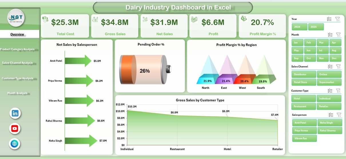
1️⃣ Overview Page – What Can You Monitor at a Glance?
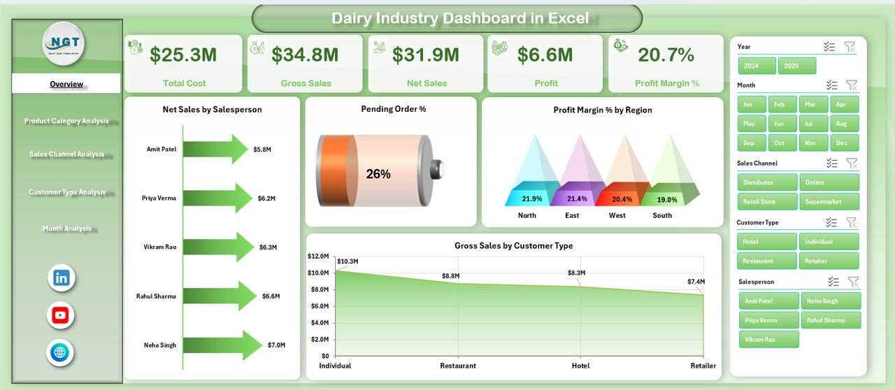
The Overview Page works as the control center of the dashboard.
On the right side, you will find slicers (filters). Therefore, you can filter data by:
-
Month
-
Region
-
Salesperson
-
Product Category
Additionally, the page displays 4 KPI cards and 4 charts.
KPI Cards
These cards provide quick performance indicators such as:
-
Total Net Sales
-
Total Gross Sales
-
Total Cost
-
Profit Margin %
Because of these cards, decision-makers instantly see performance health.
Charts Included on Overview Page
-
Net Sales by Salesperson
→ Identify top and low performers immediately. -
Pending Order %
→ Monitor operational delays quickly. -
Profit Margin % by Region
→ Understand which region generates higher profit. -
Gross Sales by Customer Type
→ Compare wholesalers, retailers, distributors, and direct customers.
Therefore, the Overview Page gives a 360-degree snapshot of dairy operations.
Click to Purchases Dairy Industry Dashboard in Excel
2️⃣ Product Category Analysis – Which Dairy Products Perform Best?
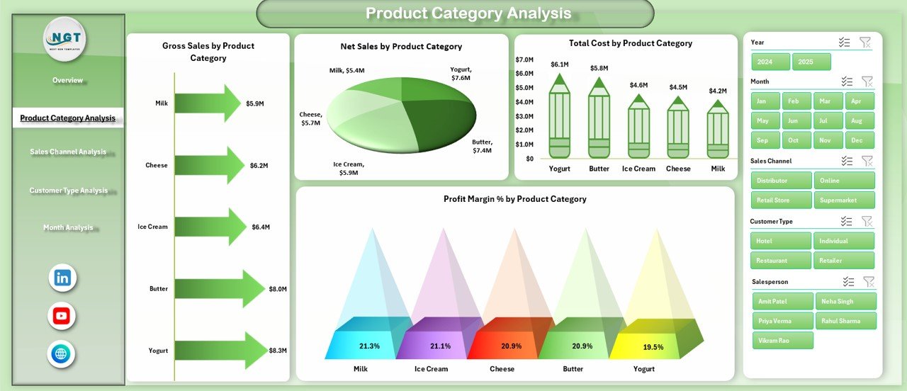
Dairy businesses manage multiple product categories. However, not every product generates equal profit.
Therefore, this page focuses on product-level analysis.
Filters
Right-side slicers allow filtering by month and region.
Charts Included
-
Gross Sales by Product Category
-
Net Sales by Product Category
-
Total Cost by Product Category
-
Profit Margin % by Product Category
As a result, managers can:
-
Identify high-volume products
-
Detect costly product lines
-
Improve pricing strategy
-
Focus on profitable dairy segments
For example, milk may show high sales but low margin. Meanwhile, cheese may show moderate sales but high margin. Therefore, strategic decisions become easier.
3️⃣ Sales Channel Analysis – Which Channel Drives Maximum Revenue?
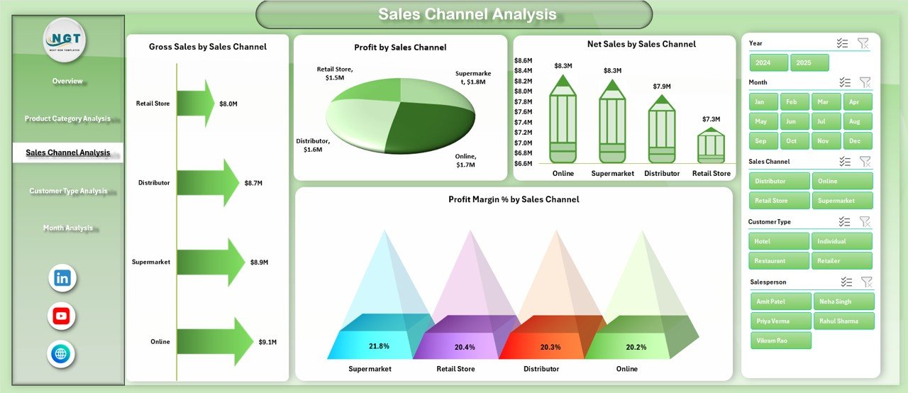
Dairy companies sell through different channels:
-
Retail Stores
-
Supermarkets
-
Distributors
-
Online Sales
-
Direct Sales
However, not every channel performs equally.
Therefore, this page analyzes performance by sales channel.
Charts Included
-
Gross Sales by Sales Channel
-
Net Sales by Sales Channel
-
Profit Sales by Sales Channel
-
Profit Margin % by Sales Channel
Because of this analysis, businesses can:
-
Invest more in profitable channels
-
Reduce dependency on low-margin channels
-
Improve distribution strategy
-
Optimize commission structure
For example, supermarkets may generate high revenue but low margin. Meanwhile, direct sales may deliver better profit percentage.
Click to Purchases Dairy Industry Dashboard in Excel
Thus, strategic resource allocation becomes easier.
4️⃣ Customer Type Analysis – Who Are Your Most Profitable Customers?
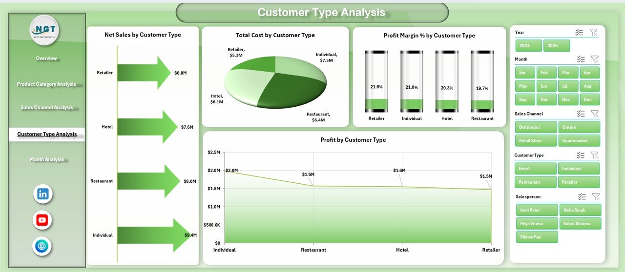
Dairy businesses serve various customer types:
-
Wholesalers
-
Retailers
-
Institutional Buyers
-
Direct Consumers
Therefore, understanding customer profitability becomes critical.
Charts Included
-
Total Cost by Customer Type
-
Net Sales by Customer Type
-
Profit Sales by Customer Type
-
Profit Margin % by Customer Type
As a result, managers can:
-
Identify high-value customers
-
Improve discount policy
-
Strengthen profitable relationships
-
Reduce cost-heavy segments
Therefore, customer strategy becomes data-driven instead of assumption-based.
5️⃣ Month Analysis – How Does Performance Change Over Time?
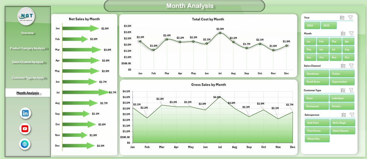
Seasonality plays a major role in the dairy industry. For example:
-
Summer increases demand for ice cream
-
Festivals increase sweet product demand
-
Winter increases butter and cream sales
Therefore, month-wise tracking becomes essential.
Charts Included
-
Total Cost by Month
-
Net Sales by Month
-
Gross Sales by Month
Because of this page, businesses can:
-
Track growth trends
-
Detect seasonal fluctuations
-
Forecast demand
-
Plan inventory
Thus, managers can plan production more effectively.
What Do the Support Sheet and Data Sheet Do?
Support Sheet
The Support Sheet manages:
-
Drop-down lists
-
Lookup tables
-
Category mapping
-
Data validation controls
Therefore, it ensures smooth functioning of slicers and formulas.
Data Sheet
The Data Sheet stores raw transaction data including:
-
Date
-
Salesperson
-
Region
-
Product Category
-
Customer Type
-
Sales Channel
-
Gross Sales
-
Cost
-
Net Sales
-
Profit
Once you update this sheet, the entire dashboard updates automatically.
Key KPIs Included in Dairy Industry Dashboard
This dashboard tracks important performance indicators such as:
-
Gross Sales
-
Net Sales
-
Total Cost
-
Profit Sales
-
Profit Margin %
-
Pending Order %
-
Sales by Region
-
Sales by Channel
-
Sales by Product Category
Because of these KPIs, dairy managers gain complete control over operations.
Advantages of Dairy Industry Dashboard in Excel
Click to Purchases Dairy Industry Dashboard in Excel
Now let’s explore the major benefits.
1️⃣ Real-Time Business Visibility
You instantly see business performance. Therefore, you respond faster.
2️⃣ Better Decision-Making
Since you analyze profit margin by product and region, you make smarter pricing decisions.
3️⃣ Improved Sales Monitoring
You track salesperson performance clearly. Therefore, accountability improves.
4️⃣ Cost Control
Because you monitor cost by category and customer type, you reduce unnecessary expenses.
5️⃣ Easy to Use
Excel interface remains familiar. Therefore, users do not need advanced technical skills.
6️⃣ No Additional Software Cost
You use Excel desktop application. Hence, you avoid expensive BI tools.
7️⃣ Improved Profitability
When you focus on high-margin products and channels, overall profit increases.
Best Practices for the Dairy Industry Dashboard in Excel
To get maximum benefit, follow these best practices.
1️⃣ Update Data Regularly
Enter sales and cost data daily or weekly. Therefore, insights remain accurate.
2️⃣ Maintain Data Accuracy
Check numbers before uploading. Because incorrect data leads to wrong decisions.
3️⃣ Use Filters Smartly
Apply slicers to analyze specific regions, months, or categories.
4️⃣ Review Performance Monthly
Conduct monthly review meetings using Month Analysis page.
5️⃣ Focus on Profit Margin
Do not focus only on sales. Instead, track margin percentage carefully.
6️⃣ Train Your Team
Ensure your sales and finance team understands how to use the dashboard.
How Can Dairy Businesses Use This Dashboard Strategically?
You can use this dashboard to:
-
Plan production levels
-
Optimize pricing
-
Improve inventory planning
-
Set realistic sales targets
-
Reward top-performing salespeople
-
Strengthen profitable channels
Therefore, this dashboard becomes a strategic tool instead of just a reporting file.
Conclusion
The dairy industry operates in a competitive and cost-sensitive environment. Therefore, businesses must track performance closely.
A Dairy Industry Dashboard in Excel provides:
-
Clear performance visibility
-
Structured sales tracking
-
Profitability insights
-
Month-wise trend analysis
-
Channel and customer evaluation
Moreover, this ready-to-use Excel dashboard simplifies complex dairy data. Instead of juggling multiple spreadsheets, you manage everything in one interactive system.
If you want better control, improved margins, and smarter decisions, this dashboard becomes your ideal solution.
Frequently Asked Questions (FAQs)
1. What is a Dairy Industry Dashboard in Excel?
It is an Excel-based reporting tool that tracks dairy sales, cost, profit margin, and operational metrics in one structured format.
2. Who can use this dashboard?
Dairy manufacturers, distributors, wholesalers, and dairy product retailers can use this dashboard.
3. Do I need advanced Excel skills to use it?
No. You only need basic Excel knowledge to update the data sheet.
4. Can I customize this dashboard?
Yes. You can modify categories, regions, or sales channels based on your business model.
5. How often should I update the data?
You should update it daily or weekly for accurate analysis.
6. Does it support month-wise comparison?
Yes. The Month Analysis page shows cost and sales trends month by month.
7. Can I track salesperson performance?
Yes. The Overview page shows Net Sales by Salesperson.
8. How does it help improve profitability?
It highlights high-margin products and channels. Therefore, you focus on profitable segments.
Visit our YouTube channel to learn step-by-step video tutorials