The dairy industry moves fast. Demand changes daily. Prices fluctuate weekly. Customer expectations grow every season. Therefore, dairy companies must track sales, profit, cost, customer trends, and product performance in real time.
However, many dairy businesses still rely on scattered Excel files and manual reports. As a result, managers struggle to identify profit leakage. They miss sales opportunities. They fail to track regional performance clearly.
So, how can you monitor net sales, profit margin, customer type, product category, and monthly performance in one structured and interactive system?
Click to Purchases Dairy Industry Dashboard in Power BI
The answer is simple.
You need a Dairy Industry Dashboard in Power BI.
In this detailed guide, you will learn:
-
What a Dairy Industry Dashboard in Power BI is
-
Why dairy businesses need it
-
Detailed explanation of all 5 dashboard pages
-
Key KPIs included in the dashboard
-
Advantages of Dairy Industry Dashboard in Power BI
-
Best Practices for the Dairy Industry Dashboard
-
Frequently Asked Questions with Answers
Let us explore everything step by step.
What Is a Dairy Industry Dashboard in Power BI?
A Dairy Industry Dashboard in Power BI is a ready-to-use business intelligence solution designed specifically for dairy manufacturers, distributors, and retailers.
It captures raw sales and cost data. Then, it transforms that data into powerful visual insights using Power BI.
Instead of reviewing multiple reports, you can:
-
Track net sales performance
-
Monitor profit margin percentage
-
Analyze cost structure
-
Evaluate product category performance
-
Compare customer types
-
Study sales channel performance
-
Review monthly trends
Moreover, the dashboard updates automatically once you refresh the data. Therefore, decision-makers always work with the latest numbers.
Why Does the Dairy Industry Need a Power BI Dashboard?
The dairy sector faces unique challenges. Milk prices change frequently. Seasonal demand affects sales. Distribution costs vary by region. Furthermore, product categories like milk, cheese, butter, yogurt, and cream show different profit margins.
If you do not track these variables carefully, profit margins shrink.
Here is why a dashboard becomes essential:
-
✔ You gain real-time visibility into sales and profit
-
✔ You identify high-performing product categories
-
✔ You control costs across channels
-
✔ You compare customer types instantly
-
✔ You monitor monthly performance trends
-
✔ You detect declining margins early
Therefore, instead of reacting late, you make proactive decisions.
Dashboard Structure: 5 Powerful Pages Explained
This Dairy Industry Dashboard in Power BI includes 5 interactive pages. Each page focuses on a specific business angle.
Let us break them down.
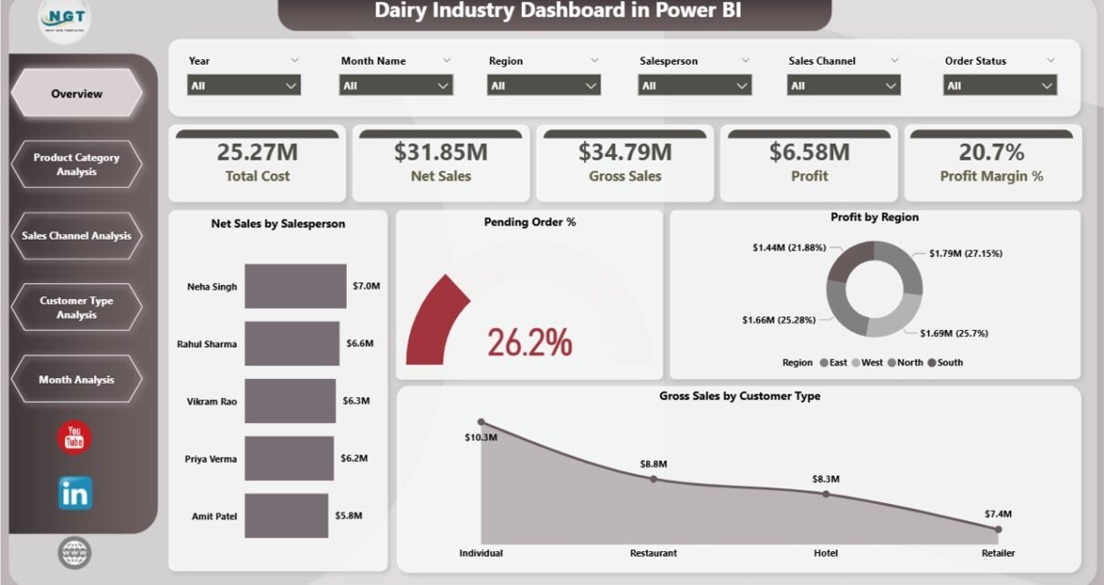
1️⃣ Overview Page – The Executive Summary
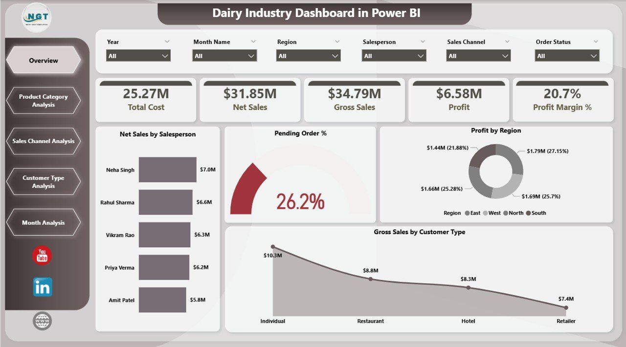
The Overview Page works as the main control panel.
Here, you can use slicers to filter the data by:
-
Year
-
Month
-
Region
-
Salesperson
-
Product Category
-
Customer Type
-
Sales Channel
Because slicers allow dynamic filtering, you can instantly change the perspective of the entire dashboard.
Key KPI Cards on Overview Page
The Overview page includes 5 KPI cards:
-
Net Sales by Salesperson
-
Pending Order %
-
Profit by Region
-
Gross Sales by Customer Type
-
Overall Profit Margin %
These KPI cards provide a quick business snapshot.
For example:
-
If Pending Order % increases above 10%, you know fulfillment delays require attention.
-
If Profit by Region drops in the North zone, you can investigate distribution costs.
Therefore, the Overview page supports high-level strategic decisions.
2️⃣ Product Category Analysis – Which Products Drive Profit?
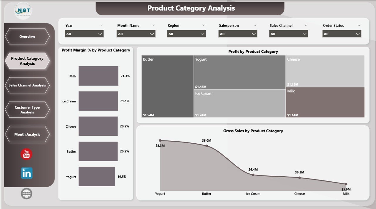
Dairy companies manage multiple product categories. However, not every category delivers equal profit.
The Product Category Analysis Page focuses on product-level insights.
Charts Included:
-
📊 Profit Margin % by Product Category
-
📊 Profit by Product Category
-
📊 Gross Sales by Product Category
With these visuals, you can answer important questions:
-
Which product category generates the highest margin?
-
Which category drives maximum revenue?
-
Which category shows high sales but low profit?
-
Click to Purchases Dairy Industry Dashboard in Power BI
For instance:
-
Milk may generate high sales volume but lower margins.
-
Cheese may deliver higher margins with moderate sales.
Therefore, this page helps you optimize product mix strategy.
3️⃣ Sales Channel Analysis – Where Does Revenue Come From?
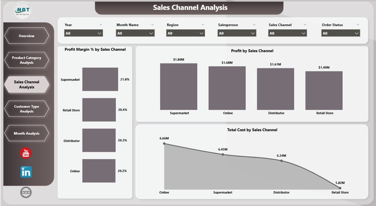
Dairy businesses sell through multiple channels:
-
Retail stores
-
Supermarkets
-
Distributors
-
Online platforms
-
Direct sales
Each channel carries different cost structures and margin levels.
The Sales Channel Analysis Page includes:
-
📊 Profit Margin % by Sales Channel
-
📊 Profit by Sales Channel
-
📊 Total Cost by Sales Channel
This page allows you to:
-
Identify the most profitable channel
-
Detect high-cost distribution channels
-
Optimize channel allocation
For example:
If Online Channel shows 25% margin but Distributor Channel shows 10%, you may increase digital focus.
Thus, this page improves channel strategy.
4️⃣ Customer Type Analysis – Who Brings Maximum Value?
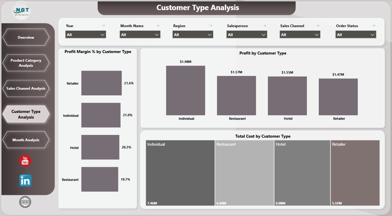
Not all customers contribute equally. Therefore, dairy businesses must analyze customer segments carefully.
Common customer types include:
-
Wholesalers
-
Retailers
-
Institutional buyers
-
Restaurants
-
Supermarkets
The Customer Type Analysis Page includes:
-
📊 Profit Margin % by Customer Type
-
📊 Profit by Customer Type
-
📊 Total Cost by Customer Type
With this data, you can:
-
Focus on high-margin customer types
-
Reduce dependency on low-margin segments
-
Customize pricing strategies
For example:
If institutional buyers generate high volume but low margin, you can revise pricing agreements.
Therefore, this page supports customer segmentation strategy.
5️⃣ Month Analysis – How Does Performance Change Over Time?
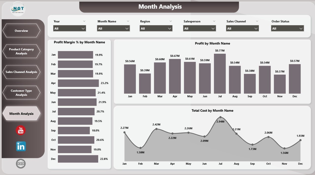
Seasonality plays a major role in the dairy industry.
For example:
-
Summer increases yogurt sales.
-
Winter boosts butter and cream demand.
-
Festival seasons raise overall dairy consumption.
The Month Analysis Page includes:
-
📊 Profit Margin % by Month
-
📊 Profit by Month
-
📊 Total Cost by Month
This page helps you:
-
Identify seasonal demand patterns
-
Track cost spikes
-
Forecast future sales trends
Therefore, you can plan inventory and production more effectively.
Key KPIs in Dairy Industry Dashboard
Click to Purchases Dairy Industry Dashboard in Power BI
This dashboard tracks essential KPIs such as:
-
Net Sales
-
Gross Sales
-
Total Cost
-
Profit
-
Profit Margin %
-
Pending Order %
-
Sales by Region
-
Sales by Channel
-
Sales by Customer Type
-
Monthly Performance Trends
Because these KPIs work together, you gain a complete financial picture.
Advantages of Dairy Industry Dashboard in Power BI
Now let us discuss why this dashboard creates real business value.
1. Real-Time Business Visibility
You see live numbers instantly after refresh. Therefore, you avoid outdated reporting.
2. Data-Driven Decisions
You rely on actual performance metrics instead of guesswork.
3. Profit Optimization
You identify high-margin products and channels quickly.
4. Cost Control
You track total cost by channel, customer, and month.
5. Interactive Filtering
Slicers allow instant drill-down analysis.
6. Better Sales Strategy
You analyze salesperson and regional performance easily.
7. Improved Forecasting
Monthly trend analysis supports demand planning.
How Does This Dashboard Improve Dairy Operations?
Let us look at real business impact.
Operational Improvements:
-
Reduce pending orders below 5%
-
Improve regional performance
-
Increase margin by optimizing product mix
Financial Improvements:
-
Boost overall profit margin
-
Reduce unnecessary channel costs
-
Increase average revenue per customer
Therefore, the dashboard transforms raw numbers into strategic actions.
Best Practices for the Dairy Industry Dashboard in Power BI
To get maximum value, follow these best practices.
1. Maintain Clean Data
Always upload accurate sales and cost data. Clean data ensures reliable insights.
2. Refresh Data Regularly
Schedule weekly or daily refresh depending on business size.
3. Use Slicers Smartly
Filter by region, month, and product to detect performance gaps.
4. Monitor Margins Weekly
Track profit margin trends consistently.
5. Compare Channels Frequently
Shift focus toward higher margin channels.
6. Review Customer Segments Monthly
Adjust pricing or discounts based on customer performance.
7. Share Dashboard with Decision Makers
Allow management teams to access reports regularly.
How to Implement Dairy Industry Dashboard in Power BI?
Implementation remains simple.
-
Prepare structured Excel data file.
-
Import data into Power BI Desktop.
-
Build relationships between tables.
-
Create DAX measures for KPIs.
-
Design visuals and cards.
-
Add slicers for dynamic filtering.
-
Publish to Power BI Service if required.
Therefore, even small dairy businesses can implement it easily.
Who Can Benefit from This Dashboard?
Click to Purchases Dairy Industry Dashboard in Power BI
This dashboard suits:
-
Dairy manufacturing companies
-
Milk processing units
-
Dairy product distributors
-
FMCG companies
-
Dairy retail chains
-
Finance and operations managers
-
Business analysts
Thus, any dairy-related business can use it effectively.
Conclusion
The dairy industry faces constant pressure. Costs fluctuate. Demand changes. Competition increases.
Therefore, dairy companies must rely on structured data analysis.
The Dairy Industry Dashboard in Power BI provides:
-
Clear profit visibility
-
Channel performance insights
-
Product category analysis
-
Customer segmentation understanding
-
Monthly trend tracking
Instead of reviewing multiple reports, you gain one powerful interactive system.
As a result, you improve profitability, reduce cost leakage, and make smarter business decisions.
Frequently Asked Questions with Answers
1. What data do I need to use the Dairy Industry Dashboard in Power BI?
You need sales data, cost data, product category details, customer type information, sales channel details, and date fields.
2. Can small dairy businesses use this dashboard?
Yes. Small and medium dairy businesses can use it effectively. They can start with basic sales and cost data.
3. How often should I refresh the dashboard?
You should refresh it weekly or daily depending on transaction volume.
4. Does this dashboard support seasonal analysis?
Yes. The Month Analysis page helps identify seasonal sales and margin patterns.
5. Can I customize KPIs in this dashboard?
Yes. You can modify KPIs, add new measures, or adjust DAX formulas according to business needs.
6. Why should I use Power BI instead of Excel?
Power BI provides interactive visuals, better scalability, dynamic filtering, and real-time refresh capabilities.
Visit our YouTube channel to learn step-by-step video tutorials