Managing a dealer network becomes challenging when the data spreads across multiple sheets, emails, and disconnected systems. When this happens, leaders struggle to monitor performance, compare dealer targets vs. actuals, and track improvements. Because of this, many organizations search for a modern, visual, and easy solution that displays every KPI in one place.
A Dealer Network KPI Dashboard in Power BI solves this problem. It brings together dealer performance data, KPI trends, and actionable insights into a single interactive dashboard. As a result, business leaders can track growth, identify gaps, and make faster decisions.
Click to Purchases Dealer Network KPI Dashboard in Power BI
In this article, you will explore what the dashboard is, how it works, its important components, and why it plays a crucial role in dealer management. You will also learn the advantages, best practices, and answers to the most common questions.
What Is a Dealer Network KPI Dashboard in Power BI?
A Dealer Network KPI Dashboard in Power BI is a ready-to-use visual reporting system that tracks the performance of all dealers across your network. It displays KPIs related to sales, targets, service quality, customer satisfaction, inventory, and business growth. Because the dashboard uses slicers, charts, drill-through features, and dynamic visuals, users can understand performance instantly.
You can load dealer data into Excel, connect it with Power BI, and refresh it with one click. As soon as the data updates, the dashboard refreshes all charts, cards, and tables automatically.
Key Features of the Dealer Network KPI Dashboard in Power BI
The Dealer Network KPI Dashboard in Power BI includes three powerful pages, each offering a different level of analysis.
1. Summary Page: The Main Dashboard for All KPIs
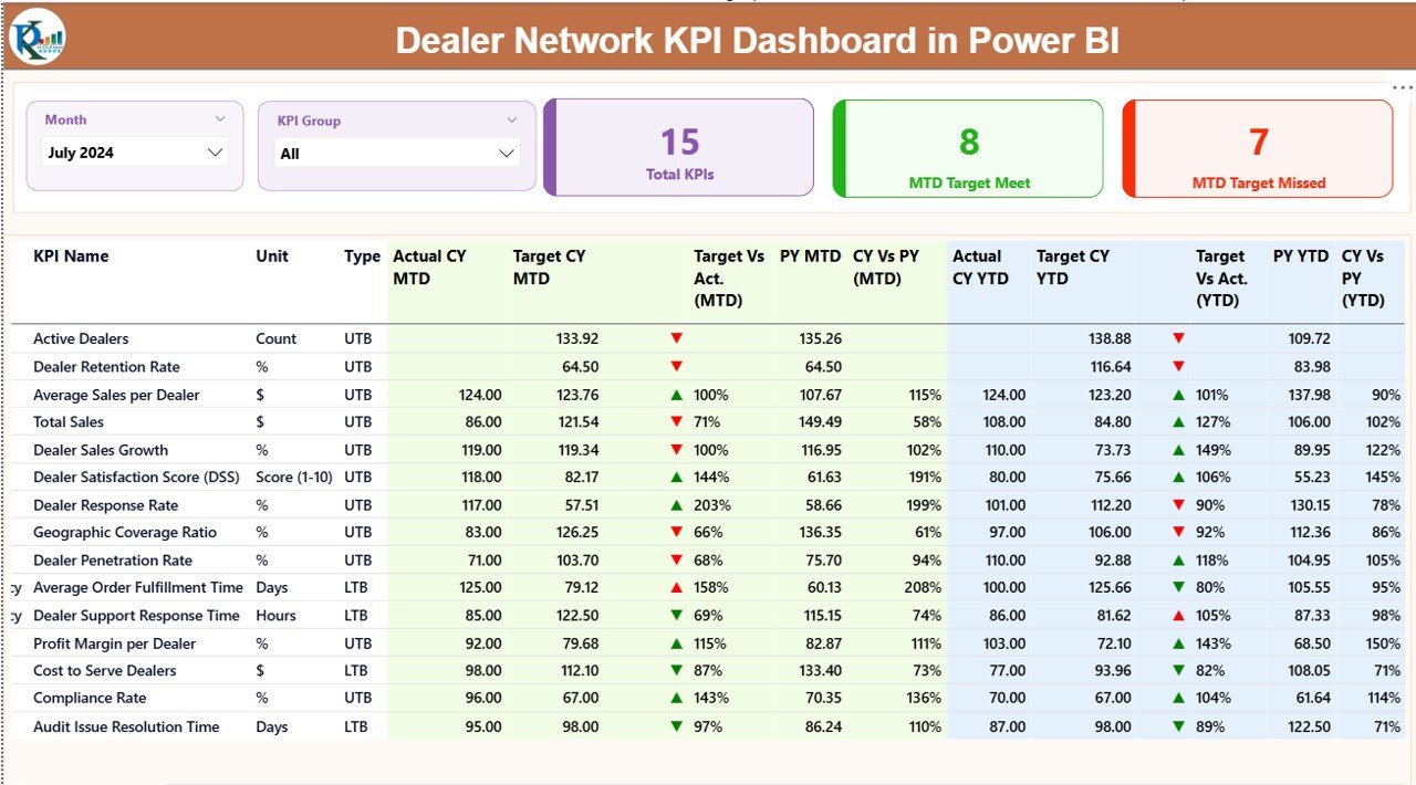
The Summary Page works as the home screen of the dashboard. Users can view trends, KPIs, and target comparisons in one place.
Key elements included:
🔹 Month Slicer
You can select any month using the slicer. As soon as you choose a month, the entire dashboard updates.
🔹 KPI Group Slicer
This filter helps you view KPIs by category such as Sales, Service, Finance, Inventory, Dealer Operations, and more.
🔹 Performance Cards
The dashboard includes three important cards:
-
Total KPIs Count
-
MTD Target Met Count
-
MTD Target Missed Count
These cards help users understand how the dealer network performs at a glance.
🔹 Detailed KPI Table
Below the cards, users can see a complete table that displays:
-
KPI Number
-
KPI Group
-
KPI Name
-
Unit of Measurement
-
Type (LTB or UTB)
-
Actual CY MTD
-
Target CY MTD
-
MTD Icon (▲ or ▼)
-
Target vs. Actual % (MTD)
-
Previous Year MTD
-
Current vs. Previous Year (MTD)
-
Actual CY YTD
-
Target CY YTD
-
YTD Icon (▲ or ▼)
-
Target vs. Actual % (YTD)
-
Previous Year YTD
-
Current vs. Previous Year (YTD)
The icons help users quickly identify whether performance meets or misses the target.
Because of this table, users get a complete view of dealer performance for the selected period.
2. KPI Trend Page: Deep Performance Analysis
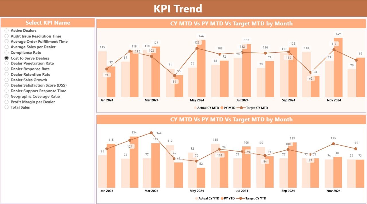
This page helps users compare Actual, Target, and Previous Year performance.
Key elements included:
🔹 Two Combo Charts
The first chart shows MTD trends:
-
Actual CY MTD
-
PY MTD
-
MTD Target
The second chart shows YTD trends:
-
Actual CY YTD
-
PY YTD
-
YTD Target
🔹 KPI Name Slicer
Users can select any KPI from the left side.
When they choose a KPI, both charts update immediately.
This helps compare progress and identify long-term performance changes.
3. KPI Definition Page: A Detail-Driven Drill-Through View
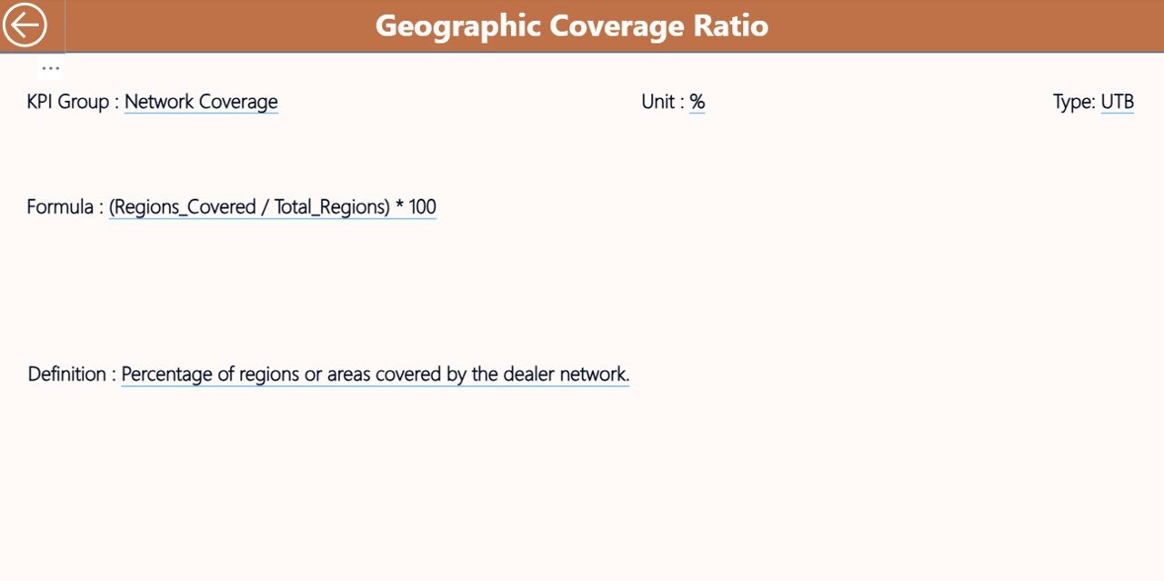
The KPI Definition Page remains hidden because users access it through a drill-through action.
From the Summary Page, users can right-click on any KPI and open the definition page.
This page shows:
-
KPI Number
-
KPI Group
-
KPI Name
-
Unit
-
Formula
-
Definition
-
Type (LTB/UTB)
Users can return to the main page using the Back Button placed on the top-left corner.
This feature improves transparency because users understand how each KPI is calculated.
How the Excel Data Source Works
The dashboard connects with a structured Excel file that includes three sheets.
1. Input_Actual Sheet
Users enter:
-
KPI Name
-
Month (use the first date of each month)
-
MTD Actual numbers
-
YTD Actual numbers
The dashboard reads this sheet automatically.
2. Input_Target Sheet
Click to Purchases Dealer Network KPI Dashboard in Power BI
This sheet contains:
-
KPI Name
-
Month
-
MTD Target
-
YTD Target
Once users update this sheet, the dashboard refreshes target data across all pages.
3. KPI Definition Sheet
This sheet includes the complete reference list:
-
KPI Number
-
KPI Group
-
KPI Name
-
Unit
-
Formula
-
Definition
-
Type (LTB/UTB)
This sheet becomes the backbone for the drill-through page in Power BI.
Why Organizations Need a Dealer Network KPI Dashboard
Managing a dealer network becomes difficult without a proper dashboard. The dashboard solves many challenges:
✔ Lack of real-time visibility
✔ Difficult manual comparisons
✔ Delayed reporting cycles
✔ Inconsistent performance tracking
With a dashboard, decision-makers get instant insights and can react quickly.
Advantages of Dealer Network KPI Dashboard in Power BI
1. You Get Real-Time Performance Insights
The dashboard updates in real time after refreshing the Excel file. Because of this, leaders always review the latest performance numbers.
2. You Get Faster Decision-Making
The visuals help users identify high- and low-performing dealers instantly. As a result, teams can take action without delay.
3. You Increase Transparency
Every KPI includes clear formulas, definitions, and comparison values. This builds trust among teams because the calculation logic stays visible.
4. You Improve Dealer Performance Monitoring
You can track dealer performance month-wise, year-wise, and against targets.
5. You Reduce Manual Effort
Power BI automates nearly everything. Users only update Excel sheets and click refresh. The dashboard handles the rest.
6. You Strengthen Strategic Planning
The Trend Page helps teams see long-term patterns. Because of this, leaders plan stronger strategies for the entire dealer network.
7. You Enhance Team Collaboration
Teams work with the same source of truth. This ensures consistency across management, sales teams, and dealer partners.
How the Dashboard Helps Different Users
🚗 Dealer Managers
They track individual dealer performance, targets, and improvement areas.
📈 Sales Teams
They understand MTD and YTD growth patterns and align future sales efforts.
📊 Business Analysts
They analyze trends and highlight gaps in performance.
🏢 Senior Leadership
They rely on high-level KPI summaries to make strategic decisions.
Important KPIs You Should Track in a Dealer Network
Although the KPIs may differ based on industry type, the most common ones include:
-
Sales Volume
-
Revenue Growth
-
Dealer Lead Conversion Rate
-
Customer Satisfaction Score
-
Inventory Turnover
-
Warranty Claims
-
On-Time Delivery %
-
Repeat Purchase Rate
-
Dealer Service Quality Score
-
Profit Margin %
-
Target Achievement %
Tracking the right KPIs ensures the dashboard delivers accurate strategic insights.
How to Use the Dealer Network KPI Dashboard Effectively
Using the dashboard becomes easier when users follow these steps:
Step 1: Update the Excel File
Fill in the Actual, Target, and KPI Definition sheets every month.
Step 2: Upload or Refresh the PBIX File
Open Power BI Desktop and press Refresh.
Step 3: Select the Month
Choose the month in the slicer to view month-specific results.
Step 4: Review Key Summary Cards
Understand how many KPIs meet or miss targets.
Step 5: Analyze Detailed KPI Table
Study MTD vs. Target, CY vs. PY, and YTD performance.
Step 6: Study KPI Trends
Open the Trend Page to see long-term progress.
Step 7: Drill Through to Check Definitions
Right-click any KPI to understand its logic.
Best Practices for the Dealer Network KPI Dashboard in Power BI
1. Keep the Data Clean
Always ensure correct month formats and values.
Clean and accurate data improves dashboard performance.
2. Maintain Consistent KPI Definitions
Never change formulas frequently.
Consistent definitions help users trust the dashboard.
3. Update Data Every Month
Regular updates maintain data accuracy.
Teams make better decisions with frequent refreshes.
4. Use Simple KPI Groups
Group KPIs under clear categories.
This helps users understand the data quickly.
5. Avoid Too Many Filters
Too many slicers confuse users.
Use only the most important ones like Month and KPI Group.
6. Train Users Briefly
A short training session helps users read charts and icons correctly.
7. Review YTD and MTD Together
Compare both values before making decisions.
This gives a complete picture of performance.
Conclusion
A Dealer Network KPI Dashboard in Power BI brings clarity, speed, and accuracy to business decisions. It converts raw data into visual stories that help teams monitor dealer performance, track KPIs, and identify improvement opportunities. Because it uses Excel as a data source, anyone can update numbers easily without technical skills.
With its Summary Page, Trend Page, and Definition Page, the dashboard offers a complete decision-support system. When businesses use the dashboard regularly, they improve transparency, performance, and planning across the entire dealer network.
Frequently Asked Questions (FAQs)
1. What is a Dealer Network KPI Dashboard in Power BI?
It is a visual reporting system that helps track and compare dealer performance using KPIs.
2. Can I update the dashboard without technical knowledge?
Yes. You only update the Excel source file and click refresh in Power BI.
3. Does the dashboard support drill-through features?
Yes. You can drill through to view detailed KPI definitions and formulas.
4. Can I track both MTD and YTD performance?
Yes. The dashboard displays MTD and YTD actuals, targets, and comparison percentages.
5. Which KPIs should I track for dealer networks?
Track KPIs such as Sales Volume, Lead Conversion Rate, Customer Satisfaction, Delivery Performance, Inventory Turnover, and Target Achievement %.
6. Can I customize KPI Groups?
Yes. You can add, delete, or modify KPI Groups using the KPI Definition sheet.
7. How often should I update the dashboard?
Update it every month or as soon as new performance data becomes available.
Visit our YouTube channel to learn step-by-step video tutorials