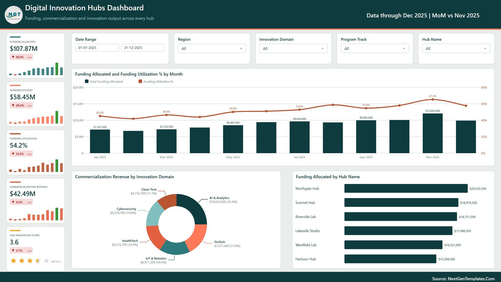
Innovation hubs are easy to fund and hard to report. Money goes out in tranches, prototypes and patents arrive months later, and commercialization revenue arrives later still – so by the time a board asks “what did we get back?”, the answer usually lives in four spreadsheets and one person’s head. The Digital Innovation Hubs Dashboard in Power BI is built to answer that question on one screen. The sample model carries a 500-project portfolio worth $107.87M allocated, $58.45M utilized (54.2% utilization), $42.49M commercialization revenue, 1,276 prototypes, 370 patents and 12,160 participants across six hubs, six innovation domains and five program tracks, all drawn from twelve months of 2025 data. This post walks through what the five pages actually show, where the template is strong, and where it deliberately stops.
Key Features of the Digital Innovation Hubs Dashboard in Power BI
- Five report pages – Digital Innovation Hubs Dashboard, Innovation Trends, Domain & Portfolio Mix, Hub Operations and Ventures & Outcomes.
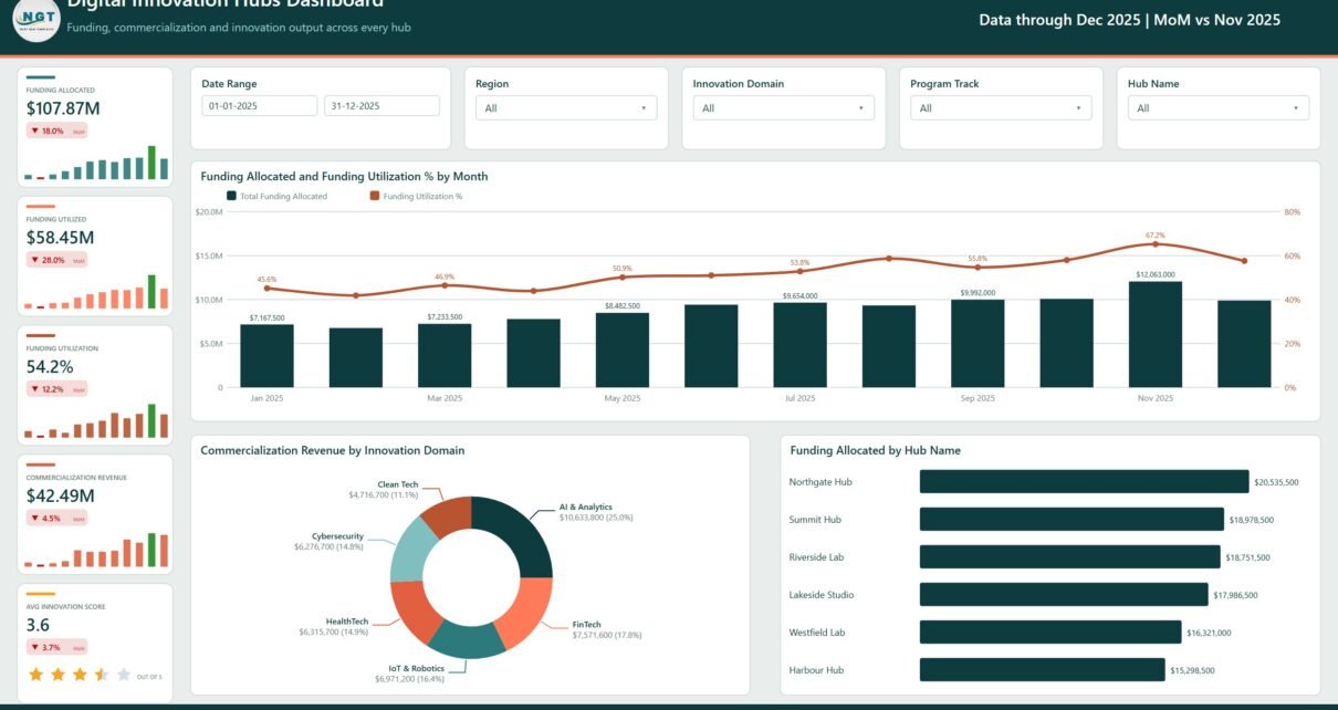
- 25 KPI cards, each carrying a sparkline and a month-on-month change against the prior month (the header reads “Data through Dec 2025 | MoM vs Nov 2025”).
- Five slicers on every page – a Date Range pair plus Region, Innovation Domain and Program Track, with a page-specific fifth: Hub Name, Maturity Stage, Priority or Status.
- A complete funding chain – Funding Allocated, Funding Utilized, Funding Utilization %, Net Innovation Value and Commercialization ROI, all derived from two source columns so they cannot contradict each other.
- Output measures that are not money – prototypes delivered, patents filed, scale-up rate, cost per prototype, participants enrolled, mentor hours and mentor hours per person.
- An Innovation Domain Scorecard pairing projects, funding, revenue and a star-rated average innovation score.
- 500 sample rows across 19 columns, including Venture Partner and Project Lead, so partner-level and owner-level reporting works before you change a thing.
Dashboard Pages Explanation
Page 1 – Digital Innovation Hubs Dashboard
The portfolio summary, subtitled “Funding, commercialization and innovation output across every hub”. Five cards run down the left: Funding Allocated $107.87M, Funding Utilized $58.45M, Funding Utilization 54.2%, Commercialization Revenue $42.49M and Avg Innovation Score 3.6 out of 5. The main visual, Funding Allocated and Funding Utilization % by Month, plots monthly allocation columns against a utilization line that climbs from 45.6% in January to 67.2% in November before easing back. Below it, Commercialization Revenue by Innovation Domain puts AI & Analytics first at $10,633,800 (25.0%), then FinTech $7,571,600 (17.8%), IoT & Robotics $6,971,200 (16.4%), HealthTech $6,315,700 (14.9%), Cybersecurity $6,276,700 (14.8%) and Clean Tech $4,716,700 (11.1%). Funding Allocated by Hub Name ranks the six sites from Northgate Hub at $20,535,500 down to Harbour Hub at $15,298,500 – a spread of only 34%, which is itself a finding.
Page 2 – Innovation Trends
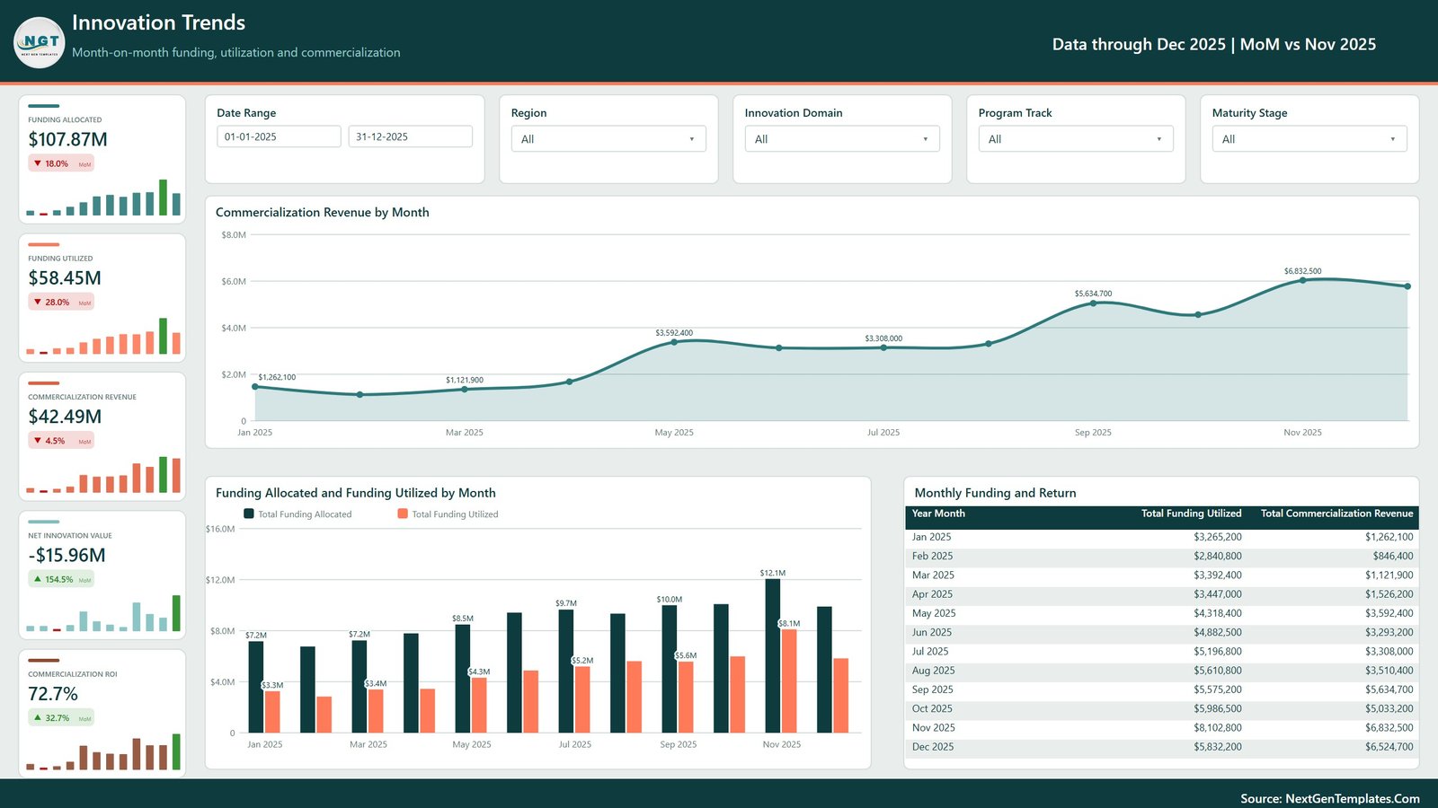
“Month-on-month funding, utilization and commercialization.” The area chart Commercialization Revenue by Month starts at $1,262,100 in January, sits flat through spring, then steps up from September to a $6,832,500 peak in November. A clustered column sets Funding Allocated against Funding Utilized month by month – November is the widest gap at $12.1M against $8.1M – and the Monthly Funding and Return table lists all twelve months so you can read the exact pair rather than eyeball it. The two cards that matter here are Net Innovation Value at -$15.96M and Commercialization ROI at 72.7%. A portfolio that has returned 73 cents per dollar spent is not a failure at this maturity, but a dashboard that hid the negative number would be useless, and this one does not.
Page 3 – Domain & Portfolio Mix
This page swaps money for output: 500 Innovation Projects, 1,276 Prototypes Delivered, 370 Patents Filed, a 20.2% Scale-Up Rate and a $45.8K Cost Per Prototype. Funding Allocated by Program Track splits Acceleration $33,270,000 (30.8%), Corporate Pilot $28,349,000 (26.3%), Incubation $17,539,500 (16.3%), Research Grant $14,619,000 (13.6%) and Prototyping $14,094,000 (13.1%) – so more than half the money sits in the two later-stage tracks. Prototypes Delivered and Patents Filed by Innovation Domain pairs the two counts per domain, from AI & Analytics at 286 prototypes and 85 patents to Cybersecurity at 165 and 50. The page closes with a matrix of Funding Allocated by Maturity Stage and Priority: Pilot carries the largest block at $33,778,000, Ideation the smallest at $18,057,000, each broken into Critical, High, Medium and Low.
Page 4 – Hub Operations
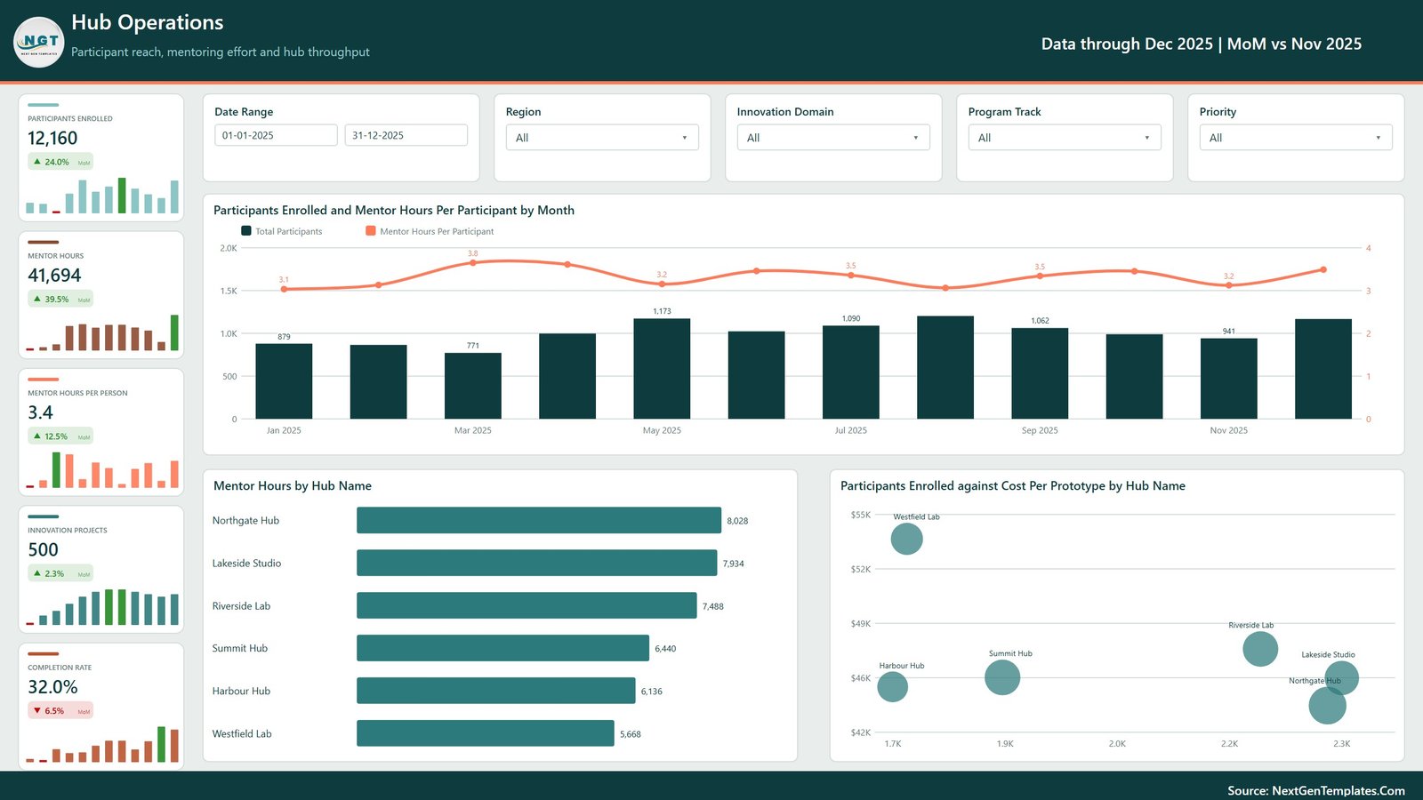
“Participant reach, mentoring effort and hub throughput.” The cards read 12,160 Participants Enrolled (up 24.0% month on month), 41,694 Mentor Hours (up 39.5%), 3.4 Mentor Hours Per Person, 500 Innovation Projects and a 32.0% Completion Rate. Mentor Hours by Hub Name runs Northgate Hub 8,028, Lakeside Studio 7,934, Riverside Lab 7,488, Summit Hub 6,440, Harbour Hub 6,136 and Westfield Lab 5,668. The most useful visual is the last one: Participants Enrolled against Cost Per Prototype by Hub Name, a bubble scatter that isolates Westfield Lab above $54K per prototype on the lowest enrolment of the six, while Northgate and Lakeside cluster near $45K on the highest. That is a conversation the bar charts cannot start.
Page 5 – Ventures & Outcomes
Delivery status and return. Innovation Projects by Status splits the 500 projects into 160 Completed (32.0%), 146 In Progress (29.2%), 124 Pending (24.8%), 37 On Hold (7.4%) and 33 Cancelled (6.6%). Funding Utilized and Commercialization Revenue by Maturity Stage is the page’s sharpest chart: Scale-Up is the only stage returning more than it consumes, at $24,450,100 against $16,746,000, while Ideation returns $771,300 on $9,005,900 utilized. The Innovation Domain Scorecard table then lists all six domains with projects, total funding allocated, an in-cell funding bar, commercialization revenue and a star-rated average innovation score – AI & Analytics 117 projects and $26,224,500, down to Cybersecurity 53 projects and $12,062,500.
Digital Innovation Hubs Dashboard in Power BI vs. Excel vs. Paid Innovation SaaS – Feature Comparison
| This Power BI template | Excel edition | Paid innovation management SaaS | |
|---|---|---|---|
| Cost | $17.99 one time | $17.99 one time | $15,000-$60,000 per year |
| Platform | Power BI Desktop (free, Windows) | Microsoft Excel | Vendor cloud |
| Setup time | 15-30 minutes | 15-30 minutes | 6-16 weeks |
| Real-time team collaboration | Via Power BI Service | Via OneDrive or SharePoint | Built in |
| Mobile access | Power BI mobile app | Excel mobile | Yes |
| Customizable fields | Full – unlocked model | Full | Within vendor limits |
| Share with link | Yes, once published | File share | Yes |
| Year-1 cost at 5 users | $17.99 | $17.99 | $20,000+ |
| Stage-gate approvals | No | No | Yes |
| Idea intake and voting | No | No | Yes |
Who Should Use This Template
Innovation hub and science-park managers who report to a board each quarter. Corporate innovation leads consolidating several accelerator or incubation sites into one view. Regional development and grant-funding agencies that must show output per pound or dollar committed. University technology-transfer offices tracking prototypes, patents and spin-out revenue side by side. And analysts who already maintain a project register in Excel and simply want it read properly rather than rebuilt monthly.
It is not the right tool if you need staff idea submission and voting, formal stage-gate sign-off trails, grant claim processing, or live integration with a finance or CRM system. It is a reporting layer over a project register.
Real-World Use Cases
A six-site science park. The director opens page 2 before every board meeting: $58.45M utilized, $42.49M returned, ROI 72.7%, net -$15.96M. Page 5 then shows the deficit sits in Ideation and Prototype, which reframes it from “we are losing money” to “our portfolio is early”, with the maturity chart as evidence.
A corporate innovation team. Acceleration and Corporate Pilot absorb 57.1% of allocated funding between them. The maturity-and-priority matrix on page 3 shows how much of that is Critical priority, which is the split the CFO asks for and nobody wants to rebuild by hand.
A regional development agency. The analyst slices to one Region and one Program Track, lifts Mentor Hours Per Person, Cost Per Prototype and Scale-Up Rate into the quarterly grant return, and moves on.
Advantages of the Digital Innovation Hubs Dashboard in Power BI
- It shows the uncomfortable number. Net Innovation Value is negative in the sample and the card says so, in green because the trend improved – not hidden because it is unflattering.Digital Innovation Hubs Dashboard in Power BI
- Consistent slicer design. The same four slicers appear in the same place on all five pages, so the mental model transfers instantly.Digital Innovation Hubs Dashboard in Power BI
- Money and output are separated. Pages 1 and 2 are financial, page 3 is output, page 4 is people, page 5 is delivery. Nobody has to hunt.
- Realistic dimensionality. Six hubs, five regions, six domains, five tracks, four maturity stages, four priorities, five statuses and 64 venture partners – enough to prove the visuals survive real cardinality.
- No lock-in. Free Power BI Desktop, an unlocked .pbix, an Excel source file and a user manual PDF in the ZIP.Digital Innovation Hubs Dashboard in Power BI
Opportunities for Improvement
- The data source is a static
Data.xlsx. Teams with a live project system will want to repoint the query at SQL, SharePoint or Dataverse – straightforward, but it is work you do. - There is no target or budget column, so variance-to-plan cannot be shown until you add one.
- Venture Partner and Project Lead exist in the data but get no dedicated page; if partner performance is your main question, you will build that view yourself.
- The month-on-month arrows compare December with November only. A rolling three-month comparison would be steadier for a portfolio this lumpy.
- Power BI Desktop is Windows-only. Mac users should take the Excel edition instead.Digital Innovation Hubs Dashboard in Power BI
Best Practices
- Keep the 19 column headers exactly as shipped when you swap in your own rows – the measures read column names.
- Load one row per project, not per transaction. The cards sum Funding Allocated directly, so duplicate rows double the portfolio.Digital Innovation Hubs Dashboard in Power BI
- Rename dimension values freely. Your hubs, domains and tracks can be called anything; the visuals read the column, not the label.
- Set the Date Range slicer to a closed period before you screenshot anything for a board pack, so the numbers stop moving.
- Refresh after every source change and check one card against a manual total the first time – it takes a minute and it settles trust.
- Publish to the Power BI Service if the board reads on tablets. Microsoft’s Power BI report view documentation covers page layout and publishing options.
Explore Relevant Templates
- Digital Innovation Hubs Dashboard in Excel – the same portfolio model as a workbook.
- Knowledge Transfer Partnerships Dashboard in Power BI – for university-industry collaboration programmes.
- Consciousness Research Labs Dashboard in Power BI – a research-lab take on the same funding-to-output question.
- Quantum Computing Labs Dashboard in Power BI and Machine Learning Labs Dashboard in Power BI – deep-tech lab portfolios.
- Cybersecurity Startups Dashboard in Power BI – when the unit of analysis is a venture rather than a hub.Digital Innovation Hubs Dashboard in Power BI
Frequently Asked Questions
Do I need a paid Power BI licence to use it?
No. Power BI Desktop is free from Microsoft and will open, refresh and edit the .pbix. You only need a Pro or PPU licence if you want to publish the report to the Power BI Service and share it with colleagues.Digital Innovation Hubs Dashboard in Power BI
Can I connect it to my own data?
Yes. Replace the 500 sample rows in Data.xlsx, keep the 19 headers, then use Transform data and Data source settings to point the query at your file and refresh.Digital Innovation Hubs Dashboard in Power BI
What is in the download?
A single ZIP containing the .pbix report, the Data.xlsx source workbook and a Power BI Dashboard user manual PDF.
Are the numbers in the screenshots real?
No. They come from a realistic synthetic dataset of 500 projects built to exercise every visual. Do not quote them as industry benchmarks.Digital Innovation Hubs Dashboard in Power BI
How many pages and KPIs does it have?
Five report pages and 25 KPI cards in total, five per page, each with a sparkline and a month-on-month change.Digital Innovation Hubs Dashboard in Power BI
Does it work on macOS?
Power BI Desktop is Windows-only, so you would need Windows or a VM. On a Mac, use the Excel edition of the same dashboard.Digital Innovation Hubs Dashboard in Power BI
About the Author
Built by PK – Microsoft Certified Professional with 15+ years of Excel, Google Sheets, and Power BI experience. Founder of NextGenTemplates, reaching 300K+ subscribers across YouTube channels. Every template is hand-built and tested before release.Digital Innovation Hubs Dashboard in Power BI
Conclusion
The Digital Innovation Hubs Dashboard in Power BI does one thing well: it connects what a hub network spends to what it produces, across funding, prototypes, patents, participants and commercialization revenue, on five pages that share one slicer layout. It will not run your stage gates or collect ideas from staff, and it says so. But if the recurring question in your board pack is “we allocated $107M – what came back?”, this is a 30-minute answer rather than a month of spreadsheet work.
Digital Innovation Hubs Dashboard in Power BI
Get it here: Digital Innovation Hubs Dashboard in Power BI – $17.99, regularly $29.99, instant download with the .pbix, sample data and user manual.
Digital Innovation Hubs Dashboard in Power BI
For Power BI and Excel walkthroughs, subscribe to youtube.com/@PKAnExcelExpert.