Knowledge Transfer Partnerships Dashboard in Power BI is a ready-to-use reporting template for universities, business engagement teams, innovation offices, grant administrators, and project managers who need clearer KTP portfolio visibility. A single KTP program can involve many moving parts: project counts, total budget, actual spend, grant funding, university partners, business organizations, project stages, milestones, sectors, regions, jobs created, and innovation outputs. When these details stay in different spreadsheets or exports, reporting becomes slow and inconsistent.
This Power BI dashboard brings those signals into 5 report pages, 4 high-level KPI cards, slicers, and focused visuals. You can open the PBIX file in Power BI Desktop, replace the sample source with your own structured data, refresh the report, and use the pages for monthly steering meetings, partner reviews, grant reporting, and innovation impact discussions. You can learn more about Power BI Desktop from Microsoft Learn.
Click here to buy Knowledge Transfer Partnerships Dashboard in Power BI
Knowledge Transfer Partnerships Dashboard in Power BI
Key Features of Knowledge Transfer Partnerships Dashboard in Power BI
- 5 report pages: Overview Page, Funding, Project Flow, Innovation, and Partners.
- 4 executive cards: Total Projects, Total Budget, Total Actual Spend, and Total Grant Funding.
- Interactive slicers: Filter the dashboard quickly by available KTP dimensions during reviews.
- Funding analysis: Review grant funding, funding leverage, budget, actual spend, year, region, project stage, and priority.
- Project flow tracking: Monitor milestone completion by project stage and month.
- Innovation impact: Track innovation outputs by region, organization, and knowledge area.
- Partner reporting: Compare total projects, budgets, university partners, organizations, and jobs created.
- Editable PBIX file: Customize visuals, measures, data connections, labels, and report colors in Power BI Desktop.
Dashboard Pages Explanation
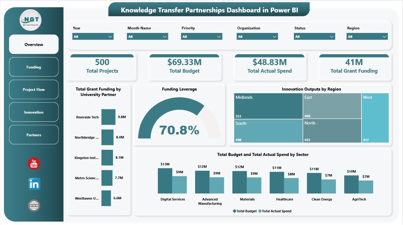
1. Overview Page
The Overview Page gives leadership a fast snapshot of KTP performance. The KPI cards show Total Projects, Total Budget, Total Actual Spend, and Total Grant Funding, making it easier to understand portfolio scale, planned investment, delivered spend, and grant-supported value.
Total Grant Funding by University Partner: This chart compares grant funding across university partners. It helps program teams see which academic institutions are connected with the highest funding value and where partner relationships may need review.
Funding Leverage by Overall Projects: This visual shows how funding leverage relates to the overall project base. It helps leaders understand whether project activity is translating into strong funding leverage.
Innovation Outputs by Region: This chart compares innovation outputs geographically. It supports regional impact reporting and helps identify regions where KTP activity is producing stronger results.
Total Budget and Total Actual Spend by Sector: This comparison shows planned and actual spending across sectors. It helps finance teams and program managers review whether spending aligns with sector priorities.
2. Funding
The Funding page focuses on how investment is allocated and used across the KTP portfolio. Milestone Completion by Project Stage shows stage-level progress, helping managers spot where projects are advancing and where delivery may need support.
Funding Leverage by Region compares leverage across regions and helps identify locations where grant support and partner contribution are working well. Total Grant Funding by Year shows year-by-year movement in grant support. Total Budget and Total Actual Spend by Priority helps teams check whether strategic priorities are being funded and used as expected.
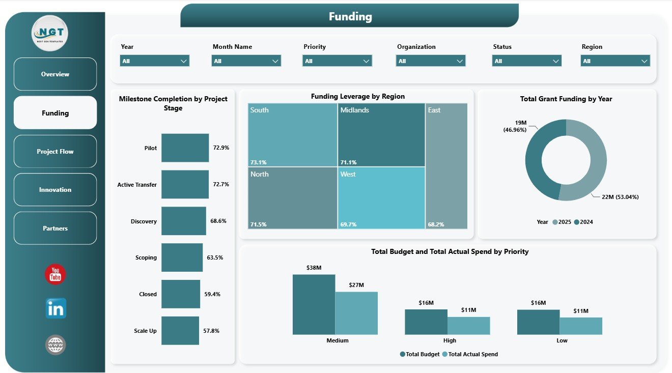
Funding
3. Project Flow
The Project Flow page explains how work is moving through priorities, knowledge areas, and monthly milestones. Innovation Outputs by Knowledge Area shows which knowledge domains are generating the most outputs and where expertise is creating measurable results.
Total Projects by Priority helps leaders understand whether the portfolio is balanced across strategic priorities. Milestone Completion by Month Name tracks monthly completion behavior, making it easier to spot delivery peaks, delays, and follow-up periods.
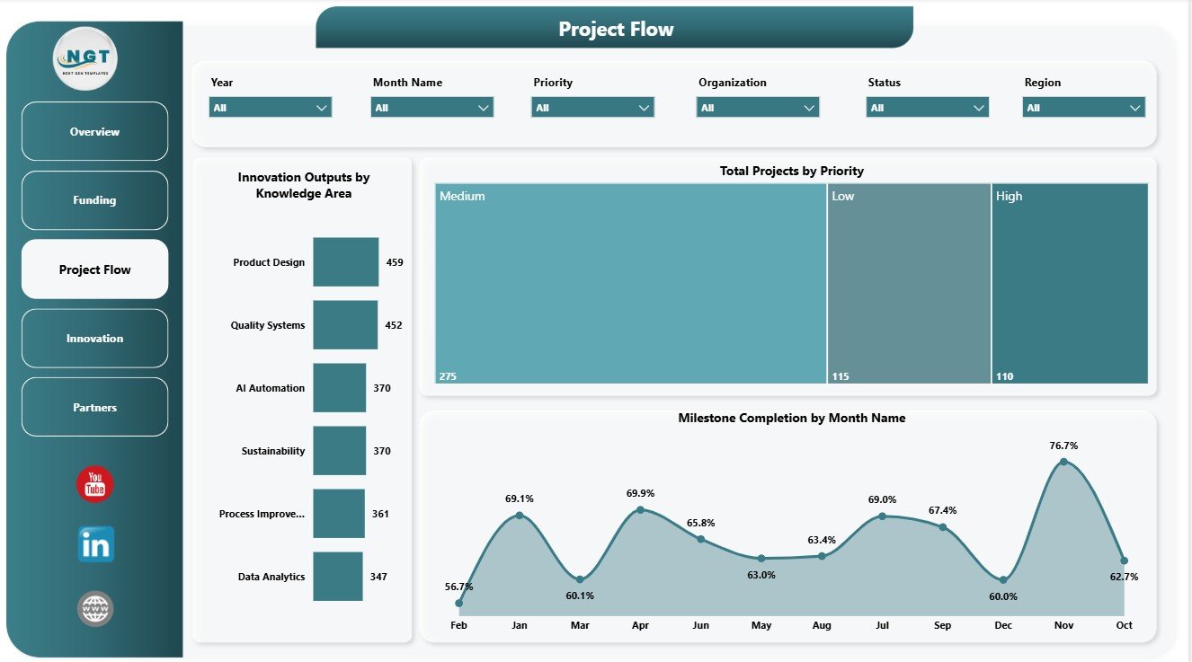
Project Flow
4. Innovation
The Innovation page connects KTP activity with outputs, jobs created, and manager-level budget ownership. Innovation Outputs by Organization compares results across participating organizations and shows which partners are contributing the most output volume.
Jobs Created by Project Stage connects employment impact with project maturity. Total Budget by Project Manager helps review budget responsibility by manager and supports portfolio accountability conversations.
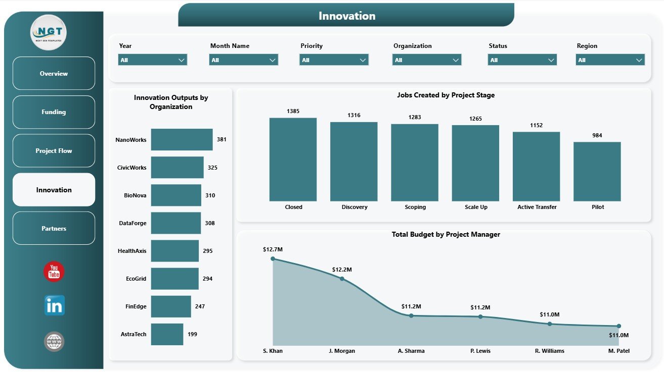
Innovation
5. Partners
The Partners page is useful for relationship management and impact reporting. Total Projects by Region shows where KTP activity is concentrated and helps teams review regional reach.
Total Budget by University Partner compares budget allocation across academic partners. Jobs Created by Organization highlights employment impact by partner organization, which is useful for stakeholder updates and outcome reporting.
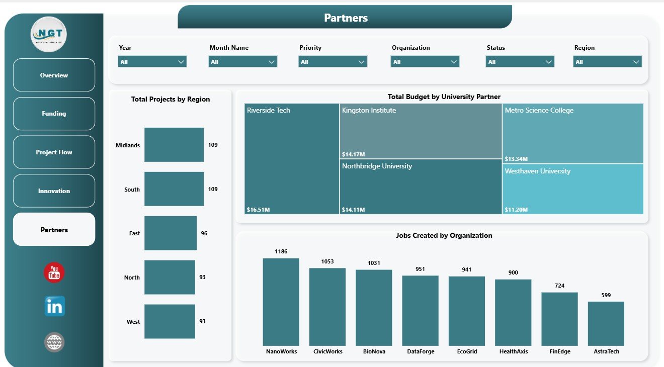
Partners
Knowledge Transfer Partnerships Dashboard in Power BI vs. Tableau vs. Paid CRM/SaaS – Feature Comparison
| Feature | This Power BI dashboard | Tableau alternative | Paid project SaaS |
|---|---|---|---|
| Cost | $17.99 one-time template | License plus dashboard build time | Monthly or annual subscription |
| Platform | Power BI Desktop and Power BI Service | Tableau Desktop or Cloud | Vendor cloud platform |
| Setup time | Open PBIX, replace data, refresh | Build workbook and model | Configuration and onboarding |
| Real-time team collaboration | Possible through Power BI Service | Possible through Tableau Cloud | Usually included by plan |
| Mobile access | Available after publishing to Power BI Service | Available after publishing | Usually browser or app based |
| Customizable fields | Editable model, visuals, slicers, and measures | Editable with Tableau skills | Depends on vendor permissions |
| Share with link | Possible with Power BI permissions | Possible with Tableau permissions | Usually account controlled |
| Year-1 cost at 5 users | $17.99 plus any Microsoft licensing | Usually higher license or development cost | Often hundreds or thousands |
| KTP-specific reporting | Projects, grants, budgets, milestones, outputs, jobs, partners, and regions included | Must be configured | Often not KTP-specific |
Who Should Use This Template
This template is useful for KTP program managers, university partnership offices, business engagement teams, research commercialization groups, grant administrators, innovation portfolio analysts, PMO teams, and consultants supporting university-business collaboration. It works best when the team already has structured data for projects, stages, priorities, sectors, regions, university partners, organizations, project managers, budgets, spend, grant funding, milestone completion, outputs, and jobs created.
It is not a grant application system, CRM, accounting tool, task management platform, contract approval workflow, or live data warehouse. It is a Power BI reporting template designed to help teams analyze and present KTP data.
Real-World Use Cases
Monthly steering review: A KTP manager uses the Overview and Project Flow pages to review total projects, milestone completion, priorities, and delivery movement before a committee meeting.
Partner performance review: A university partnership lead uses the Funding and Partners pages to compare grant funding, budgets, total projects, and jobs created by partner.
Innovation impact reporting: An impact analyst uses the Innovation page to explain outputs by organization, jobs created by stage, and budget responsibility by project manager.
Advantages of Knowledge Transfer Partnerships Dashboard in Power BI
- It brings KTP project, funding, milestone, partner, and innovation metrics into one report.
- It reduces manual dashboard-building time for recurring portfolio reviews.
- It supports leadership reporting with clear KPI cards and page-level analysis.
- It can be customized in Power BI Desktop for local terminology and data sources.
- It is a one-time template purchase, not a recurring dashboard subscription.
Opportunities for Improvement
Advanced users can extend the dashboard by connecting it to a governed data source, adding DAX measures for match funding or return on innovation, creating drill-through pages for individual projects, adding row-level security by partner or region, or publishing it to Power BI Service for scheduled refresh and controlled sharing.
Best Practices
- Keep project names, partner names, sectors, regions, stages, and priorities consistent before refreshing the report.
- Validate Total Projects, Total Budget, Total Actual Spend, and Total Grant Funding after each data update.
- Use slicers during meetings so stakeholders can focus on one region, partner, sector, or priority at a time.
- Review budget and actual spend together, not separately, to avoid misleading funding conversations.
- Document metric definitions so academic, business, finance, and innovation teams use the same language.
Explore Relevant Templates
You may also like Educational NGOs Dashboard in Power BI, Health Project Management Dashboard in Power BI, and Knowledge Hubs Dashboard in Power BI. You can browse more templates in the Power BI Dashboard category.
Frequently Asked Questions
What does the Knowledge Transfer Partnerships Dashboard in Power BI track?
It tracks total projects, total budget, total actual spend, total grant funding, funding leverage, milestones, project stages, priorities, innovation outputs, jobs created, sectors, regions, university partners, organizations, and project managers.
How many pages are included?
The report includes 5 pages: Overview Page, Funding, Project Flow, Innovation, and Partners.
Do I need Power BI Desktop?
Yes. The dashboard is a PBIX file, so you should open and edit it in Power BI Desktop.
Can I connect my own data?
Yes. Replace or connect the sample data with your own KTP dataset and refresh the report.
Can I customize the visuals?
Yes. You can edit fields, chart types, measures, colors, slicers, labels, and page layouts.
Is this a subscription product?
No. It is a downloadable template sold as a one-time purchase on NextGenTemplates.
About the Author
Built by PK – Microsoft Certified Professional with 15+ years of Excel, Google Sheets, and Power BI experience. Founder of NextGenTemplates, reaching 300K+ subscribers across YouTube channels. Every template is hand-built and tested before release.
Conclusion
The Knowledge Transfer Partnerships Dashboard in Power BI gives KTP teams a practical way to review projects, funding, budgets, spend, milestones, outputs, jobs created, regions, sectors, organizations, and university partners from one report. It is especially useful for teams that want a ready Power BI structure instead of starting from a blank canvas.
Visit our YouTube channel to learn step-by-step Excel, Power BI, and dashboard tutorials: Youtube.com/@PKAnExcelExpert.