Organizations want to build a workplace where every employee feels valued, respected, and empowered. Because of this, Diversity & Inclusion (D&I) has become a major priority for HR teams across the world. However, many companies still struggle to measure their true progress toward D&I goals. They use scattered spreadsheets, manual reports, or incomplete surveys that do not show the full picture.
A Diversity & Inclusion Dashboard in Power BI solves this problem. It brings all essential workforce data into one place and transforms it into meaningful insights. As a result, HR managers, business leaders, and DEI specialists can track trends, identify inequalities, and take actions that improve workplace culture.
In this article, you will learn everything about the D&I Dashboard in Power BI, including its structure, features, benefits, best practices, and how it helps organizations drive inclusion with data-driven decisions.
Click to Purchases Diversity & Inclusion Dashboard in Power BI
What Is a Diversity & Inclusion Dashboard in Power BI?
A Diversity & Inclusion Dashboard in Power BI is a visual reporting tool that helps organizations measure important D&I indicators such as gender distribution, age diversity, ethnicity representation, employee satisfaction, promotions, pay equity, and retention. It presents the data in simple charts, intuitive cards, and interactive drill-down pages.
The dashboard uses Power BI’s strong analytics features to convert raw HR data into clear insights. You can filter, compare, analyze, and track workforce patterns across departments, regions, job roles, age groups, and employee types. Therefore, you always stay aware of the strengths and challenges of your D&I programs.
Why Do Companies Need a D&I Dashboard?
Companies focus on diversity and inclusion because it improves collaboration, innovation, productivity, and employee satisfaction. Yet, achieving these results requires accurate tracking. Leaders cannot rely on assumptions. They need real numbers.
A D&I dashboard helps because:
-
It removes guesswork and shows real workforce trends.
-
It reveals hidden gaps in representation, engagement, and pay.
-
It highlights areas where teams need more support.
-
It helps HR teams communicate D&I progress to leadership.
-
It supports strategic decisions with strong data.
When organizations analyze these metrics consistently, they create a workplace where everyone feels included and valued.
Key Features of the Diversity & Inclusion Dashboard in Power BI
Your dashboard contains 5 professionally designed pages, each focused on a specific aspect of workforce diversity and inclusion. Below is a detailed explanation of each page.
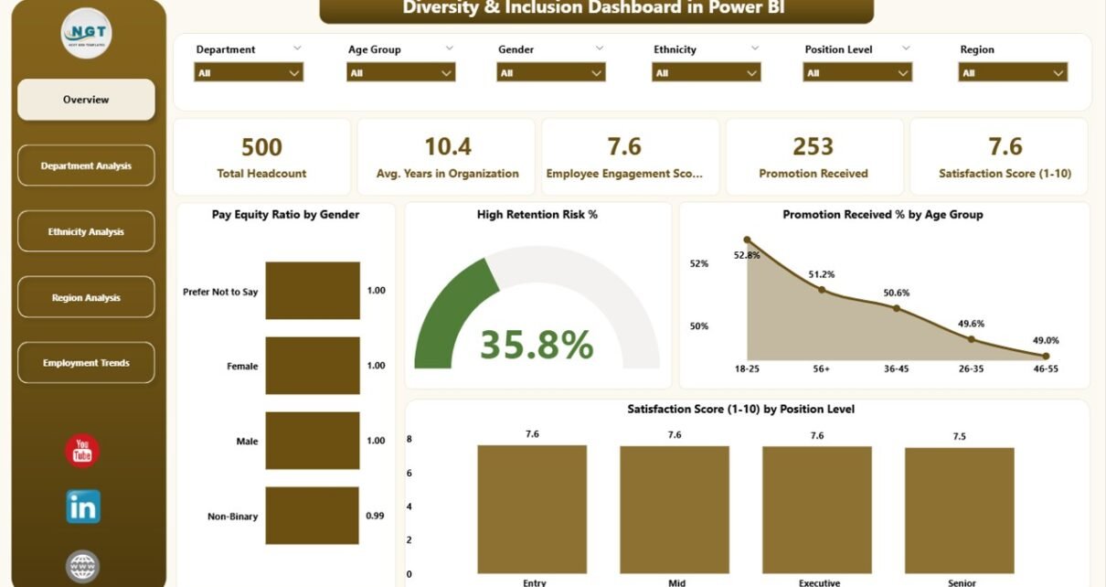
1. Overview Page
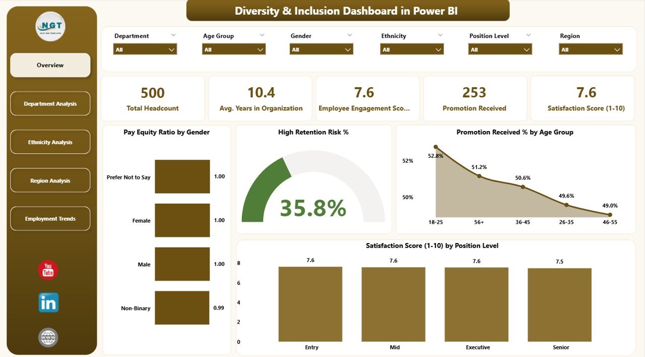
The Overview Page acts as the main entry point. It gives an instant summary of the entire organization’s diversity indicators.
🔹 What You See on This Page
-
Powerful slicers for dynamic filtering
-
5 KPI cards that show the top indicators
-
4 key charts:
-
Pay Equity Ratio by Gender
-
High Retention Risk %
-
Promotion Received % by Age Group
-
Satisfaction Score by Position Level
-
These visuals help leaders understand the overall workplace health. For example, if the pay equity ratio looks unbalanced, HR teams can immediately investigate. If retention risk increases for a certain group, managers can review engagement strategies.
2. Department Analysis Page
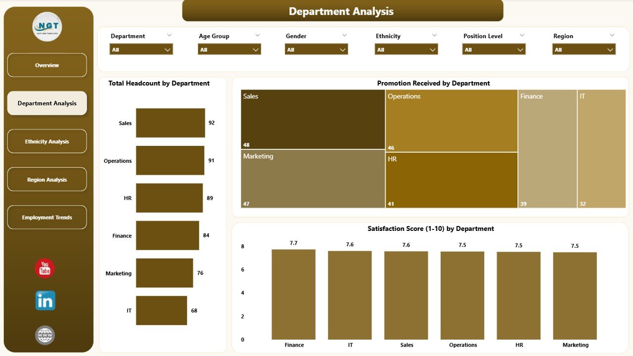
The Department Analysis Page shows how each department performs on key D&I metrics.
🔹 What You See on This Page
-
Slicers to filter departments
-
3 major charts:
-
Total Headcount by Department
-
Promotion Received by Department
-
Satisfaction Score by Department
-
This page helps HR and department heads identify challenges in specific teams. For instance, if one department shows low satisfaction scores, leaders can explore team culture, workload, or leadership style. If another department has low promotion counts, HR can review development programs.
3. Ethnicity Analysis Page
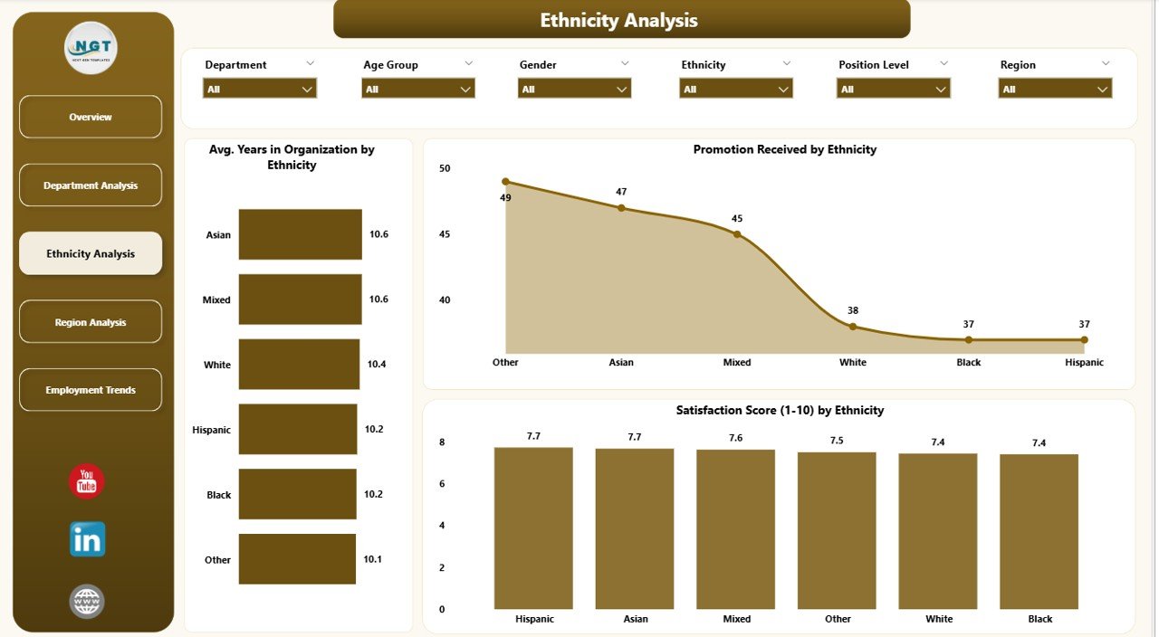
Diversity includes more than gender and age. Ethnicity plays a major role in building an inclusive environment. This page helps organizations track representation and fairness in opportunities.
🔹 What You See on This Page
-
Interactive slicers
-
3 charts:
-
Avg. Years in Organization by Ethnicity
-
Promotion Received by Ethnicity
-
Satisfaction Score by Ethnicity
-
These visuals help identify whether all ethnic groups receive equal growth opportunities. If one group stays longer in the company while another group has lower retention, HR can design targeted engagement strategies.
Click to Purchases Diversity & Inclusion Dashboard in Power BI
4. Region Analysis Page
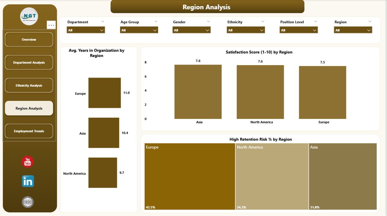
Large organizations work across multiple regions. Each region has different cultures, work environments, and employee expectations. This page shows diversity trends for each location.
🔹 What You See on This Page
-
Region selectors
-
3 charts:
-
Avg. Years in Organization by Region
-
Satisfaction Score by Region
-
High Retention Risk % by Region
-
This helps leaders understand which regions need more support. If one region shows high retention risk and low satisfaction, managers can focus on improving policies, communication, or work culture in that location.
5. Employment Trends Page
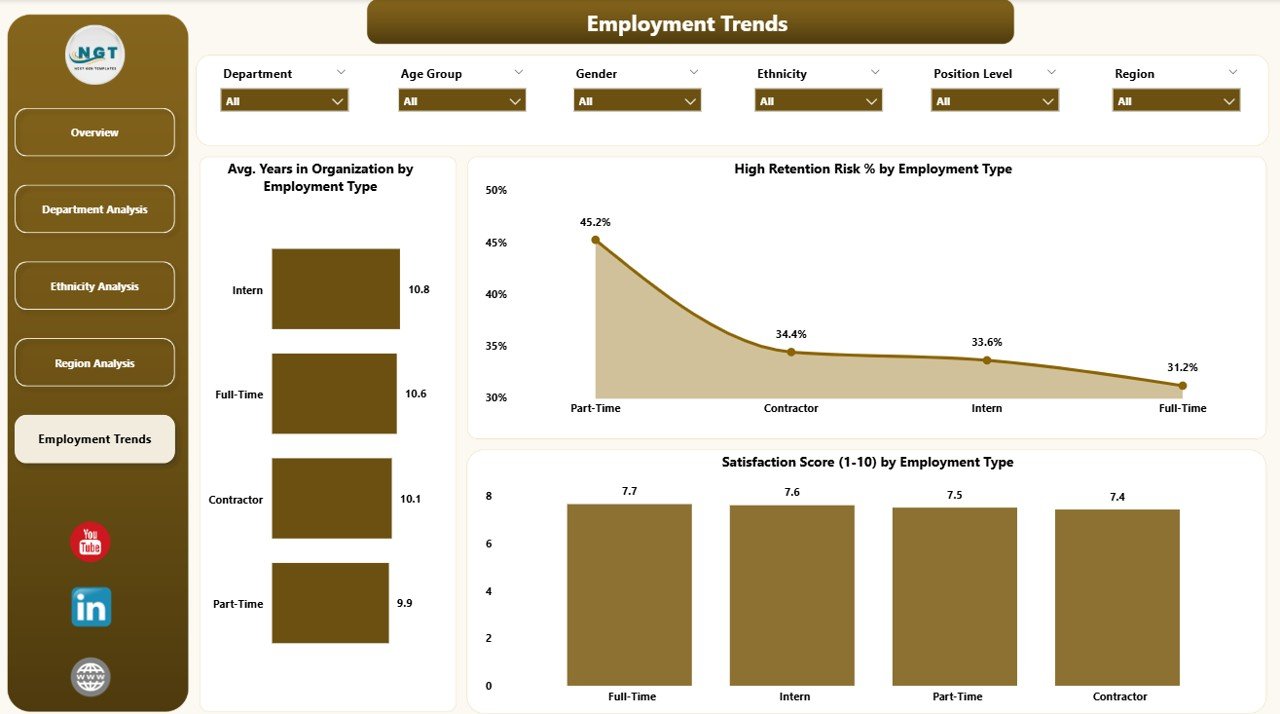
This page displays long-term patterns across months. It helps organizations track whether their D&I initiatives create a real impact over time.
🔹 What You See on This Page
-
Month-based slicers
-
3 trend charts:
-
Avg. Years in Organization by Employee Type
-
Satisfaction Score by Employee Type
-
High Retention Risk % by Employee Type
-
This page helps HR monitor changes over time. For example, if satisfaction increases after new policies, leaders know the actions are working.
Why Is a Power BI-Based D&I Dashboard Better Than Manual Reporting?
Manual reporting creates mistakes, delays, and incomplete analysis. Power BI solves these issues by offering:
✔ Live updates
Your data refreshes instantly after new HR entries.
✔ Interactive visuals
You click, filter, and compare without editing any spreadsheet.
✔ Clear storytelling
Charts, cards, and maps show trends much better than tables.
✔ Secure sharing
You can share the dashboard with leadership or HR teams securely.
✔ Automation
No need to build reports every month. The dashboard updates automatically.
Advantages of Using a Diversity & Inclusion Dashboard in Power BI
Organizations experience major improvements when they use a D&I dashboard. Some of the biggest advantages include:
1. Better Workforce Transparency
You understand representation, satisfaction, and promotion trends clearly.
2. Easy Identification of Inequalities
You see exactly where pay equity, promotions, or satisfaction gaps exist.
3. Stronger Leadership Decisions
Leadership makes better decisions because the dashboard shows accurate workforce data.
4. Higher Employee Engagement
When employees see fairness and representation, engagement rises naturally.
5. Better Retention
Understanding high-risk groups helps HR take action before employees leave.
6. Improved Culture
Teams feel valued because the organization monitors and improves inclusion.
7. Continuous Monitoring
The dashboard helps track the impact of new policies over months.
How to Use the D&I Dashboard Effectively
Using the dashboard becomes easy when you follow simple practices:
✔ Start with the Overview Page
It gives the most important insights quickly.
✔ Use slicers to drill down
Filter by gender, age, region, or department to find details.
✔ Compare trends over months
Monthly analysis shows whether your policies help employees.
✔ Review satisfaction and retention together
These two indicators show culture strength.
✔ Track promotions and pay equity
They show fairness and equal opportunities.
Best Practices for the Diversity & Inclusion Dashboard in Power BI
Click to Purchases Diversity & Inclusion Dashboard in Power BI
To get accurate insights and strong results, use the following best practices:
1. Keep Data Clean and Updated
Update HR data regularly so the dashboard always stays correct.
2. Use Standard Definitions
Define indicators like retention risk, satisfaction score, and leadership level clearly.
3. Review Trends Every Month
Track whether your D&I programs show real progress.
4. Engage Department Leaders
Share department-level insights so each team can improve.
5. Focus on Action-Oriented Insights
Use the dashboard to identify gaps and create improvement plans.
6. Protect Confidential Data
Limit sensitive employee data access to authorized users.
7. Compare Before Making Changes
Analyze historical patterns before launching new HR policies.
Conclusion
A Diversity & Inclusion Dashboard in Power BI helps organizations track, understand, and improve the health of their workforce. It brings clarity to representation, promotions, pay equity, satisfaction, and retention. As a result, leaders make better decisions, HR teams take timely action, and employees feel valued and included.
If your organization wants a fair, transparent, and inclusive workplace, a D&I dashboard becomes an essential tool. It does not only capture data — it guides meaningful action that shapes a stronger future.
Frequently Asked Questions (FAQs)
1. Why do organizations need a D&I Dashboard?
Organizations need a D&I dashboard because it helps them track representation, equality, satisfaction, and retention accurately. It improves decisions and supports fair policies.
2. What KPIs should a Diversity & Inclusion Dashboard track?
Key KPIs include gender distribution, ethnicity mix, satisfaction score, pay equity ratio, promotion rates, retention risk, and average years in the organization.
3. Can HR teams use the dashboard without technical skills?
Yes. Power BI dashboards are user-friendly. HR teams can filter, drill down, and compare data without technical knowledge.
4. How often should companies update the dashboard?
Companies should update the dashboard monthly or weekly, depending on how fast HR data changes.
5. Does the dashboard support compliance reporting?
Yes. It helps organizations maintain transparency and meet diversity reporting standards.
6. Can the dashboard highlight bias in promotions or pay?
Yes. It shows promotion percentages, pay ratios, and representation patterns to identify unequal opportunities.
7. Do small companies need a D&I dashboard?
Yes. Even small teams benefit from clear insights, fairness, and inclusion strategies.
Visit our YouTube channel to learn step-by-step video tutorials