In today’s fast-evolving logistics landscape, drone delivery services no longer remain a futuristic concept. Instead, organizations across e-commerce, healthcare, retail, and last-mile logistics increasingly rely on drones to deliver goods faster, cheaper, and more efficiently. However, managing drone delivery operations without a structured analytics system creates visibility gaps, cost overruns, and operational inefficiencies.
That is exactly where a Drone Delivery Services Dashboard in Power BI becomes a powerful business solution.
This in-depth article explains what a Drone Delivery Services Dashboard in Power BI is, why organizations need it, how it works, its page-wise structure, key features, advantages, best practices, and frequently asked questions. Moreover, the article uses clear language, active voice, strong transitions, and practical explanations to ensure easy understanding and SEO effectiveness.
Click to Purchases Drone Delivery Services Dashboard in Power BI
What Is a Drone Delivery Services Dashboard in Power BI?
A Drone Delivery Services Dashboard in Power BI is a centralized, interactive analytics dashboard designed to monitor, analyze, and optimize drone-based delivery operations using real-time or periodic data.
Instead of reviewing scattered spreadsheets, manual reports, or disconnected systems, this dashboard consolidates operational, financial, customer, and performance metrics into one visual platform. As a result, decision-makers gain instant insights into delivery costs, revenue, profitability, service quality, and operational risks.
Because the dashboard runs on Power BI, users can apply filters, drill down into details, and analyze trends dynamically. Therefore, logistics managers, operations teams, and leadership can make faster and smarter decisions.
Why Do Organizations Need a Drone Delivery Services Dashboard?
Drone delivery operations involve complex variables such as weather conditions, delivery routes, city-wise performance, cost fluctuations, and customer satisfaction. Without analytics, organizations struggle to scale efficiently.
A Drone Delivery Services Dashboard in Power BI helps organizations:
-
Track operational costs and revenue in real time
-
Measure profitability across cities and regions
-
Monitor delivery cancellations and delays
-
Analyze the impact of weather on delivery performance
-
Improve customer satisfaction ratings
-
Optimize monthly and seasonal delivery trends
As a result, organizations improve efficiency, reduce risks, and strengthen competitive advantage.
Click to Purchases Drone Delivery Services Dashboard in Power BI
How Does a Drone Delivery Services Dashboard in Power BI Work?
The dashboard works by connecting Power BI to a structured dataset, usually maintained in Excel, databases, or cloud systems. This dataset contains delivery transactions, cost details, revenue records, customer ratings, weather conditions, and geographic attributes.
Once connected, Power BI transforms raw data into:
-
KPI cards
-
Interactive charts
-
City-wise, region-wise, and time-based insights
-
Dynamic slicers for filtering
Because Power BI updates visuals instantly when filters change, users can analyze scenarios without rebuilding reports. Consequently, operational reviews become faster and more accurate.
Click to Purchases Drone Delivery Services Dashboard in Power BI
What Are the Key Pages in the Drone Delivery Services Dashboard in Power BI?
The Drone Delivery Services Dashboard in Power BI consists of five well-structured analytical pages, each designed for a specific business purpose.
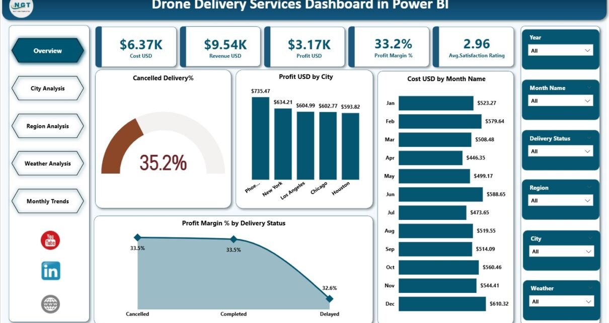
What Does the Overview Page Show?
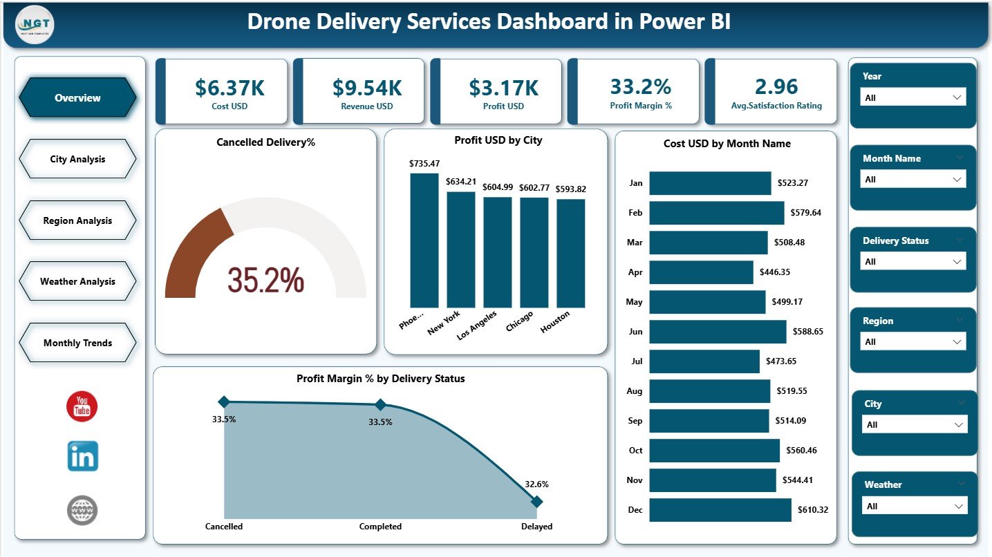
The Overview Page acts as the command center of the dashboard. It provides a high-level snapshot of overall drone delivery performance.
Key KPIs on the Overview Page
The page includes five KPI cards that instantly communicate business health:
-
Cost USD – Total operational cost of drone deliveries
-
Revenue USD – Total revenue generated from deliveries
-
Profit USD – Net profit after deducting costs
-
Profit Margin % – Profitability efficiency indicator
-
Average Satisfaction Rating – Customer experience score
Because these KPIs appear at the top, users immediately understand performance trends.
Key Charts on the Overview Page
The Overview Page also includes four analytical charts:
-
Cancelled Delivery % – Identifies delivery failure rates
-
Profit USD by City – Highlights city-wise profitability
-
Cost USD by Month Name – Tracks monthly cost trends
-
Profit Margin % by Delivery Status – Compares success vs cancellation impact
Together, these visuals enable quick operational reviews and executive-level decisions.
How Does the City Analysis Page Help?
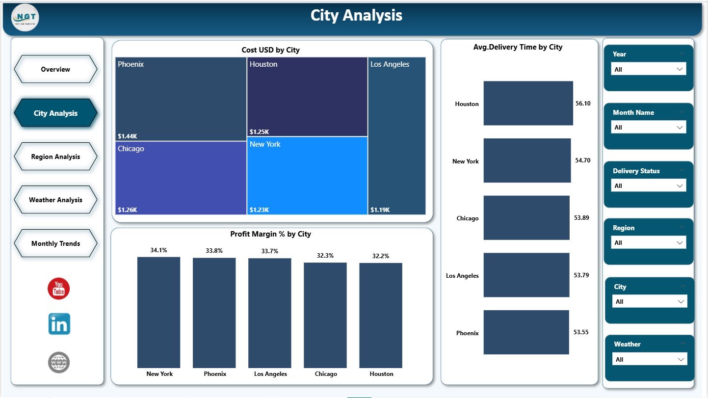
The City Analysis Page focuses on city-level performance insights. Because drone operations vary significantly by location, this page plays a critical role in optimization.
Key Charts on the City Analysis Page
The page includes three powerful charts:
-
Cost USD by City – Identifies high-cost cities
-
Average Delivery Time by City – Highlights efficiency gaps
-
Profit Margin % by City – Compares profitability across locations
As a result, managers can identify underperforming cities, optimize routes, and reallocate resources.
Click to Purchases Drone Delivery Services Dashboard in Power BI
Why Is the Region Analysis Page Important?
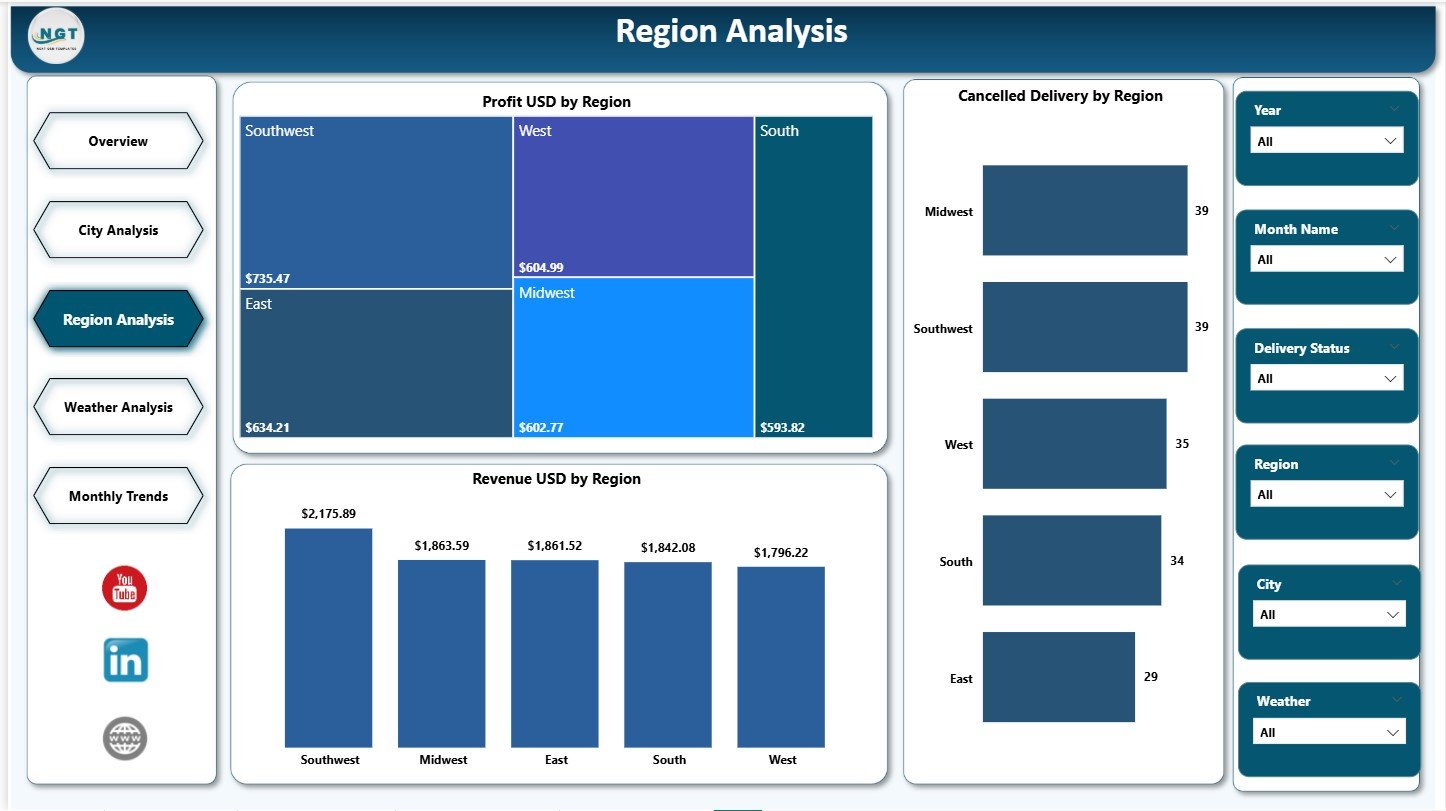
The Region Analysis Page aggregates city-level data into regional insights. This view supports strategic planning and regional investment decisions.
Key Charts on the Region Analysis Page
This page includes three charts:
-
Profit USD by Region – Shows which regions drive profitability
-
Cancelled Delivery % by Region – Identifies risk-prone regions
-
Revenue USD by Region – Highlights revenue concentration
Because regional trends often reflect regulatory, geographic, or infrastructure differences, this page supports long-term strategy.
What Insights Does the Weather Analysis Page Provide?
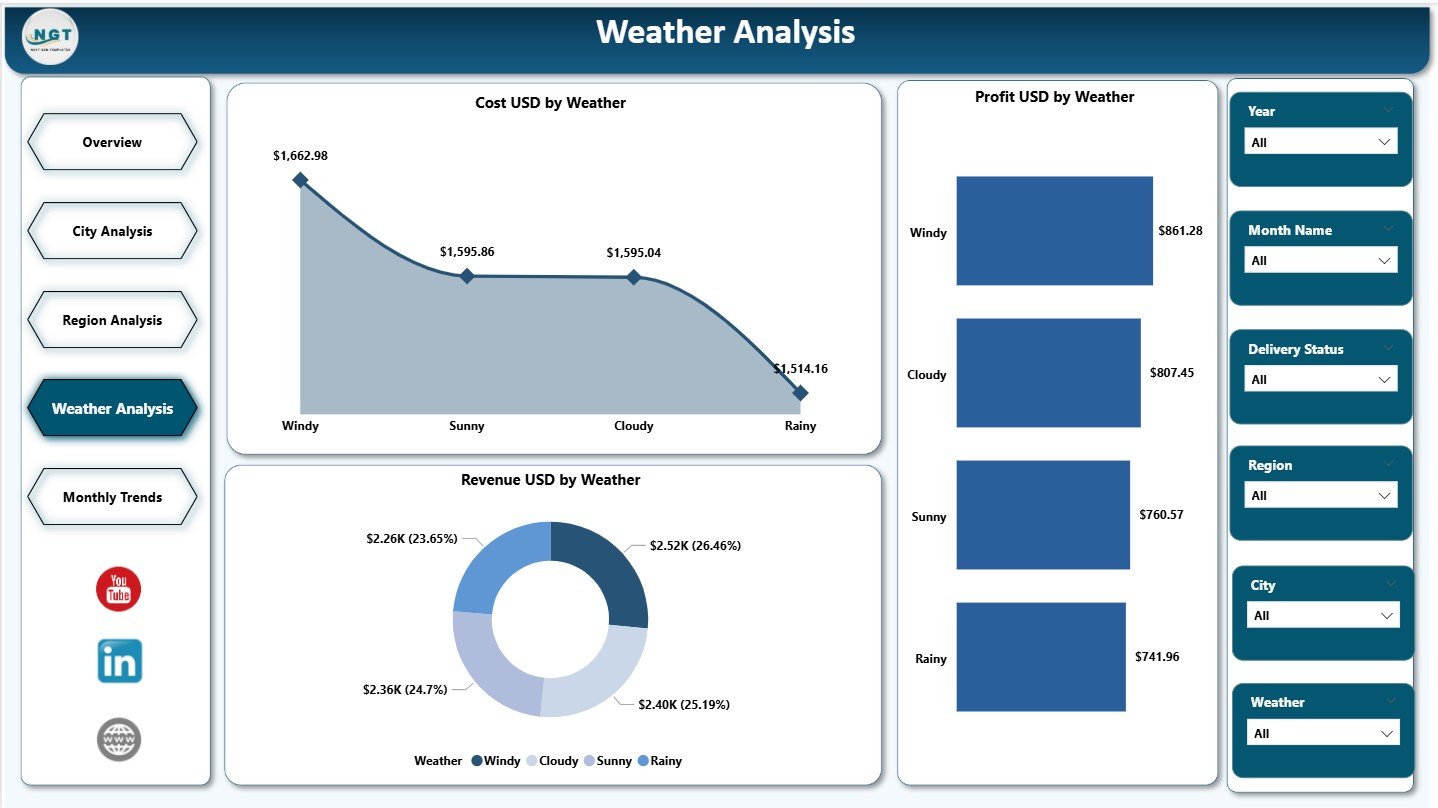
Weather significantly affects drone delivery performance. Therefore, the Weather Analysis Page focuses on understanding weather-based operational impact.
Key Charts on the Weather Analysis Page
This page includes three analytical charts:
-
Cost USD by Weather – Measures operational cost under different weather conditions
-
Profit USD by Weather – Identifies profitable weather scenarios
-
Revenue USD by Weather – Analyzes demand patterns based on weather
With these insights, organizations can improve flight planning, risk management, and contingency strategies.
How Does the Monthly Trends Page Support Planning?
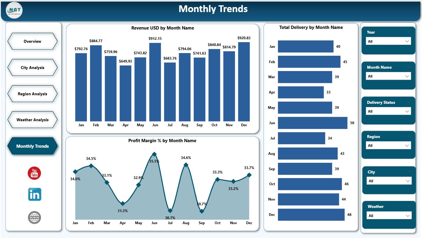
The Monthly Trends Page helps organizations understand seasonality and long-term performance patterns.
Key Charts on the Monthly Trends Page
This page includes three trend-based charts:
-
Revenue USD by Month – Tracks revenue growth or decline
-
Total Deliveries by Month – Monitors volume trends
-
Profit Margin % by Month – Measures efficiency over time
As a result, planners can forecast demand, budget accurately, and align capacity with growth.
Click to Purchases Drone Delivery Services Dashboard in Power BI
What Are the Key Features of the Drone Delivery Services Dashboard in Power BI?
The dashboard includes several powerful features that enhance usability and impact.
Interactive Slicers
Users can filter data by city, region, month, delivery status, or weather conditions.
Real-Time KPI Monitoring
Cards instantly reflect changes based on filters and data updates.
Drill-Down Capability
Users can move from summary insights to detailed views effortlessly.
Consistent Visual Design
Uniform colors and layouts improve readability and professionalism.
Business-Ready Metrics
All KPIs align with real operational and financial goals.
Advantages of Drone Delivery Services Dashboard in Power BI
The dashboard delivers measurable value across operations, finance, and customer experience.
Key Advantages
🚀 Improves decision-making speed and accuracy
📊 Centralizes all drone delivery metrics
💰 Enhances cost and profit visibility
🌍 Enables city and region-wise optimization
🌦️ Reduces weather-related operational risks
⭐ Improves customer satisfaction tracking
📈 Supports scalable growth planning
Because of these advantages, organizations gain stronger control over drone delivery performance.
Click to Purchases Drone Delivery Services Dashboard in Power BI
Who Should Use a Drone Delivery Services Dashboard in Power BI?
This dashboard suits multiple stakeholders across industries.
Ideal Users Include:
-
Logistics and supply chain managers
-
Drone operations teams
-
E-commerce and retail companies
-
Healthcare delivery providers
-
Smart city project teams
-
Business analysts and leadership teams
Each user group benefits from tailored insights without technical complexity.
Best Practices for the Drone Delivery Services Dashboard in Power BI
Following best practices ensures accuracy, adoption, and long-term value.
Data Management Best Practices
-
Maintain clean, validated delivery data
-
Standardize city, region, and weather categories
-
Update data regularly for accurate insights
Dashboard Design Best Practices
-
Keep KPIs visible at the top
-
Use consistent color themes
-
Avoid cluttered visuals
Usage Best Practices
-
Review the dashboard weekly or monthly
-
Combine insights with operational meetings
-
Use trends for forecasting and budgeting
By following these practices, organizations maximize ROI from the dashboard.
Common Challenges and How to Overcome Them
Even advanced dashboards face challenges. However, proactive planning reduces risks.
Data Quality Issues
Solution: Implement data validation rules and automated checks.
Overloading Visuals
Solution: Focus on actionable KPIs and remove unnecessary charts.
Low User Adoption
Solution: Train users and align KPIs with business goals.
How Does This Dashboard Support Future Growth?
As drone delivery networks expand, data complexity increases. This dashboard scales effortlessly by:
-
Adding new cities and regions
-
Integrating IoT or GPS data
-
Connecting real-time data sources
-
Supporting predictive analytics
Therefore, organizations future-proof their drone delivery strategy.
Conclusion
A Drone Delivery Services Dashboard in Power BI transforms drone operations from reactive management to proactive, data-driven control. By centralizing cost, revenue, profit, performance, weather, and customer satisfaction metrics, the dashboard delivers clarity and confidence.
With structured pages such as Overview, City Analysis, Region Analysis, Weather Analysis, and Monthly Trends, organizations gain actionable insights at every level. Moreover, Power BI’s interactivity ensures flexibility, scalability, and ease of use.
Ultimately, this dashboard enables faster decisions, optimized operations, higher profitability, and superior customer experience in modern drone delivery services.
Click to Purchases Drone Delivery Services Dashboard in Power BI
Frequently Asked Questions (FAQs)
What is the main purpose of a Drone Delivery Services Dashboard in Power BI?
The dashboard helps organizations monitor, analyze, and optimize drone delivery operations using visual KPIs and trends.
Can this dashboard work with Excel data?
Yes, Power BI connects seamlessly with Excel files for data input.
Does the dashboard support city-wise and region-wise analysis?
Yes, it includes dedicated City Analysis and Region Analysis pages.
How does weather analysis help drone delivery operations?
Weather insights reduce risks, improve planning, and optimize costs.
Is this dashboard suitable for small businesses?
Yes, both startups and large enterprises can use and scale it easily.
How often should data be updated?
Organizations should update data daily, weekly, or monthly based on operational needs.
Click to Purchases Drone Delivery Services Dashboard in Power BI
Visit our YouTube channel to learn step-by-step video tutorials