Eco-tourism continues to grow rapidly because travelers now care deeply about sustainability, conservation, and responsible travel. Therefore, eco-tourism operators, destination managers, NGOs, and government bodies must track performance with clarity and accuracy. However, managing sustainability metrics, visitor impact, revenue performance, and environmental goals without a structured system often leads to confusion and poor decisions.
That is exactly where an Eco-Tourism KPI Dashboard in Power BI becomes an essential solution.
This detailed and SEO-friendly guide explains what an Eco-Tourism KPI Dashboard in Power BI is, why it matters, how it works, its complete page-wise and data-wise structure, advantages, best practices, challenges, and frequently asked questions. Moreover, this article uses clear language, simple explanations, and practical logic so you can apply it immediately.
What Is an Eco-Tourism KPI Dashboard in Power BI?
An Eco-Tourism KPI Dashboard in Power BI is a ready-to-use, interactive performance tracking system designed to monitor sustainability, operational, and financial KPIs related to eco-tourism initiatives.
Instead of reviewing multiple Excel files, reports, and presentations, this dashboard consolidates all eco-tourism KPIs into one visual interface. As a result, stakeholders gain instant insights into current performance, trends, and gaps.
Because the dashboard uses Power BI with an Excel data source, it remains flexible, scalable, and easy to maintain. Additionally, teams can update data monthly without technical skills.
Why Do Eco-Tourism Organizations Need a KPI Dashboard?
Eco-tourism focuses on sustainability, but sustainability without measurement never works. Therefore, organizations must track performance regularly.
Here is why an Eco-Tourism KPI Dashboard becomes critical:
- Eco-tourism KPIs come from multiple areas such as environment, visitors, revenue, and community impact
- Manual tracking increases errors and delays
- Stakeholders need quick Month-to-Date (MTD) and Year-to-Date (YTD) insights
- Sustainability targets require continuous monitoring
- Decision-makers need visual comparisons with previous years
Consequently, a Power BI KPI dashboard creates clarity, accountability, and transparency.
How Does the Eco-Tourism KPI Dashboard in Power BI Work?
The Eco-Tourism KPI Dashboard works on a simple yet powerful logic. First, users enter actual and target values in Excel. Then, Power BI automatically calculates KPIs, comparisons, and performance indicators.
High-Level Workflow
- Enter KPI data in Excel sheets
- Refresh the Power BI file
- Use slicers to analyze KPIs by month and group
- Review MTD and YTD performance
- Drill through to KPI definitions for clarity
As a result, users save time while improving insight quality.
What Are the Key Pages in the Eco-Tourism KPI Dashboard in Power BI?
This ready-to-use dashboard contains three structured pages, each designed for a specific analytical purpose.
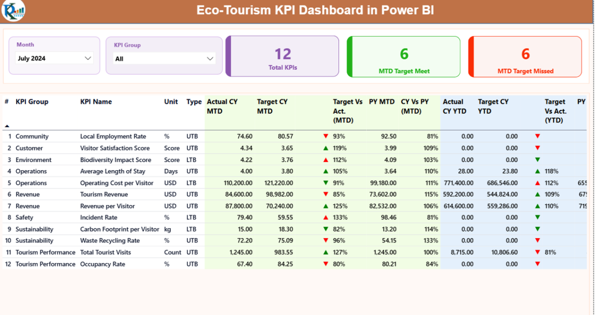
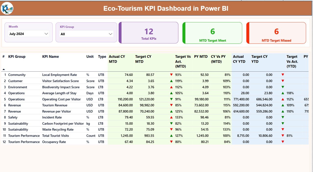
Summary Page: How Does the Main Dashboard Help Decision-Making?
The Summary Page acts as the control center of the Eco-Tourism KPI Dashboard.
Top-Level Slicers
At the top of the page, you see:
- Month slicer – analyze data for a selected month
- KPI Group slicer – filter KPIs by category
Because of these slicers, users can quickly focus on relevant insights.
KPI Cards on the Summary Page
Below the slicers, the dashboard displays three powerful KPI cards:
- Total KPIs Count – shows how many KPIs exist
- MTD Target Met Count – displays KPIs meeting targets
- MTD Target Missed Count – highlights underperforming KPIs
These cards instantly communicate overall performance status.
Detailed KPI Table: What Information Does It Show?
The detailed table provides deep insights into each KPI.
Columns Included in the Table
- KPI Number – unique sequence number
- KPI Group – sustainability, operations, finance, or impact category
- KPI Name – name of the KPI
- Unit – unit of measurement
- Type – LTB (Lower the Better) or UTB (Upper the Better)
MTD Performance Metrics
- Actual CY MTD – current year actual MTD value
- Target CY MTD – target MTD value
MTD Icon –
▲ Green for target met
▼ Red for target missed
Target vs Actual (MTD) – Actual ÷ Target
- PY MTD – previous year MTD value
- CY vs PY (MTD) – CY MTD ÷ PY MTD
These columns help users understand short-term performance clearly.
YTD Performance Metrics
- Actual CY YTD – current year YTD value
- Target CY YTD – target YTD value
- YTD Icon – visual performance indicator
- Target vs Actual (YTD) – Actual ÷ Target
- PY YTD – previous year YTD value
- CY vs PY (YTD) – CY YTD ÷ PY YTD
As a result, stakeholders see long-term trends easily.
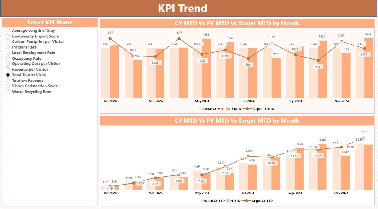
KPI Trend Page: How Can You Analyze Performance Trends?
The KPI Trend Page focuses on visual trend analysis.
Key Features of the KPI Trend Page
- Two combo charts
- Comparison of:
Current Year Actual
Previous Year Actual
Target values
- Separate views for MTD and YTD
KPI Selection Slicer
On the left side, a KPI Name slicer allows users to select a specific KPI. Consequently, trend charts update instantly.
This page helps answer critical questions such as:
- Is the KPI improving month over month?
- Are targets realistic?
- How does current performance compare with last year?
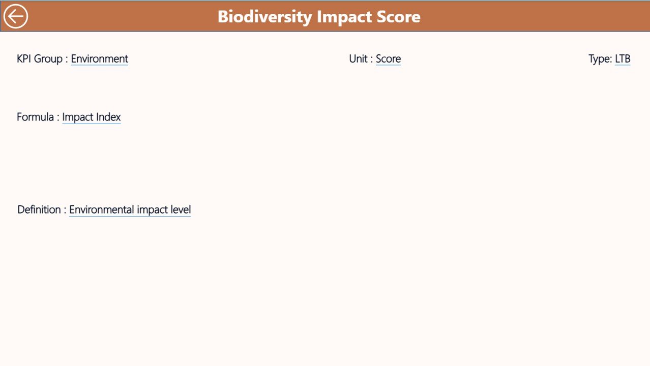
KPI Definition Page: Why Is It Important?
The KPI Definition Page acts as a reference guide.
Key Characteristics
- Hidden by default
- Accessible via drill-through from the Summary Page
- Displays:
KPI Formula
KPI Definition
KPI Logic and intent
A Back button on the top-left corner allows users to return easily.
Because of this page, even non-technical users understand KPIs clearly.
How Is Data Managed in the Eco-Tourism KPI Dashboard?
The dashboard uses an Excel file as its data source, which keeps data management simple and flexible.
Excel Sheet 1: Input_Actual
In this sheet, users enter:
- KPI Name
- Month (use the first date of the month)
- Actual MTD value
- Actual YTD value
Because of structured inputs, Power BI processes data accurately.
Excel Sheet 2: Input_Target
This sheet captures target values:
- KPI Name
- Month (first date of the month)
- Target MTD value
- Target YTD value
As a result, performance comparisons remain consistent.
Excel Sheet 3: KPI Definition
This sheet defines KPI logic:
- KPI Number
- KPI Group
- KPI Name
- Unit
- Formula
- Definition
- Type (LTB or UTB)
This structure ensures transparency and governance.
Advantages of Eco-Tourism KPI Dashboard in Power BI
Using an Eco-Tourism KPI Dashboard delivers measurable benefits.
Key Advantages
- Improved Sustainability Tracking – monitor environmental and social KPIs clearly
- Centralized Performance View – manage all KPIs in one place
- Time Savings – eliminate manual reporting
- Better Decision-Making – use real-time insights
- Transparency & Accountability – align teams with goals
- Early Issue Detection – spot underperforming KPIs quickly
Who Can Use an Eco-Tourism KPI Dashboard?
This dashboard fits multiple stakeholders:
- Eco-tourism operators
- Wildlife reserves and national parks
- Sustainable travel agencies
- NGOs and conservation bodies
- Tourism departments
- Policy makers and planners
Because of its flexible design, organizations of all sizes benefit.
Best Practices for the Eco-Tourism KPI Dashboard in Power BI
To get maximum value, follow these best practices.
- Define Clear KPI Groups
Group KPIs into:
- Environmental impact
- Visitor experience
- Financial sustainability
- Community development
This structure improves analysis clarity.
- Use Consistent KPI Definitions
Always maintain:
- Clear formulas
- Standard units
- Stable KPI logic
As a result, comparisons remain reliable.
- Update Data Regularly
Monthly updates ensure:
- Accurate MTD and YTD insights
- Reliable trend analysis
- Focus on Actionable KPIs
Track KPIs that influence decisions rather than vanity metrics.
- Train Users on Drill-Through
Encourage users to explore KPI definitions to avoid misinterpretation.
Why Power BI Is Ideal for Eco-Tourism KPI Tracking?
Power BI offers:
- Interactive visuals
- Slicer-based filtering
- Drill-through functionality
- Excel integration
- Scalable performance
Therefore, Power BI suits sustainability-focused analytics perfectly.
Conclusion: Why Should You Use an Eco-Tourism KPI Dashboard in Power BI?
An Eco-Tourism KPI Dashboard in Power BI transforms raw sustainability data into meaningful insights. It helps organizations track environmental impact, financial health, and operational performance in one unified platform.
Moreover, this dashboard improves transparency, supports strategic decisions, and strengthens sustainability goals. If you want to manage eco-tourism initiatives professionally, this dashboard becomes a must-have solution.
Frequently Asked Questions (FAQs)
What is the purpose of an Eco-Tourism KPI Dashboard in Power BI?
It tracks sustainability, operational, and financial KPIs to improve eco-tourism performance.
Can non-technical users operate this dashboard?
Yes, because data entry happens in Excel and visuals update automatically.
What does LTB and UTB mean in KPIs?
LTB means Lower the Better, while UTB means Upper the Better.
How often should KPI data be updated?
Monthly updates work best for accurate MTD and YTD analysis.
Can this dashboard scale for large organizations?
Yes, Power BI handles large datasets efficiently.
Does the dashboard support year-over-year comparison?
Yes, it compares Current Year with Previous Year for both MTD and YTD.
Visit our YouTube channel to learn step-by-step video tutorials
Watch the step-by-step video tutorial: