In today’s world of digital transformation and cost optimization, tracking educational investments has become just as important as tracking student progress. Whether you’re running a training department in a corporate organization or managing educational programs at a university, keeping tabs on your cost efficiency is essential. That’s exactly where the Education and Learning Cost Efficiency KPI Dashboard in Excel steps in.
This powerful, easy-to-use Excel-based dashboard helps organizations monitor how effectively they’re spending money on education and training. In this article, we will walk you through everything you need to know—from what this dashboard is, to its structure, advantages, best practices, and FAQs at the end.
Click to Purchases Education and Learning Cost Efficiency KPI Dashboard in Excel
What Is an Education and Learning Cost Efficiency KPI Dashboard?
An Education and Learning Cost Efficiency KPI Dashboard is a dynamic Excel template designed to track Key Performance Indicators (KPIs) related to the cost and efficiency of training or learning activities. It allows you to measure monthly and year-to-date (YTD) performance, set targets, analyze trends, and compare with previous years.
This dashboard empowers organizations to:
-
Cut unnecessary training costs
-
Optimize resources
-
Make informed decisions using clear visual reports
What Does This Excel Dashboard Include?
This dashboard comes with 7 thoughtfully designed worksheets, each playing a crucial role in organizing and analyzing your KPI data.
Home Sheet

The home sheet is your navigation hub. It features six buttons that let you jump directly to specific sections of the dashboard. It creates a smooth and organized user experience, especially useful for non-technical users.
Dashboard Sheet

This is the heart of the tool. With just a drop-down (located at cell D3), you can select any month, and instantly the entire dashboard updates with:
-
MTD (Month-to-Date) and YTD actuals
-
Comparison against Targets
-
Previous Year’s performance
-
Visual indicators (conditional formatting) using up/down arrows for trend analysis
This feature-rich view enables quick and confident decision-making.
Click to Purchases Education and Learning Cost Efficiency KPI Dashboard in Excel
KPI Trend Sheet
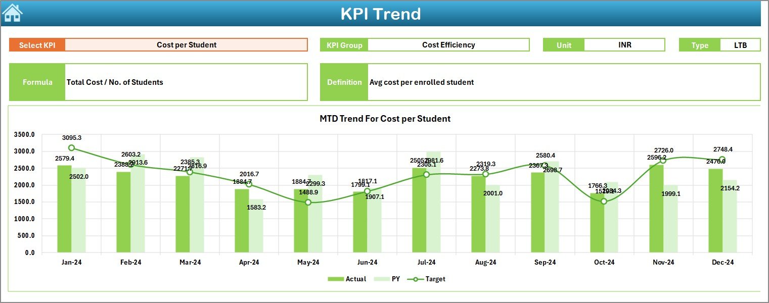
Here’s where the dashboard shows its magic! This tab allows you to:
-
Select a specific KPI from the drop-down
-
View detailed metadata like KPI Group, Unit, Type (Lower the Better or Upper the Better), and Formula
-
Visualize MTD and YTD trends over the year with well-designed charts
It not only tracks data but tells a story.
Actual Numbers Input Sheet

In this tab, you manually enter your MTD and YTD numbers. All you have to do is select the starting month in cell E1, and the sheet configures the monthly layout for the entire year. It’s structured for smooth monthly updates.
Target Sheet

This sheet lets you set your monthly goals. You enter both MTD and YTD targets for each KPI, allowing for straightforward performance benchmarking.
Previous Year Number Sheet

This section is crucial for year-over-year comparisons. Simply plug in your historical MTD and YTD data to evaluate long-term performance and improvements.
KPI Definition Sheet
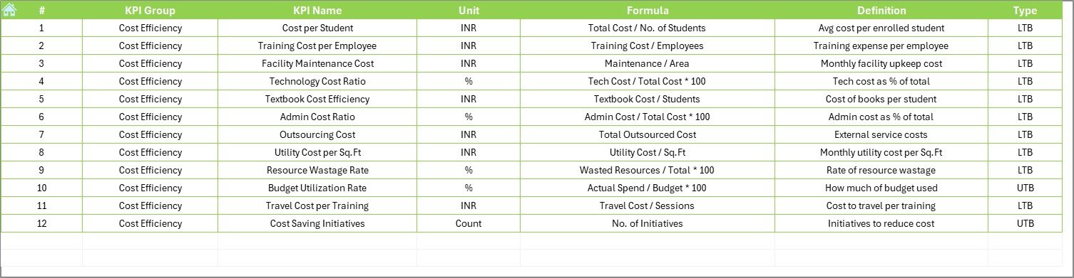
Every KPI needs clarity. This sheet defines:
-
KPI Name
-
KPI Group
-
Unit
-
Formula
-
A short and simple definition
It ensures everyone in your team interprets each KPI correctly.
Click to Purchases Education and Learning Cost Efficiency KPI Dashboard in Excel
Advantages of Using an Education and Learning Cost Efficiency KPI Dashboard
Using this dashboard unlocks a host of benefits:
✅ Transparency in Training Spend
You get a clear picture of where your learning budget is going and whether it’s being used effectively.
✅ Data-Driven Decisions
Instead of relying on guesswork, you can back your decisions with actual performance metrics and trend data.
✅ Better Resource Allocation
Monitor classroom usage, trainer hours, and material efficiency to optimize how you utilize resources.
✅ Budget Control
It becomes easier to spot overspending or underspending and take timely corrective actions.
✅ Performance Benchmarking
Compare against targets and previous years to track progress, spot patterns, and improve forecasting.
Best Practices for Using This KPI Dashboard
To get the most out of your Education and Learning Cost Efficiency KPI Dashboard, follow these best practices:
1. Update Monthly Without Fail
Consistency is key. Make it a habit to input MTD and YTD numbers monthly. This habit keeps trends clear and helps in accurate forecasting.
2. Use Historical Data Wisely
Compare with last year’s numbers to track long-term progress. Keep your “Previous Year Number” sheet up to date.
3. Set Realistic and Data-Driven Targets
While ambition is good, your targets should reflect achievable benchmarks based on past performance.
4. Review KPI Definitions Regularly
Ensure everyone understands what each KPI means. Misinterpretation can lead to poor decision-making.
5. Visualize and Present
Use the charts on the trend sheet to present performance to leadership. Visuals tell a story numbers alone cannot.
Realistic Example: How It Works
Let’s say your “Cost per Learner” in Jan 2024 is ₹100 and your target is ₹90. The dashboard will show this variance clearly, and the conditional formatting arrow will point down, signaling a need to reduce the cost.
By Jun 2024, if your Cost per Learner reduces to ₹85, the arrow will point upward (if UTB) or green (if improving), signaling efficiency gains.
Over time, you’ll see how changes in training methods, delivery platforms (like switching to e-learning), or batch sizes are impacting cost efficiency.
Why Excel Is a Great Tool for This Dashboard
You might wonder—why not use Power BI or Google Data Studio? Here’s why Excel remains a favorite:
-
It’s widely available and familiar
-
It doesn’t require internet access
-
It’s flexible and customizable
-
No special training is needed to use it
-
Supports advanced functions like conditional formatting, drop-downs, and formulas
So, whether you’re a training manager, a school admin, or a corporate HR leader, this Excel dashboard is your go-to tool for tracking training cost effectiveness.
Conclusion
Managing educational costs without compromising quality is a balancing act. The Education and Learning Cost Efficiency KPI Dashboard in Excel helps you find that balance. By tracking relevant KPIs, analyzing trends, and making comparisons, you can ensure your training investments deliver maximum impact at minimum cost.
Frequently Asked Questions (FAQs)
Q1: What is the purpose of the Education and Learning Cost Efficiency KPI Dashboard?
Answer: This dashboard helps organizations track training and education-related expenses, measure efficiency, and identify cost-saving opportunities—all in one place using Excel.
Q2: Can I customize the KPIs in the dashboard?
Answer: Absolutely! You can edit the KPI Definition sheet to add, remove, or modify any KPI based on your organization’s needs.
Q3: Is this dashboard suitable for small institutions?
Answer: Yes. Whether you’re a school, a training startup, or a large university, this dashboard scales easily and works for any size.
Q4: Do I need advanced Excel skills to use this?
Answer: No, the dashboard is designed for users with basic Excel knowledge. Drop-downs, charts, and input sheets make it easy to use.
Q5: Can I use this dashboard for remote learning analytics?
Answer: Yes! KPIs like “E-learning Access Rate” and “Digital Training Cost Ratio” are especially relevant for tracking remote or digital learning.
Visit our YouTube channel to learn step-by-step video tutorials
Click to Purchases Education and Learning Cost Efficiency KPI Dashboard in Excel
Watch the step-by-step video tutorial: