In the evolving world of education, institutions and training organizations must track performance, growth, and expansion metrics effectively. One powerful way to do this is through a KPI Dashboard built in Microsoft Excel. This tool provides a clear snapshot of how well your educational programs are growing and reaching new markets. Whether you’re an education administrator, private coach, or institution owner, the Education and Learning Market Expansion KPI Dashboard is the game-changing tool you need to stay ahead.
Let’s explore everything about this dashboard—from its structure and functionality to best practices and common questions.
Click to Purchases Education and Learning Market Expansion KPI Dashboard in Excel
What is an Education and Learning Market Expansion KPI Dashboard?
A KPI (Key Performance Indicator) Dashboard is a visual reporting tool that helps you monitor the most important metrics related to your education business. When you aim to expand in new markets, launch new courses, or track enrollment and learner engagement, this dashboard serves as your command center.
With Excel, you don’t need to invest in expensive software. You can manage everything from MTD (Month-to-Date) and YTD (Year-to-Date) performance to previous year comparisons—all in a single, dynamic dashboard.
Dashboard Structure: What’s Inside This Excel File?
This template contains 7 fully-functional worksheets, each playing a unique role:
Home Sheet – Your Quick Navigation Panel
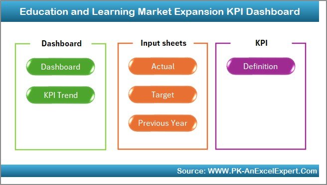
The Home sheet acts as the dashboard’s control room. It includes 6 navigation buttons that allow you to jump instantly to other worksheet tabs. Think of it as your personal remote control—saving time and boosting efficiency.
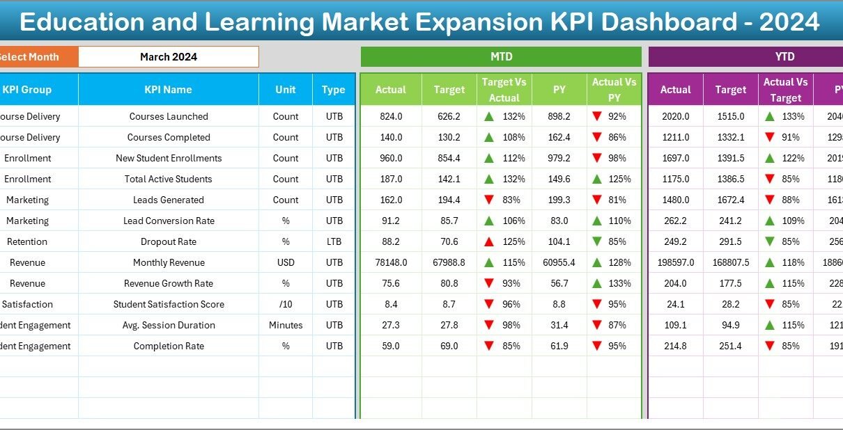
Dashboard Sheet – Real-Time KPI Visualization
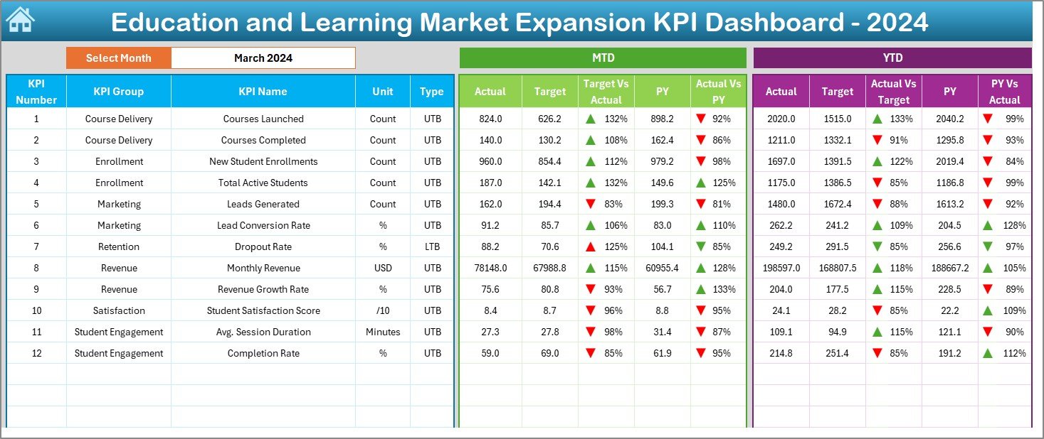
This is where the magic happens. You can select the month from a drop-down menu in cell D3, and the dashboard instantly updates.
It shows:
Click to Purchases Education and Learning Market Expansion KPI Dashboard in Excel
-
MTD Actual, Target, and Previous Year Data
-
YTD Actual, Target, and Previous Year Data
-
Conditional formatting with arrows indicating performance trends
This visual clarity makes it easy to understand if you’re on track or need to refocus efforts.
KPI Trend Sheet – Deep Dive into Trends
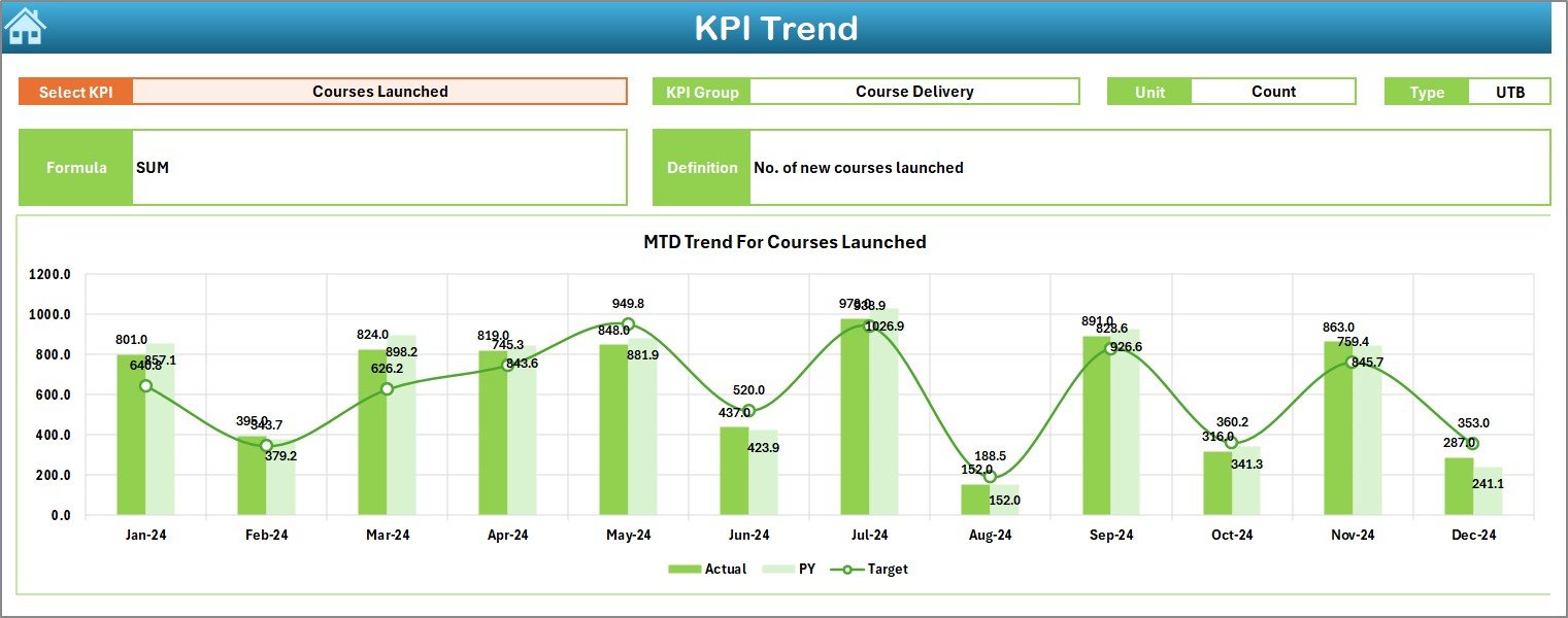
Want to see how a particular KPI is performing month-over-month?
-
Simply select the KPI name from the drop-down in cell C3
-
View its MTD and YTD performance trends over time
-
Access KPI Group, Unit, Type (UTB or LTB), Formula, and Definition
This allows for deep, data-driven decision-making.
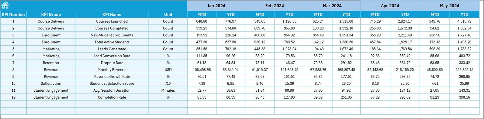
Actual Numbers Input Sheet – Your Monthly Data Entry Hub
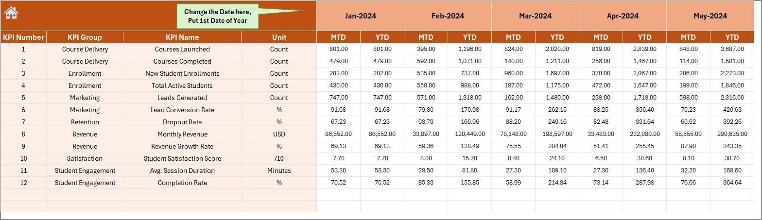
This sheet helps you log monthly actual values for MTD and YTD.
-
You choose the first month of the year in cell E1
-
Enter the actual performance figures for each KPI
This sheet fuels the entire dashboard and keeps your data current.
Target Sheet – Set Your Goals
Use this tab to define your MTD and YTD targets for each KPI across all months.
It helps teams stay aligned by providing clear performance expectations—month by month.
Click to Purchases Education and Learning Market Expansion KPI Dashboard in Excel
Previous Year Numbers Sheet – Track the Past
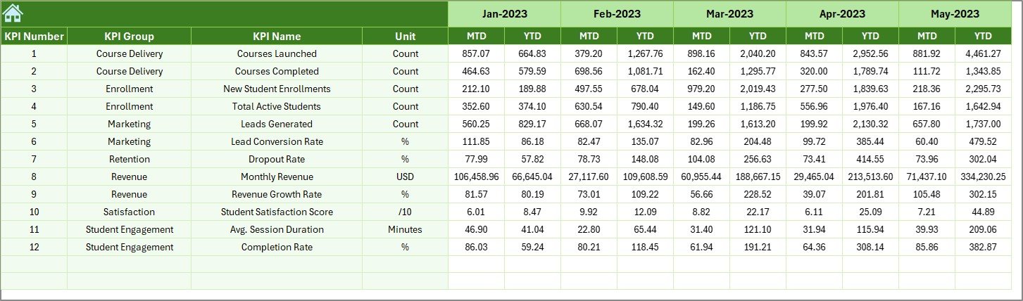
This tab is for entering last year’s values for every KPI.
Why is this helpful?
-
It allows you to track growth, seasonality, and improvement year over year.
-
Enables powerful comparisons in the Dashboard and Trend tabs.
KPI Definition Sheet – Know Your Metrics
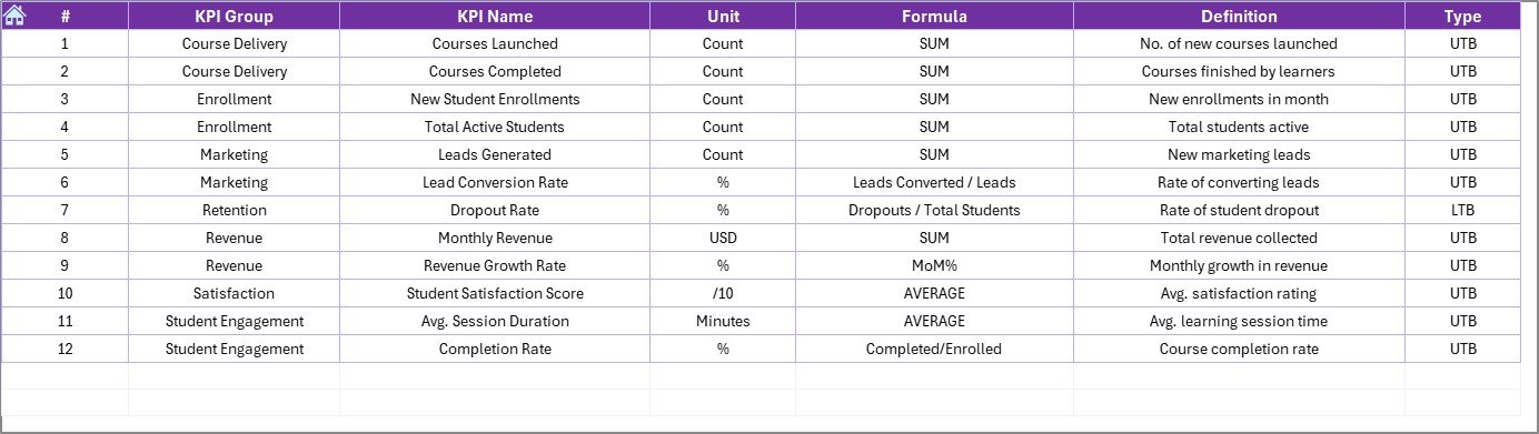
Here, you’ll find a well-organized reference sheet for:
-
KPI Name
-
KPI Group
-
Unit of Measure
-
Formula
-
Definition
-
Type (LTB or UTB)
This sheet ensures your team understands each KPI and how it’s calculated.
Advantages of Using This Dashboard
1. Centralized Monitoring
Everything is in one place. No more scattered Excel files or messy spreadsheets.
2. Dynamic and Interactive
Drop-downs, conditional formatting, and charts make it intuitive to explore performance.
3. Cost-Effective
Built in Excel—no need for expensive software or complicated setup.
4. Real-Time Insights
Just update the data sheets, and the dashboard reflects real-time performance.
5. Easy Customization
You can add KPIs, change units, or expand columns—all within Excel.
Click to Purchases Education and Learning Market Expansion KPI Dashboard in Excel
Best Practices for Using the KPI Dashboard
To get the most out of your Education and Learning Market Expansion KPI Dashboard, follow these best practices:
✔ 1. Update Data Regularly
Ensure you enter MTD and YTD data at the end of each month to maintain accuracy.
✔ 2. Define Clear KPIs
Use the KPI Definition tab to document what each KPI means, how it’s measured, and its importance.
✔ 3. Align KPIs with Business Goals
Ensure your KPIs relate directly to your objectives, whether that’s increasing enrollments, reaching new regions, or improving retention.
✔ 4. Use the Dashboard for Team Reviews
During monthly or quarterly reviews, use the dashboard as your visual reporting tool.
✔ 5. Keep It Simple
Don’t overload the dashboard with too many KPIs. Focus on the 10–15 metrics that truly matter.
How This Dashboard Drives Growth
When expanding into new markets, it’s not enough to guess what’s working. You need real data, actionable insights, and visual clarity. This dashboard gives you just that.
By comparing current performance with targets and past results, you can:
-
Adjust your marketing strategies
-
Reallocate resources
-
Reassess course offerings
-
Identify successful campaigns or locations
-
Optimize training or support functions
Who Can Use This Dashboard?
This KPI Dashboard is ideal for:
-
Educational Institutions
-
Online Course Creators
-
Tutoring Centers
-
Corporate Training Teams
-
EdTech Startups
-
Franchise-Based Learning Models
Basically, if you’re expanding educational services across regions, audiences, or delivery formats—this tool is for you.
How to Customize the Dashboard for Your Needs
While the template is ready-to-use, you can personalize it by:
🔹 Adding New KPIs
Go to the KPI Definition Sheet and add your new metrics with the unit, formula, and description.
🔹 Changing Time Periods
Although it uses monthly data, you can modify it for weekly or quarterly KPIs.
🔹 Formatting for Branding
Update color schemes, add your institution logo, or adjust fonts to match your style.
🔹 Creating Additional Charts
Use pivot charts to create more visuals—such as location-wise expansion or performance by age group.
Why Excel Over Other Tools?
You might wonder—why use Excel instead of Power BI or Google Data Studio?
Here’s why Excel still shines:
✅ It’s widely available and familiar to most users
✅ No internet dependency—works offline
✅ Easy to share and export
✅ Flexible and customizable
✅ Lower learning curve for non-technical users
Conclusion
The Education and Learning Market Expansion KPI Dashboard in Excel is more than just a reporting tool—it’s your data partner. With dynamic sheets, clear visuals, and easy navigation, you can monitor progress, make faster decisions, and stay on track with your growth goals.
Whether you’re expanding across cities, launching new digital programs, or boosting enrollment numbers, this Excel dashboard helps you see the full picture without the tech overwhelm.
Frequently Asked Questions (FAQs)
1. Can I use this dashboard if I have limited Excel knowledge?
Yes! It’s beginner-friendly. You just need to update a few sheets with your data, and the dashboard updates automatically.
2. Can I add more KPIs to the template?
Absolutely. Just head over to the KPI Definition tab and add your new KPIs, then include them in your data entry sheets.
3. What does MTD and YTD mean?
-
MTD (Month-to-Date): Performance measured from the start of the current month until today.
-
YTD (Year-to-Date): Performance measured from the start of the year until today.
4. Is this dashboard suitable for online course creators?
Yes! Online educators can track student enrollments, satisfaction, course completion rates, and much more.
5. Can I track previous year comparisons in this dashboard?
Yes. There is a dedicated sheet to input last year’s data, which is then used for comparison across charts.
6. Is this Excel dashboard compatible with Google Sheets?
The dashboard uses features like drop-downs and conditional formatting that work best in Excel. Some elements may not work properly in Google Sheets.
Visit our YouTube channel to learn step-by-step video tutorials
Click to Purchases Education and Learning Market Expansion KPI Dashboard in Excel