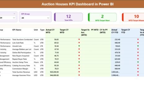
In today’s energy-driven economy, electricity distribution companies rely on timely insights to manage operations, track efficiency, and ensure service reliability. Managing such a vast amount of performance data manually is time-consuming and prone to errors. That’s why an Electricity Distribution KPI Dashboard in Power BI becomes a game-changer — empowering utility managers to visualize real-time performance metrics, detect inefficiencies, and make data-driven decisions with ease.
This article explores every aspect of this professional Power BI dashboard — including its structure, pages, data sources, key benefits, and best practices.
Click to Purchases Electricity Distribution KPI Dashboard in Power BI
What Is an Electricity Distribution KPI Dashboard?
An Electricity Distribution KPI Dashboard is an interactive Power BI solution that consolidates all key performance indicators (KPIs) related to electricity distribution into one visual interface. It offers a single source of truth for analyzing network efficiency, load distribution, downtime, power losses, and operational effectiveness.
Built on Microsoft Power BI, this dashboard pulls data directly from an Excel data source. It provides Month-to-Date (MTD) and Year-to-Date (YTD) views, allowing managers to track progress, compare results against targets, and monitor year-over-year performance trends — all without complex manual reporting.
This tool is ideal for:
-
Electricity boards
-
Utility distribution companies
-
Power grid operators
-
Energy management departments
-
Infrastructure monitoring teams
Key Features of the Electricity Distribution KPI Dashboard
This dashboard includes three interactive pages and uses Excel data as the backend. Each page serves a specific analytical purpose.
1. Summary Page

The Summary Page acts as the main dashboard interface — providing a snapshot of key metrics and real-time KPI performance.
📊 Highlights of the Summary Page:
Dynamic Slicers:
- Month slicer to filter data by specific months.
- KPI Group slicer to focus on particular operational areas (e.g., reliability, losses, revenue, etc.).
Performance Cards:
Displays three crucial indicators at the top:
- Total KPIs Count
- MTD Target Met Count
- MTD Target Missed Count
These cards help managers instantly understand how many metrics are meeting or missing targets.
🔹 2. KPI Trend Page

The KPI Trend Page dives deeper into historical analysis and trend tracking for both MTD and YTD metrics.
🧠 What You Can Do Here:
-
Use a KPI Name Slicer on the left to select specific KPIs.
View two combo charts that display:
- Actual vs Target vs Previous Year (MTD)
- Actual vs Target vs Previous Year (YTD)
These visuals make it easy to evaluate how each KPI is evolving over time. You can identify whether trends are improving, stagnating, or declining — all at a glance.
Power BI’s interactive nature allows users to hover, drill, and cross-filter to analyze the performance of individual KPIs within seconds.
Click to Purchases Electricity Distribution KPI Dashboard in Power BI
3. KPI Definition Page

The KPI Definition Page is a hidden, drill-through page — designed for in-depth metric explanation.
When users right-click on a KPI in the Summary Page and choose “Drill Through,” this page opens to show:
-
KPI Number
-
KPI Group
-
KPI Name
-
Formula
-
Definition
-
Type (LTB or UTB)
This feature ensures that every KPI remains transparent, standardized, and well-defined across the organization.
To navigate back to the Summary Page, users simply click the Back button at the top left corner.
Data Source: Excel Integration
The dashboard connects to an Excel file containing three key worksheets that form the foundation for all visuals.
1️⃣ Input_Actual Sheet
This sheet stores actual performance values for each KPI:
-
KPI Name
-
Month (first day of the month)
-
MTD (Month-to-Date) values
-
YTD (Year-to-Date) values
2️⃣ Input_Target Sheet
This sheet stores target values:
-
KPI Name
-
Month (first day of the month)
-
MTD Target
-
YTD Target
3️⃣ KPI Definition Sheet
This is the reference sheet that provides KPI metadata:
-
KPI Number
-
KPI Group
-
KPI Name
-
Unit
-
Formula
-
Definition
-
Type (LTB or UTB)
With this simple and structured Excel-based input system, even non-technical users can update the dashboard data without needing Power BI expertise.
Why Electricity Distribution Needs KPI Dashboards
Electricity distribution companies deal with complex networks, thousands of data points, and multiple performance indicators. A KPI dashboard centralizes these data streams to provide actionable insights.
Key Reasons to Use Power BI for Electricity Distribution:
-
Real-time performance tracking
-
Visibility into MTD and YTD goals
-
Comparison with previous year trends
-
Reduction of manual reporting effort
-
Enhanced accountability and transparency
-
Better operational forecasting
Advantages of the Electricity Distribution KPI Dashboard
Here are the major benefits of implementing this Power BI dashboard for electricity distribution monitoring:
🔸 1. Centralized Data Visualization
All KPIs appear in a single dashboard — no more scattered spreadsheets or manual reports.
🔸 2. Automated MTD and YTD Calculations
The dashboard automatically computes MTD and YTD comparisons, eliminating the need for manual math.
🔸 3. Quick Performance Insights
With conditional icons (▲, ▼) and color indicators, users can instantly spot whether targets are met or missed.
🔸 4. Drill-Through Transparency
Each KPI links to a definition and formula, helping teams maintain consistency and understanding across departments.
🔸 5. Interactive Data Exploration
Power BI’s slicers, filters, and charts allow users to explore performance from multiple perspectives effortlessly.
🔸 6. Simplified Reporting
Executives can download, share, or publish dashboards for performance meetings without manual PowerPoint updates.
🔸 7. Integration-Friendly
Since the dashboard pulls from Excel, it can easily be linked with ERP, SCADA, or energy management systems.
🔸 8. Reduced Operational Risk
By identifying inefficiencies early, managers can prevent outages, overloading, or loss of revenue.
Opportunities for Improvement
Even the most robust dashboards can evolve further. Here are potential enhancements:
-
Add Real-Time Data Feeds: Integrate Power BI with IoT or SCADA systems for live data refreshes.
-
Include Forecasting Models: Add predictive visuals using Power BI’s AI insights for trend forecasting.
-
Expand KPIs: Incorporate additional KPIs such as Customer Complaint Index, Outage Duration, or Energy Recovery Rate.
-
Enhance Mobile Optimization: Create mobile-friendly layouts for on-the-go monitoring.
-
Automate Alerts: Use Power Automate to trigger notifications when KPIs deviate from acceptable thresholds.
Best Practices for the Electricity Distribution KPI Dashboard
To get the most from your dashboard, follow these best practices:
✅ 1. Define Clear KPIs
Ensure each KPI has a clear purpose, measurable unit, and business relevance. Avoid overlapping indicators.
✅ 2. Maintain Data Accuracy
Always verify Excel input data before refreshing the Power BI dashboard to prevent misleading insights.
✅ 3. Use Consistent Time Frames
Align MTD and YTD data across all departments to ensure valid comparisons.
✅ 4. Limit Dashboard Clutter
Focus on the most critical KPIs. Too many visuals can reduce readability and slow performance.
✅ 5. Regularly Review Targets
Update target values periodically to reflect changes in goals or seasonal patterns.
✅ 6. Empower Teams with Access
Publish the dashboard in Power BI Service and share access with decision-makers at all operational levels.
✅ 7. Schedule Data Refresh
Automate data updates daily or weekly to maintain relevance and accuracy.
📈 Real-World Use Cases
Click to Purchases Electricity Distribution KPI Dashboard in Power BI
Here’s how organizations can benefit from this dashboard:
⚙️ Distribution Operations
Track transformer efficiency, feeder line losses, and substation downtime.
💵 Financial Performance
Compare revenue collection, cost per MWh, and energy sales margins.
👥 Customer Service
Measure outage response time, service quality, and customer complaint resolution rate.
🌍 Sustainability
Monitor carbon reduction, renewable integration, and green energy initiatives.
🧠 Management Decisions
Support strategic decisions such as capacity expansion, load balancing, and capital investment prioritization.
🧭 How to Use the Electricity Distribution KPI Dashboard
-
Open the Power BI File on your desktop.
-
Load Excel Data from the three sheets: Input_Actual, Input_Target, and KPI Definition.
-
Refresh the Dashboard to view updated numbers.
-
Navigate between Summary, KPI Trend, and KPI Definition pages using navigation buttons.
-
Use Slicers to filter by month or KPI group.
-
Drill Through to explore KPI details and return using the back button.
Within minutes, you’ll gain a full operational overview — from monthly performance to annual achievements.
🏁 Conclusion
The Electricity Distribution KPI Dashboard in Power BI is a vital tool for energy organizations striving for operational excellence. It transforms raw data into meaningful insights, highlights performance gaps, and supports smarter decision-making.
By combining Excel simplicity with Power BI intelligence, this dashboard provides an ideal balance of accessibility and analytics — helping teams achieve reliability, efficiency, and sustainability in electricity distribution.
❓ Frequently Asked Questions (FAQs)
🔹 Q1: What is the purpose of an Electricity Distribution KPI Dashboard?
The purpose is to track, analyze, and visualize electricity distribution metrics — such as efficiency, losses, and service reliability — in a single, interactive Power BI dashboard.
🔹 Q2: Which KPIs can be tracked using this dashboard?
You can track KPIs like:
-
Power Loss Percentage
-
Transformer Efficiency
-
Outage Duration
-
Energy Delivered vs Billed
-
System Reliability Index
-
Revenue Collection Rate
🔹 Q3: Can the dashboard pull data automatically?
Yes, if connected to live databases or SCADA systems. By default, it refreshes from Excel but can be automated via Power BI Gateway.
🔹 Q4: How often should data be updated?
Ideally, update the Excel data monthly or weekly, depending on your reporting cycle. Automated refreshes can be scheduled in Power BI Service.
🔹 Q5: Is the dashboard customizable?
Absolutely. You can modify KPIs, visuals, color themes, and add more pages based on your organization’s analytical needs.
🔹 Q6: Do I need Power BI expertise to use this dashboard?
Not at all. The template is pre-designed with user-friendly navigation and can be operated easily after minimal training.
🔹 Q7: How does the dashboard help in decision-making?
It consolidates multiple KPIs and provides real-time visibility into performance, allowing decision-makers to detect issues early and take corrective action promptly.
🔹 Q8: Can this dashboard be integrated with other tools?
Yes, it can connect with SQL Server, SAP, Google Sheets, or cloud databases for unified performance monitoring.
Visit our YouTube channel to learn step-by-step video tutorials