Emergency Medical Services (EMS) play a critical role in saving lives. Every second matters during emergencies, and therefore organizations must make fast, accurate, and data-driven decisions. However, many EMS departments still rely on scattered spreadsheets, manual reports, and delayed performance tracking. As a result, managers struggle to monitor operational efficiency, response outcomes, costs, and revenue performance in real time.
So, how can emergency service organizations track performance efficiently while improving operational visibility?
The answer is simple — Emergency Medical Services Dashboard in Power BI.
Click to Purchases Emergency Medical Services Dashboard in Power BI
This article explains everything you need to know about building and using an Emergency Medical Services Dashboard in Power BI. Moreover, you will learn how this powerful dashboard helps organizations monitor incidents, analyze performance trends, optimize costs, and improve emergency response outcomes using interactive analytics.
What Is an Emergency Medical Services Dashboard in Power BI?
An Emergency Medical Services Dashboard in Power BI is an interactive reporting solution designed to monitor EMS operations using real-time Key Performance Indicators (KPIs).
Instead of reviewing multiple operational reports, EMS managers can analyze all performance metrics in one centralized dashboard.
Because Power BI connects data dynamically, teams can instantly visualize trends, compare performance across zones, evaluate incident outcomes, and monitor operational costs without manual calculations.
In simple terms, the dashboard converts raw emergency service data into actionable insights.
Why Do Emergency Medical Services Need a Performance Dashboard?
Emergency services operate in high-pressure environments. Therefore, decision-makers must access accurate information quickly.
Without a structured dashboard:
-
Teams waste time collecting data manually.
-
Managers struggle to identify performance gaps.
-
Cost tracking becomes inconsistent.
-
Operational planning becomes reactive instead of proactive.
However, when organizations implement a Power BI dashboard, they gain clarity and control over operations.
Key Problems Solved by the EMS Dashboard
-
Lack of real-time operational visibility
-
Difficulty tracking incident performance
-
Poor cost management analysis
-
Limited outcome monitoring
-
Delayed reporting processes
As a result, leadership teams can make faster and smarter decisions.
What Makes Power BI Ideal for EMS Analytics?
Power BI offers powerful visualization and automation features. Therefore, it becomes an excellent platform for emergency services reporting.
Key Power BI Benefits
-
Interactive dashboards with slicers and filters
-
Real-time data refresh capability
-
Drill-down analysis across departments
-
Dynamic KPI tracking
-
Easy sharing across teams
Moreover, Power BI reduces dependency on manual reporting systems.
Key Features of the Emergency Medical Services Dashboard in Power BI
This dashboard contains five interactive pages, each designed to analyze EMS operations from different perspectives.
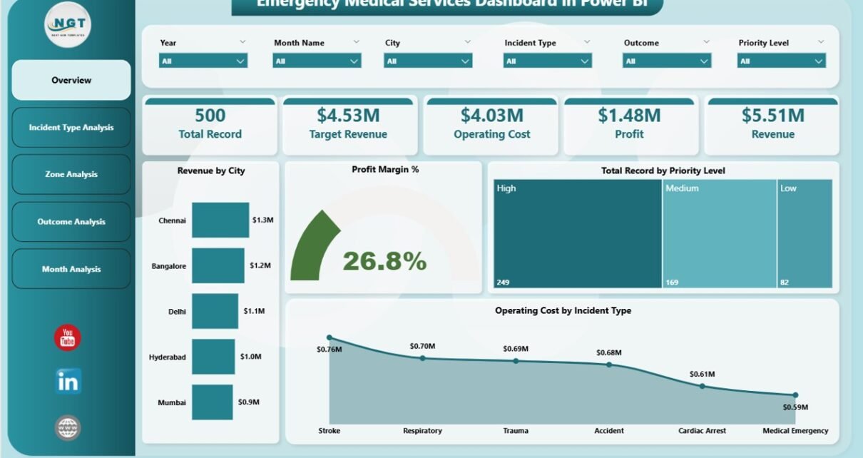
1. Overview Page – How Can Leaders Monitor EMS Performance Instantly?
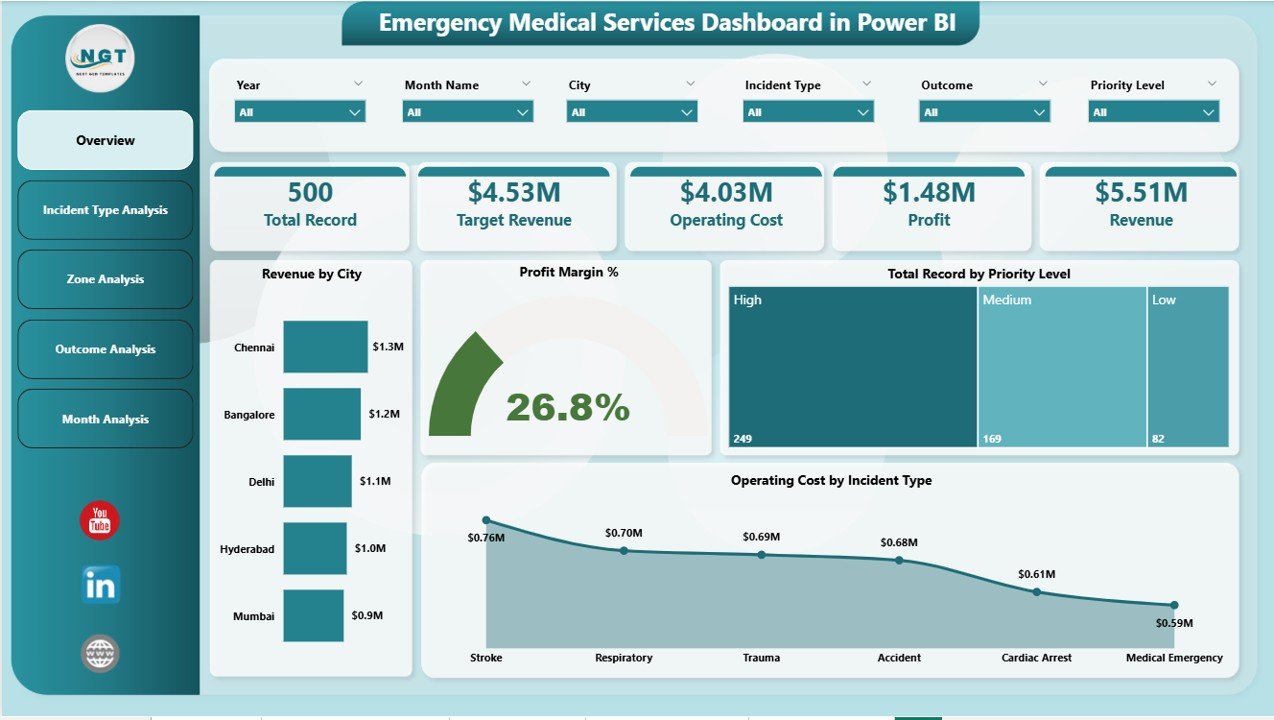
The Overview Page acts as the command center of the dashboard. It provides a high-level summary of operational performance.
KPI Cards Available
Click to Purchases Emergency Medical Services Dashboard in Power BI
-
Revenue by City
-
Profit Margin %
-
Total Records by Priority Level
-
Operating Cost by Incident Type
-
Overall Performance Indicators
These cards allow managers to evaluate performance immediately.
Why This Page Matters
Because executives need quick insights, this page highlights critical metrics without overwhelming users. Additionally, slicers help users filter data by time, location, or category.
2. Incident Type Analysis – Which Emergencies Generate the Highest Impact?
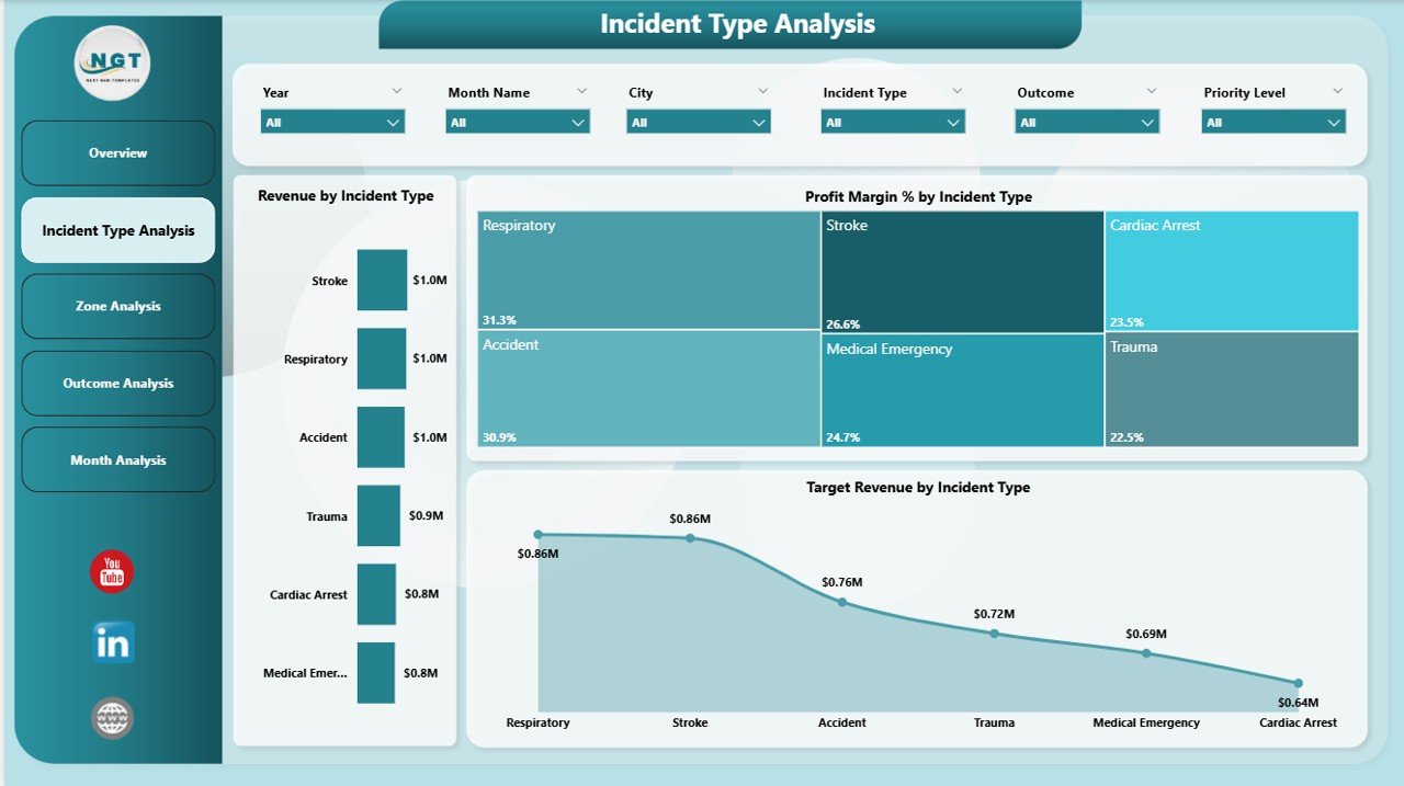
Different incident types require different resources. Therefore, analyzing them separately becomes essential.
Charts Included
-
Revenue by Incident Type
-
Profit Margin % by Incident Type
-
Target Revenue by Incident Type
Insights You Can Discover
-
Which incident types consume more resources
-
Which services generate better financial performance
-
Where operational efficiency needs improvement
Consequently, EMS administrators can allocate resources more effectively.
3. Zone Analysis – How Do Different Regions Perform?
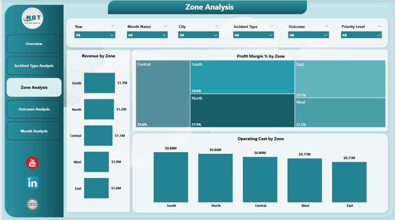
Emergency response performance varies across locations. Hence, geographic analysis becomes necessary.
Charts Available
-
Revenue by Zone
-
Profit Margin % by Zone
-
Operating Cost by Zone
Benefits of Zone Analysis
-
Compare regional performance quickly
-
Identify high-cost zones
-
Optimize resource deployment
-
Improve coverage planning
As a result, organizations ensure balanced service delivery.
Click to Purchases Emergency Medical Services Dashboard in Power BI
4. Outcome Analysis – Are Emergency Responses Successful?
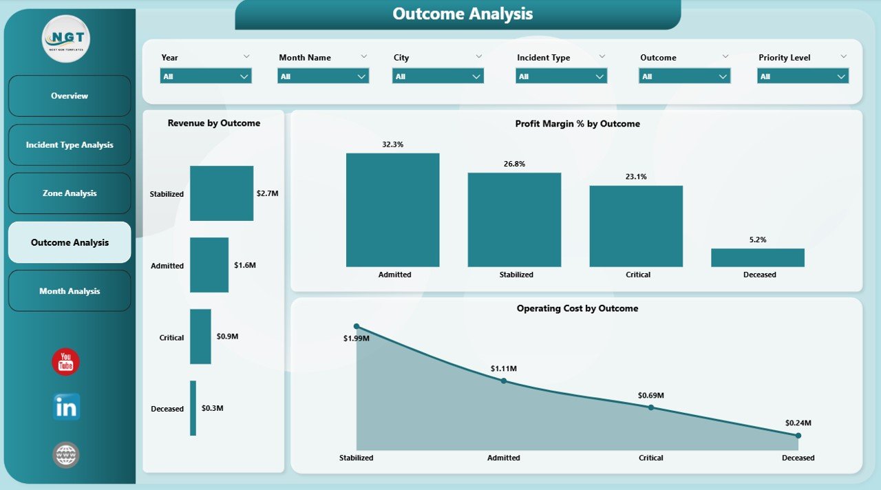
Outcome evaluation helps EMS teams understand service effectiveness.
Dashboard Visuals
-
Revenue by Outcome
-
Profit Margin % by Outcome
-
Operating Cost by Outcome
Why Outcome Analysis Is Important
Because outcomes reflect service quality, managers can:
-
Evaluate treatment success rates
-
Identify improvement areas
-
Enhance patient care strategies
-
Improve operational protocols
Therefore, outcome analytics directly support service improvement.
5. Month Analysis – How Do Trends Change Over Time?
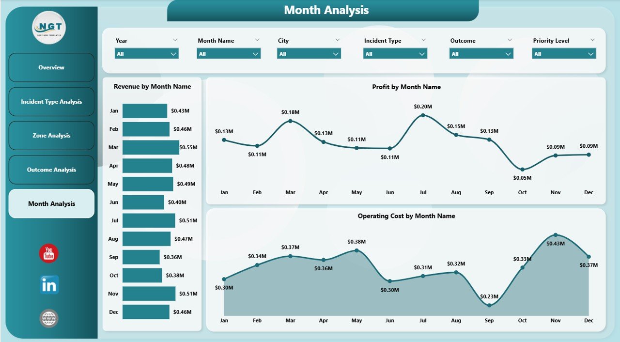
Trend monitoring helps organizations plan better.
Monthly Charts Included
-
Revenue by Month
-
Profit by Month
-
Operating Cost by Month
Key Advantages
-
Identify seasonal emergency patterns
-
Forecast future demand
-
Monitor financial trends
-
Improve budget planning
-
Click to Purchases Emergency Medical Services Dashboard in Power BI
Consequently, EMS departments can move from reactive management to predictive planning.
Which KPIs Should Emergency Services Track?
A strong EMS dashboard relies on meaningful KPIs.
Operational KPIs
-
Incident volume
-
Priority level distribution
-
Response outcomes
-
Zone performance
Financial KPIs
-
Revenue performance
-
Operating costs
-
Profit margin percentage
-
Target achievement rate
Strategic KPIs
-
Service efficiency trends
-
Resource utilization
-
Performance consistency
Tracking these KPIs ensures continuous improvement.
How Does the Dashboard Improve Decision-Making?
A well-designed dashboard transforms data into decisions.
Before Using the Dashboard
-
Reports arrive late
-
Data remains fragmented
-
Decisions rely on assumptions
After Using the Dashboard
-
Real-time monitoring becomes possible
-
Managers identify issues early
-
Teams act based on data insights
Therefore, operational efficiency improves significantly.
Advantages of Emergency Medical Services Dashboard in Power BI
Implementing this dashboard delivers multiple benefits.
✅ Improved Operational Visibility
Managers can view all performance metrics in one place. Consequently, they understand operations instantly.
✅ Faster Decision-Making
Real-time analytics help leaders respond quickly to operational challenges.
✅ Better Resource Allocation
Zone and incident analysis highlight where resources work best.
✅ Cost Optimization
Operating cost tracking helps control expenses effectively.
✅ Enhanced Service Quality
Outcome analysis supports continuous service improvement.
✅ Automated Reporting
Power BI eliminates manual reporting efforts.
✅ Data-Driven Strategy
Organizations shift from guesswork to analytics-based planning.
Click to Purchases Emergency Medical Services Dashboard in Power BI
How Can Organizations Use This Dashboard Daily?
Teams can integrate the dashboard into routine operations.
Daily Usage
-
Monitor active performance metrics
-
Review incident distribution
-
Track operational costs
Weekly Usage
-
Compare zone performance
-
Analyze outcome trends
-
Identify operational bottlenecks
Monthly Usage
-
Evaluate revenue and cost trends
-
Review KPI performance
-
Plan improvements
Thus, the dashboard becomes a daily management tool.
How to Implement an EMS Dashboard Successfully?
Implementation requires structured planning.
Step-by-Step Approach
-
Define EMS KPIs clearly
-
Collect standardized data sources
-
Clean and validate datasets
-
Connect data to Power BI
-
Design visuals logically
-
Add slicers and filters
-
Test dashboard usability
-
Train users properly
Following these steps ensures successful adoption.
Best Practices for the Emergency Medical Services Dashboard in Power BI
To achieve maximum value, organizations should follow proven practices.
✅ Keep Visuals Simple
Avoid overcrowding dashboards with excessive charts.
✅ Focus on Actionable KPIs
Track metrics that drive decisions, not vanity numbers.
✅ Use Consistent Data Structure
Maintain standardized data formats.
✅ Enable Interactive Filters
Allow users to explore insights independently.
✅ Monitor Data Quality Regularly
Accurate data ensures reliable decisions.
✅ Update Dashboard Frequently
Regular refresh keeps insights relevant.
✅ Train Decision-Makers
Ensure managers understand dashboard interpretation.
Click to Purchases Emergency Medical Services Dashboard in Power BI
Common Challenges and How to Overcome Them
Even advanced dashboards face challenges.
Challenge 1: Data Inconsistency
Solution: Use standardized input templates.
Challenge 2: User Resistance
Solution: Provide training and demonstrations.
Challenge 3: Overcomplicated Visuals
Solution: Focus only on essential KPIs.
Challenge 4: Delayed Updates
Solution: Automate data refresh processes.
Future of Emergency Medical Services Analytics
Technology continues to transform emergency management.
Emerging Trends
-
AI-driven incident prediction
-
Real-time ambulance tracking integration
-
Predictive response planning
-
Cloud-based EMS analytics
-
Mobile dashboard accessibility
Therefore, EMS dashboards will become even more intelligent and proactive.
Who Can Benefit from This Dashboard?
Many organizations can use this solution.
-
Emergency medical service providers
-
Hospitals and healthcare networks
-
Ambulance service companies
-
Public safety departments
-
Government emergency agencies
Because the dashboard remains flexible, organizations can customize it easily.
How Does This Dashboard Improve Patient Outcomes?
Data-driven insights directly influence service quality.
-
Faster response analysis improves planning
-
Outcome tracking enhances protocols
-
Resource allocation reduces delays
-
Performance monitoring ensures accountability
Consequently, patients receive better emergency care.
Conclusion: Why Every EMS Organization Needs a Power BI Dashboard
Emergency Medical Services require speed, accuracy, and coordination. However, manual reporting systems cannot support modern operational demands.
The Emergency Medical Services Dashboard in Power BI provides a centralized, intelligent, and interactive solution that transforms operational data into meaningful insights.
Because it combines financial analysis, operational tracking, geographic evaluation, and outcome monitoring, organizations gain complete visibility over their services.
As a result, EMS teams improve efficiency, control costs, and enhance patient outcomes while making confident decisions backed by data.
In today’s data-driven world, adopting an EMS dashboard is no longer optional — it is essential.
Frequently Asked Questions (FAQs)
1. What is an Emergency Medical Services Dashboard in Power BI?
It is an interactive analytics dashboard that monitors EMS operations, financial performance, incidents, and outcomes using visual reports.
2. Can small EMS organizations use this dashboard?
Yes. Power BI dashboards scale easily, so small and large organizations can use them effectively.
3. Does the dashboard require advanced technical skills?
No. Users can interact with visuals easily using filters and slicers without technical expertise.
4. How often should EMS data be updated?
Organizations should update data daily or weekly to maintain accurate insights.
5. Can this dashboard integrate with hospital systems?
Yes. Power BI connects with multiple data sources, including databases and healthcare systems.
6. What are the main KPIs included in the dashboard?
Key KPIs include revenue, operating cost, profit margin, incident type performance, zone analysis, and monthly trends.
7. Why is Power BI better than traditional reports?
Power BI provides real-time visualization, automation, and interactive analysis, unlike static reports.
8. How does the dashboard improve operational efficiency?
It identifies performance gaps quickly, enabling faster decision-making and better resource allocation.
Visit our YouTube channel to learn step-by-step video tutorials