Workplace safety no longer depends only on manual registers, delayed reports, or reactive actions. Instead, modern organizations actively rely on data-driven insights to reduce incidents, protect employees, and meet compliance requirements. That is exactly where an Employee Health and Safety Dashboard in Power BI plays a critical role.
An Employee Health and Safety Dashboard in Power BI helps organizations track incidents, monitor safety trends, and evaluate preventive actions in real time. Moreover, it transforms raw safety data into meaningful visuals that leaders can easily understand and act upon.
In this in-depth guide, you will learn what an Employee Health and Safety Dashboard in Power BI is, why it matters, how it works, its key features, advantages, best practices, and frequently asked questions. Additionally, this article explains each dashboard page in detail so you clearly understand how to use it in real business scenarios.
Click to buy Employee Health and Safety Dashboard in Power BI
What Is an Employee Health and Safety Dashboard in Power BI?
An Employee Health and Safety Dashboard in Power BI is an interactive reporting solution that visualizes workplace safety data such as incidents, severity levels, lost days, departmental risks, and response actions.
Instead of reviewing static Excel sheets or manual reports, safety managers can instantly view trends, risks, and compliance metrics on a single screen. As a result, organizations can move from reactive safety management to proactive prevention.
Moreover, Power BI allows users to filter data by department, region, incident type, or time period. Therefore, decision-makers gain clarity and control over workplace safety performance.
Why Do Organizations Need an Employee Health and Safety Dashboard?
Employee safety directly impacts productivity, morale, compliance, and brand reputation. However, many organizations struggle with scattered safety data and delayed reporting. Consequently, they fail to identify risks early.
An Employee Health and Safety Dashboard solves these challenges by:
- Centralizing all safety data in one place
- Highlighting high-risk areas instantly
- Tracking open and resolved incidents clearly
- Supporting faster and better decision-making
Furthermore, safety dashboards help organizations comply with labor laws and health regulations without excessive manual effort.
How Does an Employee Health and Safety Dashboard in Power BI Work?
An Employee Health and Safety Dashboard typically connects to structured data sources such as Excel files, databases, or safety management systems. Once connected, Power BI cleans, models, and visualizes the data using interactive charts and KPIs.
Here is how the process usually works:
- Data Collection
Organizations collect incident data such as incident type, severity, department, region, lost days, and action taken. - Data Modeling
Power BI organizes the data into relationships, measures, and calculated fields. - Dashboard Design
Visuals such as cards, bar charts, column charts, and trend lines display insights clearly. - Analysis and Decision-Making
Managers analyze trends, identify risks, and implement corrective actions.
As a result, safety reporting becomes faster, clearer, and more reliable.
What Are the Key Features of an Employee Health and Safety Dashboard in Power BI?
This Employee Health and Safety Dashboard includes five structured pages, each designed to answer specific safety-related questions. Let’s explore each page in detail.
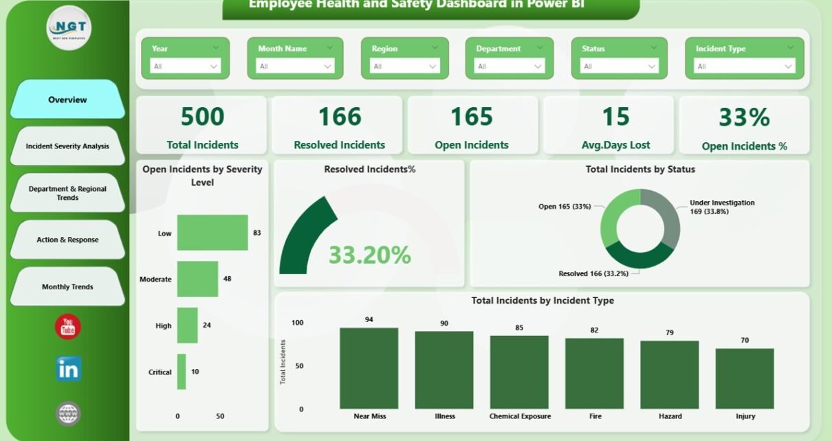
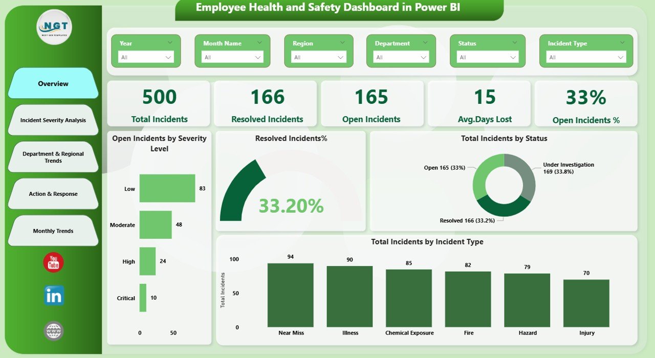
Overview Page: How Safe Is the Organization Right Now?
The Overview Page provides a high-level snapshot of workplace safety performance. It helps leaders quickly understand the current safety status.
Key Metrics on the Overview Page
- Total Incidents
Displays the total number of reported incidents across the organization. - Open Incidents
Shows how many incidents still require action or closure. - Average Days Lost
Highlights productivity loss due to safety incidents. - Open Incidents %
Indicates the proportion of unresolved incidents. - Open Incidents by Severity Level
Breaks down open incidents based on severity categories. - Resolved Incidents %
Shows how effectively the organization closes incidents. - Total Incidents by Status
Compares open, closed, and in-progress incidents. - Total Incidents by Incident Type
Identifies common incident categories.
Why the Overview Page Matters
Because it summarizes everything in one view, leadership teams can quickly spot red flags and take immediate action.
Click to buy Employee Health and Safety Dashboard in Power BI
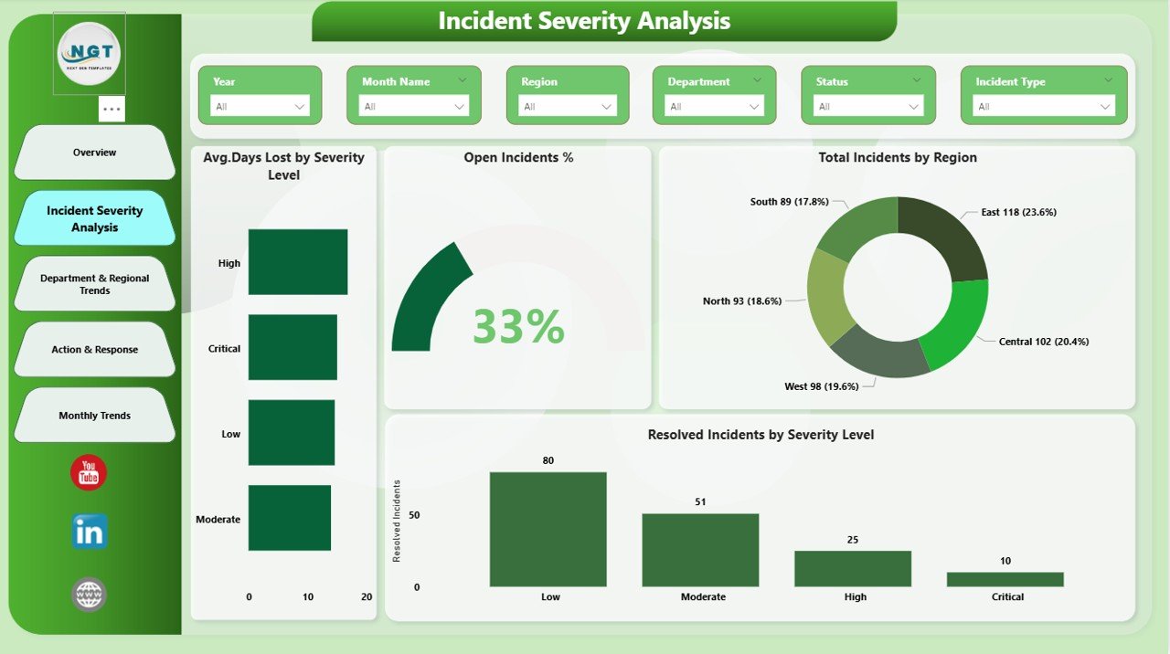
Incident Severity Analysis: Which Incidents Cause the Most Damage?
The Incident Severity Analysis Page focuses on understanding how severe incidents affect the organization.
Key Insights on This Page
- Average Days Lost by Severity Level
Reveals which severity levels lead to longer recovery times. - Total Incidents by Region
Highlights geographical risk patterns. - Resolved Incidents by Severity
Shows how efficiently severe incidents get resolved.
Business Value of Severity Analysis
By analyzing severity, organizations can prioritize high-impact risks and allocate resources more effectively. Consequently, safety efforts become more targeted and impactful.
Click to buy Employee Health and Safety Dashboard in Power BI
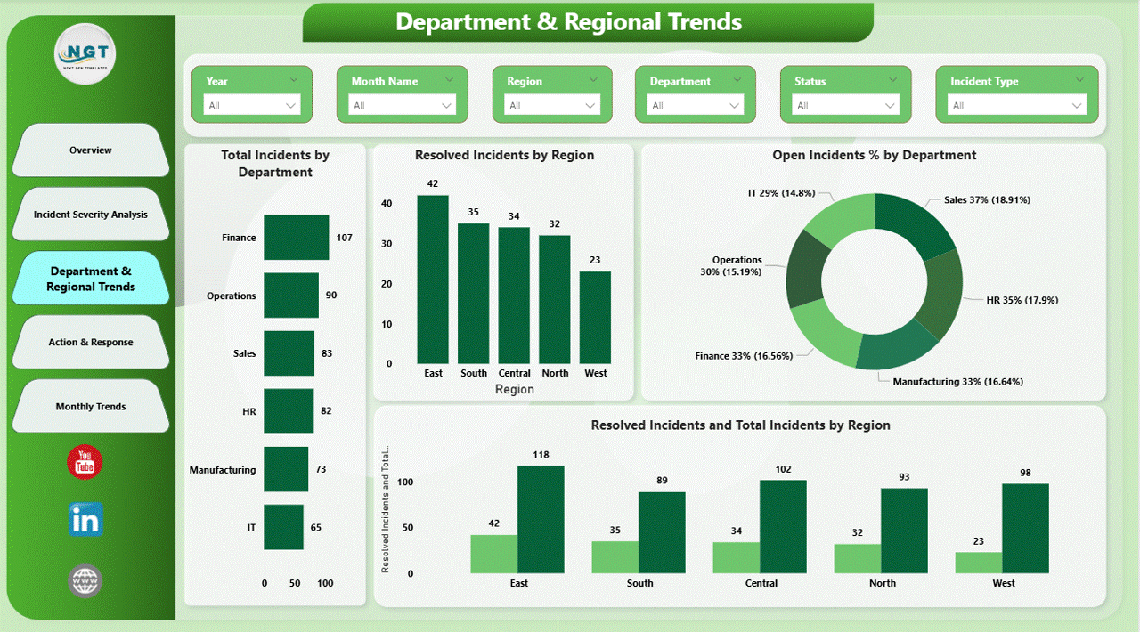
Department & Regional Trends: Where Do Most Incidents Occur?
The Department & Regional Trends Page helps organizations identify risk-prone departments and regions.
Key Metrics on This Page
- Total Incidents by Department
Identifies departments with higher incident frequency. - Open Incidents % by Department
Shows which departments struggle with incident resolution. - Resolved Incidents and Total Incidents by Region
Compares performance across regions.
Why This Page Is Important
Since departments and regions face different risks, this analysis helps tailor safety training, audits, and preventive measures accordingly.
Click to buy Employee Health and Safety Dashboard in Power BI
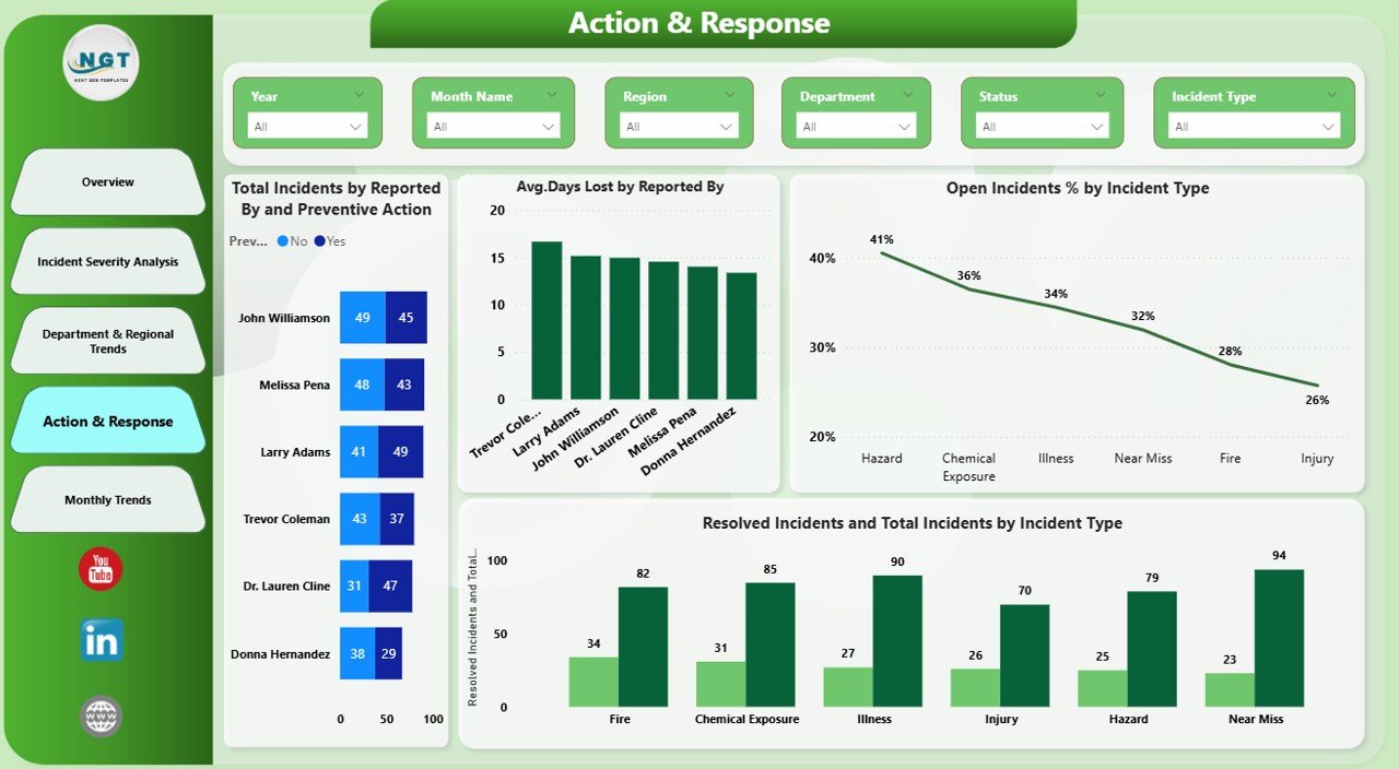
Action & Response: Are Preventive Actions Working?
The Action & Response Page evaluates how effectively the organization responds to incidents.
Key Insights on This Page
- Total Incidents by Preventive Action
Shows which preventive actions appear most frequently. - Average Days Lost by Reported By
Highlights reporting patterns across roles or teams. - Open Incidents % by Incident Type
Identifies incident types that remain unresolved longer.
Click to buy Employee Health and Safety Dashboard in Power BI
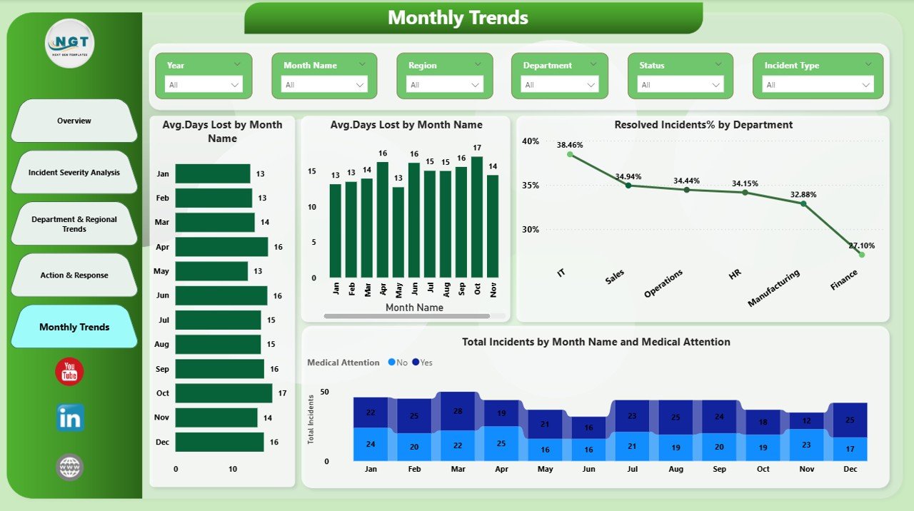
Monthly Trends: Are Safety Metrics Improving Over Time?
The Monthly Trends Page tracks safety performance over time.
Key Metrics on This Page
- Average Days Lost by Incident Type
Shows trends in recovery duration. - Resolved Incidents % by Department
Tracks departmental improvement over months. - Total Incidents by Medical Attention
Highlights incidents requiring medical support.
Why Monthly Trends Matter
Trends reveal whether safety initiatives produce positive results. Therefore, leaders can adjust strategies before issues escalate.
Click to buy Employee Health and Safety Dashboard in Power BI
Advantages of an Employee Health and Safety Dashboard in Power BI
An Employee Health and Safety Dashboard delivers measurable benefits across the organization.
Key Advantages
- Improved Visibility
Leaders clearly see safety performance at all levels. - Faster Decision-Making
Real-time insights support quick corrective actions. - Reduced Workplace Incidents
Early risk identification prevents future accidents. - Better Compliance Management
Structured data supports audits and regulations. - Higher Employee Confidence
A strong safety culture boosts morale and trust. - Time and Cost Savings
Automated reporting reduces manual effort.
Because of these advantages, organizations gain both operational and strategic benefits.
Best Practices for the Employee Health and Safety Dashboard in Power BI
To maximize value, organizations should follow proven best practices while using or building this dashboard.
- Use Clean and Consistent Data
Always standardize incident categories, severity levels, and departments. Clean data ensures accurate insights.
- Focus on Actionable KPIs
Select metrics that directly influence decisions, such as open incident percentage or days lost.
- Update Data Regularly
Frequent updates keep insights relevant and reliable. Therefore, automate data refresh whenever possible.
- Enable Role-Based Access
Limit sensitive information to authorized users to maintain data security.
- Use Filters and Slicers Wisely
Allow users to drill down by time, department, or region for deeper analysis.
- Review Trends Periodically
Regular reviews help identify improvements or emerging risks early.
By following these practices, organizations can unlock the full potential of their safety dashboard.
How Does an Employee Health and Safety Dashboard Support Business Goals?
Workplace safety connects directly with business performance. When organizations reduce incidents, they also reduce downtime, legal risks, and employee turnover.
An Employee Health and Safety Dashboard supports business goals by:
- Improving productivity through fewer lost days
- Enhancing compliance and audit readiness
- Strengthening employer brand and trust
- Supporting data-driven leadership decisions
As a result, safety becomes a strategic advantage rather than a compliance burden.
Conclusion: Why Should You Invest in an Employee Health and Safety Dashboard in Power BI?
An Employee Health and Safety Dashboard in Power BI empowers organizations to protect employees while improving operational efficiency. Instead of relying on delayed reports, leaders gain instant visibility into incidents, risks, and trends.
With structured pages such as Overview, Incident Severity Analysis, Department & Regional Trends, Action & Response, and Monthly Trends, this dashboard delivers complete safety intelligence in one place.
Ultimately, organizations that invest in safety analytics create healthier workplaces, stronger compliance, and sustainable business growth.
Frequently Asked Questions About Employee Health and Safety Dashboard in Power BI
What data do I need for an Employee Health and Safety Dashboard?
You need incident details such as date, department, region, incident type, severity, days lost, medical attention, and resolution status.
Can small organizations use this dashboard?
Yes, small organizations can easily use this dashboard. Power BI scales well for both small and large datasets.
How often should safety data be updated?
Ideally, update data daily or weekly to maintain accuracy and relevance.
Does this dashboard replace safety audits?
No, it supports audits by providing structured insights. However, organizations should still conduct physical inspections.
Can I customize the dashboard?
Yes, Power BI allows full customization of visuals, KPIs, and filters based on business needs.
Is Power BI suitable for non-technical users?
Yes, Power BI offers an intuitive interface. With basic training, managers can easily interact with dashboards.
Visit our YouTube channel to learn step-by-step video tutorials
Watch the step-by-step video tutorial:
Click to buy Employee Health and Safety Dashboard in Power BI