In today’s data-driven world, engineering teams handle multiple projects, budgets, resources, and risks at the same time. Managing all this information manually can quickly become overwhelming. That’s where the Engineering Dashboard in Excel comes in — a smart, ready-to-use solution designed to help engineering professionals monitor performance, analyze progress, and make informed decisions in real time.
This article will walk you through everything you need to know about this powerful dashboard: its structure, key features, benefits, best practices, and more. Whether you manage construction, manufacturing, or software engineering projects, this Excel-based dashboard will transform how you track your team’s efficiency and project outcomes.
Click to Purchases Engineering Dashboard in Excel
What Is an Engineering Dashboard in Excel?
An Engineering Dashboard in Excel is a prebuilt analytics tool that helps engineers, managers, and executives visualize key performance indicators (KPIs) related to project execution, department performance, issue tracking, and budget utilization.
Instead of juggling multiple spreadsheets and manual reports, you can consolidate all your data into one interactive Excel dashboard. The dashboard uses charts, KPIs, and trend visuals to highlight project health and operational efficiency. You can easily identify which departments are performing well, where the delays are, and how closely budgets align with actual costs.
Excel serves as the backbone of this solution, offering flexibility, automation, and visualization without the need for complex software.
Structure of the Engineering Dashboard in Excel
The Engineering Dashboard includes five main analytical pages and a support data sheet. Each page focuses on a specific analytical area, ensuring that all critical insights are just one click away.
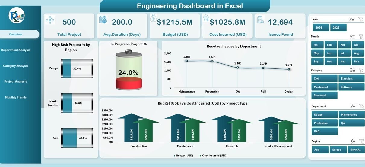
1️⃣ Overview Page
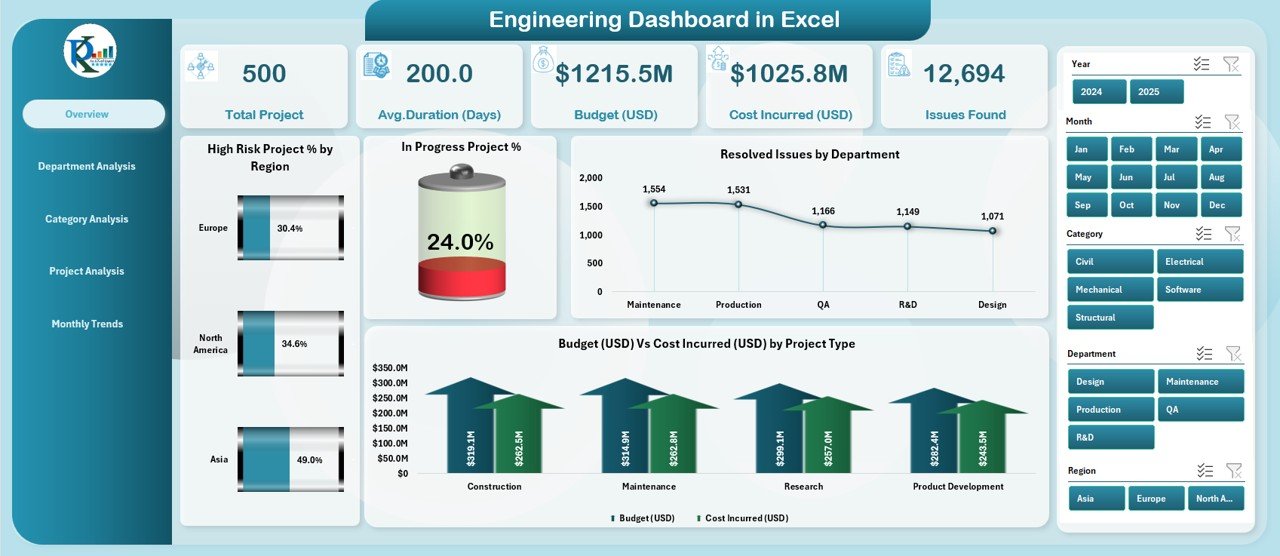
The Overview Page acts as the command center of your dashboard. It provides a high-level summary of project health and performance across regions and departments.
Highlights include:
-
Five performance cards showing major KPIs such as total projects, high-risk percentage, completed projects, total budget, and total cost.
Four analytical charts:
- High-Risk Project % by Region
- In-Progress Project %
- Resolved Issues by Department
- Budget (USD) vs. Cost Incurred (USD) by Project Type
These visuals provide instant insights into performance metrics and financial efficiency. Decision-makers can quickly understand where resources are being over- or under-utilized.
2️⃣ Department Analysis Page
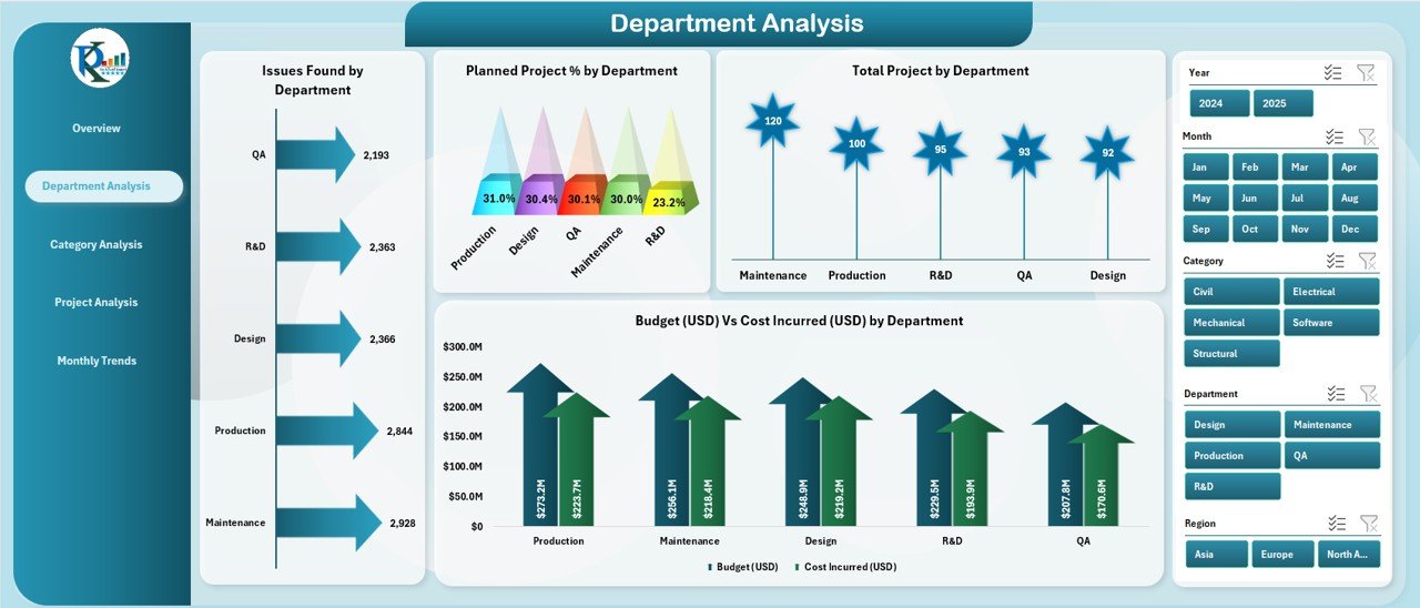
The Department Analysis Page allows a deeper dive into how each department performs across various dimensions. This section helps managers identify patterns, bottlenecks, and departmental strengths.
Key charts include:
-
Issues Found by Department
-
Planned Project % by Department
-
Total Projects by Department
-
Budget (USD) vs. Cost Incurred (USD) by Department
This view makes it easier to assess workload distribution, identify departments exceeding budgets, and prioritize high-risk areas.
3️⃣ Category Analysis Page
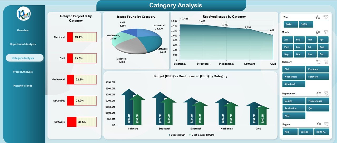
The Category Analysis Page focuses on project categories — such as infrastructure, design, software, or maintenance — depending on your industry. This page reveals which categories are most efficient or face frequent issues.
Click to Purchases Engineering Dashboard in Excel
Charts featured here:
-
Delayed Project % by Category
-
Issues Found by Category
-
Total Projects by Category
-
Budget (USD) vs. Cost Incurred (USD) by Category
By comparing categories side-by-side, you can spot trends, highlight problem areas, and allocate resources more effectively.
4️⃣ Project Analysis Page
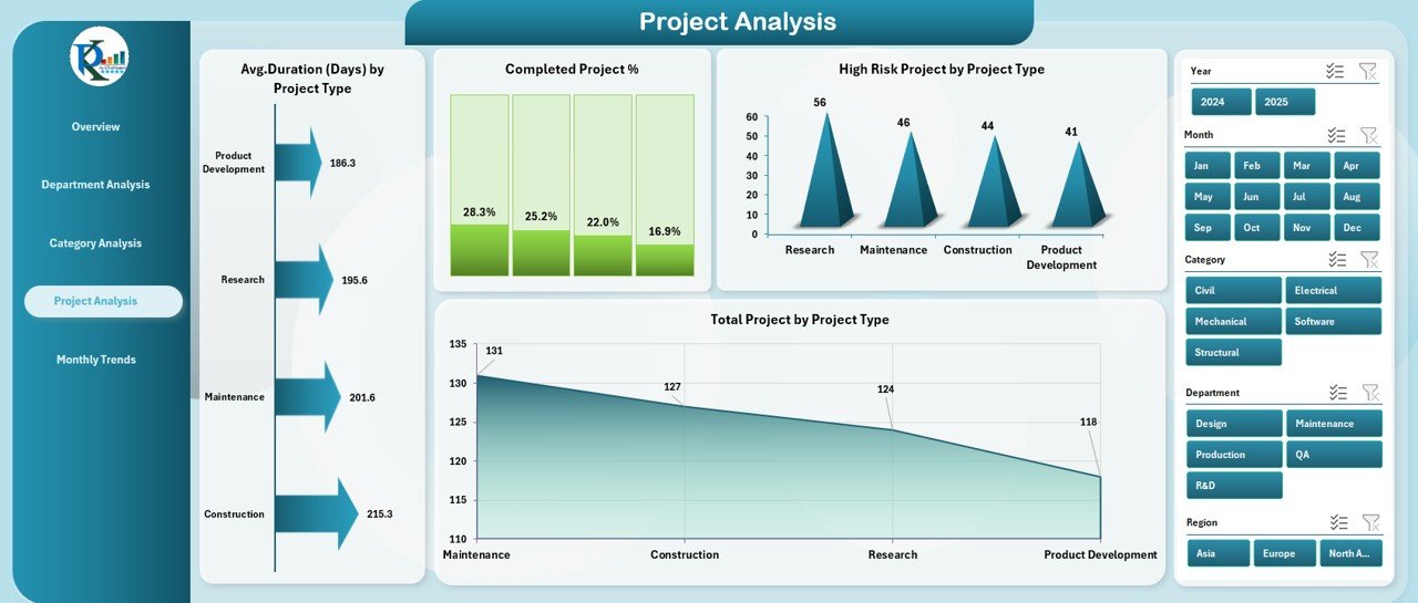
The Project Analysis Page drills down into individual project performance, providing key metrics that help gauge efficiency and success.
It includes:
-
Average Duration (days) by Project Type
-
Completed Project %
-
High-Risk Projects by Project Type
-
Total Projects by Project Type
This level of insight helps you evaluate how different project types perform, identify delays, and forecast future timelines more accurately.
5️⃣ Monthly Trends Page
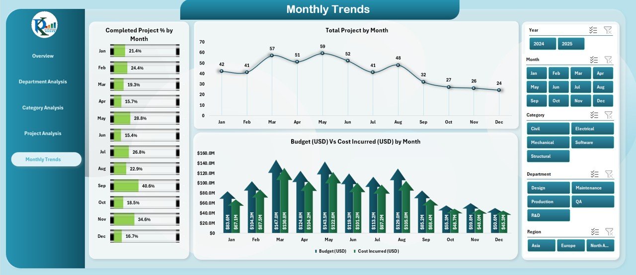
The Monthly Trends Page highlights performance over time, allowing managers to track progress and financial movement month by month.
Charts displayed include:
-
Completed Project % by Month
-
Total Projects by Month
-
Budget (USD) vs. Cost Incurred (USD) by Month
This section makes it easier to visualize seasonality in performance, identify consistent underperforming months, and assess financial trends across the year.
📊 Support Sheet and Data Sheet
Behind the dashboard, you’ll find a Data Sheet and a Support Sheet that power all the visuals and calculations. The Data Sheet holds raw data, while the Support Sheet maintains dropdown lists, mappings, and formulas.
Users only need to update the Data Sheet with new records — the dashboard automatically refreshes all charts and KPIs. This automation reduces manual effort and ensures data accuracy across all analytical pages.
How Does the Engineering Dashboard Work?
The Engineering Dashboard in Excel uses pivot tables, Excel formulas, and conditional formatting to transform raw data into actionable insights.
-
Data Entry: You record your project data — including project type, budget, cost, issues, department, and completion status — in the Data Sheet.
-
Pivot Processing: Pivot tables aggregate this data by project type, month, and department.
-
Visualization: Charts and KPI cards use these pivots to display trends, comparisons, and summary insights.
-
Interactivity: Page navigators and slicers allow you to explore different segments instantly.
This structure ensures that even non-technical users can explore detailed engineering insights without writing a single formula.
Click to Purchases Engineering Dashboard in Excel
Why Use Excel for Engineering Dashboards?
Excel remains one of the most accessible and flexible platforms for professionals across industries. It offers:
-
Familiarity: Most engineers and managers already use Excel daily.
-
No Coding Needed: You can build and maintain dashboards without programming.
-
Data Flexibility: Import data from ERP systems, databases, or CSV files.
-
Customizability: Tailor visuals, KPIs, and page layouts as per your organization’s needs.
-
Offline Availability: Access and analyze data even without an internet connection.
With the right formulas, automation, and design, Excel can deliver powerful business intelligence capabilities similar to specialized BI tools.
Advantages of the Engineering Dashboard in Excel
Let’s explore why this dashboard is a game-changer for engineering teams:
✅ 1. Centralized Project Monitoring
You get a unified view of all ongoing projects — eliminating the need for multiple reports and spreadsheets.
✅ 2. Real-Time Performance Insights
Instantly see how departments, categories, and projects perform. The visuals update automatically whenever new data is added.
✅ 3. Improved Financial Tracking
By comparing budget vs. cost incurred, you can identify cost overruns early and take corrective actions before they escalate.
✅ 4. Enhanced Decision-Making
With all KPIs visible in one place, managers can make data-driven decisions faster and more confidently.
✅ 5. Time Efficiency
Automated charts and summary cards save countless hours spent compiling manual reports.
✅ 6. Customizable Visuals
You can modify chart types, colors, and layouts to suit your organization’s reporting standards.
✅ 7. Risk Management Support
Tracking high-risk and delayed projects ensures timely mitigation strategies.
✅ 8. Better Collaboration
When shared across teams, this Excel dashboard becomes a communication hub for performance updates.
Key Performance Indicators (KPIs) You Can Track
The Engineering Dashboard allows you to track numerous KPIs that impact project delivery and operational success:
-
High-Risk Project Percentage
-
Completed Project Percentage
-
Delayed Project Percentage
-
Average Project Duration (Days)
-
Total Projects by Department
-
Budget (USD) vs. Cost Incurred (USD)
-
Resolved Issues Count
-
Issues Found by Category
-
Planned vs. Actual Projects
By tracking these metrics consistently, you can maintain transparency, accountability, and control over every engineering initiative.
How to Use the Engineering Dashboard Effectively
Using the Engineering Dashboard is simple, but following a structured workflow ensures maximum benefit:
-
Update Data Sheet: Enter or import the latest project data.
-
Refresh Pivot Tables: Click “Refresh All” in Excel to update all visuals.
-
Use Slicers: Filter data by month, project type, or department to view specific insights.
-
Review KPIs: Examine card values and charts for anomalies or trends.
-
Share Insights: Present the dashboard to stakeholders using Excel or export visuals as PDFs.
Following this cycle keeps your data current and your analysis sharp.
Best Practices for Using the Engineering Dashboard in Excel
To make the most of your Engineering Dashboard, follow these best practices:
🔹 1. Maintain Consistent Data Entry
Ensure every record follows the same format — consistent project names, date formats, and department labels. This consistency ensures accurate pivot calculations.
🔹 2. Schedule Regular Updates
Update your data weekly or monthly to maintain real-time accuracy. Regular updates help you track trends efficiently.
🔹 3. Use Conditional Formatting Wisely
Highlight delayed or high-risk projects using color codes to spot issues instantly.
🔹 4. Protect Formula Cells
Lock formula cells and protect sheets to avoid accidental edits.
🔹 5. Automate Refresh Macros
Use simple VBA macros to refresh pivots and charts with one click.
🔹 6. Review Budget vs. Cost Trends Monthly
Analyze cost deviations to prevent budget overspending.
🔹 7. Keep Historical Data
Never delete old records — they help you analyze long-term patterns and project success rates.
🔹 8. Train Your Team
Provide a short tutorial to ensure everyone knows how to navigate, filter, and interpret dashboard visuals.
By adopting these practices, you can transform your Engineering Dashboard into a strategic decision-making powerhouse.
Who Can Benefit from This Dashboard?
This Excel dashboard is ideal for:
-
Engineering Project Managers – to track timelines, budgets, and risks.
-
Department Heads – to compare departmental performance.
-
Financial Analysts – to review spending efficiency.
-
Quality Control Teams – to monitor issues and resolution rates.
-
Executives and Stakeholders – to gain summarized insights at a glance.
No matter your industry — construction, manufacturing, energy, or IT — this tool provides a clear picture of your engineering operations.
Example Use Cases
Here are a few real-world scenarios where the Engineering Dashboard can make a major difference:
-
Construction Firms: Monitor project delays, safety incidents, and cost efficiency.
-
Manufacturing Units: Track maintenance schedules, design improvements, and production bottlenecks.
-
Software Engineering Teams: Measure bug resolutions, release timelines, and testing progress.
-
Energy Companies: Oversee site projects, compliance audits, and equipment maintenance.
With customizable charts and KPIs, the dashboard fits virtually any engineering setup.
How This Dashboard Supports Business Growth
By providing visibility into performance and financial metrics, the Engineering Dashboard contributes directly to growth:
-
Reduces Operational Risks: Early identification of issues prevents costly project failures.
-
Optimizes Resource Allocation: Data-driven insights ensure the right teams handle the right projects.
-
Drives Accountability: Transparent performance tracking motivates teams to achieve targets.
-
Improves Profitability: Continuous monitoring reduces cost leaks and increases efficiency.
Ultimately, this dashboard aligns engineering objectives with organizational goals, driving sustainable success.
Conclusion
The Engineering Dashboard in Excel is more than just a reporting tool — it’s a complete performance management solution. By consolidating all engineering data into an intuitive, interactive format, it empowers professionals to make faster, smarter, and more informed decisions.
Whether you’re managing multiple projects or overseeing department-wide efficiency, this Excel-based dashboard simplifies complex data into clear, actionable insights. It’s easy to use, fully customizable, and built to scale with your organization’s evolving needs.
Adopt it today and turn your engineering data into a strategic advantage.
Frequently Asked Questions (FAQs)
1. What is the Engineering Dashboard in Excel used for?
It’s used to track, analyze, and visualize key engineering metrics — including project performance, budget utilization, and issue management — all in one place.
2. Can I customize the dashboard for my organization?
Yes. You can modify charts, KPIs, and color schemes to match your reporting standards or departmental structure.
3. Do I need coding knowledge to use it?
Not at all. The dashboard runs entirely on Excel features like pivot tables, slicers, and formulas — no coding required.
4. How often should I update the Data Sheet?
Ideally, update it weekly or monthly to keep the visuals accurate and meaningful.
5. Can this dashboard handle large data sets?
Yes. With proper optimization (using Excel Tables and Pivot Caches), it can efficiently process thousands of records.
6. Does it work with other tools?
Yes. You can import data from ERP systems, Google Sheets, or databases into Excel for analysis.
7. Is the dashboard suitable for non-technical users?
Absolutely. Its intuitive layout, clear visuals, and simple navigation make it user-friendly for everyone.
Visit our YouTube channel to learn step-by-step video tutorials