Managing events successfully requires more than just planning and coordination — it requires data-driven insights. Whether you’re organizing corporate conferences, exhibitions, concerts, or workshops, having access to accurate, real-time information can make all the difference between a good event and a great one.
That’s where the Event Management Dashboard in Power BI comes into play.
This dashboard offers a comprehensive view of your event operations, helping you track performance, monitor budgets, evaluate venues, and analyze participant satisfaction — all in one place. Built using Microsoft Power BI, it connects your event data (usually captured in Excel or other databases) and transforms it into interactive visuals for quick decision-making.
Click to Purchases Event Management Dashboard in Power BI
What Is an Event Management Dashboard in Power BI?
An Event Management Dashboard in Power BI is an analytical tool that helps event managers, coordinators, and business owners visualize key performance indicators (KPIs) across different event dimensions such as type, region, organizer, and venue.
It simplifies complex data from your event tracking sheets and displays it through charts, slicers, cards, and tables — making your performance insights more accessible and actionable.
Instead of manually analyzing hundreds of rows in Excel, you can instantly see:
-
📈 Total number of completed and ongoing events
-
💰 Budget versus actual revenue
-
🎯 Client satisfaction scores
-
📅 Monthly event trends and performance by region or venue
This not only saves time but also ensures accurate reporting and smarter decisions.
Key Features of the Event Management Dashboard in Power BI
This dashboard consists of five interactive pages, each designed to analyze a different aspect of event performance. Let’s explore each page in detail.
Overview Page
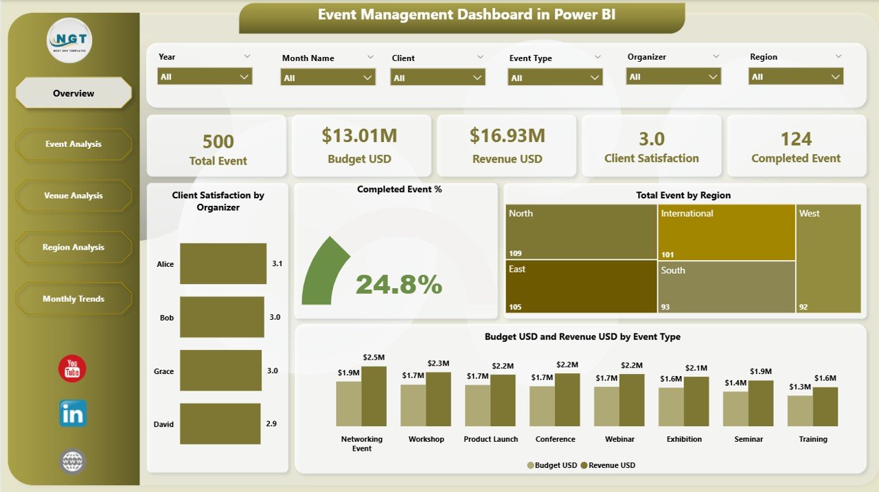
The Overview Page serves as the command center of the dashboard. It gives users a high-level summary of all event metrics using slicers and visual cards.
You can filter the data by region, event type, or organizer to get specific insights.
Key visuals on this page include:
-
🎯 Client Satisfaction by Organizer
-
✅ Completed Event %
-
🌎 Total Events by Region
-
💵 Budget (USD) and Revenue (USD) by Event Type
This page helps management quickly assess how well events are performing and whether the organization is meeting its goals.
Event Analysis Page
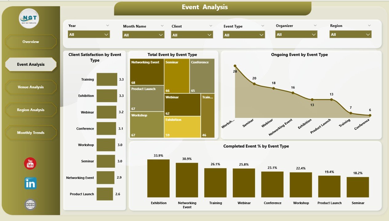
The Event Analysis Page dives deeper into the types of events you’re managing.
With a few clicks, you can explore metrics like:
-
Client Satisfaction by Event Type
-
Total Events by Event Type
-
Ongoing vs. Completed Events
-
Click to Purchases Event Management Dashboard in Power BI
These visuals highlight which event categories are most successful and where improvements are needed.
For instance, you might notice that corporate events have higher satisfaction rates but lower profitability compared to trade shows. This insight helps in planning future event portfolios more strategically.
Venue Analysis Page
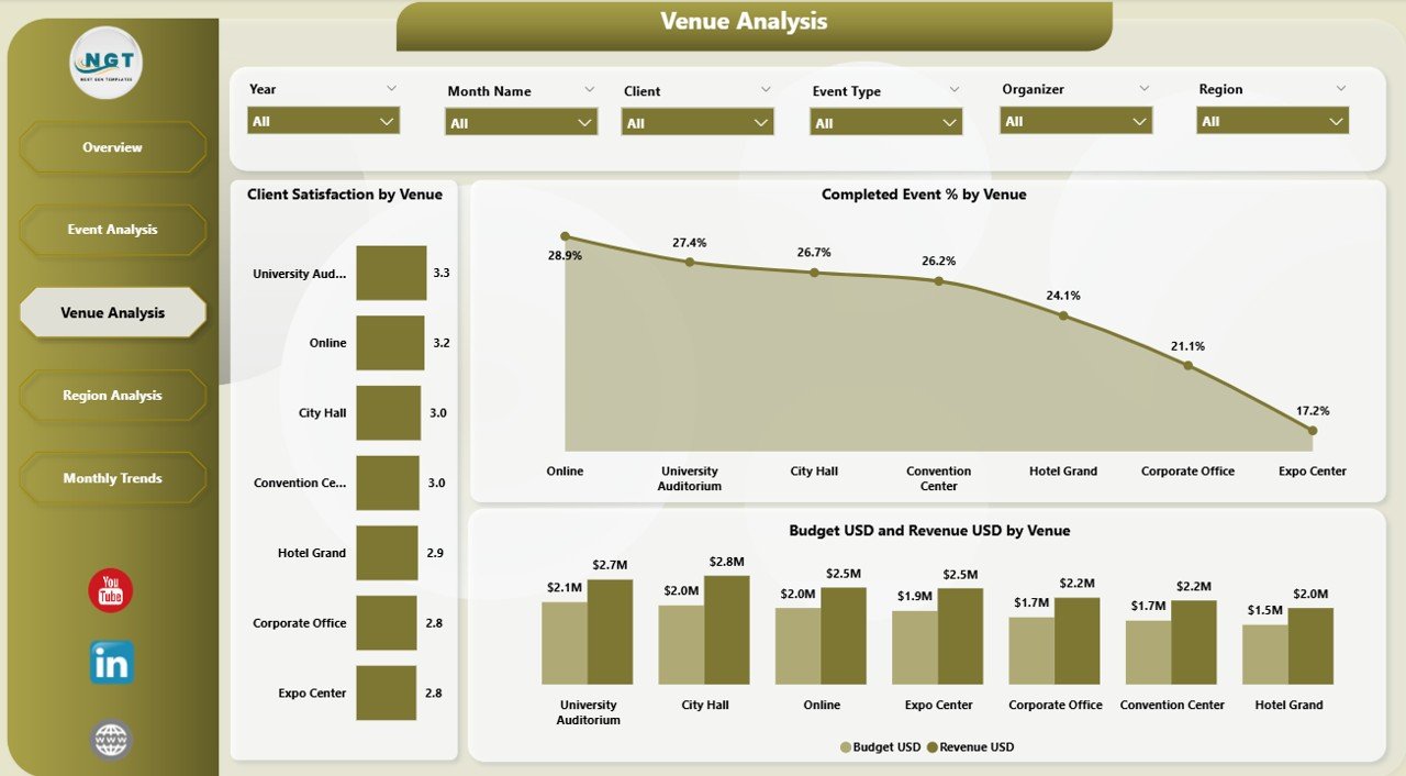
Venue selection can make or break an event. That’s why the Venue Analysis Page focuses on performance by location.
It includes visuals such as:
-
⭐ Client Satisfaction by Venue
-
🏆 Completed Event % by Venue
-
💸 Budget USD and Revenue USD by Venue
Event planners can easily compare different venues and identify which ones offer the best combination of satisfaction, cost efficiency, and profitability. This leads to better vendor negotiations and smarter venue allocation in the future.
Region Analysis Page
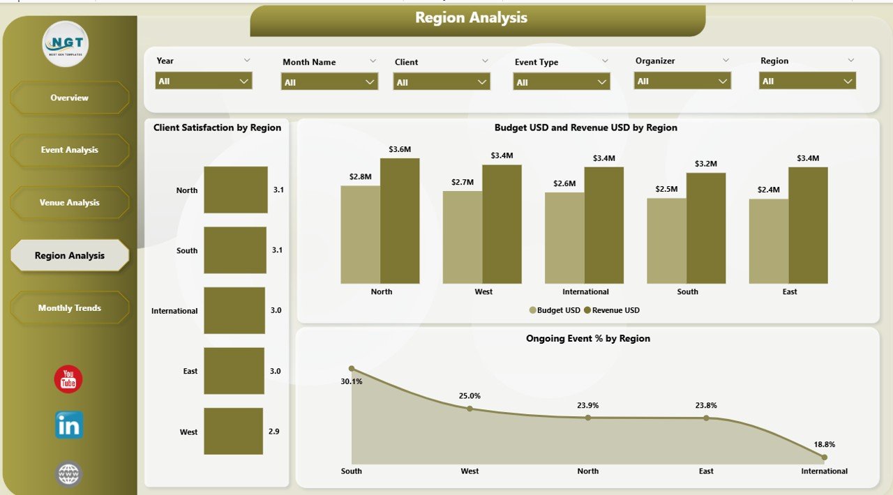
The Region Analysis Page is essential for organizations operating across multiple locations or countries.
It presents metrics like:
-
😊 Client Satisfaction by Region
-
💰 Budget USD and Revenue USD by Region
-
📊 Ongoing Event % by Region
With these insights, you can evaluate which regions are performing best in terms of event quality and financial return. You can also identify underperforming areas and develop region-specific improvement plans.
Monthly Trends Page
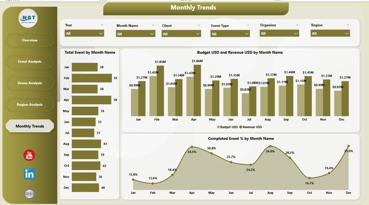
Every event manager needs to understand seasonal performance trends — when most events are held, when costs spike, and when client satisfaction peaks.
The Monthly Trends Page provides exactly that through:
-
📅 Total Events by Month
-
💵 Budget USD and Revenue USD by Month
-
✅ Completed Event % by Month
This trend analysis supports better forecasting, budgeting, and resource allocation for future events.
Why Use Power BI for Event Management?
Power BI offers dynamic, real-time analytics that make event management far more efficient. Here’s why it’s ideal for this purpose:
-
⚙️ Automated Data Refresh: You can connect your Excel event data file to Power BI and schedule automatic refreshes.
-
📊 Interactive Visuals: Users can interact with slicers, filters, and charts to view data from multiple perspectives.
-
🔐 Data Security: Power BI ensures secure data access through role-based permissions.
-
🌐 Accessibility: Dashboards can be shared online with clients or team members using Power BI Service.
-
📈 Scalability: Whether you’re managing 10 events or 1,000, the dashboard scales effortlessly.
Advantages of Event Management Dashboard in Power BI
Click to Purchases Event Management Dashboard in Power BI
Using Power BI for event management delivers numerous advantages. Let’s break them down:
1. Centralized Data Visualization
All event-related data from Excel or databases is consolidated into one dashboard. This ensures that decision-makers don’t need to navigate multiple reports.
2. Real-Time Decision Making
The dashboard updates dynamically. You can instantly see the latest figures for budget, satisfaction, and progress.
3. Enhanced Team Collaboration
With Power BI’s sharing capabilities, event planners, finance teams, and clients can all access the same live dashboard.
4. Improved Client Relationships
Tracking Client Satisfaction by Organizer or Event Type helps identify top performers and areas for improvement, strengthening overall service quality.
5. Better Financial Control
By analyzing Budget vs. Revenue per event type or venue, you can keep spending in check and maximize profit margins.
6. Predictive Insights
Monthly trend data helps forecast high-demand periods and prepare accordingly, minimizing risks of overbooking or underperformance.
Opportunities for Improvement
Even though Power BI dashboards are powerful, there’s always room for optimization. Consider these opportunities:
-
⚙️ Automation of Data Input: Integrate your Excel sheets or event management systems directly using Power BI dataflows to eliminate manual uploads.
-
💡 Adding Forecasting Models: Implement Power BI’s AI visuals to predict satisfaction trends and expected revenue growth.
-
📲 Mobile Optimization: Ensure the dashboard layout is mobile-friendly for managers on the go.
-
🔁 Incorporate Feedback Loops: Add participant feedback analysis visuals to capture sentiment in real-time.
-
🎯 KPI Refinement: Regularly review which KPIs provide the most actionable insights and adjust as your business evolves.
Best Practices for Event Management Dashboard in Power BI
To get the most out of your Event Management Dashboard, follow these proven best practices:
1. Define Clear KPIs
Start by deciding what success looks like — such as Client Satisfaction %, Budget Utilization %, Event Completion %, or ROI per Event.
2. Keep Design Simple
Avoid clutter. Use a clean layout with consistent color schemes for better readability.
3. Use Filters and Slicers Wisely
Add slicers for region, organizer, event type, and month to allow easy comparison across categories.
4. Monitor Data Quality
Ensure your Excel source data is complete and accurate. Incomplete or inconsistent data can distort dashboard visuals.
5. Automate Refreshes
Schedule daily or weekly refreshes in Power BI Service to always work with the latest numbers.
6. Add Drill-Through Pages
Include drill-through options (for example, click on a venue name to see detailed event performance for that venue).
7. Include Target vs. Actual Comparisons
Use visual indicators (green for achieved, red for missed) to quickly assess performance.
8. Keep User Access Controlled
Use Power BI’s role-based access feature to share specific views only with authorized users.
How the Dashboard Supports Decision Making
This Event Management Dashboard acts as a strategic control center for event-based decision making.
Executives and planners can use it to:
-
Identify top-performing venues or regions
-
Evaluate event profitability and satisfaction rates
-
Optimize resource allocation for upcoming events
-
Compare planned vs. actual financial results
-
Enhance operational efficiency by spotting recurring issues
By combining all these insights, the dashboard transforms raw event data into strategic intelligence that drives measurable improvement.
Real-World Example: Event Data in Action
Imagine a global company that hosts multiple corporate events every quarter.
Before using Power BI, their event data lived in scattered Excel sheets, making reporting time-consuming and error-prone.
After implementing the Event Management Dashboard in Power BI, they experienced:
-
⏱️ 60% faster monthly reporting
-
💹 25% increase in event profitability
-
📊 Improved visibility into regional performance
-
💬 Enhanced client satisfaction tracking
This proves how a well-structured dashboard can revolutionize operational efficiency.
Conclusion
The Event Management Dashboard in Power BI is not just a visualization tool — it’s a complete management system for planners, coordinators, and business leaders.
From tracking budgets and revenue to measuring satisfaction and regional performance, it delivers every metric needed for success. With its five pages — Overview, Event Analysis, Venue Analysis, Region Analysis, and Monthly Trends — it provides a 360° view of your event operations.
By following the best practices and continually refining your KPIs, you can turn this dashboard into a decision-making powerhouse that ensures every event is more successful than the last.
Frequently Asked Questions (FAQs)
1. What is the purpose of an Event Management Dashboard in Power BI?
It helps visualize and analyze key metrics related to event performance, such as satisfaction rates, budgets, revenues, and event completion percentages.
2. Can I connect Excel data directly to Power BI?
Yes. You can easily import Excel sheets or connect them as live data sources for automatic updates in Power BI.
3. Is this dashboard suitable for large-scale events?
Absolutely. Power BI handles large datasets efficiently, making it suitable for organizations managing hundreds of events annually.
4. How can I share the dashboard with my team or clients?
You can publish it to Power BI Service and share it securely via links, email, or embedded reports.
5. Can I customize the dashboard for different event types?
Yes. You can add slicers or filters for event types, organizers, or venues to tailor the view to specific requirements.
6. What kind of KPIs can I include?
Common KPIs include Budget vs. Revenue, Client Satisfaction %, Event Completion %, and Total Events by Region.
7. How often should I update the dashboard?
Ideally, set it to refresh automatically every day or week depending on your event frequency.
8. Do I need coding skills to use this dashboard?
No. Power BI offers a drag-and-drop interface that allows anyone to design or use dashboards without coding.
Visit our YouTube channel to learn step-by-step video tutorials