Event management is one of the most dynamic industries, where success depends on efficient coordination, timely execution, and accurate performance tracking. From planning and budgeting to logistics and post-event evaluation, every step involves measurable performance indicators.
The Event Production KPI Dashboard in Excel is a ready-to-use analytical solution designed to simplify this complex process. It helps event planners, managers, and production teams track the most critical Key Performance Indicators (KPIs) in a single, interactive Excel file.
This guide explores the dashboard’s structure, its key features, benefits, and best practices — giving you everything you need to understand and implement it effectively.
Click to Purchases Event Production KPI Dashboard in Excel
🧭 What Is an Event Production KPI Dashboard in Excel?
An Event Production KPI Dashboard in Excel is a data-driven tool used to monitor the performance of event operations. It collects, calculates, and visualizes metrics such as total events, budget adherence, audience engagement, logistics efficiency, and vendor performance — all in one workbook.
Instead of juggling multiple spreadsheets, this dashboard gives you a single window to view Month-to-Date (MTD) and Year-to-Date (YTD) performance with comparisons against targets and previous years.
🔹 Key Objectives
-
Measure event performance across multiple dimensions.
-
Compare actual results with set targets.
-
Visualize monthly and yearly trends with conditional formatting.
-
Enable quick insights for event strategy and improvement.
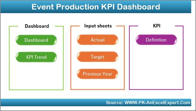
📊 Structure of the Event Production KPI Dashboard
The dashboard is composed of seven worksheet tabs, each serving a unique purpose in managing and analyzing event KPIs.
1️⃣ Home Sheet
2️⃣ Dashboard Sheet
3️⃣ KPI Trend Sheet
4️⃣ Actual Numbers Input Sheet
5️⃣ Target Sheet
6️⃣ Previous Year Numbers Sheet
7️⃣ KPI Definition Sheet
Let’s explore each in detail.
🏠 1. Home Sheet – The Navigation Center
The Home Sheet acts as the control panel for the entire workbook. It includes six interactive buttons that allow users to jump directly to different sections of the dashboard.
This feature saves time and makes navigation easy, especially for new users. Each button links to a specific sheet, ensuring a seamless transition between data input, analysis, and visualization.
Click to Purchases Event Production KPI Dashboard in Excel
Benefits:
-
Simplifies user navigation.
-
Prevents manual scrolling across sheets.
-
Offers a professional and user-friendly interface.
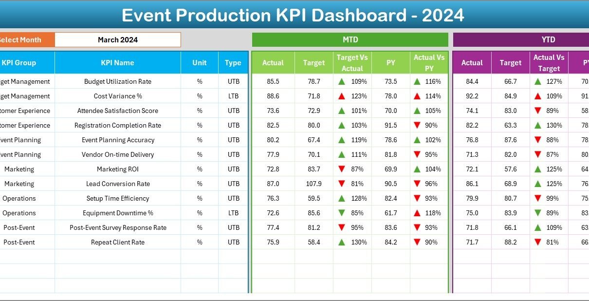
📈 2. Dashboard Sheet – The Performance Overview
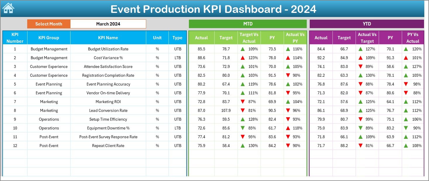
This is the main sheet of the Event Production KPI Dashboard. It’s where the real analysis happens.
🔹 Dynamic Month Selection
At the top, you’ll find a dropdown menu (cell D3) to select a month. Once you choose a month, all data — including MTD and YTD — updates automatically across charts and tables.
🔹 Data Display
The dashboard shows both Month-to-Date (MTD) and Year-to-Date (YTD) values:
-
Actual Numbers: Current performance values.
-
Target Numbers: Desired or expected results.
-
Previous Year Data: Historical data for the same period.
🔹 Visual Indicators
Conditional formatting adds color-coded arrows:
-
🔺 Green upward arrow – Performance meets or exceeds target.
-
🔻 Red downward arrow – Performance below target.
These icons make the data instantly understandable without deep analysis.
🔹 KPI Metrics Displayed
-
Target vs. Actual (MTD): Shows percentage achievement.
-
PY vs. CY (MTD): Compares current and previous year’s performance.
-
Target vs. Actual (YTD): Displays yearly progress.
-
PY vs. CY (YTD): Year-over-year growth percentage.
Example:
If the current MTD event attendance is 9,800 against a target of 10,000, the dashboard shows 98% completion with a red down arrow if it’s below target.
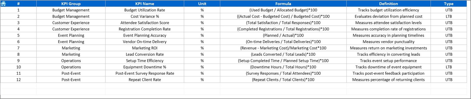
📉 3. KPI Trend Sheet – Tracking Progress Over Time
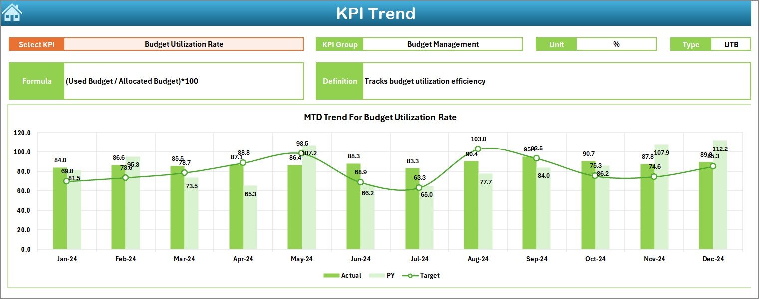
The KPI Trend Sheet provides deeper insights into performance trends across months.
🔹 Interactive KPI Selection
A dropdown in cell C3 allows you to choose any KPI from the list. Once selected, the sheet automatically updates to show detailed information about that KPI.
🔹 Key Information Displayed
-
KPI Group: Category of the KPI (e.g., Budget, Logistics, Marketing).
-
Unit: Unit of measurement (e.g., %, Count, Hours, Cost).
-
Type: “Lower the Better” (LTB) or “Upper the Better” (UTB).
-
Formula: Calculation logic behind the KPI.
-
Definition: Explanation of what the KPI represents.
🔹 Trend Charts
Two main charts display MTD and YTD comparisons:
-
MTD Trend Chart: Compares Actual vs. Target vs. Previous Year.
-
YTD Trend Chart: Shows long-term cumulative performance.
These charts help identify whether performance is improving or declining, enabling managers to take timely corrective action.
📋 4. Actual Numbers Input Sheet – Data Entry Area
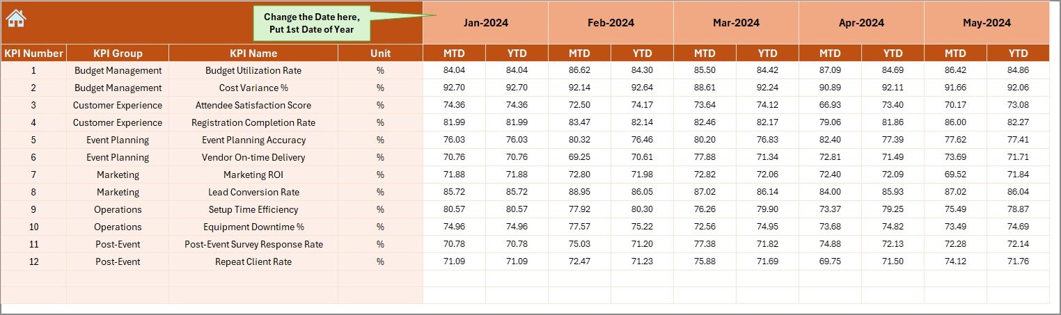
This sheet is where users enter actual event performance data.
🔹 Data to Enter
-
KPI Name
-
Month (use the first day of the month)
-
MTD Value
-
YTD Value
🔹 How It Works
The dashboard automatically reads this data when refreshed, ensuring accurate visualization in all charts and calculations.
To maintain consistency, the first month of the year (e.g., January 1) should be entered in cell E1.
🎯 5. Target Sheet – Defining Performance Goals
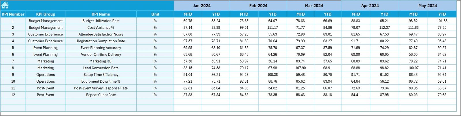
The Target Sheet is used to enter the desired performance levels for each KPI.
🔹 Key Inputs
-
KPI Name
-
Month
-
Target MTD
-
Target YTD
This ensures that comparisons in the Dashboard and Trend sheets accurately reflect performance against targets.
Maintaining realistic targets helps management set achievable goals and evaluate event success effectively.
📆 6. Previous Year Numbers Sheet – Benchmarking Historical Data
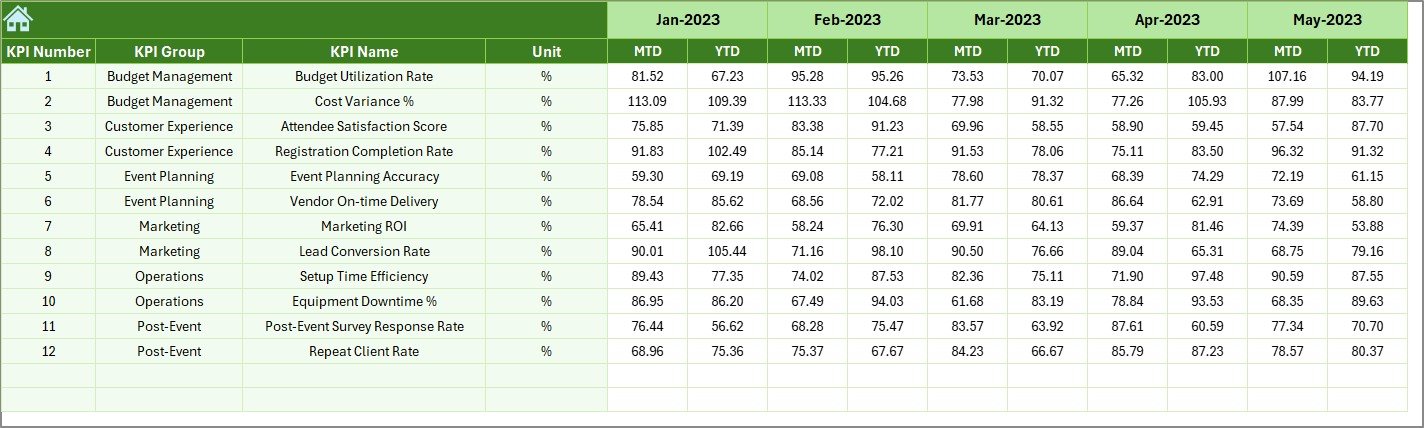
Historical data is essential for meaningful performance evaluation.
The Previous Year Numbers Sheet stores data for the same KPIs from the last year.
By entering these numbers in a similar format to the current year, the dashboard automatically calculates:
-
Year-over-Year performance growth
-
Trend improvements or declines
-
Long-term event success indicators
This benchmarking helps in identifying consistent performers and areas needing focus.
📘 7. KPI Definition Sheet – The Reference Library
This sheet acts as a reference guide for all KPIs used in the dashboard.
🔹 Fields Included
-
KPI Name
-
KPI Group
-
Unit of Measurement
-
Formula
-
KPI Definition
-
Type (LTB or UTB)
It ensures that everyone on the team understands how each KPI is calculated and interpreted.
When KPI definitions are standardized, event managers can make more reliable comparisons and communicate results clearly to stakeholders.
Click to Purchases Event Production KPI Dashboard in Excel
🧩 How the Dashboard Works
The entire system follows a simple workflow:
-
Input Actual Data: Enter event results in the Actual sheet.
-
Enter Targets: Define expected results in the Target sheet.
-
Add Historical Data: Provide previous year numbers for benchmarking.
-
Refresh Dashboard: Update the Excel calculations to refresh visuals.
-
Analyze Results: Review insights in Dashboard and Trend sheets.
All calculations update automatically, minimizing manual work and reducing the risk of human error.
💡 Advantages of the Event Production KPI Dashboard in Excel
Implementing this dashboard provides numerous operational and strategic benefits.
✅ Key Advantages
-
Centralized KPI Tracking: View all event performance metrics in one place.
-
Time Efficiency: Automated calculations reduce manual reporting hours.
-
Real-Time Insights: Instantly identify strong or weak performance areas.
-
Data Consistency: Unified data source ensures reliable decision-making.
-
Enhanced Accuracy: Built-in formulas minimize calculation errors.
-
Visual Clarity: Conditional formatting and charts simplify analysis.
-
Easy Customization: Add or remove KPIs without coding knowledge.
-
Professional Presentation: Ready for management review and client reporting.
Whether managing small corporate events or large productions, this tool helps teams stay organized and goal-oriented.
🧠 Opportunities for Improvement
Even though the Event Production KPI Dashboard is comprehensive, you can enhance it further through advanced Excel techniques.
Click to Purchases Event Production KPI Dashboard in Excel
🔹 Suggested Improvements
-
Add Department-Wise Filters: Analyze KPIs for logistics, marketing, or finance teams separately.
-
Integrate VBA Buttons: Automate data refresh or chart export actions.
-
Include Forecasting Models: Use Excel formulas to predict future event performance.
-
Connect Live Data: Link to Google Sheets or databases for auto-updates.
-
Create Printable Reports: Add summary pages formatted for PDF export.
By applying these upgrades, event planners can turn the dashboard into a full performance management system.
🧭 Best Practices for Using the Dashboard
To ensure consistent and accurate reporting, follow these best practices:
🔸 Data Entry
-
Always use correct date formats (first day of the month).
-
Verify all values before refreshing the dashboard.
-
Maintain consistent naming conventions for KPIs.
🔸 Dashboard Usage
-
Review KPIs regularly to track trends.
-
Compare monthly results against targets and past performance.
-
Discuss outliers and anomalies during team reviews.
🔸 Maintenance
-
Archive previous year Excel files for reference.
-
Update KPI definitions when event strategies change.
-
Use Excel’s protection feature to lock formulas from accidental edits.
Following these guidelines ensures your dashboard remains reliable, accurate, and easy to maintain throughout the year.
📊 Example KPIs for Event Production
Here are some KPIs typically tracked using this dashboard:
-
Event Budget Utilization (%)
-
Event Attendance Rate (%)
-
Sponsorship Revenue (USD)
-
Logistics Timeliness (%)
-
Vendor Delivery Compliance (%)
-
Customer Satisfaction Score
-
Marketing ROI (%)
-
Event Lead Conversion (%)
-
Operational Cost per Event (USD)
-
Average Setup Time (Hours)
These indicators help event planners analyze efficiency, profitability, and audience satisfaction — the three pillars of successful event management.
🧾 Conclusion
The Event Production KPI Dashboard in Excel is a powerful performance tracking solution for event managers and production teams. It simplifies data collection, automates analysis, and presents results in a visually compelling way.
By consolidating actuals, targets, and historical data in one workbook, you gain a complete understanding of your event’s success and improvement opportunities.
Whether you manage corporate conferences, entertainment shows, or exhibitions, this dashboard empowers you to make informed decisions, improve efficiency, and deliver successful events every time.
Click to Purchases Event Production KPI Dashboard in Excel
❓ Frequently Asked Questions (FAQs)
1. What is an Event Production KPI Dashboard?
It’s an Excel-based tool that tracks and visualizes key metrics for event performance, such as budget, attendance, and satisfaction.
2. How many sheets does this dashboard include?
It contains seven sheets — Home, Dashboard, KPI Trend, Actual Numbers, Target, Previous Year Numbers, and KPI Definition.
3. Do I need Excel formulas knowledge to use it?
No, all formulas are pre-built. You only need to update the input sheets.
4. Can I customize KPIs?
Yes, you can add, remove, or rename KPIs according to your organization’s needs.
5. How are MTD and YTD calculated?
They are auto-calculated from the Actual and Target sheets using month selection.
6. Does it show visual comparisons?
Yes, it includes up/down arrows and color formatting for easy interpretation.
7. Can I compare performance with last year?
Absolutely. The Previous Year Numbers sheet enables year-over-year comparisons.
8. Is it suitable for large-scale events?
Yes, it’s scalable for both small and large productions.
9. Can I export reports?
Yes, you can export dashboard visuals to PDF or PowerPoint for presentations.
Click to Purchases Event Production KPI Dashboard in Excel
Visit our YouTube channel to learn step-by-step video tutorials