Managing facility leases across multiple locations often becomes complicated. Many organizations still depend on scattered spreadsheets and manual tracking. As a result, teams struggle to monitor lease costs, escalation trends, occupancy status, and service charges effectively. Moreover, decision-makers often lack real-time visibility into facility performance.
So, how can facility managers and finance teams control leasing data in one centralized and interactive system?
The answer is simple.
You need a Facilities Leasing Dashboard in Power BI.
Click to Purchases Facilities Leasing Dashboard in Power BI
This powerful and ready-to-use dashboard helps organizations track lease metrics, analyze cost drivers, and monitor performance across departments, regions, and facility types. Furthermore, it enables faster monthly reviews and smarter decisions. Therefore, businesses gain clarity, control, and confidence in managing their facility portfolio.
In this comprehensive guide, you will learn:
-
What a Facilities Leasing Dashboard in Power BI is
-
Why organizations need it
-
Detailed explanation of all 5 analytical pages
-
Advantages of the dashboard
-
Best practices for implementation
-
Frequently asked questions
Let us explore everything step by step.
What Is a Facilities Leasing Dashboard in Power BI?
A Facilities Leasing Dashboard in Power BI is an interactive business intelligence solution that helps organizations monitor and analyze lease-related financial and operational data in real time.
Instead of using multiple spreadsheets, you can view everything in one structured dashboard. As a result, facility managers quickly identify cost patterns, escalation trends, and performance gaps.
This dashboard typically tracks:
-
Escalation percentages
-
Monthly lease costs
-
Service charges
-
Lease status distribution
-
Department and regional performance
-
Month-wise trends
Because Power BI offers dynamic filtering and visualization, users can slice data instantly. Consequently, decision-makers respond faster and plan better.
Why Do Organizations Need a Facilities Leasing Dashboard?
Many companies manage dozens or even hundreds of leased facilities. However, without a centralized system, several problems appear.
Common Challenges Without a Dashboard
-
Teams maintain data in multiple files
-
Manual reporting consumes too much time
-
Cost overruns remain unnoticed
-
Escalation tracking becomes difficult
-
Department-wise visibility stays limited
-
Monthly reviews take longer
Therefore, organizations need a smarter approach.
How the Dashboard Solves These Problems
The Facilities Leasing Dashboard in Power BI provides:
-
Real-time visibility
-
Automated calculations
-
Interactive filtering
-
Department and region insights
-
Faster monthly analysis
-
Better cost control
As a result, leadership teams make confident, data-driven decisions.
Key Features of the Facilities Leasing Dashboard in Power BI
This dashboard contains 5 powerful analytical pages inside the Power BI Desktop file. Each page focuses on a specific dimension of facility leasing performance.
Let us understand each page in detail.
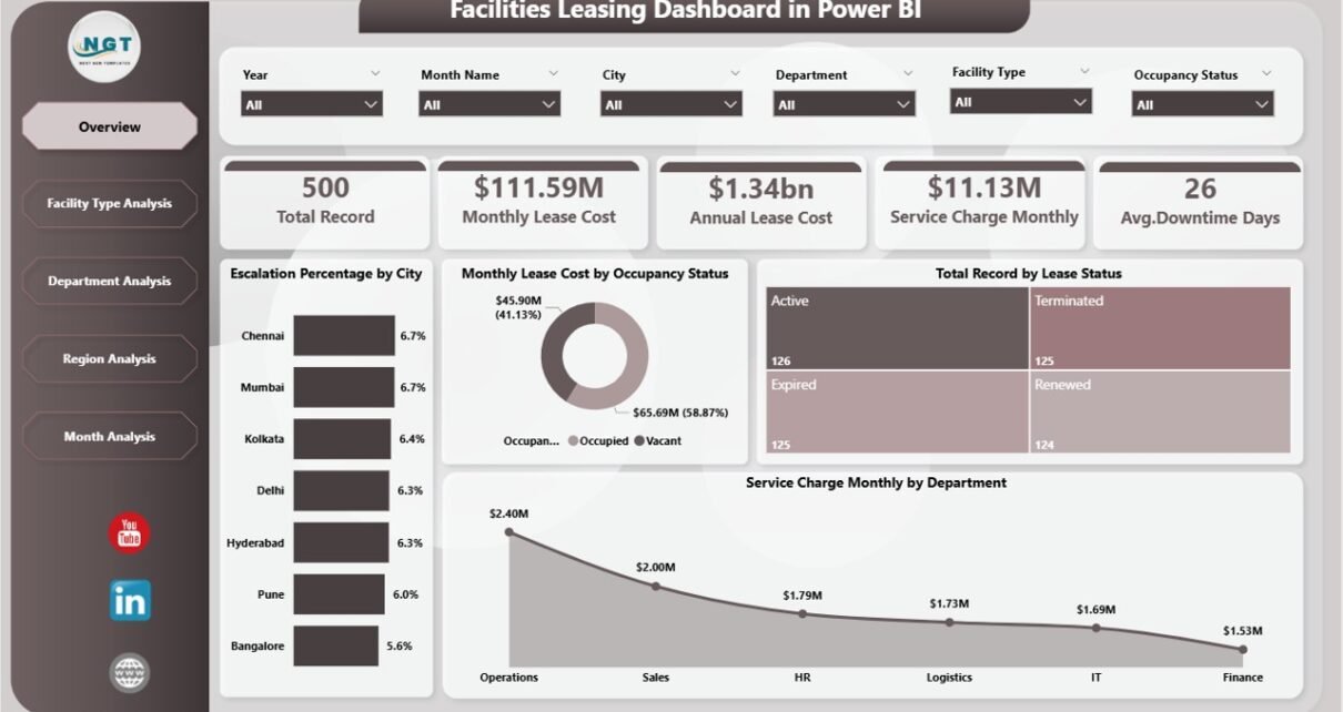
1. Overview Page – Your Command Center
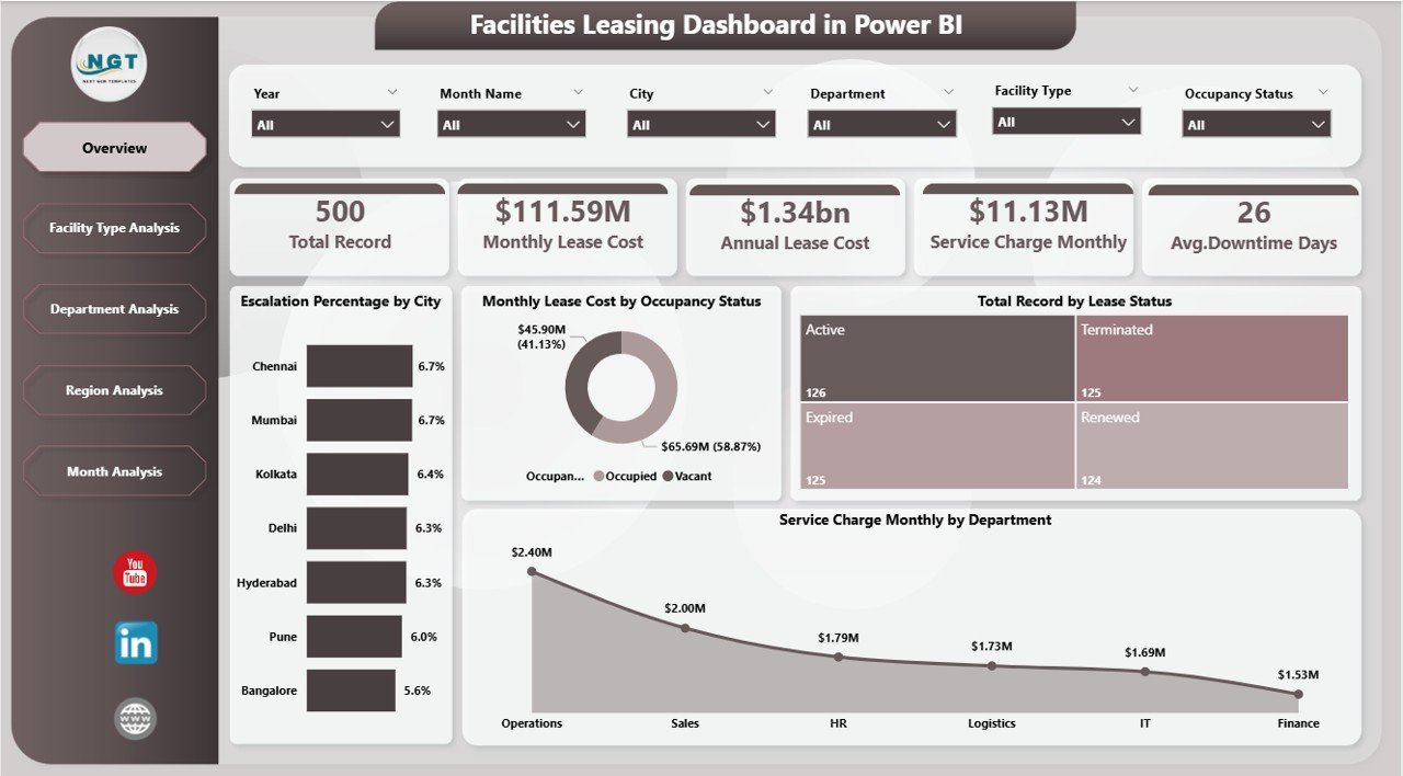
The Overview Page serves as the main landing page of the dashboard. It provides a high-level summary of key leasing metrics.
🔹 Slicers Available
Users can quickly filter data using interactive slicers. Therefore, the dashboard updates instantly based on selections.
🔹 KPI Cards Displayed
The page includes five important KPI cards:
-
Escalation % by City
-
Monthly Lease Cost by Occupancy Status
-
Total Record by Lease Status
-
Service Charge Monthly by Department
-
Overall performance indicators
Because these cards appear at the top, users immediately understand the current leasing position.
🔹 Key Charts on Overview
The Overview page helps answer critical questions such as:
-
Which cities show higher escalation?
-
How does occupancy affect lease cost?
-
What is the distribution of lease status?
-
Which departments incur higher service charges?
Therefore, executives can perform a quick health check within seconds.
2. Facility Type Analysis – Which Facilities Cost More?
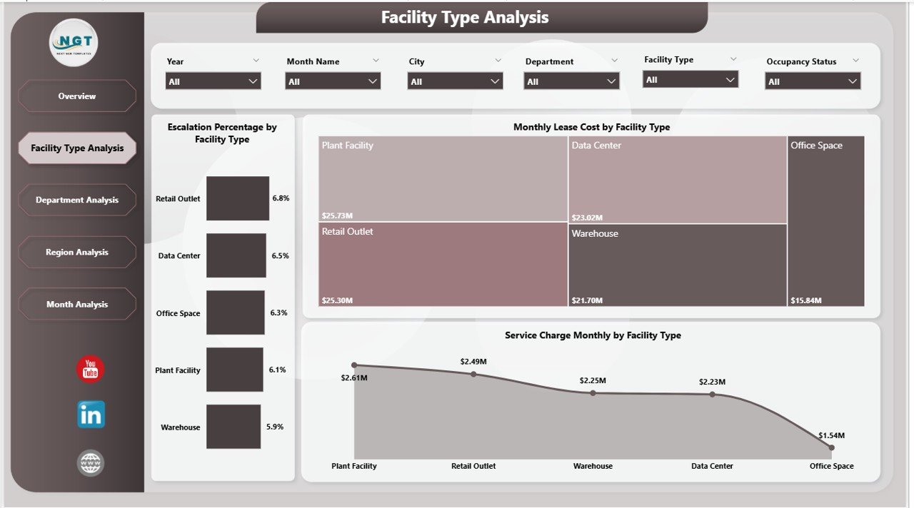
The Facility Type Analysis page provides deep insights into performance by facility category.
🔹 Available Slicers
Users can filter data dynamically to focus on specific facility types.
Click to Purchases Facilities Leasing Dashboard in Power BI
🔹 Charts Included
This page contains three powerful visuals:
-
Escalation % by Facility Type
-
Monthly Lease Cost by Facility Type
-
Service Charge Monthly by Facility Type
🔹 What Insights Can You Get?
With this page, organizations can:
-
Identify high-cost facility categories
-
Compare escalation trends across facility types
-
Monitor service charge distribution
-
Optimize facility mix
As a result, facility planners allocate budgets more efficiently.
3. Department Analysis – Who Drives the Costs?
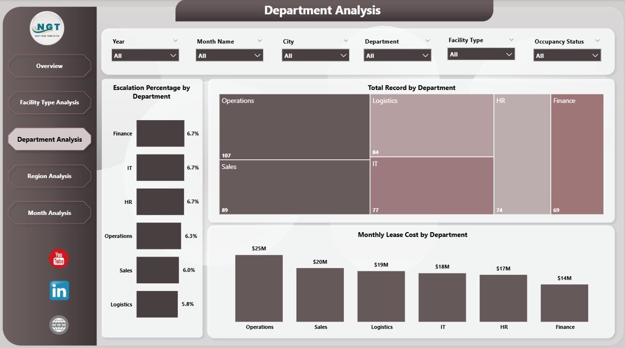
The Department Analysis page helps organizations understand how different departments utilize leased facilities.
🔹 Interactive Filtering
Users can slice the data by department and other dimensions. Consequently, the dashboard reveals hidden cost patterns.
🔹 Charts on This Page
-
Escalation % by Department
-
Monthly Lease Cost by Department
-
Total Record by Department
🔹 Business Questions Answered
This page helps management answer:
-
Which department spends the most on leasing?
-
Where do escalation rates remain high?
-
How many lease records belong to each department?
Therefore, finance teams can control departmental budgets more effectively.
Click to Purchases Facilities Leasing Dashboard in Power BI
4. Region Analysis – Geographic Performance Insights
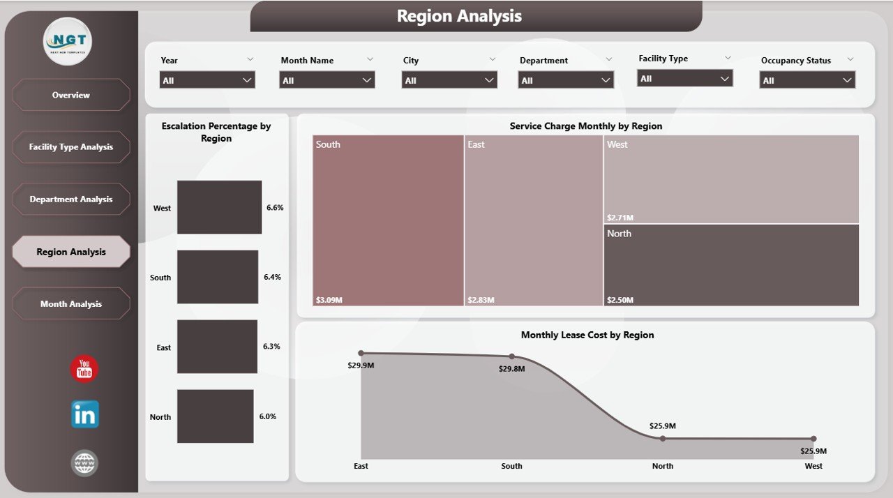
The Region Analysis page focuses on location-based lease performance. This view becomes extremely valuable for organizations operating across multiple regions.
🔹 Key Visuals
The page includes three charts:
-
Escalation % by Region
-
Monthly Lease Cost by Region
-
Service Charge Monthly by Region
🔹 Why This Page Matters
With regional insights, organizations can:
-
Detect high-cost regions
-
Compare geographic performance
-
Plan regional budgets
-
Identify negotiation opportunities
As a result, leadership teams improve regional cost efficiency.
5. Month Analysis – Track Trends Over Time
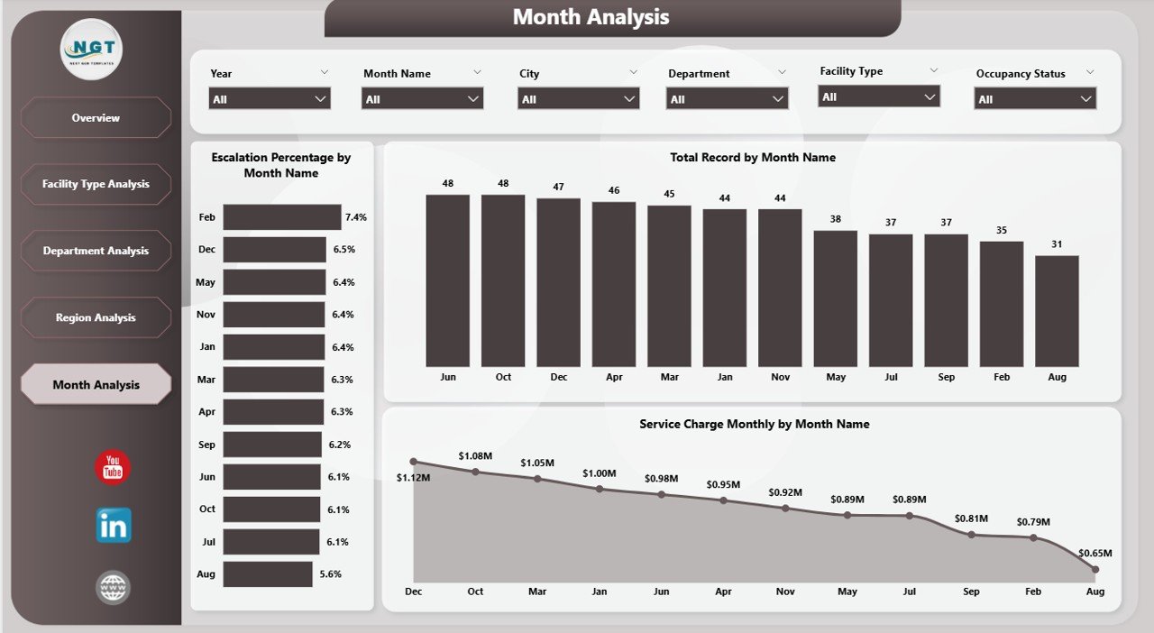
The Month Analysis page reveals time-based trends in facility leasing.
🔹 Charts Available
-
Escalation % by Month
-
Total Record by Month
-
Service Charge Monthly by Month
🔹 Insights You Can Extract
This page helps users:
-
Monitor monthly cost patterns
-
Detect seasonal spikes
-
Track escalation trends over time
-
Evaluate leasing growth
Because trend analysis drives forecasting, this page supports long-term planning.
What Type of Analysis Can You Perform?
Click to Purchases Facilities Leasing Dashboard in Power BI
The Facilities Leasing Dashboard in Power BI enables powerful multi-dimensional analysis.
🔹 Financial Analysis
-
Monthly lease cost tracking
-
Service charge monitoring
-
Escalation trend analysis
-
Cost comparison across regions
🔹 Operational Analysis
-
Occupancy status review
-
Lease status monitoring
-
Department utilization
-
Facility type performance
🔹 Strategic Analysis
-
Budget planning
-
Cost optimization
-
Vendor negotiation support
-
Portfolio rationalization
Therefore, this dashboard supports both operational and strategic decisions.
Advantages of Facilities Leasing Dashboard in Power BI
Implementing this dashboard delivers significant business value. Let us explore the key advantages.
✅ Centralized Data Visibility
You can view all leasing information in one place. As a result, teams stop searching through multiple files.
✅ Real-Time Insights
Power BI updates visuals instantly. Therefore, decision-makers always see the latest data.
✅ Faster Decision-Making
Because the dashboard highlights key metrics, leaders act quickly and confidently.
✅ Improved Cost Control
The dashboard clearly shows cost drivers. Consequently, finance teams reduce unnecessary expenses.
✅ Better Department Accountability
Department-wise views increase transparency. As a result, teams manage their budgets more responsibly.
✅ Strong Visual Storytelling
Interactive charts make complex data easy to understand. Therefore, even non-technical users benefit.
✅ Scalable and Flexible
Organizations can easily expand the dashboard as data grows.
Best Practices for the Facilities Leasing Dashboard in Power BI
To get maximum value from this dashboard, follow these proven best practices.
🔹 Keep Data Clean and Structured
Always maintain consistent data formats. Clean data improves dashboard accuracy.
🔹 Update Data Regularly
Schedule frequent data refreshes. Therefore, users always see current insights.
🔹 Use Meaningful Filters
Configure slicers carefully. Good filters improve user experience significantly.
🔹 Monitor Key KPIs Monthly
Review escalation, lease cost, and service charges every month. Regular monitoring prevents surprises.
🔹 Standardize Department and Region Names
Consistent naming avoids reporting errors.
🔹 Limit Visual Clutter
Do not overload pages with too many visuals. Clean dashboards improve readability.
🔹 Train End Users
Provide short training sessions. Educated users extract more value from the dashboard.
Who Should Use This Dashboard?
The Facilities Leasing Dashboard in Power BI serves multiple business roles.
👔 Facility Managers
They can monitor occupancy, costs, and facility performance.
💰 Finance Teams
They can track expenses, escalation trends, and budget impact.
🏢 Corporate Real Estate Teams
They can optimize the lease portfolio.
📊 Business Leaders
They can make strategic decisions based on real data.
🧾 Operations Teams
They can improve resource allocation.
Therefore, this dashboard fits organizations of all sizes.
How Does This Dashboard Improve Decision-Making?
This dashboard transforms raw lease data into actionable intelligence.
Because users can slice data instantly, they identify problems faster. Moreover, visual trends highlight cost spikes before they become serious.
As a result:
-
Teams reduce manual reporting
-
Leaders detect inefficiencies early
-
Finance improves budget control
-
Operations optimize facility usage
Consequently, organizations move from reactive management to proactive planning.
Implementation Tips for Quick Success
If you plan to deploy this dashboard, follow these quick tips:
-
Start with clean historical data
-
Define clear KPI ownership
-
Validate calculations before publishing
-
Use role-based access if required
-
Schedule automatic refresh
-
Collect user feedback regularly
These steps ensure smooth adoption.
Conclusion
Click to Purchases Facilities Leasing Dashboard in Power BI
Managing facility leases without a structured system creates confusion, delays, and cost leakages. However, the Facilities Leasing Dashboard in Power BI changes everything.
It brings all lease data into one interactive platform. Moreover, it delivers real-time visibility across departments, regions, facility types, and months. Because the dashboard highlights key cost drivers, organizations gain stronger financial control.
In addition, the five analytical pages provide deep operational and strategic insights. Therefore, facility managers, finance teams, and leadership can make faster and smarter decisions.
If your organization wants better lease visibility, improved cost control, and data-driven planning, this dashboard offers the perfect solution.
Frequently Asked Questions (FAQs)
❓ What is a Facilities Leasing Dashboard in Power BI?
It is an interactive reporting solution that helps organizations monitor lease costs, escalation trends, service charges, and facility performance in one centralized view.
❓ Who can use this dashboard?
Facility managers, finance teams, corporate real estate teams, and business leaders can use it effectively.
❓ Can the dashboard handle large data volumes?
Yes. Power BI handles large datasets efficiently. Therefore, the dashboard scales as your organization grows.
❓ How often should we update the data?
You should refresh the data monthly or weekly. However, many organizations prefer automated daily refresh for real-time insights.
❓ Does this dashboard support filtering?
Yes. The dashboard includes interactive slicers. Users can filter by city, department, region, facility type, and month.
Visit our YouTube channel to learn step-by-step video tutorials