Fleet management has evolved rapidly in recent years. Companies no longer rely only on owning vehicles to manage transportation services. Instead, many organizations now use Fleet-as-a-Service (FaaS) models to manage mobility operations more efficiently.
However, as fleet operations grow, managers must track several performance indicators such as trip cost, fuel expenses, contract performance, driver ratings, and service packages. Without a proper monitoring system, companies often struggle to manage fleet performance effectively.
Therefore, organizations increasingly use data-driven analytics dashboards to monitor fleet performance and optimize transportation operations. One of the most effective solutions is the Fleet-as-a-Service Dashboard in Power BI.
The Fleet-as-a-Service Dashboard in Power BI provides a centralized platform where fleet managers can track operational costs, revenue performance, driver ratings, service packages, and fuel efficiency. Because Power BI offers interactive visualizations and powerful analytics capabilities, decision-makers gain valuable insights into fleet operations.
In this comprehensive guide, we will explore everything about the Fleet-as-a-Service Dashboard in Power BI, including its features, benefits, best practices, and frequently asked questions.
Click to buy Fleet-as-a-Service Dashboard in Power BI
What is a Fleet-as-a-Service Dashboard in Power BI?
A Fleet-as-a-Service Dashboard in Power BI is an interactive analytics dashboard designed to monitor and analyze fleet operations in real time.
Instead of reviewing multiple spreadsheets or manual reports, fleet managers can use this dashboard to track key operational metrics such as:
- Total trip cost
- Fuel or energy cost
- Revenue generated
- Driver performance
- Contract status
- Service package profitability
- Regional operational trends
Because the dashboard consolidates data into visual charts, KPI cards, and slicers, managers can quickly analyze operational performance and identify areas that require improvement.
Moreover, Power BI allows organizations to integrate multiple data sources such as fleet management systems, telematics platforms, fuel tracking systems, and operational databases.
As a result, fleet managers gain complete visibility into fleet performance.
Why Do Companies Need a Fleet-as-a-Service Dashboard?
Fleet operations involve many moving parts. Companies must manage vehicles, drivers, contracts, fuel consumption, maintenance costs, and service packages simultaneously.
Without proper monitoring tools, businesses often face several challenges:
- Rising operational costs
- Poor fuel efficiency
- Lack of driver performance insights
- Contract management difficulties
- Inefficient service package planning
Therefore, organizations use Fleet-as-a-Service dashboards to overcome these challenges.
When companies implement a Fleet-as-a-Service Dashboard in Power BI, they gain:
- Real-time operational visibility
- Data-driven decision making
- Cost optimization insights
- Improved fleet efficiency
As a result, companies can run fleet operations more efficiently while improving profitability.
Key Features of the Fleet-as-a-Service Dashboard in Power BI
The Fleet-as-a-Service Dashboard in Power BI contains five interactive analytical pages. Each page focuses on a specific aspect of fleet operations.
Let us explore each page in detail.
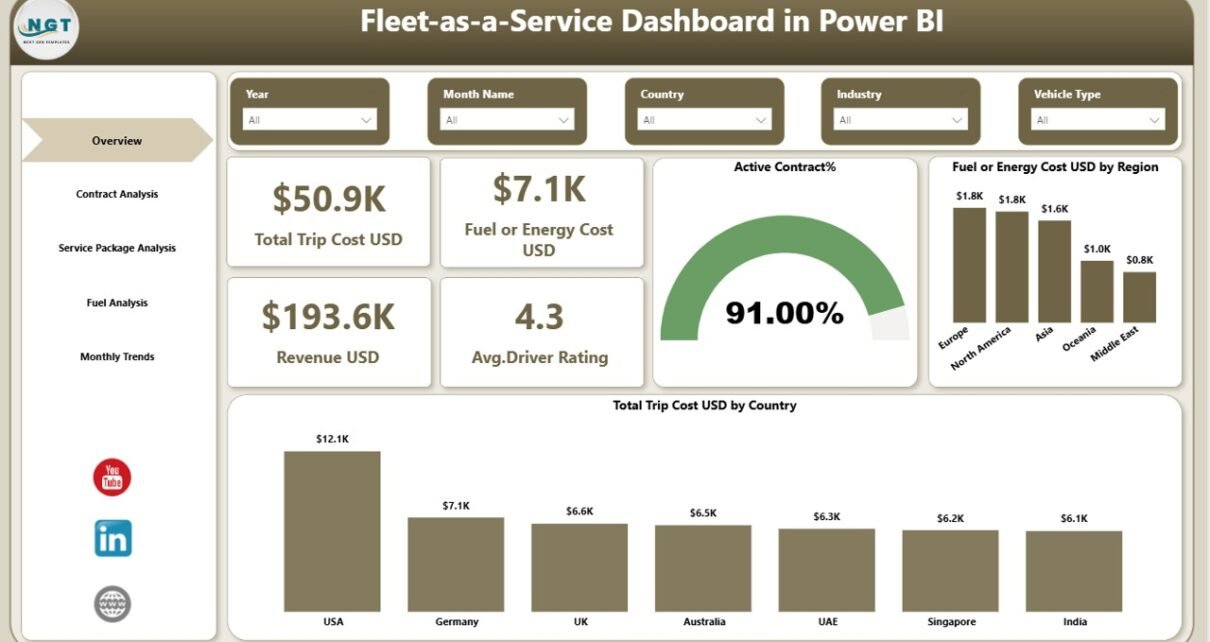
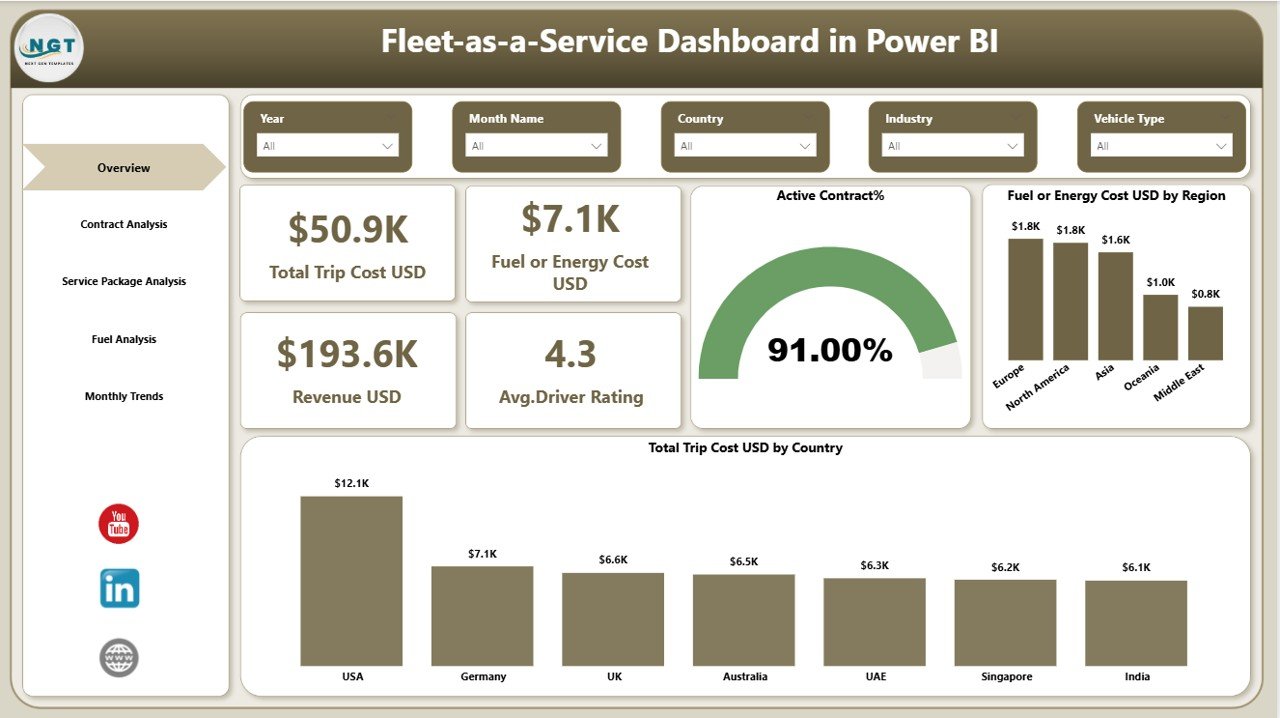
Overview Page: What Does the Main Dashboard Show?
The Overview Page acts as the central control panel of the dashboard. It provides a high-level summary of fleet performance.
Because managers need quick insights, this page displays the most important operational metrics using KPI cards and visual charts.
KPI Cards on the Overview Page
The dashboard displays four key performance indicators:
- Total Trip Cost (USD) – Shows the total operational cost of fleet trips.
- Fuel or Energy Cost (USD) – Displays the total fuel or electric energy expenses.
- Revenue (USD) – Shows the total revenue generated from fleet operations.
- Average Driver Rating – Displays driver performance ratings from customers.
These KPI cards allow managers to quickly evaluate overall fleet performance.
Charts on the Overview Page
The overview page also includes three analytical charts:
- Active Contract Percentage – Shows the proportion of active fleet contracts.
- Fuel or Energy Cost by Region – Helps managers identify regions with higher fuel costs.
- Total Trip Cost by Country – Displays trip expenses across different countries.
Because these visualizations highlight operational trends, managers can easily detect cost variations and performance issues.
Click to buy Fleet-as-a-Service Dashboard in Power BI
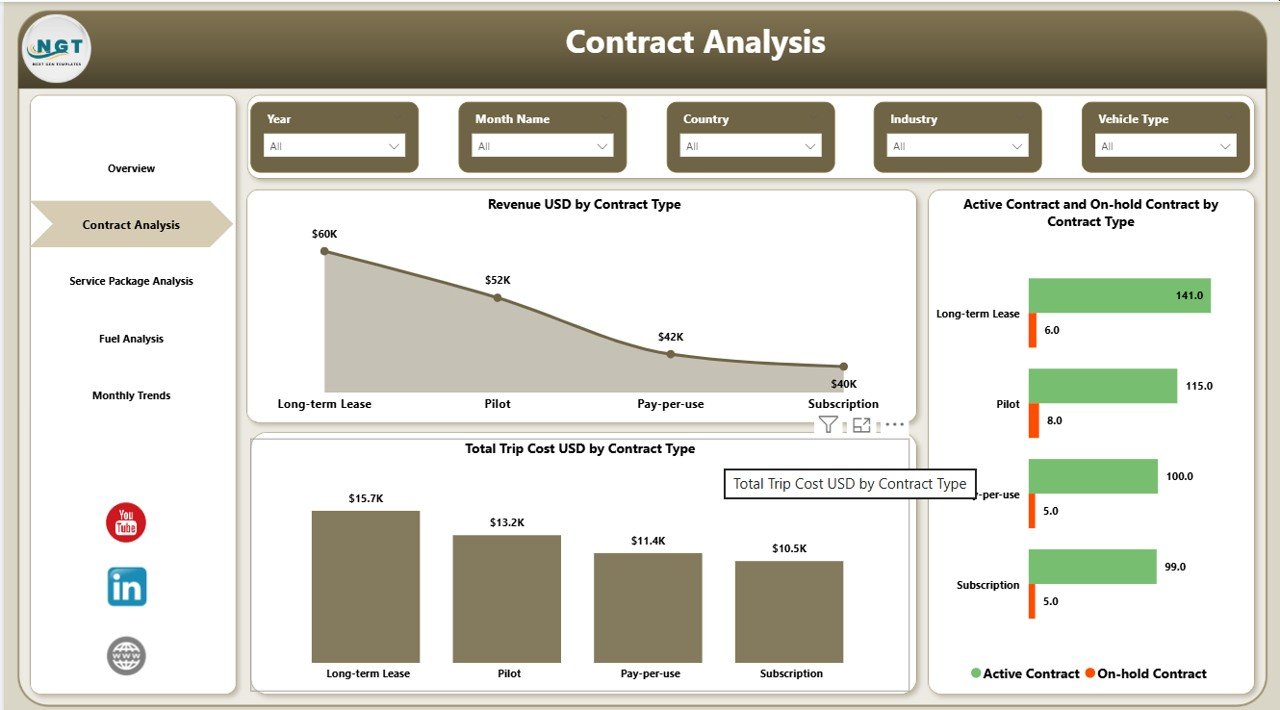
Contract Analysis: How Does the Dashboard Track Contract Performance?
Contracts play a major role in fleet operations. Many companies offer Fleet-as-a-Service solutions through service contracts.
The Contract Analysis Page helps organizations evaluate contract performance.
This page includes three important charts:
Revenue by Contract Type
This chart shows how much revenue each contract category generates.
For example:
- Corporate contracts
- Logistics contracts
- Rental service contracts
Because this information highlights revenue distribution, businesses can focus on the most profitable contract types.
Active and On-Hold Contracts by Contract Type
This visualization shows the number of contracts that are:
- Active
- On hold
As a result, fleet managers can monitor contract health and quickly identify operational delays.
Total Trip Cost by Contract Type
This chart compares trip costs across contract categories.
Therefore, managers can evaluate whether specific contracts generate sufficient profit compared to operational expenses.
Click to buy Fleet-as-a-Service Dashboard in Power BI
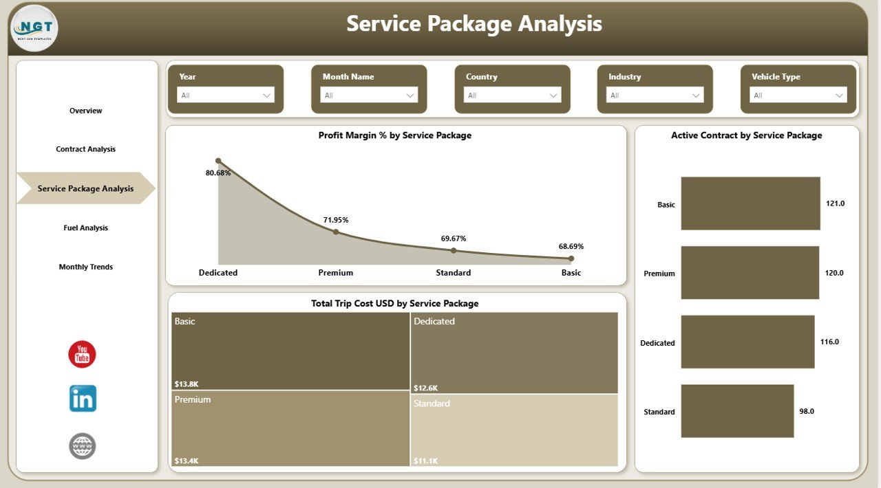
Service Package Analysis: How Do Service Packages Affect Fleet Profitability?
Fleet-as-a-Service companies often provide multiple service packages.
Examples include:
- Premium fleet packages
- Standard fleet services
- Short-term mobility packages
- Subscription-based fleet services
The Service Package Analysis Page helps managers analyze the performance of these packages.
Charts Included in Service Package Analysis
Profit Margin Percentage by Service Package
This chart shows how profitable each package is.
Because profit margins directly impact company growth, managers can use this chart to optimize pricing strategies.
Active Contracts by Service Package
This visualization displays the number of active customers subscribed to each service package.
As a result, managers can identify the most popular service offerings.
Total Trip Cost by Service Package
This chart helps managers evaluate the operational cost associated with each service package.
Therefore, businesses can balance service quality with operational expenses.
Click to buy Fleet-as-a-Service Dashboard in Power BI
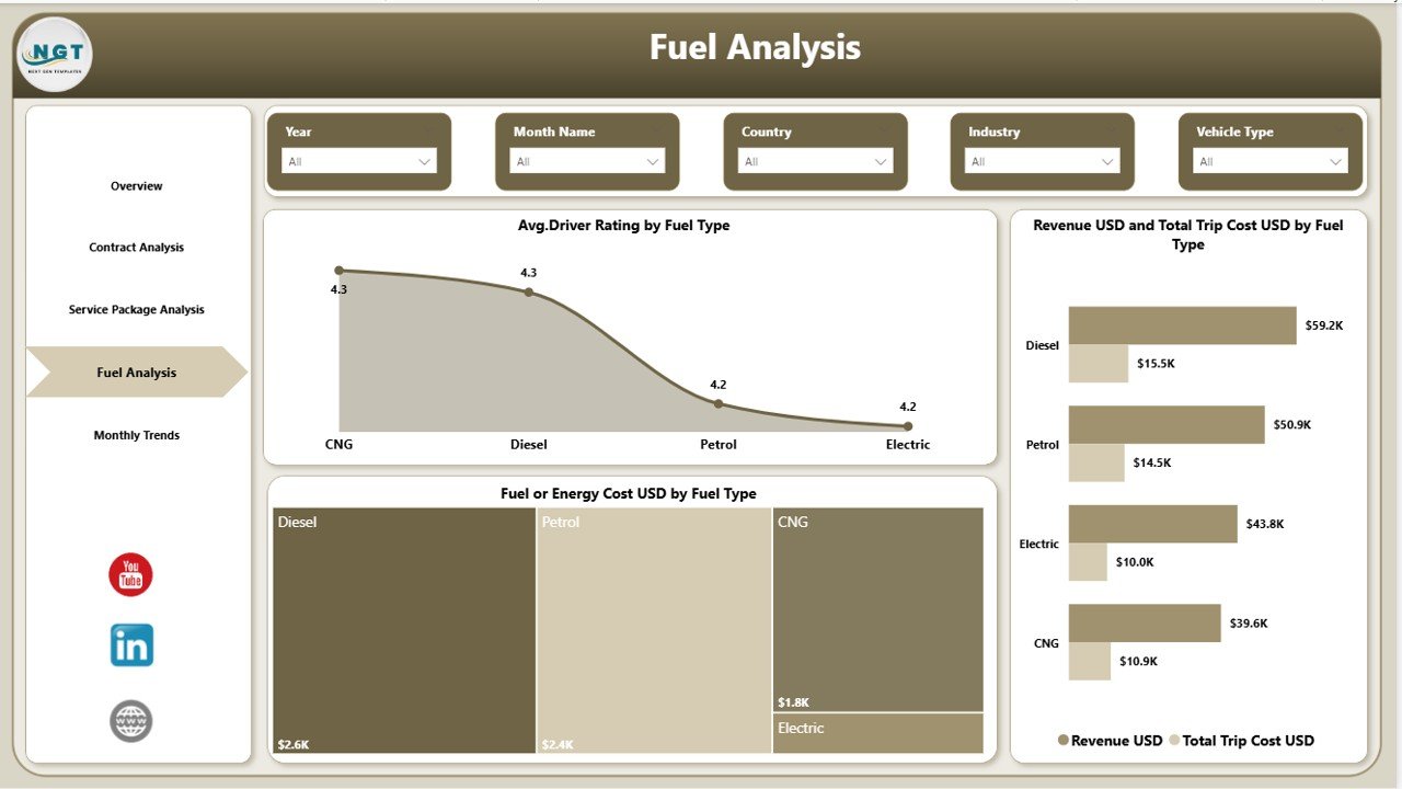
Fuel Analysis: How Does the Dashboard Track Energy Consumption?
Fuel or energy consumption remains one of the largest operational expenses in fleet management.
Therefore, the Fuel Analysis Page focuses on energy efficiency and fuel performance.
Charts Included in Fuel Analysis
Average Driver Rating by Fuel Type
This chart compares driver ratings across different fuel types such as:
- Diesel vehicles
- Petrol vehicles
- Electric vehicles
- Hybrid vehicles
Because driver performance often influences customer satisfaction, companies can monitor service quality across different vehicle types.
Revenue and Total Trip Cost by Fuel Type
This visualization compares revenue and operational costs for each fuel type.
As a result, fleet managers can determine which vehicle types generate better financial performance.
Fuel or Energy Cost by Fuel Type
This chart displays fuel expenses across vehicle categories.
Therefore, companies can identify cost-saving opportunities and shift toward energy-efficient fleets.
Click to buy Fleet-as-a-Service Dashboard in Power BI
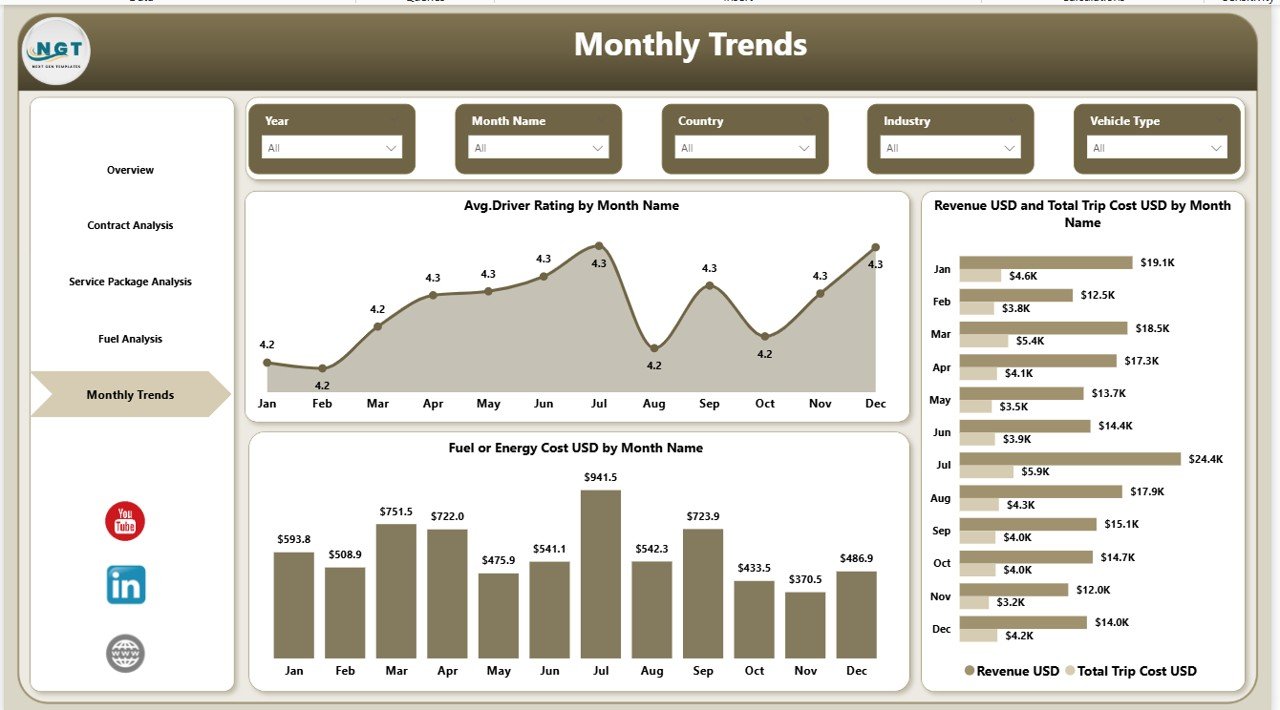
Month Analysis: How Does the Dashboard Track Monthly Trends?
Fleet performance changes over time. Therefore, companies must analyze operational metrics on a monthly basis.
The Month Analysis Page helps organizations monitor monthly fleet trends.
Charts Included in Month Analysis
Average Driver Rating by Month
This chart helps managers track customer satisfaction trends across different months.
Revenue and Total Trip Cost by Month
This visualization compares revenue with trip costs over time.
As a result, managers can evaluate seasonal demand patterns.
Fuel or Energy Cost by Month
This chart tracks energy expenses across months.
Because fuel prices fluctuate frequently, companies can analyze cost trends and plan budgets accordingly.
Click to buy Fleet-as-a-Service Dashboard in Power BI
Advantages of Fleet-as-a-Service Dashboard in Power BI
Organizations gain several benefits when they implement the Fleet-as-a-Service Dashboard in Power BI.
- Centralized Fleet Data Management
The dashboard consolidates fleet data into one platform. Therefore, managers no longer need to review multiple spreadsheets.
- Improved Operational Visibility
Interactive charts and KPI cards provide clear visibility into fleet performance.
- Better Decision Making
Because managers access real-time analytics, they can make data-driven decisions.
- Cost Optimization
Companies can monitor fuel costs, trip expenses, and service package profitability.
- Enhanced Customer Satisfaction
Driver ratings and service quality metrics help organizations improve customer experience.
- Contract Performance Monitoring
The dashboard tracks active and on-hold contracts effectively.
- Energy Efficiency Insights
Fuel analysis helps companies optimize energy consumption and reduce operational costs.
Best Practices for the Fleet-as-a-Service Dashboard
To maximize the value of the Fleet-as-a-Service Dashboard, organizations should follow several best practices.
Ensure Accurate Data Collection
Organizations must collect data from reliable sources such as:
- GPS tracking systems
- Fleet management software
- Fuel management systems
- Driver rating platforms
Update Data Regularly
Fleet data changes frequently. Therefore, companies should update the dashboard regularly.
Use Data Validation Rules
Data validation prevents incorrect entries and improves dashboard accuracy.
Monitor Key KPIs Consistently
Fleet managers should regularly monitor important KPIs such as:
- Trip cost
- Fuel consumption
- Driver ratings
- Contract performance
Train Teams to Use the Dashboard
Employees must understand how to interpret dashboard insights.
Therefore, companies should provide training sessions.
How Can Businesses Use the Fleet-as-a-Service Dashboard?
Different industries can benefit from this dashboard.
Examples include:
Logistics Companies
Logistics companies can track delivery performance and transportation costs.
Ride-Sharing Platforms
Ride-sharing businesses can analyze driver ratings and trip revenue.
Corporate Fleet Operators
Organizations managing employee transportation can monitor operational efficiency.
Mobility-as-a-Service Providers
Mobility companies can optimize subscription-based transportation services.
Conclusion
Fleet operations require constant monitoring to ensure efficiency, profitability, and service quality. However, traditional reporting methods often fail to provide clear operational insights.
The Fleet-as-a-Service Dashboard in Power BI solves this challenge by providing a centralized analytics platform. Through interactive charts, KPI cards, and dynamic filters, fleet managers can analyze trip costs, fuel consumption, driver ratings, contract performance, and service packages.
Because the dashboard organizes fleet data into structured visual reports, organizations can quickly identify operational issues and improve decision making.
As a result, businesses can optimize fleet performance, reduce costs, and enhance customer satisfaction.
Therefore, organizations that adopt data-driven fleet analytics gain a competitive advantage in modern mobility services.
Frequently Asked Questions (FAQs)
What is Fleet-as-a-Service (FaaS)?
Fleet-as-a-Service is a business model where companies provide vehicles, fleet management services, and operational support through subscription or service contracts.
Why should companies use Power BI for fleet dashboards?
Power BI provides interactive data visualization, real-time analytics, and easy integration with multiple data sources, which makes it ideal for fleet performance monitoring.
What metrics should a fleet dashboard track?
A fleet dashboard should track metrics such as:
- Trip cost
- Fuel consumption
- Driver ratings
- Contract performance
- Revenue
- Service package profitability
Can the Fleet-as-a-Service Dashboard integrate with fleet management software?
Yes. Power BI supports integration with multiple data sources including fleet management systems, GPS tracking platforms, and operational databases.
Who can benefit from this dashboard?
Many organizations can benefit from this dashboard, including:
- Logistics companies
- Transportation businesses
- Corporate fleet operators
- Ride-sharing platforms
- Mobility service providers
Visit our YouTube channel to learn step-by-step video tutorials
Watch the step-by-step video tutorial:
Click to buy Fleet-as-a-Service Dashboard in Power BI