Retail brands in the footwear and accessories industry deal with fast-changing trends, daily sales fluctuations, customer expectations, and tight margins. Because of this constant movement, retailers need a simple and reliable way to track performance. A Footwear & Accessories Dashboard in Excel helps you manage this complexity with ease. It centralizes your sales, cost, profit, returns, and customer rating data into a single visual dashboard.
This complete guide explains everything you need to know about the dashboard, how each page works, how to use insights correctly, and how this Excel template supports stronger decisions. You will also learn the advantages, best practices, and answers to common questions.
Click to Purchases Footwear & Accessories Dashboard in Excel
What Is a Footwear & Accessories Dashboard in Excel?
A Footwear & Accessories Dashboard in Excel is a ready-to-use reporting tool that gives clear insights into sales performance, customer behavior, store efficiency, product performance, and cost trends. You can view key KPIs across months, regions, brands, subcategories, and stores.
This dashboard uses simple Excel formulas, structured tables, conditional formatting, and slicers. Therefore, you can update the data quickly without technical knowledge. You only enter your data in the Data Sheet, and the dashboard updates all pages instantly.
Most brands prefer Excel because it offers flexibility, easier updates, and lower cost compared to heavy analytics tools. As a result, retail teams use it for daily reporting, weekly reviews, and monthly performance analysis.
Why Do Footwear Retailers Need This Dashboard?
Footwear and accessories sales depend on several factors—seasonality, fashion trends, price sensitivity, return behavior, and store experience. Because so many variables change daily, leaders need quick insights.
This dashboard helps you:
-
Compare revenue and total cost
-
Track profit and margins
-
Monitor returned items
-
Evaluate the top-performing subcategories
-
Understand customer feedback
-
Compare stores and regions
-
Study month-wise trends
-
Control business performance without spending hours on manual reporting
Since everything is automated, your team saves time and focuses on decision-making instead of data preparation.
Key Features of the Footwear & Accessories Dashboard in Excel
This dashboard includes several pages and slicers to help you explore your data from different angles.
✔ Page Navigator
The page navigator appears on the left side. You can use it to move quickly from one analysis page to another. As a result, you enjoy a modern, user-friendly dashboard layout.
✔ Slicers on Every Page
Each page contains easy-to-use slicers on the right side. You can filter your data by:
-
Brand
-
Region
-
Store
-
Subcategory
-
Month
-
Year
This makes analysis fast, interactive, and error-free.
Pages Inside the Footwear & Accessories Dashboard in Excel
This dashboard contains five powerful analysis pages, each designed for a specific purpose.
1. Overview Page: Complete Business Snapshot
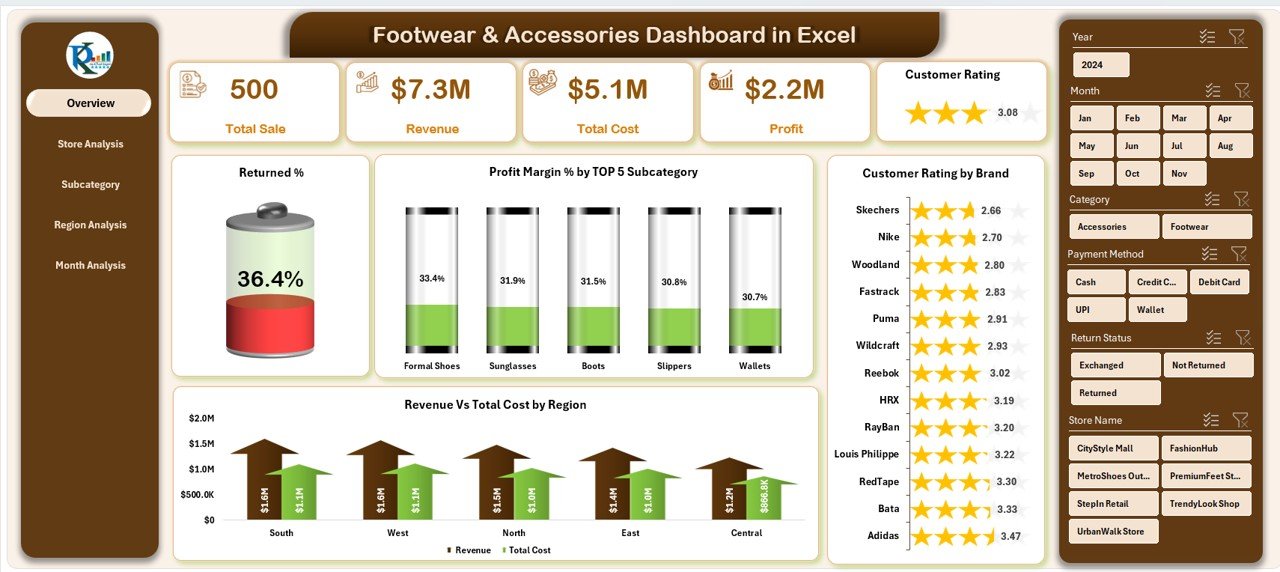
The Overview Page works as the central summary of your entire business performance. You can view your key KPIs at a glance.
✔ KPI Cards
The page contains five cards that show:
-
Total Sales
-
Total Cost
-
Final Revenue
-
Profit Margin %
-
Returned %
These KPI cards help you identify overall performance within seconds.
✔ Charts on the Overview Page
The page contains four important visuals:
• Returned %
This chart shows how many products customers return. When the return rate increases, you can examine size issues, product quality, fit problems, or packaging concerns.
• Profit Margin % by Top 5 Subcategories
This visual highlights the most profitable subcategories. It helps you identify which product groups perform better than others.
• Customer Rating by Brand
This chart compares brand-level customer satisfaction. You can use these insights to improve brand partnerships or product selection.
• Revenue vs Total Cost by Region
This is one of the most useful charts. It compares revenue and cost across regions so you can identify:
-
High-profit regions
-
Low-performing markets
-
Areas that need better marketing or store support
The Overview Page gives you a complete performance story in a simple and clean layout.
2. Store Analysis: Measure Store-Level Performance
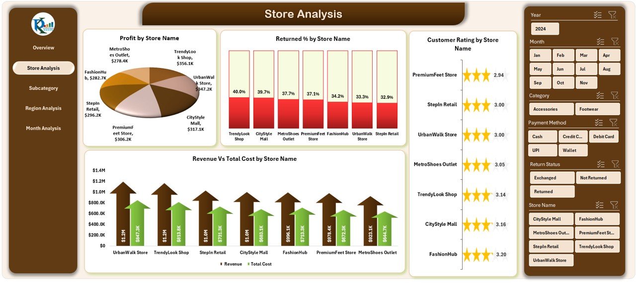
Retail performance changes from store to store. The Store Analysis page helps you understand these differences clearly.
Click to Purchases Footwear & Accessories Dashboard in Excel
This page also includes slicers on the right side for easy filtering.
✔ Charts on the Store Analysis Page
• Profit by Store Name
This chart shows which stores bring the highest profit. You can identify strong stores and improve weaker ones.
• Returned % by Store
A sudden jump in return percentage may signal a store-level issue such as poor fitting guidance or wrong billing entries.
• Customer Rating by Store Name
This helps you measure customer experience quality across different stores.
• Revenue vs Total Cost by Store Name
With this chart, you can compare store performance and take action on cost control, staff training, or product mix improvement.
3. Subcategory Analysis: Track Performance at Product Level
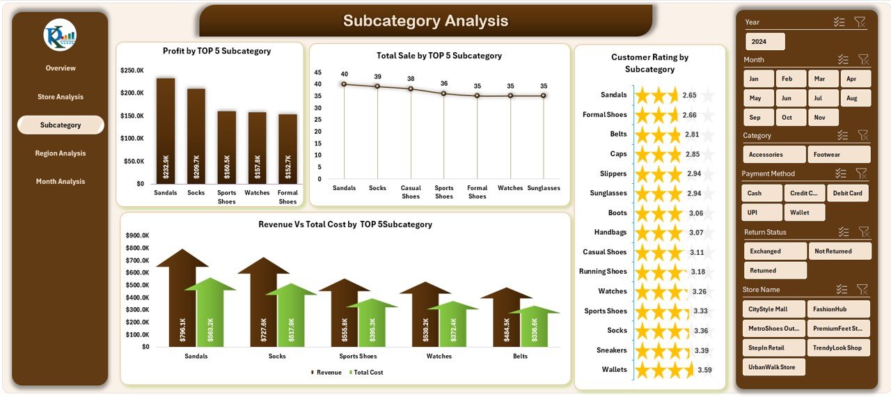
The Subcategory Analysis page helps you understand product group performance. This is important because footwear and accessories categories behave differently.
This page highlights four major charts:
✔ Charts on the Subcategory Analysis Page
• Profit by Top 5 Subcategories
This chart shows the subcategories that generate the highest profit. You can focus more on these categories in promotions and inventory planning.
• Customer Rating by Subcategory
This reveals which product groups customers prefer.
• Revenue vs Total Cost by Subcategory
This chart shows financial performance at the subcategory level.
• Total Sales by Top 5 Subcategories
This highlights high-demand categories. You can track sales patterns and plan stock levels based on actual data.
4. Region Analysis: Compare Market Performance
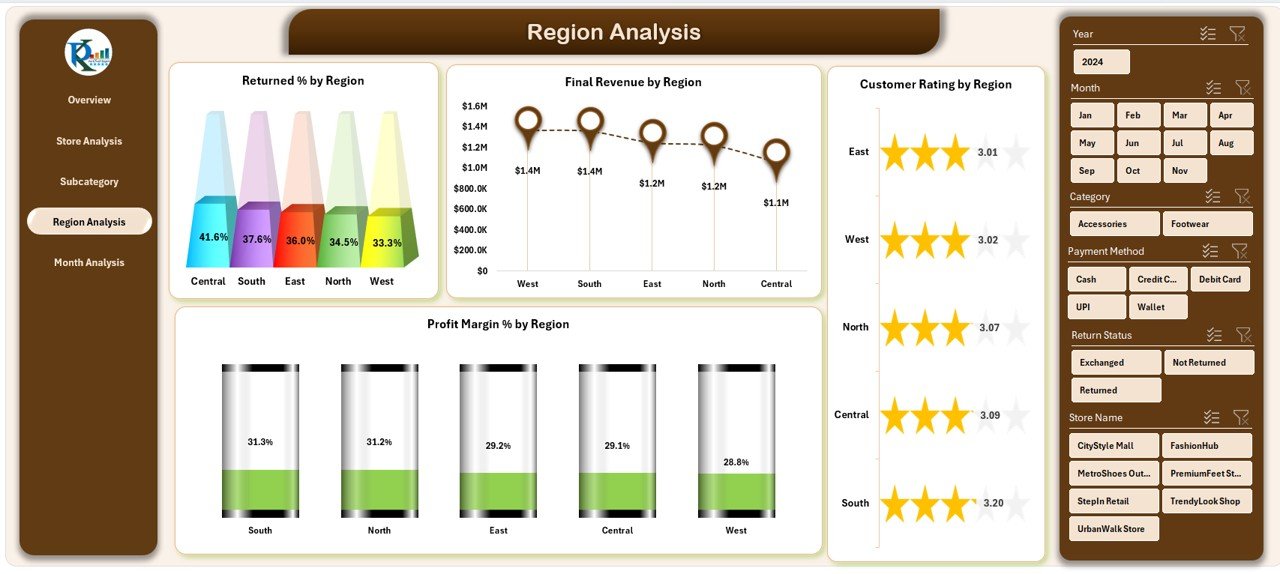
The Region Analysis page helps you study regional performance and identify market trends. Since footwear and accessories demand varies across areas, this page becomes very important.
✔ Charts on the Region Analysis Page
• Returned % by Region
A high return percentage may indicate product mismatch or quality issues in specific regions.
• Final Revenue by Region
This chart highlights strong and weak revenue zones.
• Profit Margin % by Region
This helps you understand which regions handle cost efficiency better.
• Customer Rating by Region
You can compare customer feedback across different geographical areas.
This page supports market expansion decisions and region-specific planning.
5. Month Analysis: Study Performance Over Time
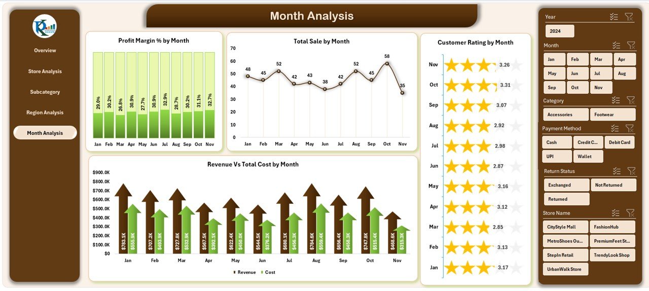
The Month Analysis page shows monthly trends. This helps you understand seasonality and buying patterns.
✔ Charts on the Month Analysis Page
• Profit Margin % by Month
This shows how profit margins change throughout the year. It helps you plan seasonal marketing and discount strategies.
• Total Sales by Month
This chart highlights peak months and low sales periods.
• Customer Rating by Month
You can study whether customers remain satisfied throughout the year.
• Revenue vs Total Cost by Month
With this chart, you can clearly see financial trends across the months.
Click to Purchases Footwear & Accessories Dashboard in Excel
Support Sheet
The Support Sheet contains reference lists and lookup tables needed for calculations. It keeps your formulas clean and error-free.
Data Sheet
The Data Sheet is where you enter your raw data. Once you enter monthly data for sales, cost, returns, ratings, and categories, the dashboard updates automatically.
Why This Dashboard Is Essential for Footwear & Accessories Brands
This dashboard helps different teams in many ways. Some key benefits include:
-
Faster decision-making
-
Automated reporting
-
Clear visuals for presentations
-
Easy tracking of store and region performance
-
Better understanding of customer preferences
-
Accurate month-wise performance insights
-
Clear visibility of product and subcategory performance
Because the dashboard uses Excel, anyone on your team can use it without technical skills.
Advantages of a Footwear & Accessories Dashboard in Excel
1. Saves Time and Reduces Reporting Work
You no longer prepare charts and tables manually. The dashboard automates everything.
2. Helps You Track Return Behavior
Returned products affect profit. This dashboard highlights return percentages clearly.
3. Improves Customer Understanding
Customer rating charts help you study satisfaction across brands, stores, and regions.
4. Supports Business Growth
You get clear insights about top subcategories, high-profit stores, and strong regions.
5. Offers Flexible and Low-Cost Analysis
Excel gives you complete control without depending on expensive tools or software.
6. Makes Monthly Reviews Easy
The Month Analysis page shows seasonal changes and trend shifts.
Best Practices for Using the Footwear & Accessories Dashboard
To get the best results, follow these practical tips:
✔ Keep Your Data Clean
Use correct formats for dates, numbers, and categories.
✔ Update Data Regularly
Enter your data weekly or monthly for accurate insights.
✔ Use Slicers Effectively
Switch between months, regions, brands, and stores for deeper understanding.
✔ Watch Return and Rating Trends
These two metrics give early warning signals about product issues.
✔ Compare Top 5 Subcategories Frequently
This helps in planning inventory and promotions.
✔ Conduct Monthly Review Sessions
Use the dashboard during management meetings for faster decisions.
✔ Track Region Performance Before Expansion
This avoids investing in weak markets.
Conclusion
The Footwear & Accessories Dashboard in Excel gives you everything you need to manage a fast-moving retail business. It brings sales, costs, returns, ratings, and category performance into one powerful system. Since the dashboard uses Excel, you can update it easily, customize it, and use it for your daily analysis.
With this dashboard, your team makes quicker, smarter, and more confident decisions. It becomes the center of your performance tracking and helps you grow with data-driven clarity.
Frequently Asked Questions (FAQs)
1. Who can use the Footwear & Accessories Dashboard in Excel?
Retail owners, store managers, category managers, analysts, and brand teams can use this dashboard.
2. Do I need advanced Excel skills to use this dashboard?
No, you only need basic Excel knowledge. You enter your data, and the dashboard updates automatically.
3. Can I customize the charts in the dashboard?
Yes, you can modify colors, titles, and chart styles based on your branding needs.
4. How often should I update the Data Sheet?
You should update it weekly or monthly depending on your reporting cycle.
5. Can the dashboard track customer ratings?
Yes, the dashboard includes charts for customer ratings by store, region, brand, subcategory, and month.
6. Does the dashboard show return trends?
Yes, multiple charts show returned percentages across several dimensions.
7. Can I use this dashboard for multiple stores?
Yes, you can analyze store-level and region-level performance easily.
Visit our YouTube channel to learn step-by-step video tutorials