Managing electricity procurement without a structured performance system often leads to rising costs, missed savings opportunities, and unclear reporting. However,
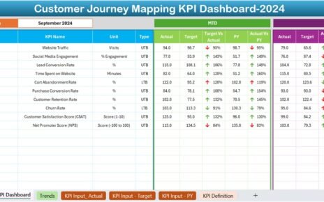
Tracking and improving customer experience is critical for business success. However, understanding customer behavior at different touchpoints can be overwhelming.
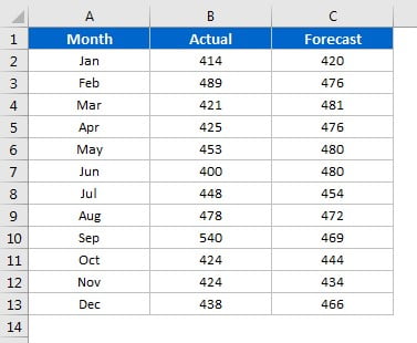
In any project-driven organization, managing budgets is not just a formality—it’s a critical step toward success. Without a proper mechanism