Managing freight expenses efficiently is one of the most critical challenges for logistics, supply chain, and transportation departments. With fluctuating fuel prices, multiple carriers, and complex delivery networks, controlling freight costs requires both precision and insight. That’s exactly where the Freight Cost KPI Dashboard in Power BI becomes a game-changer.
This dashboard helps organizations visualize, analyze, and optimize freight costs across regions, carriers, and time periods — transforming raw logistics data into actionable intelligence. In this article, we’ll explore its key features, benefits, structure, and best practices for implementation.
Click to Purchases Freight Cost KPI Dashboard in Power BI
What Is a Freight Cost KPI Dashboard in Power BI?
A Freight Cost KPI Dashboard in Power BI is a dynamic data visualization tool designed to monitor key performance indicators related to shipping and logistics expenses. Built using Microsoft Power BI, this dashboard consolidates information from Excel sheets or other databases into an interactive and real-time reporting system.
By tracking both Month-to-Date (MTD) and Year-to-Date (YTD) performance, the dashboard allows decision-makers to evaluate cost efficiency, identify trends, compare actual performance with targets, and make informed decisions that directly impact profitability.
The best part? The dashboard is fully automated — simply connect your Excel data, refresh the visuals, and you get instant freight cost insights with interactive charts and slicers.
Key Features of the Freight Cost KPI Dashboard in Power BI
This ready-to-use dashboard is built around three primary pages — each offering unique insights and a focused view of your logistics KPIs.
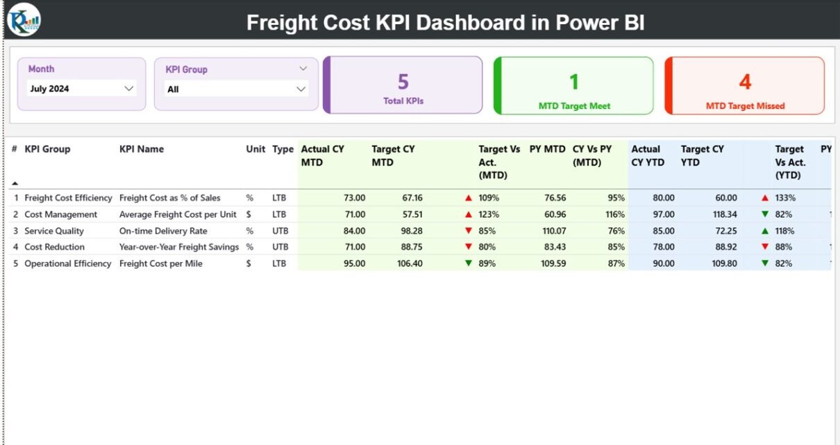
Summary Page
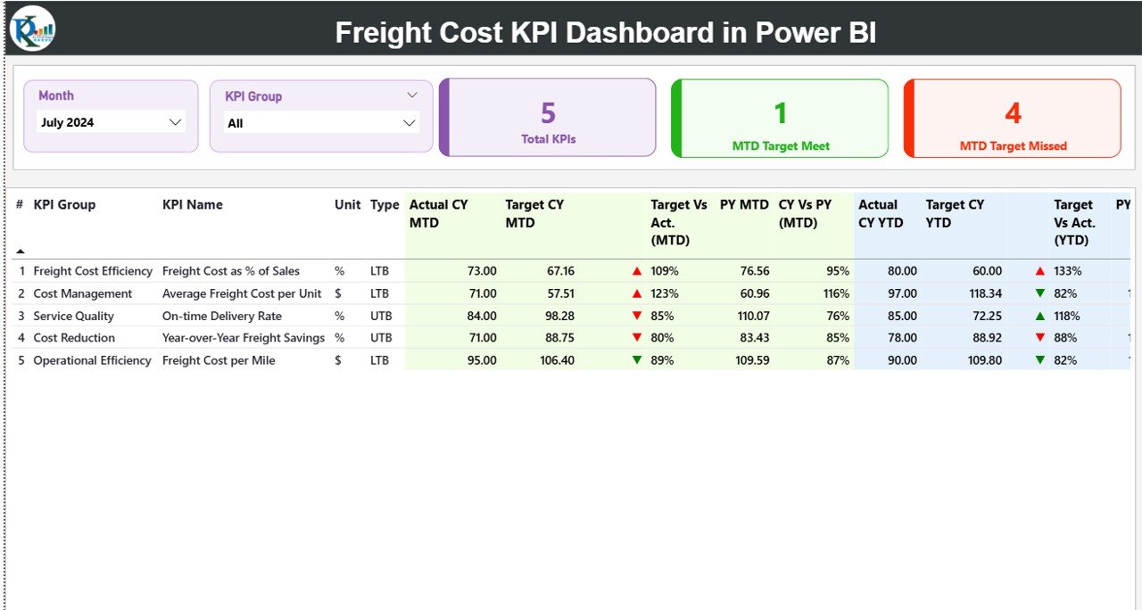
The Summary Page is the central hub of the dashboard. It provides a quick and comprehensive snapshot of all KPIs with interactive visuals and filters.
Top Section: Dynamic Slicers and Cards
-
Month and KPI Group Slicers: Easily filter data by month or KPI category.
Cards Display:
- Total KPIs Count – Total number of KPIs tracked.
- MTD Target Met Count – Number of KPIs that met or exceeded monthly targets.
- MTD Target Missed Count – Number of KPIs that fell below expectations.
If the Average Freight Cost per Shipment is $120 this month against a target of $100, the dashboard immediately shows a red down arrow (▼) under MTD Icon — signaling that cost control is below the desired level.
This visual storytelling approach simplifies data interpretation, even for non-technical users.
KPI Trend Page
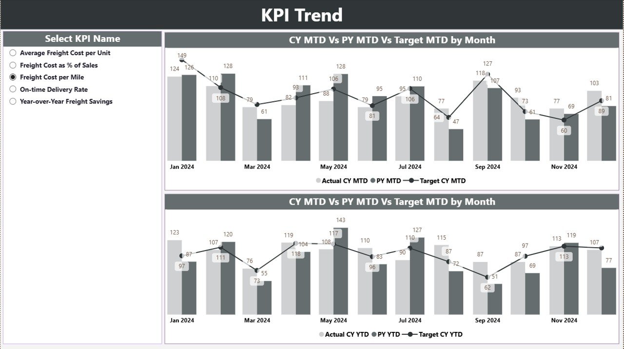
The KPI Trend Page focuses on the visual progression of performance. It helps users see whether costs are increasing or decreasing over time and how targets align with actuals.
Key Elements:
-
Combo Charts: Two combination charts are displayed — one for MTD and another for YTD performance. Each chart shows Actual, Target, and Previous Year trends simultaneously.
-
Slicer Panel: On the left side, users can select a specific KPI name to instantly update both charts.
-
Interactive Comparison: Hovering over points reveals monthly values, helping users identify high-cost or underperforming months quickly.
This page is particularly useful for analyzing patterns such as:
-
Freight cost spikes during certain months.
-
Target achievement trends throughout the year.
-
Year-over-year improvement in shipping efficiency.
KPI Definition Page
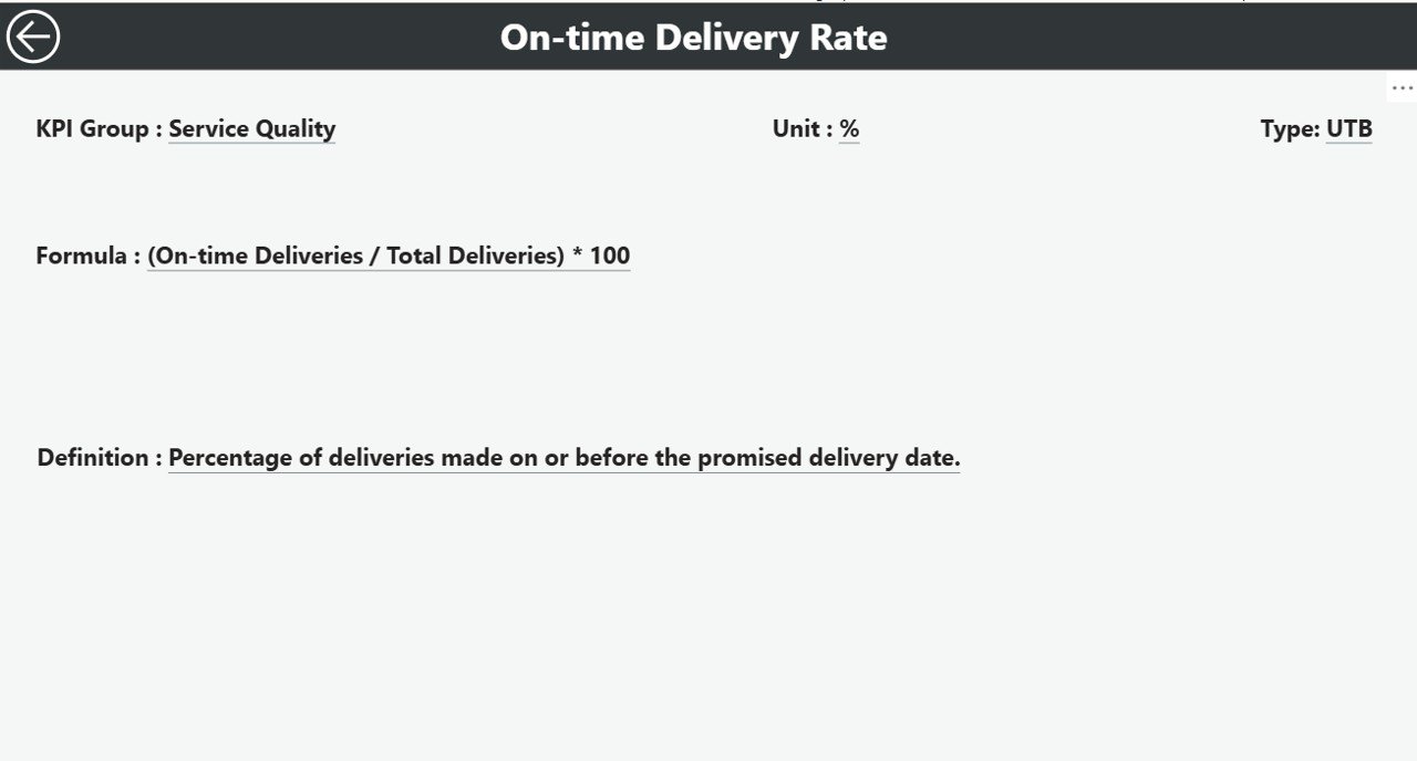
The KPI Definition Page provides the background logic behind each KPI. It’s a hidden drill-through page, accessible directly from the Summary page. When users right-click a KPI name, they can “drill through” to view the detailed formula, definition, and type (LTB or UTB).
This ensures full transparency and helps teams understand how each KPI is calculated — essential for maintaining data consistency across departments.
A “Back” button on the top-left corner allows users to return easily to the Summary Page.
Data Source: Excel Integration
The dashboard uses an Excel file as its data source, structured across three key worksheets:
-
Input_Actual Sheet
-
Fields: KPI Name, Month (first day of each month), MTD Value, and YTD Value.
-
Function: Captures the real-time performance data.
-
-
Input_Target Sheet
-
Fields: KPI Name, Month, MTD Target, and YTD Target.
-
Function: Stores benchmark values for comparison.
-
-
KPI Definition Sheet
-
Fields: KPI Number, KPI Group, KPI Name, Unit, Formula, Definition, and Type (LTB or UTB).
-
Function: Documents each KPI’s definition for clarity and governance.
-
By keeping data in this structured format, Power BI can refresh visuals seamlessly, ensuring users always see the most up-to-date information.
Click to Purchases Freight Cost KPI Dashboard in Power BI
Why Freight Cost KPIs Matter
Freight costs often account for a significant portion of total logistics expenditure. Without clear visibility, organizations risk overspending or missing savings opportunities. Tracking freight KPIs provides the foundation for cost control and strategic improvement.
Common Freight Cost KPIs Include:
-
Total Freight Cost
-
Freight Cost per Shipment
-
Freight Cost as % of Sales
-
Cost per Carrier or Route
-
Cost per Mode (Air, Sea, Road)
-
On-Time Delivery Rate
-
Fuel Surcharge %
-
Claims and Damage Costs
Each of these KPIs can be visualized in Power BI to uncover inefficiencies and drive better decision-making.
How Power BI Enhances Freight Cost Monitoring
Power BI adds a new dimension to freight cost management by converting static Excel reports into interactive, insightful dashboards. Here’s how it transforms your logistics reporting:
-
Real-time Data Visualization: Connects to live Excel or database feeds for automatic updates.
-
Interactive Filters: Lets users filter by month, carrier, region, or KPI group instantly.
-
Comparative Insights: Compares actual vs target and year-over-year data visually.
-
Color-Coded Alerts: Instantly highlights areas needing attention with green/red indicators.
-
Drill-Down Analytics: Enables in-depth exploration of cost drivers.
-
Data Storytelling: Translates numbers into visual narratives for better communication across teams.
With these capabilities, logistics managers no longer need to manually compile reports — Power BI does it automatically, saving hours of effort while improving accuracy.
Advantages of the Freight Cost KPI Dashboard in Power BI
Let’s explore the major benefits this dashboard offers to logistics and supply chain professionals:
1️⃣ Real-Time Insights
Get immediate visibility into freight cost trends without waiting for month-end reports.
2️⃣ Cost Control and Optimization
Track performance against targets to identify cost overruns early and take corrective actions.
3️⃣ Improved Decision-Making
Interactive visuals make it easy to analyze carrier performance, shipment modes, and regional expenses.
4️⃣ Historical Comparison
Easily compare this year’s costs with previous years to measure improvement and detect patterns.
5️⃣ KPI Transparency
Drill-through pages clarify definitions and formulas, promoting consistent KPI understanding across the organization.
6️⃣ Time Savings
Automated data refresh eliminates repetitive manual reporting tasks.
7️⃣ Enhanced Accountability
Managers can see exactly which areas are performing well and which require immediate attention.
8️⃣ Data-Driven Culture
Encourages teams to rely on data for planning freight strategies, rather than assumptions.
Use Cases of Freight Cost KPI Dashboard
The dashboard is valuable for a wide range of logistics functions, such as:
-
Procurement Teams: Analyzing carrier cost efficiency.
-
Finance Departments: Tracking freight expenses vs budget.
-
Operations Managers: Monitoring shipment performance and delivery efficiency.
-
Executives: Viewing summarized KPI performance for strategic decisions.
-
Third-Party Logistics Providers: Demonstrating cost transparency to clients.
Example Analysis You Can Perform
With the Freight Cost KPI Dashboard in Power BI, you can conduct multiple performance analyses, including:
-
MTD and YTD Variance Analysis: Compare monthly and yearly performance with targets.
-
Carrier Comparison: Identify the most cost-efficient transport partners.
-
Route Analysis: Highlight cost differences between domestic and international routes.
-
Mode Analysis: Compare air, sea, and road freight costs.
-
Seasonal Trend Analysis: Understand cost peaks and troughs throughout the year.
-
Profitability Correlation: Analyze freight costs as a percentage of revenue.
These insights help organizations reduce costs, negotiate better rates, and improve overall freight management efficiency.
Best Practices for the Freight Cost KPI Dashboard in Power BI
To get the most value from your dashboard, follow these best practices:
1️⃣ Maintain Clean Data
Ensure your Excel input sheets have no blanks, duplicates, or inconsistent date formats.
2️⃣ Standardize KPI Definitions
Keep all KPIs defined consistently in the KPI Definition sheet to avoid confusion across teams.
3️⃣ Update Regularly
Refresh the data monthly (or more frequently) for accurate insights.
4️⃣ Use Slicers Effectively
Add meaningful slicers like Carrier, Region, and Month for deeper drill-downs.
5️⃣ Highlight Key KPIs
Use color coding and conditional formatting to draw attention to underperforming metrics.
6️⃣ Enable Drill-Through Functionality
Allow users to explore KPI formulas and definitions without cluttering the main dashboard.
7️⃣ Automate Data Refresh
If possible, connect the Excel file to OneDrive or SharePoint for real-time auto-refresh in Power BI Service.
8️⃣ Monitor Trends, Not Just Numbers
Focus on performance patterns over time rather than isolated monthly results.
Conclusion
The Freight Cost KPI Dashboard in Power BI is a must-have tool for logistics and supply chain professionals seeking to control expenses and improve operational efficiency.
It transforms static Excel data into a dynamic, interactive, and insightful reporting system — enabling smarter decisions, better forecasting, and measurable savings.
By tracking freight KPIs such as total cost, cost per shipment, and performance vs target, organizations gain end-to-end visibility of their logistics operations. Whether you’re managing local deliveries or global freight, this dashboard empowers you to reduce costs, boost accountability, and drive continuous improvement.
Frequently Asked Questions (FAQs)
Click to Purchases Freight Cost KPI Dashboard in Power BI
1️⃣ What is the Freight Cost KPI Dashboard in Power BI used for?
It’s used to track, monitor, and analyze freight cost performance metrics such as total cost, cost per shipment, and performance vs targets across different timeframes.
2️⃣ Can this dashboard be connected to live data?
Yes. While it’s designed with Excel input initially, it can connect to live data sources like SQL Server, SharePoint, or ERP systems for real-time reporting.
3️⃣ How often should I update the Excel data?
Ideally, you should update it monthly to reflect the most recent freight costs and performance metrics.
4️⃣ Is this dashboard suitable for small businesses?
Absolutely. It’s scalable — small logistics teams can use Excel inputs, while larger enterprises can integrate databases or APIs.
5️⃣ What KPIs can I track in this dashboard?
You can track Total Freight Cost, Freight Cost per Shipment, Cost per Mode, Freight Cost as % of Sales, On-Time Delivery %, and many others.
6️⃣ How do I interpret the MTD and YTD icons?
Green ▲ indicates performance meeting or exceeding targets; red ▼ indicates underperformance for the selected period.
7️⃣ Can users drill down to see KPI definitions?
Yes, the dashboard includes a hidden KPI Definition page where users can view detailed formulas and descriptions.
8️⃣ What software do I need to use this dashboard?
You need Microsoft Power BI Desktop (free version) and Microsoft Excel for data input. Optionally, Power BI Service can be used for online sharing.
Visit our YouTube channel to learn step-by-step video tutorials
Click to Purchases Freight Cost KPI Dashboard in Power BI