The Future of Work Programs Dashboard in Excel reports 12 workforce-programme metrics across 5 linked pages, 20 charts, 24 pivot tables and 4 slicers. The sample workbook covers 6 programmes, 6 departments, 4 regions and 3 work models, and every visual is pivot-driven, so a single refresh moves the whole file onto your own numbers.

Most organisations now run several workforce-transformation programmes at the same time – hybrid working, automation adoption, data literacy, leadership development, wellbeing – and report each one from a different place. The learning team has enrolment numbers, finance has the spend, and nobody has the two on the same page. That gap is what this workbook is built to close: one Data sheet, one set of filters, and five pages that answer enrolment, impact, cost and geography in the same visual language.
Key Features of the Future of Work Programs Dashboard in Excel
12 metrics from a single table. Total Enrollments, Completed Enrollments, Completion Rate %, Total Program Cost, Total Training Hours, Total Hours Saved, Total Certifications, Employees Redeployed, Redeployment Rate %, Avg. Skill Gain, Avg. Satisfaction and Cost per Training Hour all come from the one Data sheet. There is no second model to keep in sync.
Four slicers that act on every page. Month, Program, Region and Department sit in the right-hand rail of all five pages. Selecting “Hybrid Work” or “APAC” refilters the KPI cards and all 20 charts at once.
A five-button navigation rail. Overview, Program Insights, Workforce Impact, Cost Efficiency and Regional View are one click apart, and each page repeats the same layout and palette so a reader does not have to relearn the screen.
No macros. The file is a plain .xlsx built on PivotTables and slicers, so it opens without a macro security warning and can be extended with tools you already know.
Fictional sample data you overwrite. Every number in the file is illustrative. The Data sheet carries the column headers the pivots expect; you paste your extract underneath and refresh.
Dashboard Pages Explanation
Page 1: Overview
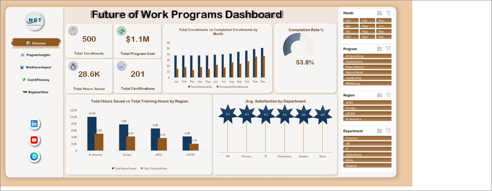
The Overview page opens with four KPI cards – Total Enrollments (500), Total Program Cost ($1.1M), Total Hours Saved (28.6K) and Total Certifications (201) – next to a Completion Rate % gauge sitting at 53.8%. Below them sit Total Enrollments vs Completed Enrollments by Month, Total Hours Saved vs Total Training Hours by Region and Avg. Satisfaction by Department, where every department lands between 4.0 and 4.1 on the sample data.
Page 2: Program Insights
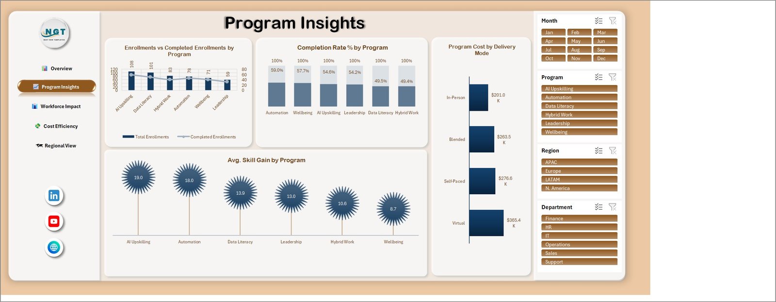
Program Insights compares the six programmes head to head through Enrollments vs Completed Enrollments by Program, Completion Rate % by Program, Program Cost by Delivery Mode and Avg. Skill Gain by Program. The sample data tells a useful story: AI Upskilling pulls the most enrolments (108) and the biggest skill gain (19.0), but Automation converts best at 59.0% completion while Hybrid Work trails at 49.4%. Program Cost by Delivery Mode shows virtual delivery as the largest line at $365.4K against $201.0K for in-person.
Page 3: Workforce Impact
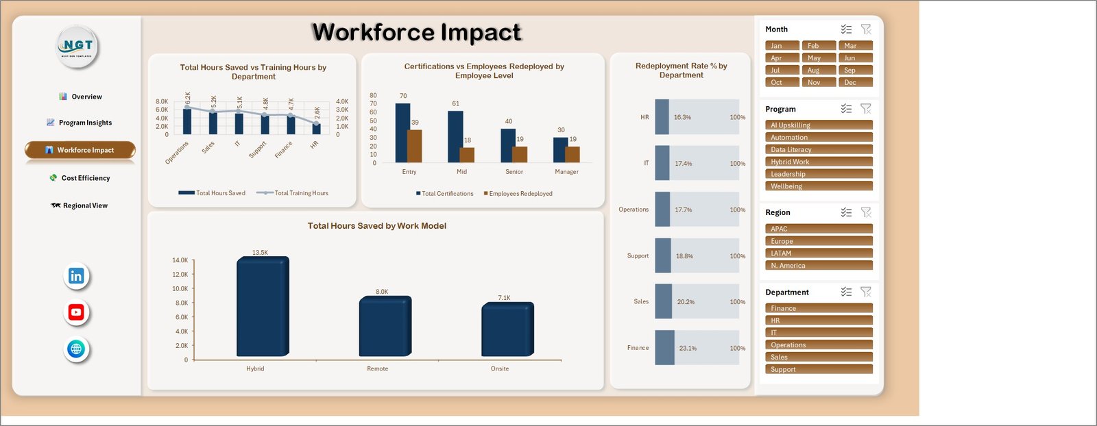
Workforce Impact is where the programme stops being an activity report. Total Hours Saved vs Training Hours by Department ranks Operations top at 6.2K saved hours and HR bottom at 2.6K. Certifications vs Employees Redeployed by Employee Level splits Entry, Mid, Senior and Manager, showing 70 certifications and 39 redeployments at entry level. Redeployment Rate % by Department runs from 16.3% in HR to 23.1% in Finance, and Total Hours Saved by Work Model puts hybrid working at 13.5K against 8.0K remote and 7.1K onsite.
Page 4: Cost Efficiency
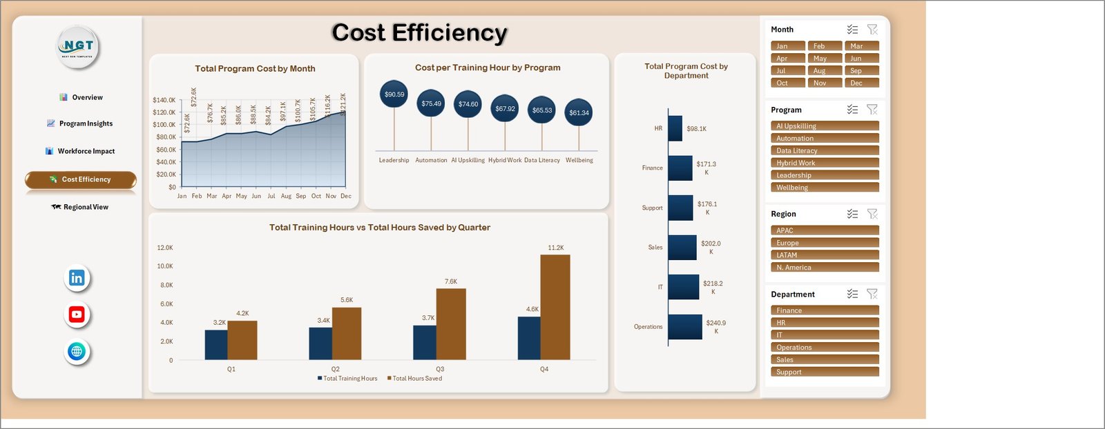
Cost Efficiency answers the budget question. Total Program Cost by Month climbs from $72.6K in January to $121.2K in December on the sample data. Cost per Training Hour by Program spreads from $61.34 for Wellbeing to $90.59 for Leadership. Total Program Cost by Department puts Operations highest at $240.9K, and Total Training Hours vs Total Hours Saved by Quarter shows the return widening through the year – 3.2K hours delivered against 4.2K saved in Q1, versus 4.6K against 11.2K in Q4.
Page 5: Regional View
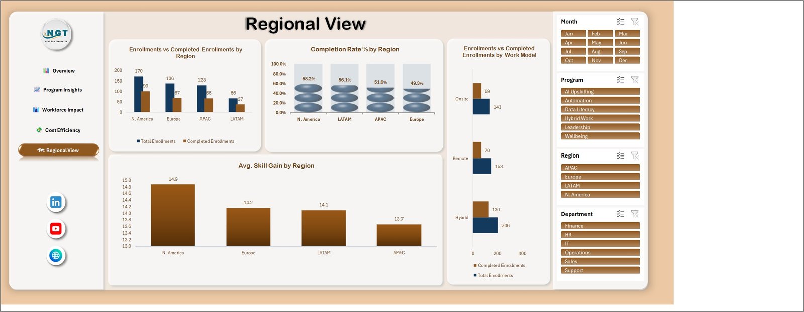
Regional View breaks the portfolio down by geography and work model. Enrollments vs Completed Enrollments by Region has North America at 170 enrolments and 99 completions, ahead of Europe (136/67), APAC (128/66) and LATAM (66/37). Completion Rate % by Region ranks North America first at 58.2% and Europe last at 49.3%, while Avg. Skill Gain by Region stays in a tight 13.7 to 14.9 band. Enrollments vs Completed Enrollments by Work Model confirms hybrid as the dominant model at 206 enrolments.
Data sheet and Support sheet
Behind the five pages sit two working sheets. The Data sheet is the single input table feeding all 24 pivot tables, and the Support sheet holds the helper calculations and lookup lists the charts depend on. Keep the Data sheet headers intact and the rest of the workbook takes care of itself.
Future of Work Programs Dashboard in Excel vs. a Google Sheets Build vs. Paid HR Analytics SaaS
| Feature | This Excel Dashboard | Google Sheets build | Workday / BambooHR / Cornerstone analytics |
|---|---|---|---|
| Cost | One-time purchase ✅ | Free tool, days of build time | $8-$40 per employee per month |
| Platform | Microsoft Excel (desktop) | Browser | Vendor cloud |
| Setup time | Under 15 minutes ✅ | 1-3 days to build charts and filters | Weeks of implementation |
| Real-time team collaboration | Via OneDrive / SharePoint | Built in ✅ | Built in ✅ |
| Mobile access | Excel mobile (view) | Browser ✅ | Native app ✅ |
| Customisable fields and charts | Full control, no lock-in ✅ | Full control | Vendor-defined reports |
| Cost per training hour by programme | Included on Page 4 ✅ | Build it yourself | Usually a paid add-on |
| Data stays on your machine | Yes ✅ | Google cloud | Vendor cloud |
| Year-1 cost at 5 users | Price of one template ✅ | $0 plus build time | $480-$2,400 |
For teams that want programme-level reporting without signing an annual HR analytics contract, this workbook sits in the sweet spot.
Who Should Use This Template
Perfect for:
- HR, L&D and People Operations leads at 50-2,000 person organisations running several programmes at once
- Transformation and change managers reporting hybrid-work, automation and reskilling progress to a steering group
- Training managers who want a workforce transformation dashboard in Excel instead of another licence
- Consultants who present programme outcomes to clients and need a file they can rebrand
Not a fit if:
- You need a live feed from Workday, SAP SuccessFactors or another HRIS – this workbook is fed by a pasted extract
- You are looking for a system of record for individual employee data; the model reports aggregates
- Your team works only in Google Sheets or Excel for the web
- You need automated LMS enrolment sync or certificate issuing
Real-World Use Cases
Priya leads L&D at a 600-person software company. Her CFO wants to know which programme deserves next year’s budget. She filters the Cost Efficiency page to the last two quarters and shows that automation training costs $75.49 an hour but returns more saved hours per head than leadership coaching at $90.59.
Daniel is a transformation lead at a manufacturer moving to hybrid working. He uses the Workforce Impact page as an employee reskilling tracker, watching redeployment rate by department to see which teams are genuinely moving people into new roles rather than simply enrolling them in courses.
Maya consults for mid-market HR teams. She drops each client’s extract into the Data sheet, adjusts the header, and hands over a five-page programme review the same afternoon – a repeatable deliverable rather than a bespoke build.
Advantages of This Future of Work Dashboard Template
The obvious advantage is cost: a one-time purchase against a per-employee subscription. The less obvious one is speed of iteration. Because the file is an ordinary workbook, a manager who wants a new cut – say cost per certification by region – can build it from the same pivot cache in minutes, without raising a request with a vendor.
There is also a reporting advantage in having cost and outcome on adjacent pages. Enrolment numbers alone flatter a programme; enrolment next to completion rate, hours saved and cost per training hour tells you whether it is working. The sample data deliberately shows a portfolio where the most popular programme is not the best-completing one, because that is the shape most real portfolios take.
Finally, the file stays on your machine. For programme data that touches headcount planning, keeping the workbook offline is often simpler than negotiating access in a cloud platform.
Opportunities for Improvement
It is worth being clear about what this workbook is not. It does not connect to an HRIS, HCM or learning platform, so refreshing means pasting a new extract rather than clicking sync. It is not a system of record for employee data and should not be used to hold personal records – the model is designed around aggregate programme counts.
Slicer behaviour across 24 pivot tables is reliable on Excel for Windows desktop; Excel for the web can display the pages, but filtering is noticeably less predictable. And because the pivots expect specific column headers, a poorly shaped extract will produce empty charts until the columns are mapped. Reading the Data sheet header row before the first paste saves most of the trouble people run into.
Best Practices
- Keep one row per enrolment in the Data sheet, with date, programme, region, department, work model, delivery mode, cost and hours in their own columns.
- Delete the fictional sample rows once your data is in, or every chart will mix the two.
- Refresh everything at once with Ctrl+Alt+F5 rather than refreshing pivots one at a time.
- Clear all four slicers before exporting a page to PDF, or your reader gets a filtered view without knowing it.
- Save a dated copy each month so you can compare quarters without rebuilding history.
- Leave the Support sheet alone until you are comfortable with the model – the charts read their lookups from it.
Explore Relevant Templates
If your programmes are about workplace models rather than training, the Remote Work Communities Dashboard in Excel and the Coworking Cafes Dashboard in Excel cover the space-and-community side of hybrid working. On the learning side, the Online Certification Providers Dashboard in Excel and the Teacher Training Institutes KPI Dashboard in Excel follow the same build pattern.
On the store, the closest neighbours are the Corporate Skill Hubs Dashboard in Excel, the Learning and Development (L&D) KPI Dashboard in Excel and the Employee Retention Dashboard in Excel. If your reporting has already moved to Power BI, there is a Corporate Training KPI Dashboard in Power BI, and the HR & Workforce Analytics Bundle collects ten people-analytics templates in one purchase.
For context on why these programmes are being measured, the World Economic Forum Future of Jobs Report is the standard reference for reskilling and automation trends.
Frequently Asked Questions
What does the Future of Work Programs Dashboard in Excel track?
It tracks 12 metrics – enrolments, completions, completion rate, programme cost, training hours, hours saved, certifications, employees redeployed, redeployment rate, average skill gain, average satisfaction and cost per training hour – across 6 programmes, 6 departments, 4 regions and 3 work models.
How to track training programs in Excel without macros
Use pivot tables and slicers, which is exactly how this workbook is built. You paste programme records onto the Data sheet, press Ctrl+Alt+F5 to refresh, and the five dashboard pages update. There is no VBA in the file, so it opens with no macro security prompt.
Does the workbook connect to an HRIS or LMS?
No. The Future of Work Programs Dashboard is not connected to any HRIS, HCM or learning platform and is not a system of record for employee data. You paste an aggregate extract into the Data sheet yourself, which keeps the file offline and under your control.
Is the data in the file real?
No. All figures in the workbook are fictional sample data used to demonstrate the charts. The 500 enrolments, $1.1M programme cost and 53.8% completion rate on the Overview page are illustrative only, and you replace them with your own numbers.
How long does setup take?
Under 15 minutes for most buyers: unzip, open the .xlsx, paste your rows onto the Data sheet, delete the sample rows, refresh. A PDF user manual is included in the download and walks through the same sequence with screenshots.
How does this compare to paid HR analytics software?
Workday, BambooHR and Cornerstone charge per employee per month and take weeks to roll out. This workbook is a one-time purchase, runs in Excel your team already has, and every chart is editable. What it does not give you is live sync, audit trails or user-level permissions.
Will it work in Excel for the web or Google Sheets?
It is built for Microsoft Excel on Windows desktop. Excel for the web renders the pages, but slicer behaviour across 24 pivot tables is only dependable on desktop, and the file is not designed for Google Sheets.
About the Author
Built by PK – Microsoft Certified Professional with 15+ years of Excel, Google Sheets and Power BI experience. Founder of NextGenTemplates, reaching 300K+ subscribers across YouTube channels. Every template is hand-built and tested before release.
Conclusion
Workforce-transformation programmes are judged on whether people finished, whether skills moved and whether the spend made sense. The Future of Work Programs Dashboard in Excel puts those three answers on adjacent pages, filtered by the same four slicers, in a file you own outright rather than rent.
👉 Click here to purchase the Future of Work Programs Dashboard in Excel
Instant download · One-time payment · No subscription
🎥 For step-by-step video tutorials, visit YouTube.com/@PKAnExcelExpert.
Last updated: September 2026