In today’s competitive manufacturing environment, glassware production companies must continuously monitor performance to maintain quality, control costs, and improve operational efficiency. Manufacturers face constant challenges such as production losses, quality defects, equipment downtime, and fluctuating demand. Therefore, organizations need a smart system that helps them track Key Performance Indicators (KPIs) in a structured and visual way.
This is exactly where the Glassware Production KPI Dashboard in Power BI becomes a powerful solution. Instead of managing multiple spreadsheets and manual reports, businesses can analyze all production KPIs through a centralized, interactive, and automated dashboard.
In this comprehensive guide, you will learn everything about the Glassware Production KPI Dashboard in Power BI, including its structure, features, benefits, implementation process, best practices, and frequently asked questions.
Click to buy Glassware Production KPI Dashboard in Power BI
What Is a Glassware Production KPI Dashboard in Power BI?
A Glassware Production KPI Dashboard in Power BI is a ready-to-use business intelligence solution designed to monitor manufacturing performance using measurable KPIs. It transforms raw production data into meaningful visual insights.
Rather than reviewing complex reports manually, production managers can instantly understand operational performance through charts, KPI cards, and comparisons.
Because Power BI provides dynamic visualization and real-time filtering, decision-makers gain clarity faster. As a result, teams identify issues early and take corrective actions without delay.
Why Do Glassware Manufacturers Need KPI Dashboards?
Glass manufacturing involves multiple interconnected processes such as melting, forming, annealing, inspection, and packaging. Each stage directly affects productivity and quality.
However, many factories still rely on manual reporting systems. Consequently, teams struggle with delayed insights and inconsistent performance tracking.
A KPI dashboard solves these challenges because it:
- Centralizes production data
- Provides real-time performance visibility
- Enables faster decisions
- Reduces reporting effort
- Improves operational accountability
Therefore, companies move toward Power BI dashboards to modernize performance monitoring.
Key Features of the Glassware Production KPI Dashboard in Power BI
This ready-to-use dashboard contains three interactive pages inside the Power BI Desktop application. Each page serves a specific analytical purpose.
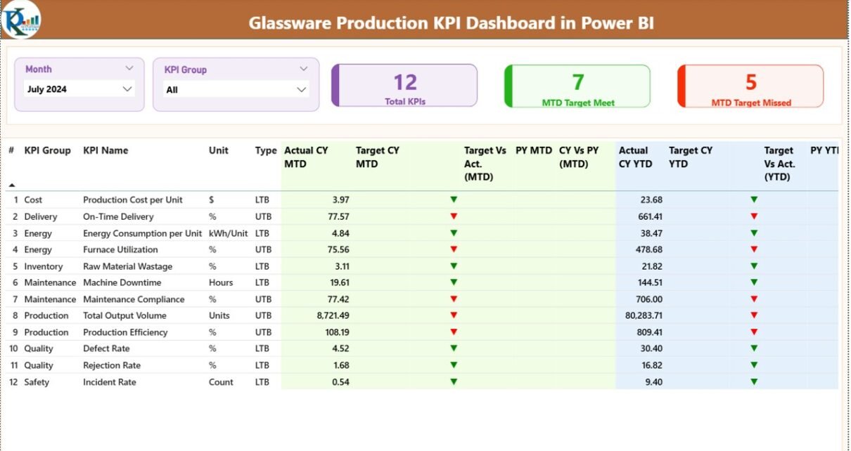
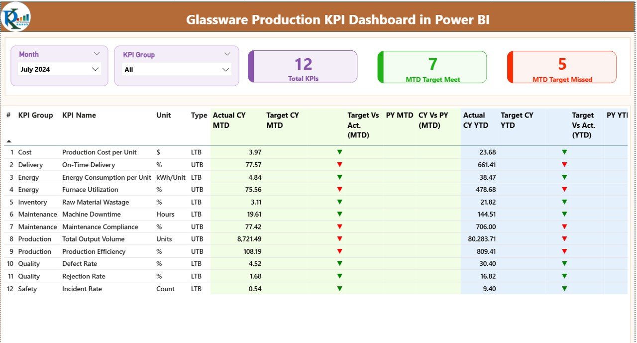
Summary Page – Central Performance Overview
The Summary Page acts as the main control center of the dashboard. Users immediately understand performance status when they open this page.
Interactive Slicers
At the top, users can select:
- Month slicer
- KPI Group slicer
As soon as users change selections, the entire dashboard updates automatically. Therefore, analysis becomes quick and flexible.
KPI Performance Cards
The dashboard displays three important KPI cards:
- Total KPIs Count
- MTD Target Meet Count
- MTD Target Missed Count
These cards provide instant performance visibility. Consequently, managers quickly evaluate whether operations stay on track.
Detailed KPI Performance Table
Below the cards, a detailed KPI table displays structured information.
KPI Information Includes:
- KPI Number – Sequential identifier
- KPI Group – Category of KPI
- KPI Name – Performance indicator
- Unit – Measurement unit
- Type – LTB (Lower the Better) or UTB (Upper the Better)
MTD Performance Metrics
The dashboard shows:
- Actual CY MTD
- Target CY MTD
- Target vs Actual (MTD)
- Previous Year MTD
- CY vs PY (MTD)
Visual icons improve understanding:
- ▲ Green Arrow → Target achieved
- ▼ Red Arrow → Target missed
Because visual indicators simplify analysis, users recognize performance instantly.
YTD Performance Metrics
Similarly, Year-To-Date data includes:
- Actual CY YTD
- Target CY YTD
- Target vs Actual (YTD)
- Previous Year YTD
- CY vs PY (YTD)
Thus, organizations analyze both short-term and long-term trends simultaneously.
Click to buy Glassware Production KPI Dashboard in Power BI
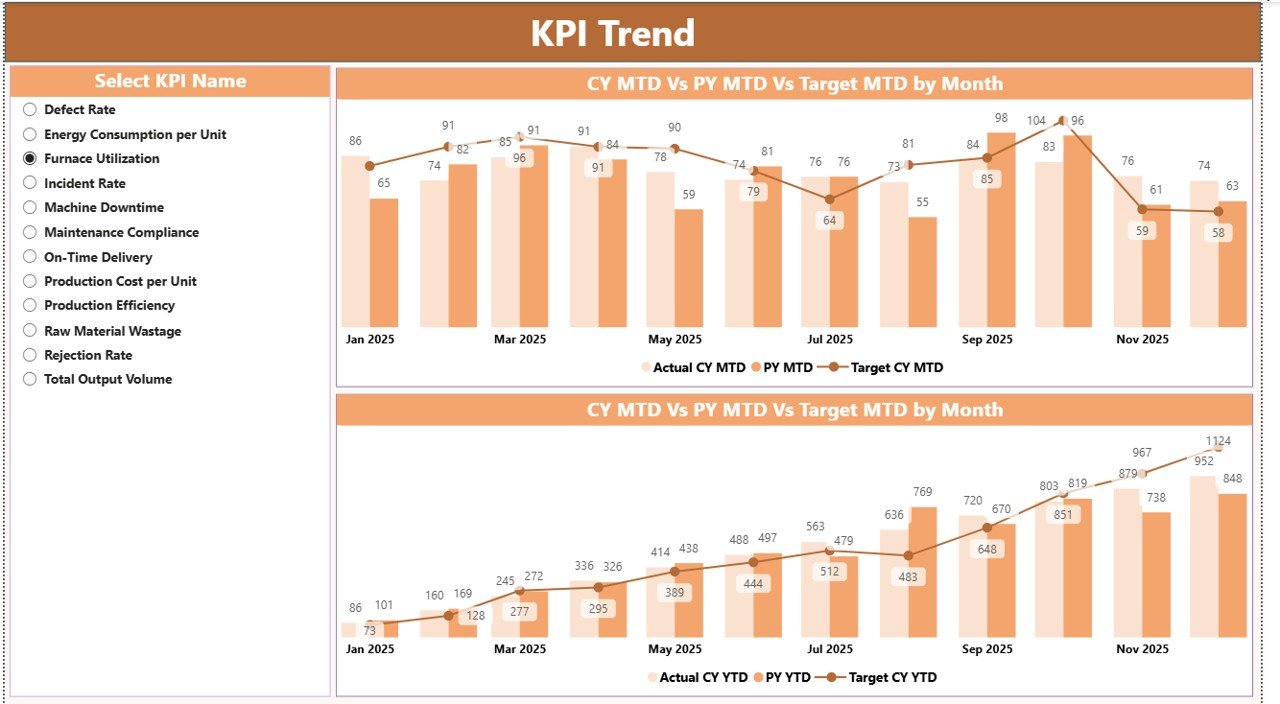
KPI Trend Page – Performance Analysis Over Time
While the summary page shows current performance, the KPI Trend Page focuses on historical analysis.
Features of KPI Trend Page
- KPI Name slicer on the left
- Two combo charts:
- MTD comparison chart
- YTD comparison chart
Each chart compares:
- Current Year Actual
- Previous Year Actual
- Target Values
Therefore, managers easily identify improvement patterns and seasonal performance changes.
Moreover, trend visualization helps forecast future outcomes.
Click to buy Glassware Production KPI Dashboard in Power BI
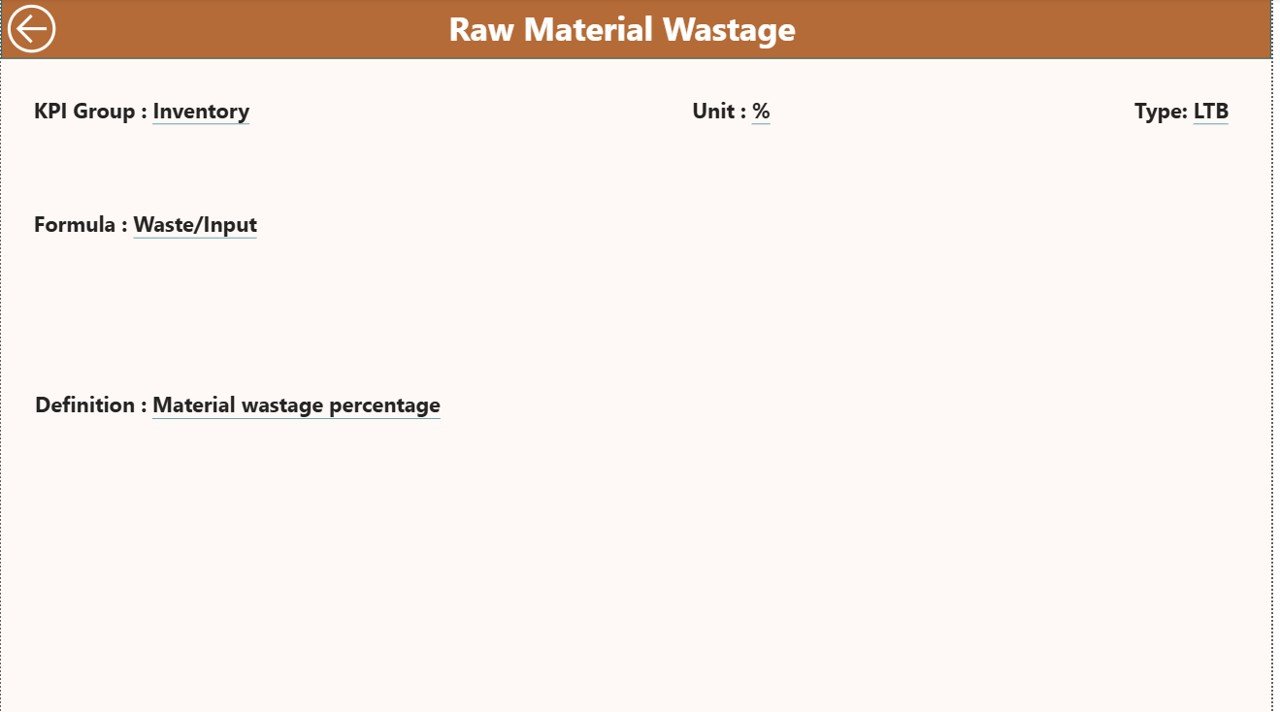
KPI Definition Page – Drill-Through Insights
The KPI Definition Page remains hidden and works as a drill-through feature.
Users can navigate from the Summary Page to view:
- KPI Formula
- KPI Definition
- Measurement logic
Because every KPI includes clear documentation, teams maintain transparency and consistency.
A back button allows users to return instantly to the main dashboard.
Click to buy Glassware Production KPI Dashboard in Power BI
Excel Data Source Structure
The dashboard uses an Excel file as its data source. This approach makes the system simple and flexible.
Users only need to update three worksheets.
Input_Actual Sheet
Here users enter:
- KPI Name
- Month (first date of month)
- MTD values
- YTD values
Once updated, Power BI refreshes the dashboard automatically.
Click to buy Glassware Production KPI Dashboard in Power BI
Input_Target Sheet
This sheet contains:
- KPI targets
- Monthly targets
- MTD and YTD target values
Therefore, performance comparisons remain accurate.
KPI Definition Sheet
Users define KPI details:
- KPI Number
- KPI Group
- KPI Name
- Unit
- Formula
- Definition
- KPI Type (LTB or UTB)
This structured design ensures standardized KPI management.
How Does the Dashboard Improve Glassware Production Management?
The dashboard improves operations in multiple ways.
Better Production Monitoring
Managers track furnace efficiency, defect rates, and output levels continuously.
Faster Decision Making
Because insights appear visually, leaders respond quickly to performance issues.
Reduced Manual Reporting
Automation eliminates repetitive spreadsheet work.
Improved Accountability
Every KPI owner clearly understands performance expectations.
Advantages of Glassware Production KPI Dashboard in Power BI
Organizations gain several advantages after implementing this dashboard.
Real-Time Performance Visibility
Managers monitor KPIs instantly without waiting for reports.
Centralized Data Management
All production metrics exist in one dashboard.
Improved Quality Control
Teams identify defect trends early and reduce waste.
Data-Driven Decisions
Visual analytics support accurate planning.
Easy Scalability
Companies can add new KPIs anytime.
User-Friendly Interface
Even non-technical users operate the dashboard easily.
What KPIs Can Be Tracked in Glassware Production?
Companies typically monitor KPIs such as:
- Production Output Volume
- Defect Rate %
- Furnace Efficiency
- Energy Consumption per Unit
- Machine Downtime
- Yield Rate
- On-Time Delivery %
- Scrap Rate
- Rework Percentage
- Production Cost per Unit
- Labor Productivity
- Customer Complaint Rate
Tracking these KPIs ensures balanced operational control.
How to Implement the Glassware Production KPI Dashboard?
Implementing the dashboard requires a structured approach.
Step 1: Define KPIs
Identify measurable production indicators aligned with business goals.
Step 2: Prepare Excel Data
Fill Actual, Target, and KPI Definition sheets.
Step 3: Connect Data to Power BI
Import Excel file into Power BI Desktop.
Step 4: Validate Data Model
Ensure relationships and calculations work correctly.
Step 5: Publish Dashboard
Share reports with management teams.
Step 6: Monitor Regularly
Update data monthly for continuous tracking.
Best Practices for the Glassware Production KPI Dashboard in Power BI
Organizations achieve better results when they follow proven practices.
Keep KPIs Limited but Meaningful
Avoid tracking too many metrics. Focus on impactful KPIs.
Maintain Data Accuracy
Always validate Excel inputs before refreshing reports.
Use Consistent Definitions
Ensure KPI formulas remain standardized.
Review Performance Regularly
Conduct weekly or monthly performance reviews.
Train Users Properly
Provide dashboard usage training to supervisors.
Automate Data Refresh
Schedule refreshes to reduce manual effort.
Common Challenges and How to Overcome Them
Data Inconsistency
Standardize data entry templates.
Resistance to Change
Educate teams about dashboard benefits.
KPI Overload
Prioritize strategic metrics.
Lack of Ownership
Assign responsible persons for each KPI.
Why Power BI Is Ideal for Manufacturing KPI Dashboards?
Power BI offers several advantages compared to traditional reporting tools.
- Interactive visuals
- Drill-through analysis
- Automated calculations
- Cloud sharing capability
- Scalable analytics environment
Therefore, manufacturing companies increasingly adopt Power BI for operational intelligence.
Future Scope of KPI Dashboards in Manufacturing
Manufacturing analytics continues to evolve rapidly.
In the future, dashboards will include:
- Predictive analytics
- AI-driven alerts
- IoT integration
- Real-time machine monitoring
- Automated anomaly detection
Consequently, KPI dashboards will become intelligent decision-support systems.
Conclusion
The Glassware Production KPI Dashboard in Power BI provides a modern, structured, and efficient way to monitor manufacturing performance. Instead of relying on manual reports, organizations gain real-time insights through interactive visual analytics.
Because the dashboard integrates Excel data with Power BI visualization, businesses achieve flexibility without complexity. Managers track performance, compare trends, and identify improvement opportunities quickly.
Ultimately, companies that adopt KPI dashboards improve productivity, reduce operational risks, and strengthen decision-making capabilities.
Frequently Asked Questions (FAQs)
What is a KPI dashboard in Power BI?
A KPI dashboard in Power BI visually tracks performance indicators using charts, cards, and interactive filters.
Can beginners use this dashboard?
Yes. The dashboard uses Excel inputs and simple slicers, so beginners can operate it easily.
How often should data be updated?
Organizations usually update KPI data monthly, although weekly updates also work.
What does LTB and UTB mean?
LTB means Lower the Better, while UTB means Upper the Better.
Can we customize KPIs?
Yes. Users can add or modify KPIs through the Excel KPI Definition sheet.
Does the dashboard support historical comparison?
Yes. It compares Current Year performance with Previous Year data for MTD and YTD.
Is Power BI required to use the dashboard?
Yes. Power BI Desktop or Power BI Service is required to view and interact with the dashboard.
Can this dashboard work for other industries?
Yes. With minor KPI changes, organizations can adapt it for any manufacturing sector.
Visit our YouTube channel to learn step-by-step video tutorials
Watch the step-by-step video tutorial:
Click to buy Glassware Production KPI Dashboard in Power BI