Running a grocery store is not just about stocking shelves and serving customers. Behind the scenes, a lot of data drives profitability, customer satisfaction, and operational efficiency. From monitoring sales trends to managing supply chains, grocery stores handle countless numbers every day. But without a clear view of these numbers, decision-making can become guesswork.
That’s where a Grocery Store KPI Dashboard in Power BI comes in. This powerful dashboard transforms raw data into visual insights, helping managers, business owners, and staff make smarter decisions faster.
Click to Purchases Grocery Store KPI Dashboard in Power BI
In this article, we will explore:
-
What a Grocery Store KPI Dashboard is
-
Key features of the dashboard in Power BI
-
Detailed explanation of the dashboard’s pages
-
Advantages of using such a tool
-
Best practices to maximize its value
-
FAQs to clear common doubts
Let’s get started.
What Is a Grocery Store KPI Dashboard?
A KPI Dashboard (Key Performance Indicator Dashboard) is a visual tool that tracks and displays the most important metrics for a business. In the case of a grocery store, these KPIs include sales, stock levels, profitability, and customer engagement.
The Grocery Store KPI Dashboard in Power BI is a prebuilt, ready-to-use template that connects with an Excel data source. This dashboard makes it simple to:
-
Compare performance against targets
-
Track month-to-date (MTD) and year-to-date (YTD) progress
-
Spot trends by comparing with previous year data
-
Drill down into KPI definitions and formulas for clarity
Key Features of the Grocery Store KPI Dashboard in Power BI
The dashboard includes three primary pages:
-
Summary Page
-
KPI Trend Page
-
KPI Definition Page
Let’s dive into each one.
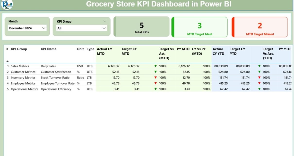
Summary Page – The Big Picture
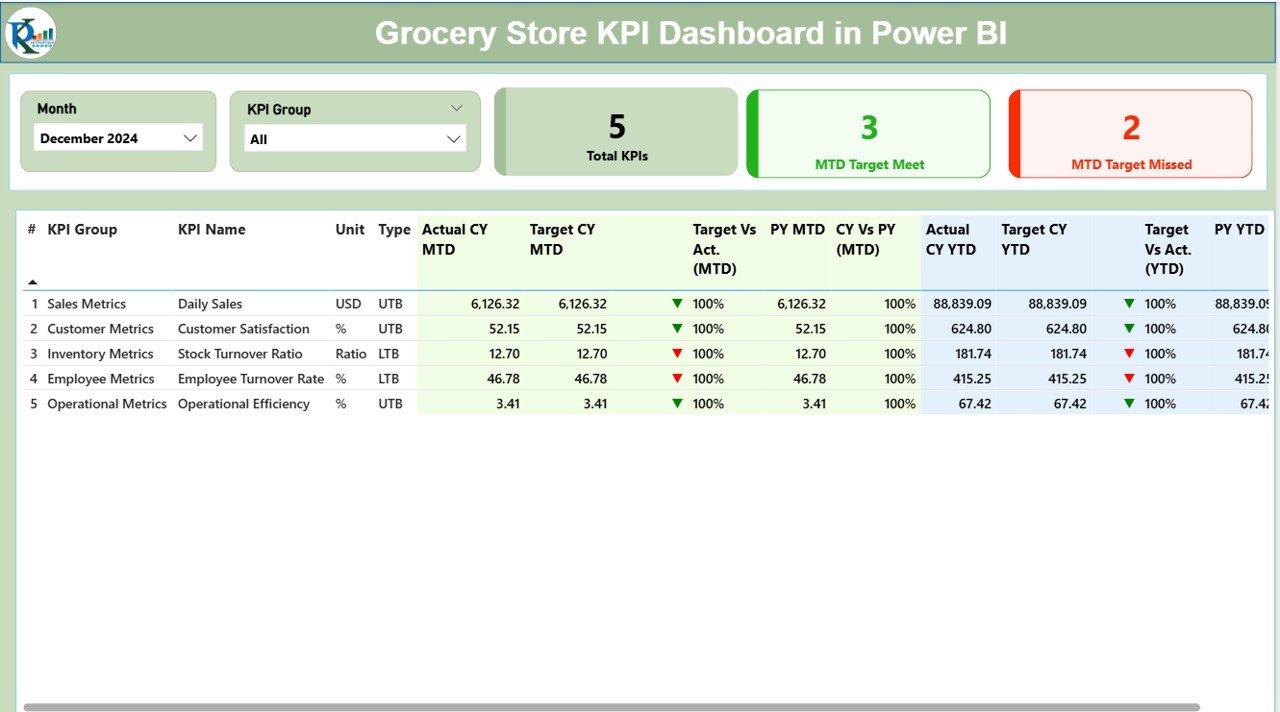
The Summary Page acts as the control center of the dashboard. It provides an overview of all KPIs, enabling managers to quickly evaluate whether the store is on track.
At the top, you will find:
-
Month slicer: Select the month for which you want to see KPIs.
-
KPI Group slicer: Filter KPIs by category (such as Sales, Inventory, Customer Service).
Below the slicers, three cards provide quick insights:
-
Total KPIs Count: The number of KPIs being tracked.
-
MTD Target Met Count: KPIs that achieved their targets for the month-to-date period.
-
MTD Target Missed Count: KPIs that did not meet their targets for the month-to-date period.
KPI Table Details
The table in this page contains the following columns:
-
KPI Number – Unique sequence number for each KPI.
-
KPI Group – Category of the KPI (e.g., Sales, Costs, Inventory).
-
KPI Name – The specific KPI name.
-
Unit – Measurement unit (e.g., %, $, units).
-
Type – Type of KPI: UTB (Upper the Better) or LTB (Lower the Better).
-
Actual CY MTD – Current Year’s Month-to-Date actual value.
-
Target CY MTD – Current Year’s Month-to-Date target value.
-
MTD Icon – Green ▲ or red ▼ icon indicating performance against MTD target.
-
Target vs Actual (MTD) – Percentage calculation (Actual ÷ Target).
-
PY MTD – Previous Year’s MTD value.
-
CY vs PY (MTD) – Percentage comparison of Current Year vs Previous Year for MTD.
-
Actual CY YTD – Current Year’s Year-to-Date actual value.
-
Target CY YTD – Current Year’s Year-to-Date target value.
-
YTD Icon – Green ▲ or red ▼ icon indicating performance against YTD target.
-
Target vs Actual (YTD) – Percentage calculation (Actual ÷ Target).
-
PY YTD – Previous Year’s YTD value.
-
CY vs PY (YTD) – Percentage comparison of Current Year vs Previous Year for YTD.
This table provides both MTD and YTD comparisons, allowing managers to identify trends and patterns at a glance.
KPI Trend Page – Understanding the Flow
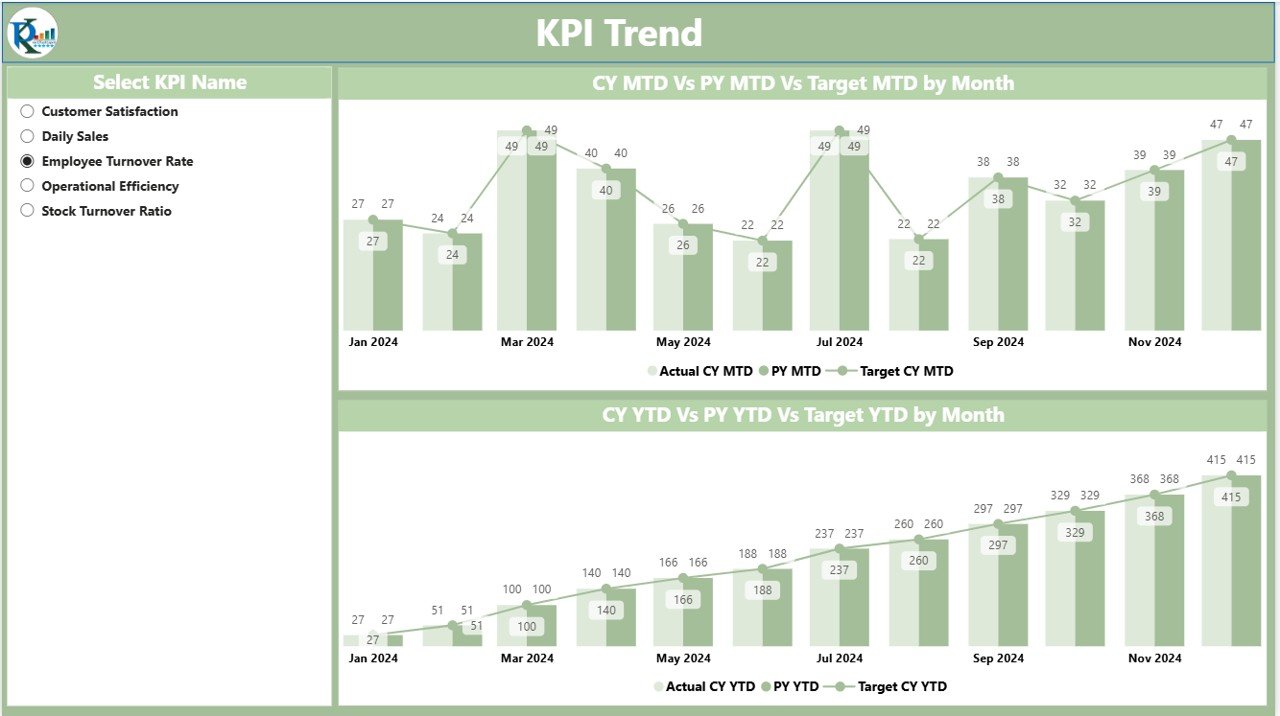
The KPI Trend Page gives a more detailed, visual representation of KPIs over time.
It includes two combo charts:
- MTD Chart – Displays Actual, Target, and Previous Year values for Month-to-Date.
- YTD Chart – Displays Actual, Target, and Previous Year values for Year-to-Date.
-
A slicer on the left lets you select specific KPI names, so you can focus on one metric at a time.
This page helps managers identify whether performance is improving or declining, and how it compares to both targets and past performance.
Click to Purchases Grocery Store KPI Dashboard in Power BI
KPI Definition Page – Drill-Through Insights
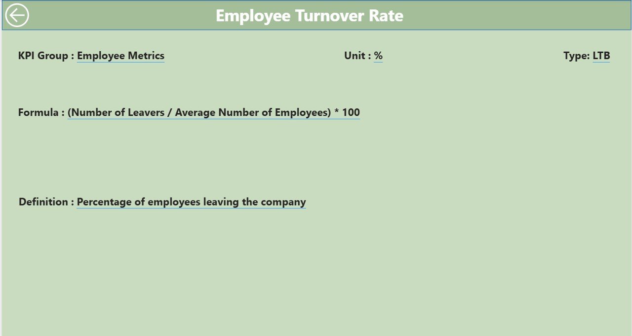
The KPI Definition Page is hidden but accessible through a drill-through action from the Summary Page.
On this page, you can see details for each KPI such as:
-
Formula used for calculation
-
Clear definition
-
Unit of measurement
-
Type (LTB or UTB)
This ensures transparency and avoids confusion about how KPIs are calculated. A Back button on the top-left corner allows users to easily return to the main page.
Excel Data Structure for the Dashboard
The Grocery Store KPI Dashboard connects with an Excel file that serves as the data source. The file contains three worksheet tabs:
Input_Actual
- Enter the actual numbers for each KPI.
- Fields include: KPI Name, Month (use the first date of the month), MTD value, and YTD value.
Input_Target
- Enter the target numbers for each KPI.
- Fields include: KPI Name, Month (first date of the month), MTD target, and YTD target.
KPI Definition
- Maintain details such as KPI Number, KPI Group, KPI Name, Unit, Formula, Definition, and Type (LTB/UTB).
This structured format makes the dashboard easy to update and ensures data integrity.
Why Do Grocery Stores Need KPI Dashboards?
Managing a grocery store involves juggling many moving parts. Without proper tracking, it’s easy to miss warning signs like:
-
Increasing operational costs
-
Declining customer satisfaction
-
Inventory waste due to poor stock rotation
-
Sales shortfalls against targets
A KPI Dashboard in Power BI solves these issues by consolidating data into a single, interactive platform.
Advantages of Grocery Store KPI Dashboard in Power BI
Here are the main benefits:
📊 Data Visibility: Get real-time insights into sales, inventory, and operational performance.
🎯 Target Tracking: Compare actual performance against goals for both MTD and YTD.
🔄 Trend Analysis: Easily monitor changes by comparing with previous year data.
⚡ Quick Decision-Making: Visual indicators like green and red arrows highlight problem areas instantly.
🛒 Store Optimization: Identify which departments or product groups are driving performance.
✅ Transparency: Drill-through KPI definitions make calculations easy to understand.
📈 Scalability: Suitable for single stores as well as multi-branch grocery chains.
Opportunities for Improvement
While the dashboard is powerful, there are areas that can be enhanced:
🔧 Automation: Link directly with POS or ERP systems to reduce manual data entry.
📡 Real-Time Updates: Move from monthly updates to daily or hourly refreshes.
🤝 Collaboration: Integrate with tools like Teams or Slack for instant sharing of insights.
🔍 Customer Insights: Add KPIs related to customer satisfaction, loyalty programs, and basket analysis.
🌍 Sustainability Metrics: Track KPIs like energy consumption, food waste reduction, and eco-friendly packaging.
Best Practices for Grocery Store KPI Dashboard
To maximize the value of your dashboard:
✅ Keep KPIs Relevant: Focus on metrics that directly impact your store’s success.
📅 Update Data Regularly: Ensure timely and accurate data entry in the Excel source.
🖥️ Use Interactive Features: Train staff to use slicers, drill-through, and charts.
🔑 Standardize Definitions: Make sure every KPI is clearly defined to avoid confusion.
📊 Visualize Smartly: Use conditional formatting and icons to highlight performance gaps.
🚀 Expand Over Time: Start with core KPIs (like sales, costs, stock levels) and add more as needed.
Conclusion
The Grocery Store KPI Dashboard in Power BI is more than just a reporting tool—it’s a decision-making companion. By centralizing data, providing visual insights, and allowing drill-through analysis, it ensures that grocery store managers stay on top of their operations.
Whether you run a single neighborhood shop or manage a chain of supermarkets, this dashboard helps you align targets, monitor progress, and improve efficiency.
Frequently Asked Questions (FAQs)
1. What is a KPI in a grocery store?
A KPI (Key Performance Indicator) is a measurable value that shows how effectively a grocery store achieves key business objectives, such as sales per square foot, stock turnover rate, or customer satisfaction.
2. Can I customize the Grocery Store KPI Dashboard in Power BI?
Yes. The dashboard is fully customizable. You can add new KPIs, modify formulas, or connect it with different data sources.
3. Do I need advanced Power BI skills to use this dashboard?
No. The template is user-friendly and ready to use. Basic knowledge of Power BI and Excel is enough to operate it.
4. Can I connect the dashboard directly with my store’s POS system?
Yes, with additional configuration. Connecting directly to POS or ERP systems can automate data refresh and reduce manual work.
5. What are the most important KPIs for a grocery store?
Some critical KPIs include:
-
Sales revenue
-
Gross profit margin
-
Inventory turnover
-
Shrinkage percentage
-
Average basket size
-
Customer satisfaction scores
Click to Purchases Grocery Store KPI
Watch the step-by-step video tutorial:
Dashboard in Power BI
Visit our YouTube channel to learn step-by-step video tutorials