Healthcare organizations today face a common challenge: how to manage data effectively while ensuring patient satisfaction, operational efficiency, and compliance. Clinics, hospitals, and health startups generate massive amounts of information every single day—from appointment records to patient feedback, from doctor performance to digital app usage.
Handling all of this data manually is not only overwhelming but also prone to errors. This is where a Health Tech Dashboard in Excel makes the difference. By providing a single, interactive platform, it helps healthcare providers track performance, analyze trends, and make informed decisions.
In this article, we’ll explore what the Health Tech Dashboard in Excel is, its key features, advantages, best practices, and how healthcare professionals can use it to improve patient outcomes and organizational efficiency.
Click to Purchases Health Tech Dashboard in Excel
What Is a Health Tech Dashboard in Excel?
A Health Tech Dashboard in Excel is a ready-to-use, interactive template designed to monitor healthcare performance metrics. It combines multiple sheets and charts into a structured dashboard that highlights everything from patient satisfaction to appointment completion rates.
Unlike traditional spreadsheets, this dashboard offers dynamic navigation, real-time updates, and visual charts, making it easy for healthcare administrators, doctors, and managers to quickly understand performance indicators without scrolling through endless rows of data.
It essentially transforms raw healthcare data into actionable insights. Whether you want to know which department has the longest wait times or which doctor has the highest satisfaction score, the dashboard provides that information at a glance.
Key Features of the Health Tech Dashboard in Excel
This template is designed with practicality and usability in mind. Below are the key features you will find inside:
Page Navigator
-
Located on the left side, the Page Navigator allows users to switch between different analytical pages with a single click.
-
No need to scroll endlessly—jump straight to the page you want.
Five Interactive Pages
The dashboard is divided into five main analytical pages, each focusing on a different dimension of healthcare performance.
Overview Page
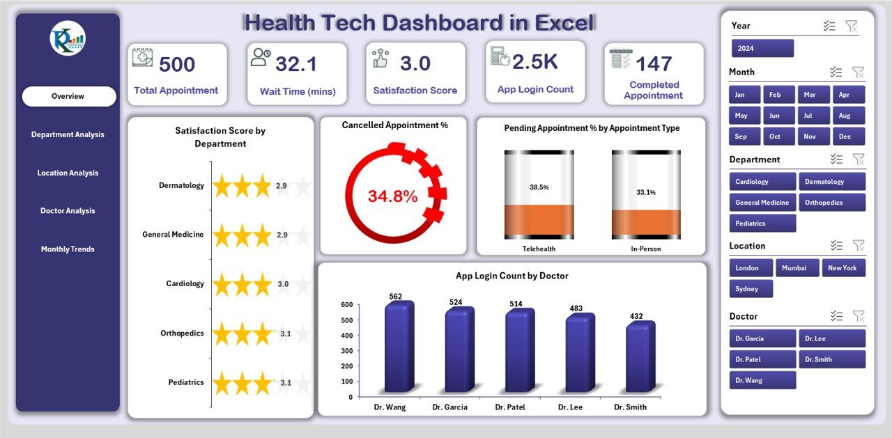
-
The central hub of the dashboard.
Displays 5 key performance cards:
- Total Appointments
- Cancelled Appointments %
- Pending Appointments %
- Satisfaction Score
- App Login Count by Doctor
Contains 4 powerful charts:
- Satisfaction Score by Department
- Cancelled Appointment %
- Pending Appointment % by Appointment Type
- App Login Count by Doctor
Department Analysis

-
Provides a detailed view of departmental efficiency.
3 interactive charts included:
- Wait Time (mins) by Department
- Total Appointments by Department
- Completed Appointment % by Department
Click to Purchases Health Tech Dashboard in Excel
Location Analysis
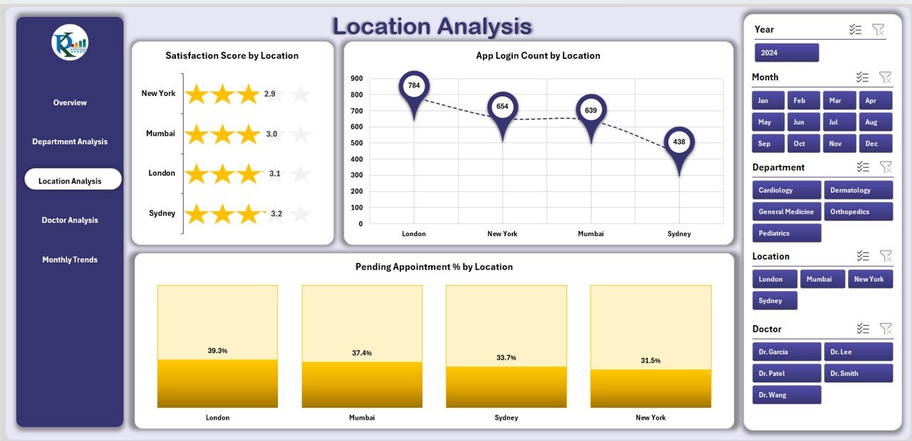
-
Highlights performance across different hospital or clinic locations.
3 charts available:
- Satisfaction Score by Location
- App Login Count by Location
- Pending Appointment % by Location
Doctor Analysis

-
Focuses on individual doctor performance and efficiency.
3 charts included:
- Satisfaction Score by Doctor
- Completed Appointment % by Doctor
- Total Appointments by Doctor
Monthly Trends

-
Tracks healthcare performance over time.
3 trend charts provided:
- Total Satisfaction Score by Month
- Total Appointments by Month
- Completed Appointment % by Month
Support Sheet
-
A backend sheet where raw data is stored.
-
Users can update this sheet with appointment data, doctor information, and patient feedback to refresh the entire dashboard.
Why Do You Need a Health Tech Dashboard in Excel?
Healthcare organizations deal with multiple moving parts. Without a system to track them, it becomes nearly impossible to measure performance or identify gaps. A Health Tech Dashboard in Excel solves this problem by:
-
Centralizing healthcare data in one place.
-
Offering real-time insights into patient care and operational efficiency.
-
Highlighting bottlenecks such as long wait times or high appointment cancellation rates.
-
Helping management compare performance across doctors, departments, and locations.
Advantages of Health Tech Dashboard in Excel
✅ Better Decision Making
With visual charts and performance indicators, managers can quickly identify areas needing attention.
✅ Improved Patient Satisfaction
By tracking satisfaction scores by department, doctor, or location, healthcare providers can address issues immediately.
✅ Time Efficiency
Instead of spending hours analyzing data manually, administrators can rely on automated dashboards.
✅ Cost Savings
Since the dashboard is built in Excel, there is no need to purchase expensive healthcare analytics software.
✅ Flexibility
The dashboard can be customized to suit different healthcare organizations, from small clinics to large hospitals.
Opportunities for Improvement in Health Tech Dashboards
Even though Excel dashboards are powerful, there is always room for improvement:
-
Automation: Adding VBA or Power Query can reduce manual updates.
-
Integration: Connecting the dashboard to external data sources (like EMR systems) can improve accuracy.
-
Scalability: For very large hospitals, Power BI or Google Data Studio may be better suited for handling large datasets.
-
Data Security: Healthcare data is sensitive, so security protocols must be followed when using Excel files.
Best Practices for Using a Health Tech Dashboard in Excel
Click to Purchases Health Tech Dashboard in Excel
To get the most out of this dashboard, healthcare teams should follow these best practices:
1. Keep Data Updated
Always update the support sheet with the latest data. Outdated data can lead to wrong decisions.
2. Use Filters Effectively
Take advantage of slicers and drop-down filters to analyze data by month, department, or doctor.
3. Monitor Trends Regularly
Monthly trend charts can help identify whether performance is improving or declining.
4. Train Staff
Ensure that managers and department heads understand how to read and interpret the charts.
5. Customize as Needed
Every healthcare organization is unique. Customize the dashboard to reflect KPIs that matter most to your institution.
Real-World Applications of Health Tech Dashboard
Here are some ways hospitals and clinics can use the dashboard:
-
Patient Care: Track satisfaction scores to improve patient experiences.
-
Operational Efficiency: Monitor appointment cancellations and wait times to reduce bottlenecks.
-
Doctor Performance: Compare appointment completion rates and satisfaction scores across doctors.
-
Location Management: Identify which clinic locations are performing better and why.
-
Digital Adoption: Use app login counts to understand patient engagement with digital healthcare tools.
Conclusion
The Health Tech Dashboard in Excel is more than just a spreadsheet—it is a complete healthcare analytics solution. By offering five interactive pages with charts, performance cards, and trend analysis, it empowers healthcare organizations to make data-driven decisions, improve patient satisfaction, and streamline operations.
With minimal setup and maximum usability, this dashboard is a must-have tool for healthcare providers looking to enhance efficiency and transparency.
Frequently Asked Questions (FAQs)
1. What is a Health Tech Dashboard in Excel?
It is a ready-to-use Excel template designed to monitor healthcare performance metrics such as patient satisfaction, appointment completion, and doctor efficiency.
2. Who can use this dashboard?
Hospital administrators, doctors, clinic managers, and healthcare IT teams can all use this dashboard to track and analyze performance.
3. How do I update the dashboard?
You only need to update the support sheet with new data. The charts and visualizations will refresh automatically.
4. Can the dashboard be customized?
Yes, the dashboard is highly customizable. You can add new KPIs, change chart types, or expand it with Power Query and VBA.
5. Is this dashboard suitable for large hospitals?
Yes, but for very large datasets, tools like Power BI or Google Data Studio may provide better scalability.
6. What KPIs can be tracked in this dashboard?
Common KPIs include:
-
Appointment Completion %
-
Wait Time by Department
-
Satisfaction Score by Doctor or Location
-
Cancelled Appointments %
-
App Login Count by Doctor
Click to Purchases Health Tech Dashboard in Excel
Visit our YouTube channel to learn step-by-step video tutorials