Managing risks in the healthcare sector is more important than ever. With patient safety, data privacy, and compliance all in the spotlight, healthcare organizations need strong tools to stay ahead. That’s where a Healthcare Risk Management KPI Dashboard in Excel can become your secret weapon.
This guide walks you through everything you need to know about creating and using a powerful KPI dashboard to manage risk. Whether you’re part of a hospital, clinic, or healthcare consultancy, this tool can help you track key metrics and make smarter decisions—without getting overwhelmed.
Click to Purchases Healthcare Risk Management KPI Dashboard in Excel
What is a Healthcare Risk Management KPI Dashboard?
A Healthcare Risk Management KPI Dashboard is a structured Excel-based tool that lets healthcare professionals track, monitor, and analyze key risk indicators. These KPIs (Key Performance Indicators) help identify potential risks in real-time and ensure proactive mitigation steps.
The best part? You can manage all of this using Microsoft Excel, a tool you already know and trust. No need for expensive software or long learning curves!
Why Use Excel for Healthcare Risk Management?
Excel is widely available, highly customizable, and easy to use. It allows you to:
-
Track trends over time
-
Compare actual vs target KPIs
-
Monitor performance with simple visualizations
-
Automate reports using formulas and charts
With the right structure, Excel becomes a dynamic dashboard that helps teams make quick, informed decisions in a fast-paced healthcare environment.
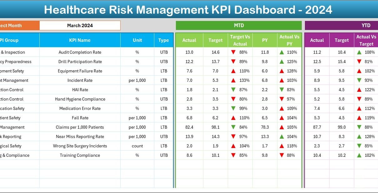
Key Features of the Healthcare Risk Management KPI Dashboard
This ready-to-use dashboard includes seven well-structured worksheets:
Home Sheet
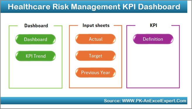
The Home Sheet acts as a central hub. It includes six navigation buttons that instantly take you to different sheets like Dashboard, Trend, Target, or Data Entry tabs.
Dashboard Sheet Tab
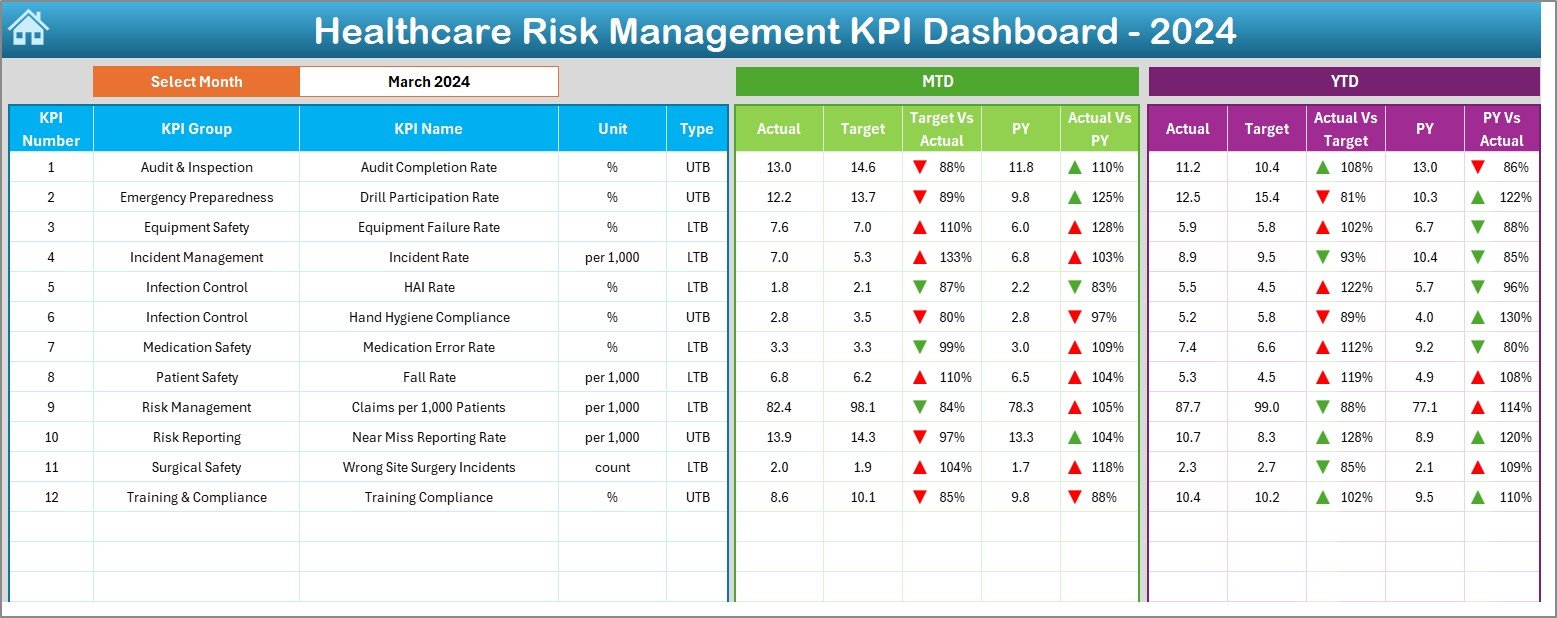
This is the main area where you can view all critical risk indicators at a glance. Here’s what makes it powerful:
-
Dynamic month selection (Range D3)
-
Conditional formatting with up/down arrows to show trends
-
Side-by-side comparison of MTD and YTD data (Actual vs Target vs Previous Year)
This lets you spot risks early and act fast.
KPI Trend Sheet Tab
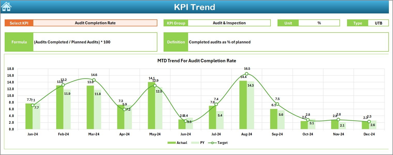
Want to analyze how a specific KPI has changed over time?
-
Select any KPI from a drop-down (Range C3)
-
View the KPI Group, Unit, Type (UTB/LTB), Formula, and Definition
-
Visual charts show MTD and YTD performance trends
This visual aid helps leadership teams monitor changes and forecast risks effectively.
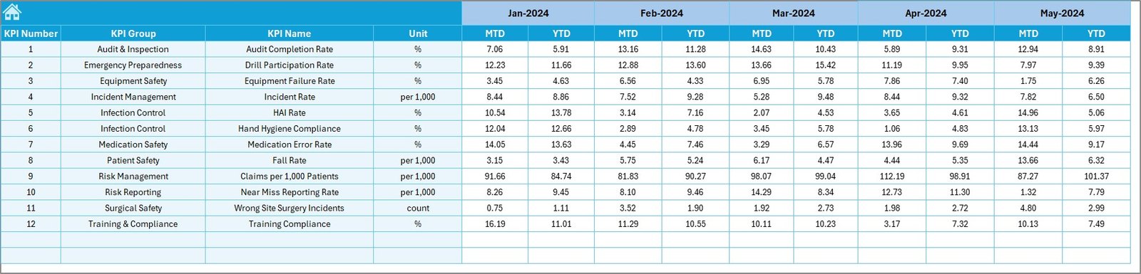
Actual Numbers Input Sheet
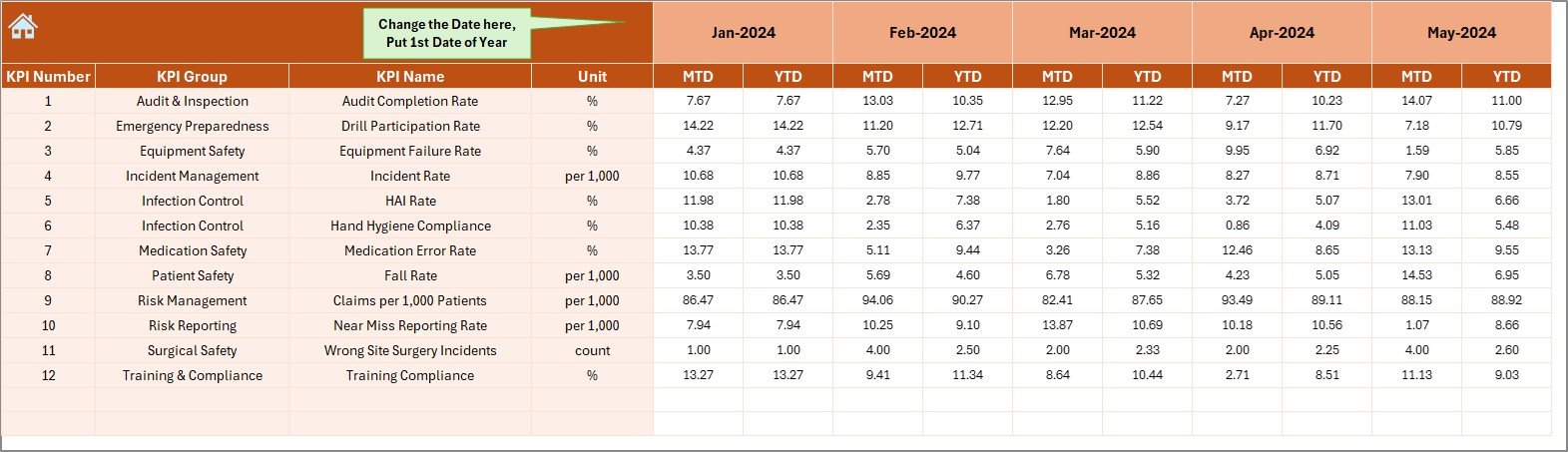
Capture all real-time or historical values for:
-
MTD (Month-to-Date)
-
YTD (Year-to-Date)
Change the reporting month by updating Cell E1. This feeds the entire dashboard with fresh data, automatically.
Target Sheet Tab
Set your monthly targets clearly. For each KPI, you can define:
-
MTD targets
-
YTD targets
This allows you to align goals across departments and keep everyone focused on the same objectives.
Previous Year Number Sheet
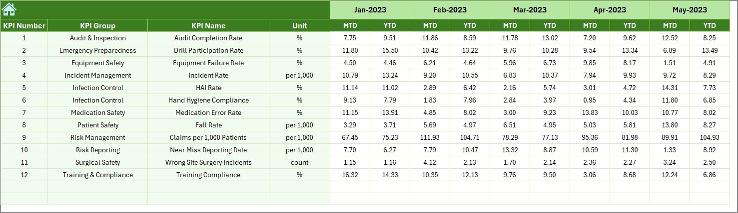
Input last year’s figures to enable:
-
Historical comparison
-
Performance benchmarking
-
Strategic risk assessment
This is especially helpful during audits and year-end reviews.
Click to Purchases Healthcare Risk Management KPI Dashboard in Excel
KPI Definition Sheet
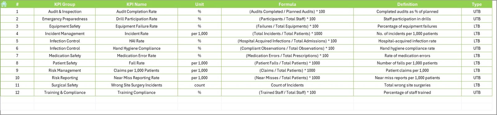
Maintain clarity across your organization by defining:
-
KPI Name & Group
-
Measurement Unit
-
Formula
-
Brief, simple definition
This serves as a quick reference guide for all users of the dashboard.
Advantages of Healthcare Risk Management KPI Dashboard in Excel
Let’s explore why this dashboard is more than just a spreadsheet.
📌 Simplifies Risk Monitoring
No more scattered data. The dashboard brings all your key risk indicators under one roof.
📌 Enhances Compliance and Accountability
With clear targets, definitions, and actual performance, it’s easier to track regulatory compliance and maintain accountability across teams.
📌 Increases Operational Efficiency
You can instantly spot underperforming areas, prioritize issues, and deploy solutions—without waiting for monthly reports.
📌 Improves Team Communication
The dashboard’s clear structure ensures that every stakeholder sees the same data, reducing miscommunication and aligning goals.
Best Practices for Building a Healthcare Risk KPI Dashboard in Excel
Following best practices ensures your dashboard is reliable and easy to use.
1. Keep Data Updated
Ensure the Actual Numbers, Targets, and Previous Year data are entered consistently each month.
2. Use Simple and Clear Formulas
Avoid complicated formulas. Stick to AVERAGE, SUM, IF, and LOOKUP functions for better stability.
3. Visualize for Faster Understanding
Incorporate charts, arrows, and color-coded bars to make trends more intuitive.
4. Standardize KPI Definitions
All team members must refer to the same definitions. Use the KPI Definition tab to avoid confusion.
5. Limit Manual Entry
Wherever possible, use drop-downs, data validation, and formulas to reduce human error.
Who Should Use This Dashboard?
This dashboard is valuable for:
-
Hospital Risk Managers
-
Quality Assurance Teams
-
Healthcare Administrators
-
Compliance Officers
-
IT Security in Healthcare
-
Patient Safety Committees
It works for any healthcare organization—public or private, large or small.
Example Use Case: How a Hospital Reduced Risk by 27%
A regional hospital implemented the Healthcare Risk Management KPI Dashboard and focused on three KPIs:
-
Medication Errors
-
Infection Rates
-
Emergency Response Accuracy
Within 6 months, they observed:
-
A 40% drop in medication errors
-
Faster resolution times for emergencies
-
Improved compliance reporting during audits
All they did was update their dashboard monthly and review the trends during team meetings.
Tips to Maximize Impact
Here’s how you can get the most out of your KPI dashboard:
-
Schedule regular reviews to track progress
-
Highlight red flags automatically using conditional formatting
-
Export dashboard to PDF for monthly reporting
-
Use slicers (if applicable) for better filtering
-
Protect sheets to avoid accidental data loss
Conclusion
A Healthcare Risk Management KPI Dashboard in Excel is more than a tracking tool—it’s a strategy enhancer. With it, you can monitor patient safety, operational risks, and compliance—all in one place.
By using Excel smartly, you don’t just meet healthcare standards—you exceed them.
❓Frequently Asked Questions (FAQs)
Q1: What is a Healthcare Risk Management KPI?
A Healthcare Risk Management KPI is a measurable indicator that tracks and evaluates risks affecting patient safety, compliance, and operations in a healthcare setting.
Q2: Can Excel handle complex healthcare data?
Yes. Excel, when used with proper structure and formulas, can manage a large set of KPIs and visualize them through charts, conditional formatting, and dynamic ranges.
Q3: How often should I update the KPI dashboard?
Ideally, update it once a month with fresh MTD and YTD data. However, high-risk areas may require weekly reviews.
Q4: How many KPIs should be tracked?
Start with 10 to 15 essential KPIs. Focus on quality over quantity. Once your team is comfortable, you can add more indicators.
Q5: Can this dashboard be used for audit purposes?
Absolutely. The dashboard includes historical comparisons and KPI definitions, which are useful during internal or external audits.
Visit our YouTube channel to learn step-by-step video tutorials