Humanitarian organizations operate in complex and high-pressure environments. They deliver food, medical support, shelter, education, and emergency relief across regions. However, without proper tracking, leaders struggle to measure impact clearly.
Many NGOs and aid agencies still depend on scattered reports and manual summaries. As a result, they face delays, lack visibility, and struggle to compare targets against real results.
So, how can humanitarian organizations track performance in a structured, data-driven way?
The answer is simple.
You need a Humanitarian Aid KPI Dashboard in Excel.
This ready-to-use Excel dashboard helps humanitarian teams monitor Key Performance Indicators (KPIs), compare performance against targets, analyze monthly and yearly progress, and evaluate previous year comparisons — all in one interactive system.
In this comprehensive guide, you will learn:
-
What a Humanitarian Aid KPI Dashboard in Excel is
-
Why humanitarian organizations need KPI tracking
-
Detailed explanation of all 7 worksheets
-
Key performance tracking capabilities
-
Advantages of Humanitarian Aid KPI Dashboard in Excel
-
Best Practices for the Humanitarian Aid KPI Dashboard in Excel
-
Frequently Asked Questions
Let us explore everything step by step.
Click to Purchases Humanitarian Aid KPI Dashboard in Excel
What Is a Humanitarian Aid KPI Dashboard in Excel?
A Humanitarian Aid KPI Dashboard in Excel is a structured performance monitoring system that helps NGOs and aid agencies measure operational efficiency and program impact.
Instead of reviewing disconnected reports, this dashboard allows you to:
-
Monitor Monthly-to-Date (MTD) performance
-
Track Year-to-Date (YTD) results
-
Compare actual performance against targets
-
Compare current performance with previous year
-
Analyze KPI trends visually
Moreover, Excel automation updates calculations automatically when you select a month.
Why Do Humanitarian Organizations Need KPI Dashboards?
Humanitarian operations require accountability and transparency. Donors expect measurable impact. Beneficiaries expect timely delivery.
Without KPI monitoring, organizations may:
-
Miss performance gaps
-
Fail to detect underperformance
-
Struggle with donor reporting
-
Lack strategic direction
Therefore, a KPI dashboard improves decision-making.
When organizations track KPIs effectively, they:
-
Improve operational efficiency
-
Optimize resource allocation
-
Increase donor confidence
-
Enhance transparency
-
Strengthen program performance
What Are the Key Features of Humanitarian Aid KPI Dashboard in Excel?
This dashboard includes 7 structured worksheets designed to provide full performance visibility.
Click to Purchases Humanitarian Aid KPI Dashboard in Excel
1️⃣ Home Sheet – Navigation Center
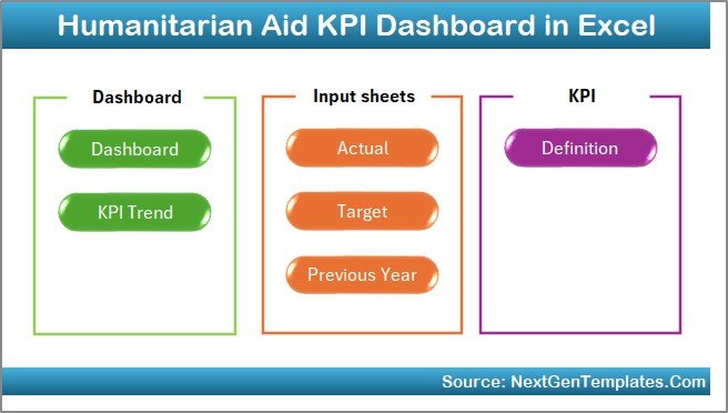
The Home sheet serves as the index page.
It contains 6 navigation buttons that allow users to jump directly to:
-
Dashboard
-
KPI Trend
-
Actual Numbers Input
-
Target Sheet
-
Previous Year Sheet
-
KPI Definition
Because of this structure, users can navigate easily without confusion.
Click to Purchases Humanitarian Aid KPI Dashboard in Excel
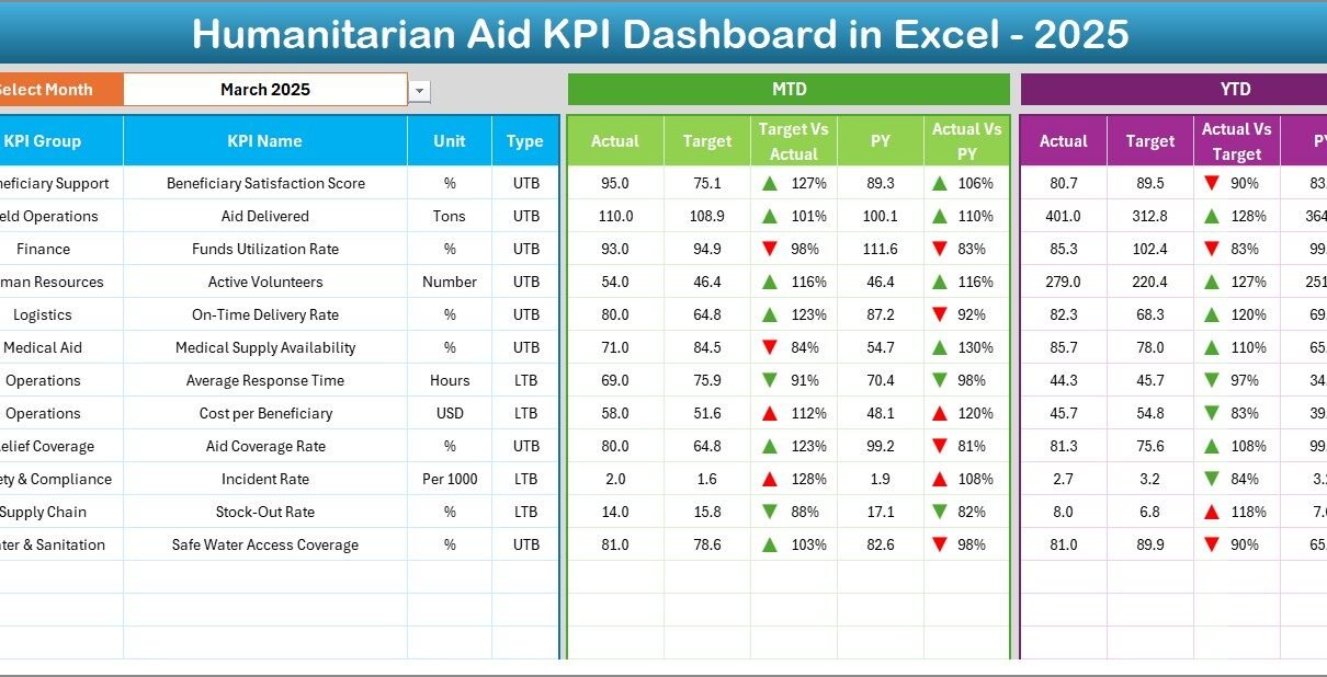
2️⃣ Dashboard Sheet – Main KPI Performance View
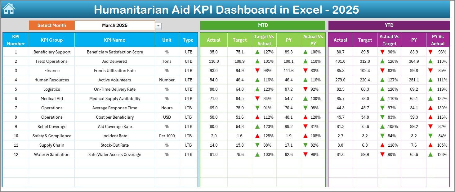
This is the core performance sheet.
On cell D3, you can select the Month from a drop-down list. When you change the month, the entire dashboard updates automatically.
What Does the Dashboard Display?
✔ MTD Performance Section
-
MTD Actual
-
MTD Target
-
MTD Previous Year
-
Target vs Actual comparison
-
Previous Year vs Actual comparison
-
Conditional formatting arrows (Up/Down)
✔ YTD Performance Section
-
YTD Actual
-
YTD Target
-
YTD Previous Year
-
Target vs Actual
-
PY vs Actual
-
Conditional formatting arrows
Because of visual indicators, managers instantly understand performance direction.
For example:
-
If Actual > Target, arrow points up
-
If Actual < Target, arrow points down
Therefore, leadership can take corrective action quickly.
3️⃣ KPI Trend Sheet – Performance Over Time
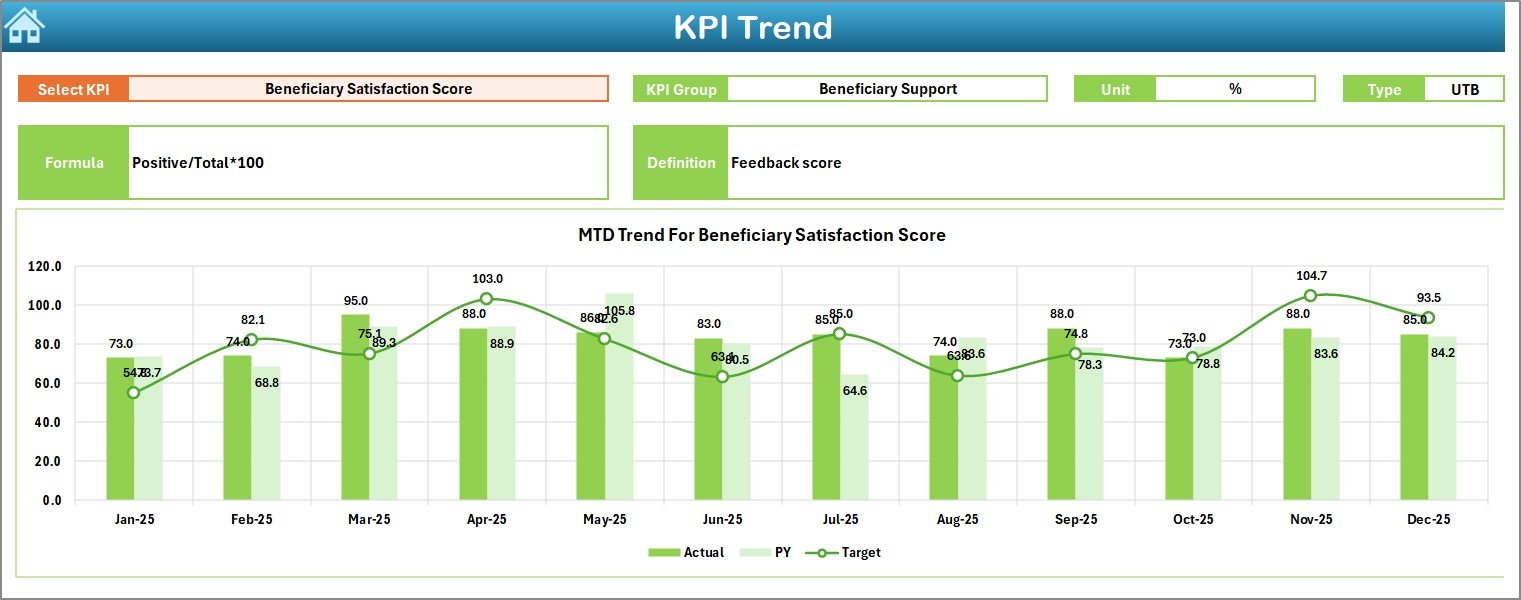
The KPI Trend sheet focuses on individual KPI analysis.
On cell C3, you can select a KPI name from the drop-down.
Once selected, the sheet displays:
-
KPI Group
-
Unit of KPI
-
KPI Type (Lower the Better or Upper the Better)
-
KPI Formula
-
KPI Definition
Trend Charts Included
The sheet displays:
-
MTD Trend Chart (Actual vs Target vs PY)
-
YTD Trend Chart (Actual vs Target vs PY)
Therefore, users can analyze performance trends month by month.
For example:
-
If beneficiary coverage improves steadily, the trend line rises
-
If response time increases and KPI type is “Lower the Better,” it highlights concern
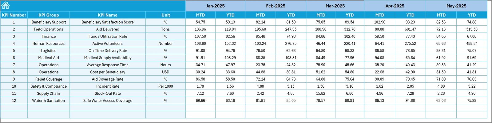
4️⃣ Actual Numbers Input Sheet – Data Entry Sheet
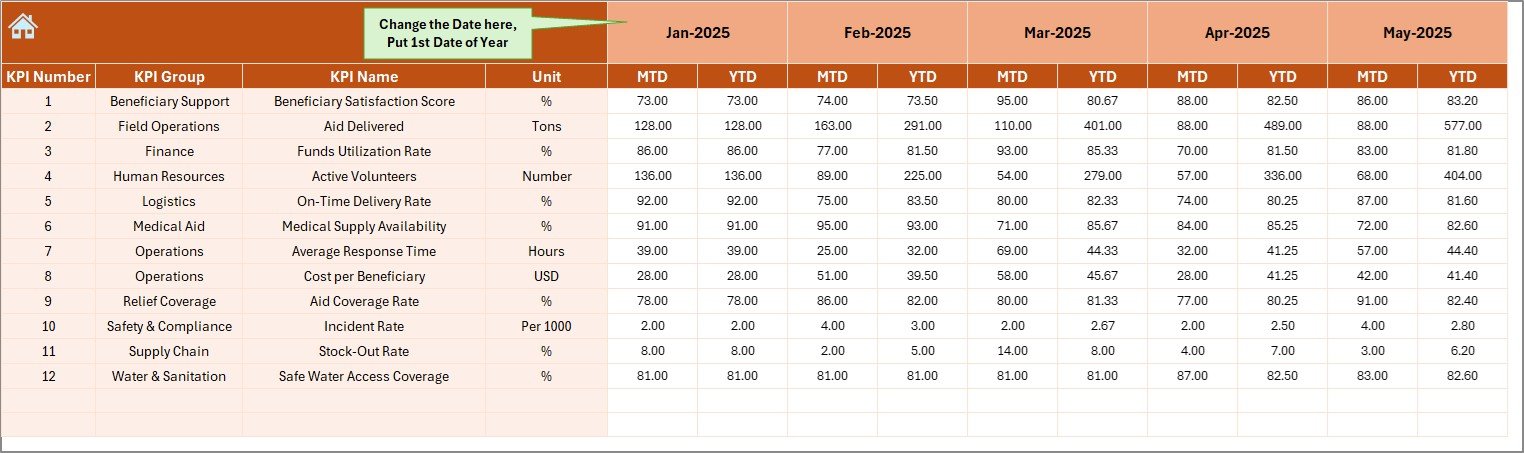
This sheet allows you to input actual KPI data.
On cell E1, enter the first month of the year. Then, input MTD and YTD actual numbers for each KPI.
Because this sheet drives calculations, accurate data entry becomes critical.
5️⃣ Target Sheet – KPI Planning Data
In this sheet, you enter:
-
MTD Target values
-
YTD Target values
By defining monthly targets clearly, organizations set measurable goals.
Click to Purchases Humanitarian Aid KPI Dashboard in Excel
6️⃣ Previous Year Number Sheet – Historical Comparison
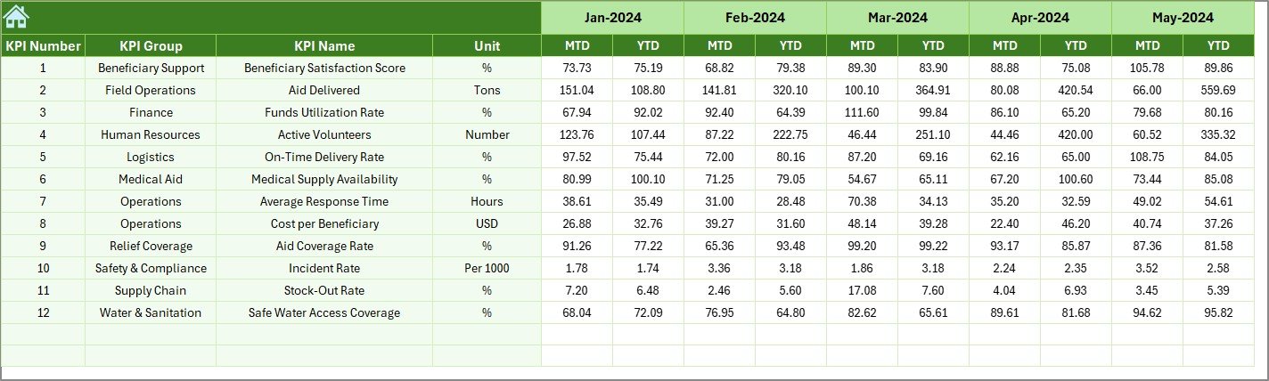
Here, you enter last year’s performance data.
This allows comparison between:
-
Current Year vs Previous Year
-
Growth trends
-
Performance improvements
Therefore, organizations can measure progress effectively.
7️⃣ KPI Definition Sheet – KPI Documentation
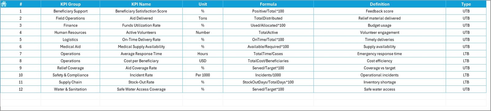
This sheet contains:
-
KPI Name
-
KPI Group
-
Unit
-
Formula
-
Definition
Because of this documentation, users understand how each KPI works.
Moreover, this improves transparency and governance.
Click to Purchases Humanitarian Aid KPI Dashboard in Excel
What KPIs Can You Track in a Humanitarian Aid Dashboard?
Organizations can track KPIs such as:
-
Beneficiaries Served
-
Aid Distribution Efficiency
-
Emergency Response Time
-
Budget Utilization %
-
Medical Coverage Rate
-
Volunteer Engagement Rate
-
Project Completion Rate
-
Fund Utilization Ratio
Additionally, you can define custom KPIs based on program focus.
Advantages of Humanitarian Aid KPI Dashboard in Excel
Let us explore the benefits.
1️⃣ Improves Transparency
The dashboard clearly shows performance against targets.
2️⃣ Enhances Accountability
Teams track measurable KPIs and responsibilities.
3️⃣ Supports Data-Driven Decisions
Leadership can identify underperforming areas instantly.
4️⃣ Improves Donor Reporting
You can generate structured performance reports easily.
5️⃣ Tracks Yearly Growth
Comparison with previous year shows improvement clearly.
6️⃣ Provides Visual Clarity
Conditional formatting arrows highlight performance direction.
7️⃣ Cost-Effective Solution
Excel eliminates the need for expensive BI software.
Click to Purchases Humanitarian Aid KPI Dashboard in Excel
Best Practices for the Humanitarian Aid KPI Dashboard in Excel
To maximize effectiveness, follow these best practices:
✔ Define Clear KPIs
Choose measurable, relevant, and actionable KPIs.
✔ Update Data Monthly
Regular updates ensure accuracy and reliability.
✔ Review Trends Quarterly
Trend analysis helps identify long-term patterns.
✔ Use KPI Type Correctly
Define whether KPI is “Lower the Better” or “Upper the Better” properly.
✔ Validate Data Entry
Cross-check actual numbers before finalizing.
✔ Share Dashboard with Leadership
Regular sharing improves strategic planning.
Why Choose Excel for Humanitarian KPI Tracking?
Excel offers several advantages:
-
Familiar platform
-
No additional licensing cost
-
Easy customization
-
Supports formulas and automation
-
Compatible with donor reporting
Moreover, most NGOs already use Excel, which makes implementation simple.
Common Mistakes to Avoid
Avoid these common errors:
-
Ignoring data accuracy
-
Setting unrealistic targets
-
Not reviewing previous year trends
-
Failing to define KPI formulas
-
Skipping monthly updates
When you avoid these mistakes, your dashboard becomes reliable and powerful.
Click to Purchases Humanitarian Aid KPI Dashboard in Excel
How Does This Dashboard Improve Humanitarian Impact?
Humanitarian missions aim to serve communities effectively.
This dashboard helps you:
-
Measure impact clearly
-
Optimize resource allocation
-
Improve emergency response
-
Strengthen accountability
-
Enhance donor confidence
Therefore, you create measurable and visible impact.
Conclusion: Why Should You Use Humanitarian Aid KPI Dashboard in Excel?
Humanitarian organizations must balance accountability and efficiency. Therefore, structured KPI monitoring becomes essential.
The Humanitarian Aid KPI Dashboard in Excel provides:
-
MTD and YTD tracking
-
Target vs Actual comparison
-
Previous Year comparison
-
KPI trend analysis
-
Clear documentation
-
Interactive monthly selection
Moreover, because it remains user-friendly, teams can adopt it quickly without technical complexity.
If you want data-driven humanitarian impact measurement, this Excel dashboard offers a practical and powerful solution.
Click to Purchases Humanitarian Aid KPI Dashboard in Excel
Frequently Asked Questions with Answers
1️⃣ Can I customize KPIs?
Yes. You can add, edit, or modify KPIs in the KPI Definition sheet.
2️⃣ How does month selection work?
Select the month in cell D3 on the Dashboard sheet, and the numbers update automatically.
3️⃣ What is MTD and YTD?
MTD means Month-to-Date performance.
YTD means Year-to-Date performance.
4️⃣ Can I compare with previous year?
Yes. Enter last year’s data in the Previous Year sheet.
5️⃣ Is this dashboard suitable for small NGOs?
Yes. Small and large humanitarian organizations can use it effectively.
6️⃣ Does it require advanced Excel skills?
No. Basic Excel knowledge is sufficient.
7️⃣ Can I create charts from this dashboard?
Yes. The KPI Trend sheet already includes MTD and YTD trend charts.
Click to Purchases Humanitarian Aid KPI Dashboard in Excel
Visit our YouTube channel to learn step-by-step video tutorials