Humanitarian organizations work in high-pressure environments. They deliver food, medical supplies, shelter, education, and emergency response services across regions. However, without structured performance tracking, leaders struggle to measure real impact.
Many NGOs still rely on manual Excel reports and scattered summaries. As a result, they face delayed insights, unclear accountability, and weak donor reporting.
So, how can humanitarian organizations monitor performance clearly and professionally?
The answer is simple.
You need a Humanitarian Aid KPI Dashboard in Power BI.
This ready-to-use Power BI dashboard transforms Excel data into interactive visuals. It helps organizations track Month-to-Date (MTD) and Year-to-Date (YTD) performance, compare targets vs actuals, and measure impact against previous year results — all in one powerful solution.
In this detailed guide, you will learn:
-
What a Humanitarian Aid KPI Dashboard in Power BI is
-
Why NGOs need KPI monitoring
-
A full explanation of all 3 dashboard pages
-
How Excel integrates with Power BI
-
Advantages of Humanitarian Aid KPI Dashboard in Power BI
-
Best Practices for the Humanitarian Aid KPI Dashboard in Power BI
-
Frequently Asked Questions
Let us explore everything step by step.
Click to Purchases Humanitarian Aid KPI Dashboard in Power BI
What Is a Humanitarian Aid KPI Dashboard in Power BI?
A Humanitarian Aid KPI Dashboard in Power BI is an interactive performance monitoring system built using Power BI Desktop and connected to structured Excel data.
Instead of analyzing static spreadsheets, you can:
-
Select month dynamically
-
Filter KPIs by group
-
Compare actual vs target
-
Analyze current year vs previous year
-
View trend charts instantly
Moreover, Power BI provides slicers, drill-through pages, and conditional icons. Therefore, decision-makers get real-time clarity.
Click to Purchases Humanitarian Aid KPI Dashboard in Power BI
Why Do Humanitarian Organizations Need KPI Dashboards?
Humanitarian work requires accountability. Donors expect transparency. Communities expect timely support.
However, when organizations fail to track KPIs properly, they:
-
Miss performance gaps
-
Underutilize resources
-
Delay corrective actions
-
Struggle with donor reporting
Therefore, KPI dashboards create structured visibility.
When organizations track KPIs effectively, they:
-
Improve program performance
-
Optimize resource allocation
-
Increase donor confidence
-
Strengthen impact measurement
-
Enhance transparency
Key Features of Humanitarian Aid KPI Dashboard in Power BI
This dashboard includes 3 powerful pages designed for full performance monitoring.
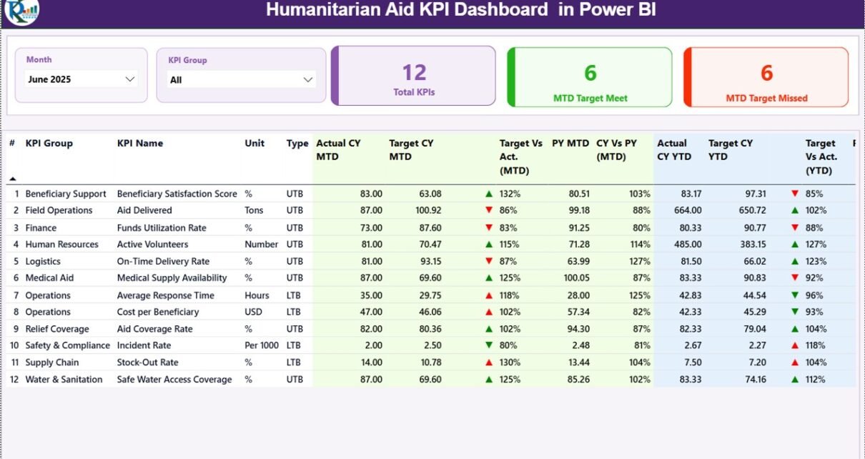
1️⃣ Summary Page – Complete KPI Overview
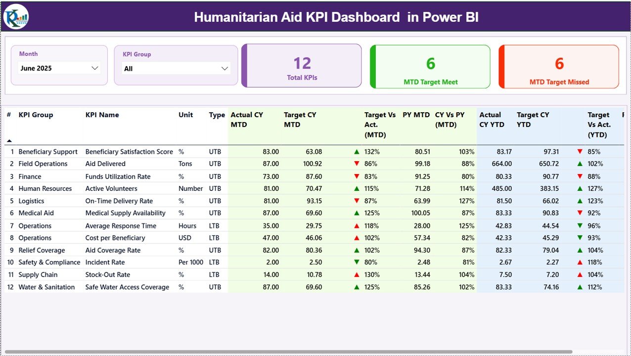
The Summary Page acts as the main dashboard.
At the top, you will find two slicers:
-
Month slicer
-
KPI Group slicer
When you select a month, the entire dashboard updates automatically.
KPI Cards on Summary Page
This page displays three key performance cards:
-
Total KPIs Count
-
MTD Target Meet Count
-
MTD Target Missed Count
Therefore, leadership can instantly understand overall KPI health.
Detailed KPI Table
Below the cards, a detailed KPI table displays:
-
KPI Number
-
KPI Group
-
KPI Name
-
Unit
-
Type (LTB or UTB)
-
Actual CY MTD
-
Target CY MTD
-
MTD Icon (▲ or ▼)
-
Target vs Actual (MTD %)
-
PY MTD
-
CY vs PY (MTD %)
-
Actual CY YTD
-
Target CY YTD
-
YTD Icon (▲ or ▼)
-
Target vs Actual (YTD %)
-
PY YTD
-
CY vs PY (YTD %)
How Performance Icons Work
The dashboard uses:
-
▲ Green icon when KPI meets or exceeds target
-
▼ Red icon when KPI underperforms
For example:
If Actual MTD ≥ Target MTD, the arrow points up.
If Actual MTD < Target MTD, the arrow points down.
This visual system improves quick decision-making.
Click to Purchases Humanitarian Aid KPI Dashboard in Power BI
2️⃣ KPI Trend Page – Performance Over Time
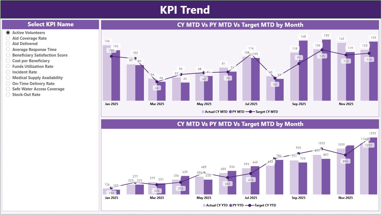
The KPI Trend page provides deep performance insights.
On the left side, you can select a KPI name using the slicer.
Once selected, the page displays:
-
MTD Combo Chart (Actual vs Target vs PY)
-
YTD Combo Chart (Actual vs Target vs PY)
Therefore, you can analyze trends across months.
For example:
-
If beneficiary coverage improves steadily, the line moves upward.
-
If response time increases and KPI type is “Lower the Better,” performance declines.
Trend charts help leadership detect patterns early.
Click to Purchases Humanitarian Aid KPI Dashboard in Power BI
3️⃣ KPI Definition Page – Drill-Through Detail View
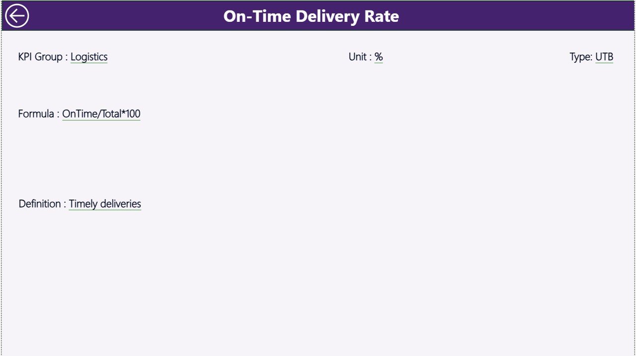
The KPI Definition page remains hidden by default.
From the Summary page, users can drill through to see detailed KPI information such as:
-
KPI Formula
-
KPI Definition
-
Unit of Measurement
-
KPI Group
-
KPI Type (LTB or UTB)
This improves transparency and understanding.
To return, users click the Back button on the top left corner.
Excel Data Integration: How It Works
This Power BI dashboard connects to an Excel file.
You must fill three worksheets in Excel:
1️⃣ Input_Actual Sheet
Enter:
-
KPI Name
-
Month (first date of month)
-
MTD Actual number
-
YTD Actual number
2️⃣ Input_Target Sheet
Enter:
-
KPI Name
-
Month
-
MTD Target
-
YTD Target
3️⃣ KPI Definition Sheet
Enter:
-
KPI Number
-
KPI Group
-
KPI Name
-
Unit
-
Formula
-
Definition
-
Type (LTB or UTB)
Once you update Excel, Power BI refreshes automatically.
Therefore, the dashboard remains dynamic.
Click to Purchases Humanitarian Aid KPI Dashboard in Power BI
What KPIs Can You Track in Humanitarian Aid?
You can monitor KPIs such as:
-
Number of Beneficiaries Served
-
Emergency Response Time
-
Aid Distribution Rate
-
Medical Coverage Percentage
-
Volunteer Participation Rate
-
Budget Utilization %
-
Project Completion Rate
-
Fund Disbursement Speed
Moreover, you can customize KPIs based on mission focus.
Advantages of Humanitarian Aid KPI Dashboard in Power BI
Let us explore the benefits.
1️⃣ Real-Time Insights
Slicers allow instant month and KPI filtering.
2️⃣ Visual Performance Indicators
Icons clearly show whether KPIs meet targets.
3️⃣ MTD and YTD Tracking
You monitor both short-term and long-term performance.
4️⃣ Previous Year Comparison
You measure growth and impact over time.
5️⃣ Improved Donor Reporting
Structured visual reports increase donor confidence.
6️⃣ Drill-Through Capability
Users can explore KPI details instantly.
7️⃣ Interactive Data Experience
Power BI provides dynamic analysis compared to static spreadsheets.
Click to Purchases Humanitarian Aid KPI Dashboard in Power BI
Best Practices for the Humanitarian Aid KPI Dashboard in Power BI
To maximize impact, follow these best practices:
✔ Define Clear and Measurable KPIs
Choose KPIs aligned with mission objectives.
✔ Update Data Monthly
Regular updates ensure accurate reporting.
✔ Use KPI Types Properly
Define whether KPI is Lower the Better (LTB) or Upper the Better (UTB).
✔ Validate Excel Data Before Refresh
Ensure correct data entry to avoid reporting errors.
✔ Analyze Trends Quarterly
Review trend charts to identify patterns.
✔ Share Dashboard with Stakeholders
Provide access to leadership and donors.
Why Choose Power BI for Humanitarian KPI Monitoring?
Power BI offers:
-
Interactive visuals
-
Drill-through functionality
-
Dynamic filtering
-
Professional reporting layout
-
Seamless Excel integration
-
Scalable analytics
Moreover, Power BI improves credibility during donor presentations.
Common Mistakes to Avoid
Avoid these mistakes:
-
Ignoring data validation
-
Setting unrealistic targets
-
Skipping trend analysis
-
Failing to define KPI formulas
-
Not refreshing data regularly
When you avoid these errors, your dashboard becomes reliable and impactful.
Click to Purchases Humanitarian Aid KPI Dashboard in Power BI
How Does This Dashboard Improve Humanitarian Impact?
This dashboard helps you:
-
Measure impact precisely
-
Identify performance gaps early
-
Optimize resource allocation
-
Improve transparency
-
Strengthen accountability
-
Enhance donor trust
Therefore, organizations can focus on delivering meaningful change.
Conclusion: Why Should You Use Humanitarian Aid KPI Dashboard in Power BI?
Humanitarian organizations must combine compassion with accountability. Therefore, structured KPI tracking becomes essential.
The Humanitarian Aid KPI Dashboard in Power BI provides:
-
Interactive KPI monitoring
-
MTD and YTD comparison
-
Target vs Actual analysis
-
Previous year benchmarking
-
Trend visualization
-
Drill-through KPI documentation
Moreover, because it integrates with Excel, teams can manage data easily without complex systems.
If you want professional, transparent, and data-driven humanitarian performance monitoring, this Power BI dashboard delivers a powerful and practical solution.
Click to Purchases Humanitarian Aid KPI Dashboard in Power BI
Frequently Asked Questions with Answers
1️⃣ Can I customize KPIs in this dashboard?
Yes. You can update KPI details in the Excel KPI Definition sheet.
2️⃣ How does the month slicer work?
Select a month from the slicer, and the dashboard updates automatically.
3️⃣ What does LTB and UTB mean?
LTB means Lower the Better.
UTB means Upper the Better.
4️⃣ Can I compare current year with previous year?
Yes. The dashboard calculates CY vs PY for both MTD and YTD.
5️⃣ Is this suitable for small NGOs?
Yes. Small and large humanitarian organizations can use it effectively.
6️⃣ Does it require advanced Power BI skills?
No. Basic Power BI knowledge is sufficient to refresh and manage the dashboard.
7️⃣ Can I export reports for donors?
Yes. You can export visuals and share professional reports easily.
Click to Purchases Humanitarian Aid KPI Dashboard in Power BI
Visit our YouTube channel to learn step-by-step video tutorials