Innovation labs play a critical role in shaping the future of organizations. They experiment, test ideas, build prototypes, and convert creativity into measurable business value. However, innovation without measurement quickly turns into guesswork. That is exactly why an Innovation Labs KPI Dashboard in Power BI becomes essential.
Instead of relying on scattered Excel files or static reports, innovation teams need a centralized, visual, and interactive solution. A Power BI dashboard delivers exactly that. Moreover, it helps leaders track progress, measure impact, and align innovation efforts with business goals.
In this detailed guide, you will learn what an Innovation Labs KPI Dashboard in Power BI is, how it works, why it matters, and how each dashboard page supports data-driven innovation management. Additionally, you will explore its advantages, best practices, and frequently asked questions.
Click to buy Innovation Labs KPI Dashboard in Power BI
What Is an Innovation Labs KPI Dashboard in Power BI?
An Innovation Labs KPI Dashboard in Power BI is a ready-to-use, interactive analytics solution designed to track, monitor, and evaluate key performance indicators related to innovation initiatives.
Instead of manually checking monthly spreadsheets, this dashboard consolidates all innovation KPIs into a single Power BI file. As a result, innovation managers, R&D leaders, and executives gain instant visibility into performance trends.
More importantly, this dashboard connects directly to an Excel data source. Therefore, teams can update data easily without touching Power BI formulas or visuals.
Why Do Innovation Labs Need a KPI Dashboard?
Innovation labs handle multiple initiatives at the same time. They track experiments, targets, outcomes, and year-over-year performance. However, manual tracking often leads to errors, delays, and poor visibility.
A KPI dashboard solves these challenges because:
- It centralizes innovation performance data
- It highlights target achievements and misses instantly
- It enables month-to-date (MTD) and year-to-date (YTD) tracking
- It supports informed and timely decision-making
Consequently, innovation leaders spend less time preparing reports and more time driving results.
How Does the Innovation Labs KPI Dashboard in Power BI Work?
This dashboard uses Power BI Desktop as the visualization layer and Excel as the data source. Because of this setup, the dashboard stays flexible, scalable, and user-friendly.
You only need to update Excel sheets. Power BI then refreshes visuals automatically. As a result, even non-technical users can manage data confidently.
What Are the Key Features of the Innovation Labs KPI Dashboard in Power BI?
This dashboard includes three structured pages, each designed to answer specific performance questions.
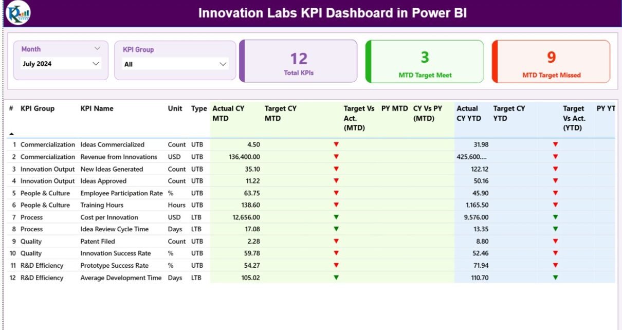
Summary Page Show
The Summary Page acts as the main landing page of the dashboard. It provides a complete snapshot of innovation performance at a glance.
Interactive Slicers on the Summary Page
At the top of the page, you will find two slicers:
- Month slicer to analyze data for a selected period
- KPI Group slicer to focus on specific innovation categories
Because of these slicers, users can drill down instantly without changing reports.
KPI Cards for Instant Insights
Below the slicers, the dashboard displays three key KPI cards:
- Total KPIs Count
- MTD Target Met Count
- MTD Target Missed Count
These cards provide immediate clarity on overall performance. As a result, leaders quickly understand whether innovation goals stay on track.
Detailed KPI Performance Table
The summary page also includes a detailed and structured KPI table. This table shows the following fields:
- KPI Number – Unique sequence number for each KPI
- KPI Group – Category or domain of the KPI
- KPI Name – Name of the innovation metric
- Unit – Unit of measurement
- Type – UTB (Upper the Better) or LTB (Lower the Better)
Month-to-Date (MTD) Performance Metrics
For MTD analysis, the table includes:
- Actual CY MTD – Current year actual MTD value
- Target CY MTD – Current year target MTD value
- MTD Icon – Green ▲ or red ▼ icons indicating performance
- Target vs Actual (MTD) – Actual ÷ Target percentage
- PY MTD – Previous year MTD value
- CY vs PY (MTD) – Current vs previous year comparison
These metrics help teams understand short-term performance clearly.
Year-to-Date (YTD) Performance Metrics
For long-term tracking, the table also shows:
- Actual CY YTD – Current year actual YTD value
- Target CY YTD – Current year target YTD value
- YTD Icon – Status indicator for YTD targets
- Target vs Actual (YTD) – Actual ÷ Target percentage
- PY YTD – Previous year YTD value
- CY vs PY (YTD) – Year-over-year comparison
As a result, innovation leaders can track growth trends over time.

Click to buy Innovation Labs KPI Dashboard in Power BI
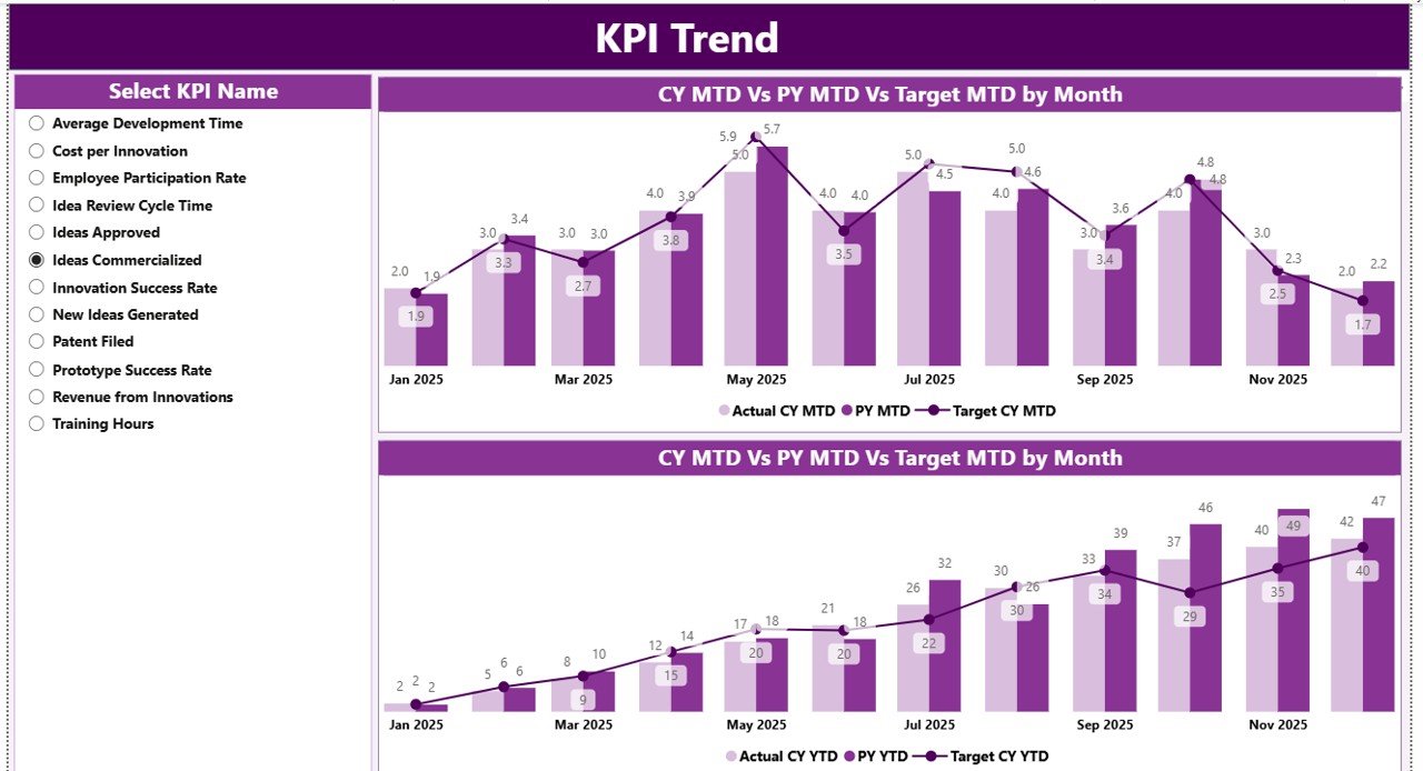
KPI Trend Page
The KPI Trend Page focuses on performance movement across months.
Combo Charts for Trend Analysis
This page includes two combo charts that display:
- Actual values for the current year
- Actual values for the previous year
- Target values
One chart shows MTD trends, while the other shows YTD trends.
KPI Selection Slicer
A slicer on the left allows users to select a specific KPI. Once selected, all charts update instantly. Therefore, teams can analyze trends for one KPI at a time without distractions.
Click to buy Innovation Labs KPI Dashboard in Power BI
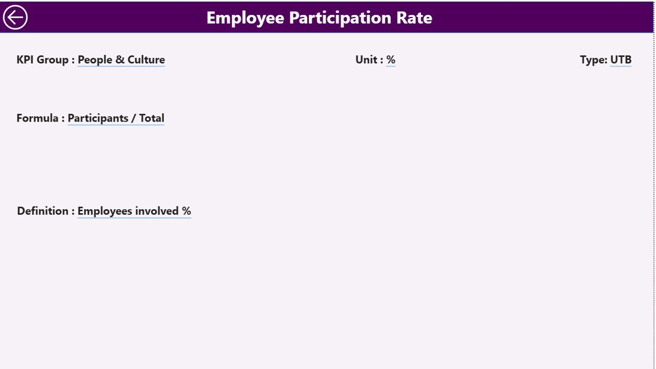
KPI Definition Page
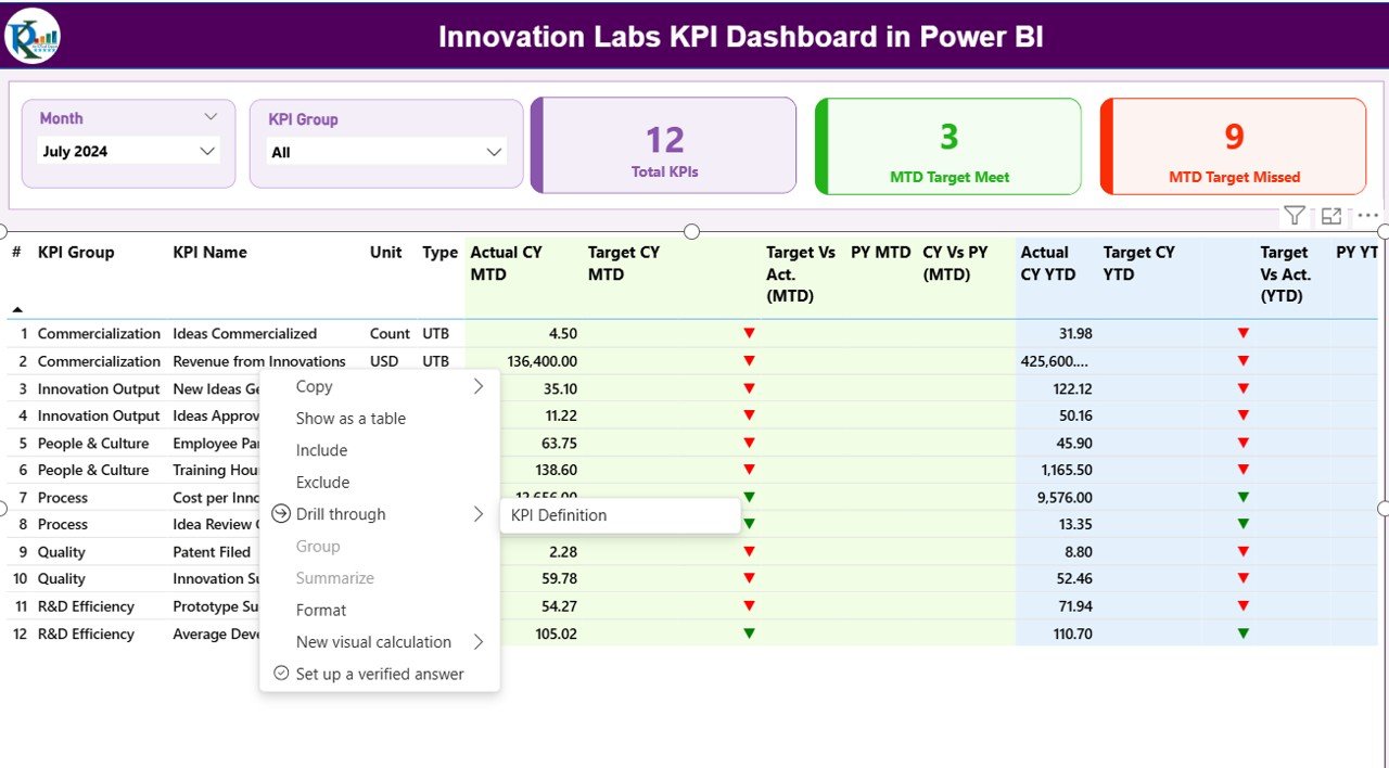
The KPI Definition Page acts as a hidden drill-through page.
From the summary table, users can right-click on any KPI and drill through to this page. Here, they can view:
- KPI Formula
- KPI Definition
- KPI Unit
- KPI Type (LTB or UTB)
This design improves transparency and ensures consistent KPI interpretation across teams.
Easy Navigation with Back Button
A back button at the top left corner allows users to return to the summary page instantly. As a result, navigation remains smooth and intuitive.
Click to buy Innovation Labs KPI Dashboard in Power BI
What Excel Data Is Required for This Dashboard?
The Innovation Labs KPI Dashboard uses three Excel worksheets as its data source.
Input_Actual Sheet
In this sheet, users enter:
- KPI Name
- Month (first date of the month)
- MTD Actual value
- YTD Actual value
Because the structure stays simple, data entry remains fast and error-free.
Click to buy Innovation Labs KPI Dashboard in Power BI
Input_Target Sheet
In this sheet, users enter:
- KPI Name
- Month (first date of the month)
- MTD Target value
- YTD Target value
As a result, the dashboard can compare actual performance against goals accurately.
KPI Definition Sheet
This sheet stores master data, including:
- KPI Number
- KPI Group
- KPI Name
- Unit
- Formula
- Definition
- Type (LTB or UTB)
This sheet ensures data consistency and governance.
Advantages of Innovation Labs KPI Dashboard in Power BI
Using an Innovation Labs KPI Dashboard in Power BI delivers several powerful benefits.
Centralized Performance Tracking
All innovation KPIs live in one interactive dashboard.
Faster Decision-Making
Real-time visuals help leaders act quickly.
Clear Target Visibility
Icons and percentages highlight wins and gaps instantly.
Excel-Friendly Data Entry
Teams update data without technical complexity.
Improved Accountability
Clear ownership and tracking improve execution.
Year-Over-Year Insights
MTD and YTD comparisons reveal long-term trends.
Best Practices for the Innovation Labs KPI Dashboard in Power BI
To get maximum value from this dashboard, follow these best practices.
Define KPIs Clearly
Ensure every KPI has a clear formula and definition.
Update Data Regularly
Maintain consistent monthly updates for accuracy.
Use UTB and LTB Logic Correctly
Apply KPI types correctly to avoid misleading indicators.
Limit KPI Overload
Track only meaningful KPIs that drive innovation value.
Review Trends, Not Just Numbers
Focus on patterns rather than isolated data points.
Train Users Briefly
A short walkthrough helps teams adopt the dashboard faster.
Conclusion: Why Should Innovation Teams Use a KPI Dashboard in Power BI?
Innovation thrives on experimentation. However, sustainable innovation requires measurement. The Innovation Labs KPI Dashboard in Power BI bridges this gap perfectly.
It transforms raw Excel data into clear insights. It highlights performance gaps early. It empowers leaders to make informed decisions. Most importantly, it aligns innovation outcomes with business objectives.
If your innovation lab values clarity, accountability, and growth, this dashboard becomes an essential tool.
Frequently Asked Questions About Innovation Labs KPI Dashboard in Power BI
What industries can use this dashboard?
Any organization running innovation labs, R&D teams, or transformation initiatives can use it.
Do I need Power BI Service to use this dashboard?
No. You can use it fully in Power BI Desktop with Excel as the data source.
Can I customize KPIs?
Yes. You can add, remove, or modify KPIs through the Excel sheets.
Is technical knowledge required to update data?
No. Basic Excel knowledge is sufficient.
Can I track both short-term and long-term performance?
Yes. The dashboard supports MTD, YTD, and year-over-year comparisons.
Does this dashboard support drill-through?
Yes. You can drill through to view KPI definitions and formulas.
Visit our YouTube channel to learn step-by-step video tutorials
Watch the step-by-step video tutorial:
Click to buy Innovation Labs KPI Dashboard in Power BI


