Running internal audits feels demanding because every department generates massive amounts of data. You track risks, findings, severity levels, audit scores, progress status, and cost. Because this information stays scattered across Excel files, emails, and manual notes, internal auditors struggle to get a quick and clear view of audit health. However, you can solve this problem easily with an Internal Audit Dashboard in Power BI.
This dashboard brings all your audit-related data into one interactive and dynamic view. Therefore, you make faster decisions, understand trends instantly, reduce confusion, and strengthen your audit process. In this detailed guide, you will learn everything about the Internal Audit Dashboard in Power BI. You will explore its pages, features, benefits, best practices, and answers to common questions.
Let’s begin by understanding what this dashboard is and why every audit team needs it today.
Click to Purchases Internal Audit Dashboard in Power BI
What Is an Internal Audit Dashboard in Power BI?
An Internal Audit Dashboard in Power BI is a ready-to-use reporting solution designed for audit managers, auditors, compliance teams, and risk management professionals. It shows all major audit KPIs in one place with the help of interactive visuals, filters, cards, and charts. Because the dashboard runs on Power BI, it updates automatically when your data changes.
Therefore, you track audit progress, findings, severity levels, cost, department performance, auditor performance, and monthly trends without spending long hours preparing manual reports.
This dashboard supports:
-
Audit Score Tracking
-
Risk Score Monitoring
-
Severity-Level Analysis
-
Status-Based Reporting
-
Audit Cost Review
-
Region-Wise Audit Insights
-
Monthly Audit Performance Trends
Because the dashboard works on both Power BI Desktop and Power BI Service, you enjoy flexibility, accuracy, and complete visibility into your audit process.
Why Do You Need an Internal Audit Dashboard in Power BI?
You need this dashboard because internal audits generate complex information. Without a visual dashboard, teams feel confused and slow. However, when you use a Power BI dashboard, you see everything clearly in seconds.
Here’s why this dashboard becomes essential:
-
You understand audit status and findings quickly
-
You identify high-risk departments immediately
-
You measure performance of auditors and departments
-
You compare current trends with previous months
-
You take action based on data instead of assumptions
-
You reduce errors and improve accuracy
Because Power BI shows data visually, your decisions become fast, confident, and meaningful.
Key Features of the Internal Audit Dashboard in Power BI
We created this dashboard with five powerful pages. Each page highlights important KPIs in a simple and intuitive way. Below is the full structure with explanations.
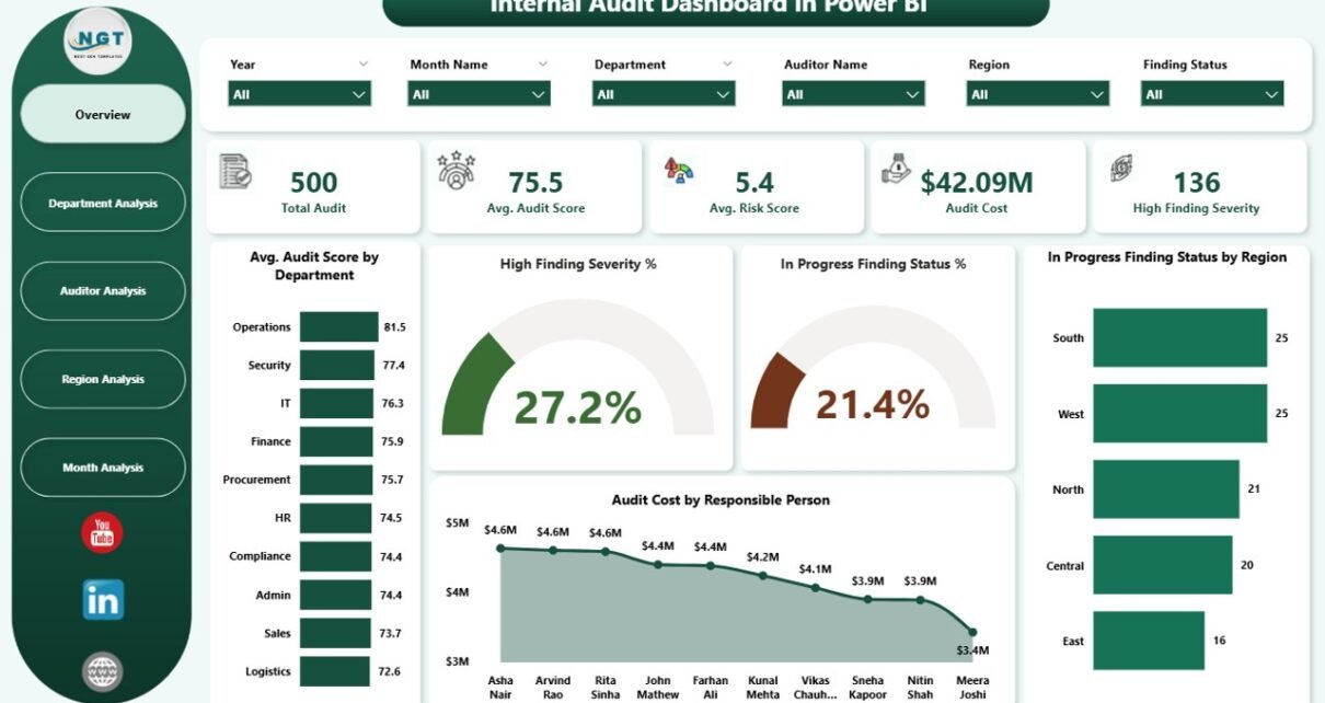
1. Overview Page
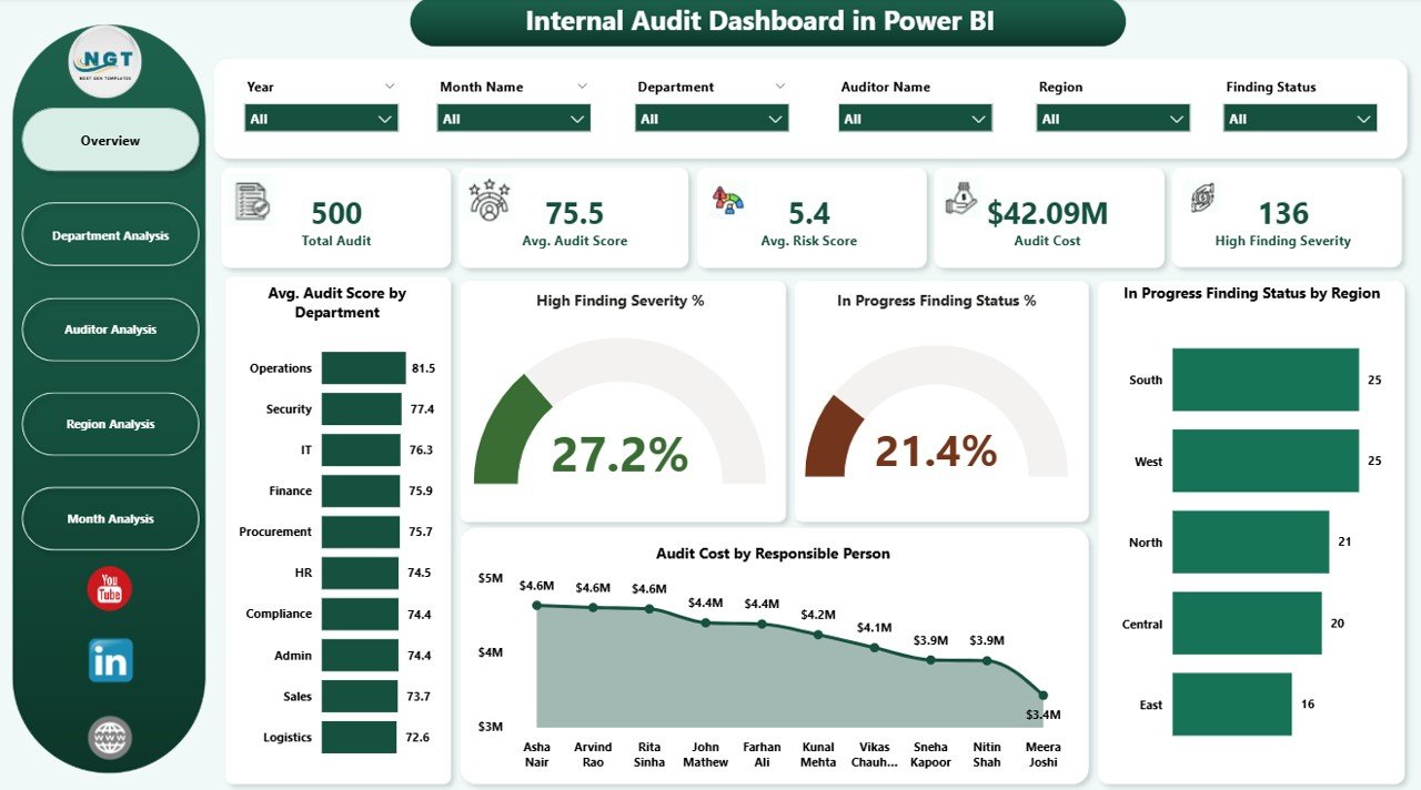
The Overview Page works as the main control center of your internal audit reporting. You see major KPIs at the top, followed by interactive charts.
What You See on This Page
-
5 KPI Cards, showing the most important numbers
-
4 Insightful Charts, including:
-
Avg. Audit Score by Department
-
High Finding Severity
-
In Progress Finding Status %
-
In Progress Status by Region
-
Audit Cost by Responsible Person
-
This page helps you understand the overall audit health. Because the visuals appear clean and structured, you get a quick summary of risks, findings, and cost.
2. Department Analysis Page
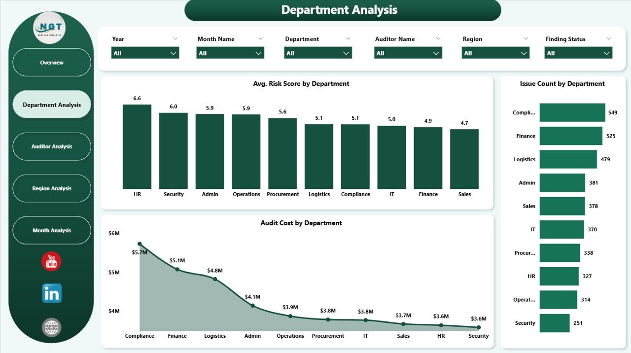
The Department Analysis Page helps you monitor department-wise performance. You see which departments perform well and which departments need improvement.
Charts on This Page
-
Average Risk Score by Department
-
Issue Count by Department
-
Audit Cost by Department
Although these may appear simple, they offer deep insights. For example, if one department shows a high risk score and high issue count, you take immediate action.
3. Auditor Analysis Page
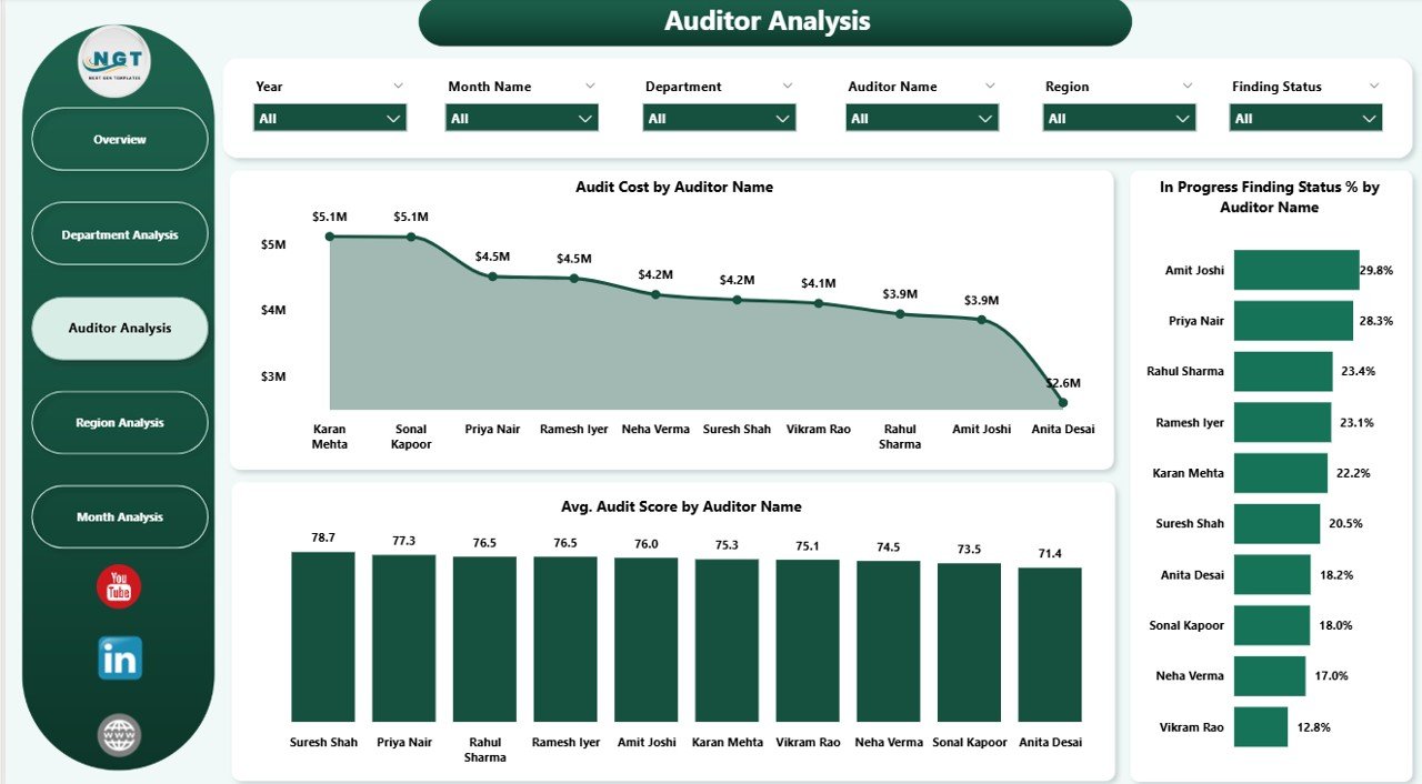
The Auditor Analysis Page shows how each auditor performs. Every audit manager needs this view because it improves planning, training, responsibility handling, and workload distribution.
Charts You See Here
-
Audit Cost by Auditor Name
-
In Progress Finding Status % by Auditor Name
-
Average Audit Score by Auditor Name
You understand:
-
Which auditor delivers high audit scores
-
Who handles more complex audits
-
Where finding resolution takes time
-
Which auditor has high pending items
Because the charts show performance visually, you improve team management instantly.
Click to Purchases Internal Audit Dashboard in Power BI
4. Region Analysis Page
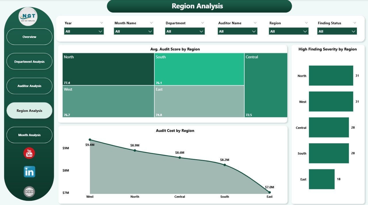
The Region Analysis Page shows how different regions perform during audits. If your audit operations cover multiple branches or geographical zones, this page becomes extremely important.
Charts on This Page
-
Avg. Audit Score by Region
-
High Finding Severity by Region
-
Audit Cost by Region
You identify patterns such as:
-
A region with low audit scores
-
A region with high severity issues
-
A region with rising audit costs
Therefore, you plan improvement strategies based on facts instead of guesswork.
5. Monthly Trends Page
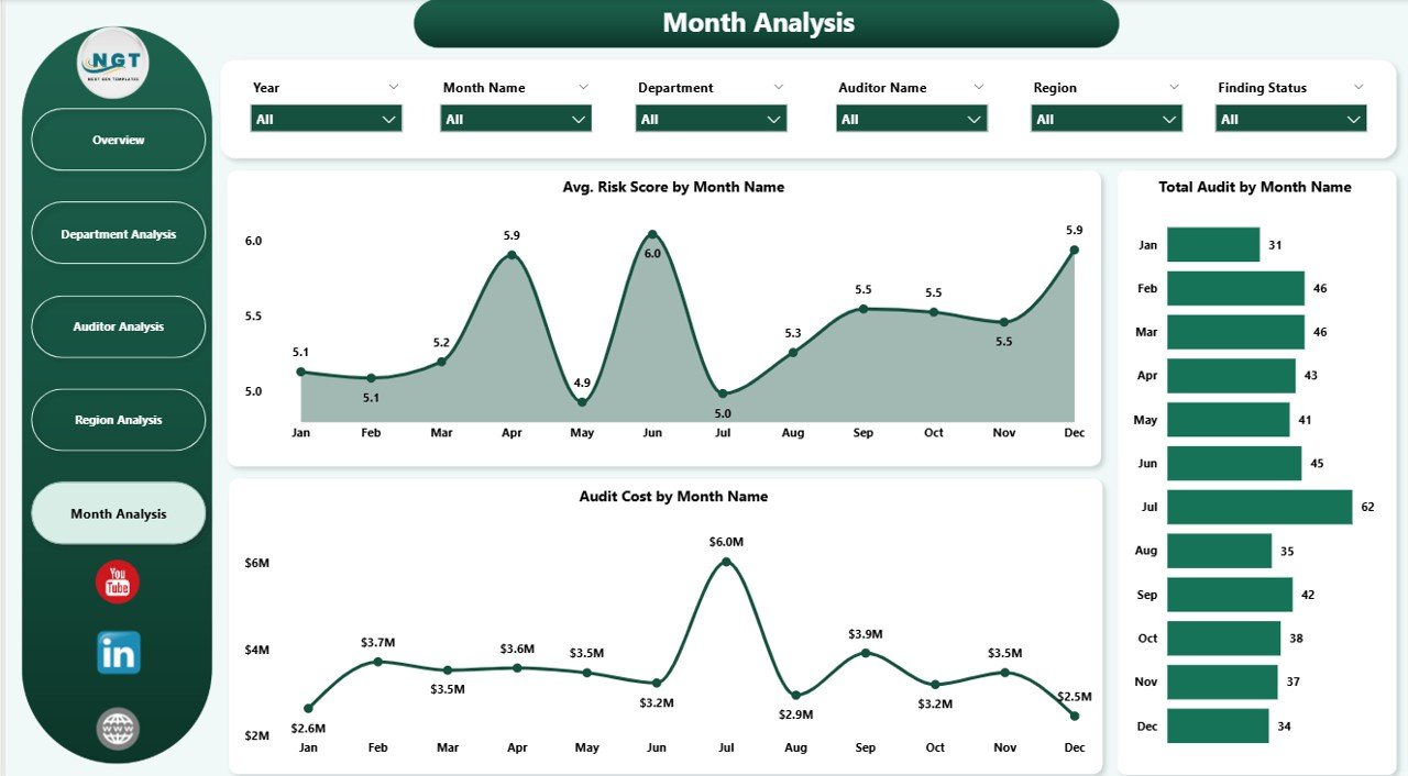
The Monthly Trends Page helps you track audit performance over time. You understand how audit activities behave month by month.
Charts You See
-
Avg. Risk Score by Month
-
Total Audit by Month
-
Audit Cost by Month
Therefore, you recognize:
-
Peak audit months
-
Months with rising cost
-
Months with high risk
-
Departments and auditors needing support
Because this page highlights trends, you see the complete picture of your audit operations.
How an Internal Audit Dashboard in Power BI Helps Your Organization
This dashboard does much more than showing charts. It increases your efficiency and improves decision-making.
Here are the top benefits:
-
You reduce errors because the dashboard updates automatically
-
You save time on manual reports
-
You track risk, cost, and findings in seconds
-
You increase transparency across departments
-
You improve auditor productivity
-
You maintain compliance easily
-
You strengthen your internal control environment
Because everything stays visual and structured, you enjoy smoother audits.
Advantages of Internal Audit Dashboard in Power BI
1. Improves Decision-Making
The dashboard gives you real-time insights. Therefore, you understand problems quickly and take action without delay.
2. Increases Efficiency
You avoid manual Excel reporting. Power BI collects, transforms, and visualizes data for you.
3. Reduces Human Errors
Automation reduces mistakes. Therefore, you trust your data and take confident decisions.
4. Strengthens Audit Quality
You monitor score trends, findings, risk levels, and progress status. This helps you maintain high-quality audits.
5. Enhances Team Collaboration
Teams communicate better because everyone sees the same numbers. Therefore, discussions become faster and clearer.
6. Ensures Compliance
Because you track findings, severity, and risk levels, compliance becomes easier and smoother.
Best Practices for Using an Internal Audit Dashboard in Power BI
To get the best results, follow these practices:
1. Update Your Data Monthly or Weekly
Although Power BI updates automatically, you must keep your data source fresh.
2. Use Clear KPI Definitions
Ensure each KPI has one meaning. This avoids confusion.
3. Apply Filters for Deep Analysis
Use slicers like Department, Region, Auditor, and Month for detailed insights.
4. Keep Visuals Clean
Do not overload your dashboard with too many charts. Clear visuals improve understanding.
5. Share the Dashboard With Stakeholders
Share it with management, audit committees, and department heads. Everyone benefits from the insights.
6. Compare Performance Over Time
Use the Monthly Trends page to understand long-term patterns.
7. Review Audit Cost Frequently
Audit cost becomes a key performance driver. Keep a close eye on it.
How to Use the Internal Audit Dashboard in Your Daily Workflow
This dashboard fits naturally in your routine. Here’s how you use it daily:
-
Start your day from the Overview Page
-
Check high severity findings
-
Review in-progress items
-
Monitor department-level issues
-
Check high-risk areas
-
Review auditor performance
-
Study monthly changes
-
Plan corrective actions
Because each page offers unique insights, your audit planning becomes more structured.
Who Should Use This Dashboard?
This dashboard helps many roles inside an organization:
-
Internal Audit Managers
-
Chief Audit Executives
-
Senior Auditors
-
Risk and Compliance Teams
-
Finance and Accounting Leaders
-
Department Heads
-
Internal Control Managers
Because the dashboard is simple and visual, everyone understands it easily.
Conclusion
Internal audits play a crucial role in strengthening internal control, managing risks, and ensuring compliance. However, audit data becomes difficult to manage when stored in different systems. Therefore, every audit team needs an Internal Audit Dashboard in Power BI.
This dashboard gives you complete visibility into findings, risk levels, severity, status, cost, and monthly trends. You take faster decisions, improve efficiency, and increase audit quality. Because the dashboard is interactive, dynamic, and easy to understand, it becomes the perfect tool for modern audit teams.
Frequently Asked Questions (FAQs)
1. What is an Internal Audit Dashboard in Power BI?
An Internal Audit Dashboard in Power BI is a reporting tool that shows audit KPIs visually using charts, cards, filters, and tables. It helps audit teams make quick decisions.
2. Why should audit teams use this dashboard?
Audit teams should use this dashboard because it saves time, reduces errors, improves accuracy, and gives real-time insights.
3. Can beginners use this dashboard easily?
Yes. The dashboard uses simple visuals and easy navigation. Anyone can understand it without technical knowledge.
4. Does the dashboard update automatically?
Yes. Power BI updates visuals when your data source updates.
5. Can I customize this dashboard?
Yes. You can add new KPIs, remove visuals, change colors, or insert more analysis pages.
6. Does this dashboard support multiple departments?
Yes. It tracks multiple departments, regions, auditors, and categories.
7. Can I share the dashboard with management?
Yes. You can publish it on Power BI Service and share it with your team and management.
Visit our YouTube channel to learn step-by-step video tutorials