Investor services teams work in a fast and demanding environment. They handle investor onboarding, communication, fund reporting, compliance reviews, performance updates, and service-level commitments every day. Because investors expect transparency and quick responses, teams cannot rely on scattered spreadsheets or slow manual reports. They need a dashboard that shows them everything in one place.
The Investor Services KPI Dashboard in Power BI gives them that clarity. It brings all KPIs into a structured visual system and helps users check performance instantly. In this article, you will learn how the dashboard works, why it matters, and how you can use it to improve service accuracy and investor satisfaction.
Click to Purchases Investor Services KPI Dashboard in Power BI
What Is an Investor Services KPI Dashboard in Power BI?
An Investor Services KPI Dashboard in Power BI helps teams track the most important KPIs related to investor operations. It displays metrics like response time, onboarding progress, document turnaround, query resolution, SLA performance, compliance checks, and reporting accuracy. Because the dashboard uses Excel as the data source, teams can update values easily.
The dashboard has three main pages:
-
Summary Page
-
KPI Trend Page
-
KPI Definition Page
Each page gives useful insights that guide better decisions and stronger investor relationships.
Why Do Investor Services Teams Need a KPI Dashboard?
Investor servicing requires speed, accuracy, and consistent communication. Teams handle large volumes of information. Therefore, they need a tool that shows performance trends and highlights issues before they become serious. A well-designed Power BI dashboard helps them:
-
Track efficiency in real-time
-
Compare actual vs. target numbers
-
Identify workload pressure
-
Improve team productivity
-
Reduce delays and errors
-
Build trust with investors
Because Power BI updates visuals instantly, the dashboard becomes a central control system for every investor services team.
Click to Purchases Investor Services KPI Dashboard in Power BI
Key Features of the Investor Services KPI Dashboard in Power BI
The dashboard offers deep performance insights through three strong pages. Below is a detailed explanation of each page with their major components.
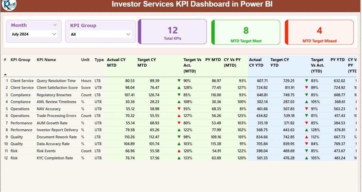
1. Summary Page – The Most Important Overview

The Summary Page works as the main monitoring screen. Anyone can use it to check the status of all KPIs for any selected month.
Top-Level Slicers
-
Month Selector – Choose the month you want to review.
-
KPI Group Selector – Choose a category such as onboarding, reporting, compliance, service quality, or investor support.
These slicers filter the entire dashboard instantly.
Summary Cards
The dashboard displays three key cards:
-
Total KPIs Count
-
MTD Target Meet Count
-
MTD Target Missed Count
These numbers help users check overall performance in seconds.
Detailed KPI Table on Summary Page
Below the cards, the dashboard shows a table with complete KPI information. Users can scan this table to understand performance quickly.
KPI Metadata Columns
-
KPI Number – Unique ID
-
KPI Group – KPI category
-
KPI Name – KPI Title
-
Unit – Measurement value (%, days, hours, count, etc.)
-
Type – UTB (Upper the Better) or LTB (Lower the Better)
MTD (Month-to-Date) Performance Fields
-
Actual CY MTD – Current Month Actual
-
Target CY MTD – Current Month Target
-
MTD Icon – Green ▲ or Red ▼
-
Target vs Actual (MTD) –
Formula: Actual MTD ÷ Target MTD -
PY MTD – Previous Year’s MTD
-
CY vs PY (MTD) –
Formula: Current MTD ÷ Previous MTD
YTD (Year-to-Date) Performance Fields
-
Actual CY YTD
-
Target CY YTD
-
YTD Icon – Green ▲ or Red ▼
-
Target vs Actual (YTD) –
Formula: Actual YTD ÷ Target YTD -
PY YTD
-
CY vs PY (YTD) –
Formula: Current YTD ÷ Previous YTD
Because the dashboard highlights icons with colors, teams understand the performance in real time without reading long reports. This helps them take quick action and solve issues.
Click to Purchases Investor Services KPI Dashboard in Power BI
2. KPI Trend Page – A Deep Dive Into Performance Movement
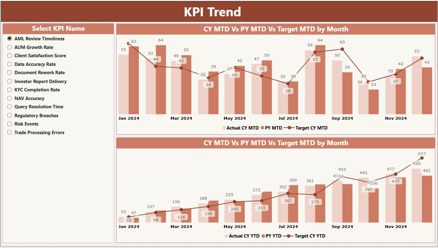
The KPI Trend Page shows how metrics change month after month. This page uses combo charts to compare three values:
-
Current Year Actual
-
Previous Year Actual
-
Target Value
Users can choose the KPI name from the slicer on the left. As soon as they select the KPI, the trend visuals change. This feature helps teams identify patterns and understand where improvement is necessary.
MTD Trend Chart
This chart compares month-to-date actual performance with past performance and targets.
YTD Trend Chart
This chart focuses on long-term performance and shows how the KPI moves through the entire year.
These trend lines help leaders spot improvement opportunities. They also help identify unexpected drops early and understand the reason behind them.
3. KPI Definition Page – The Reference Library for Every KPI
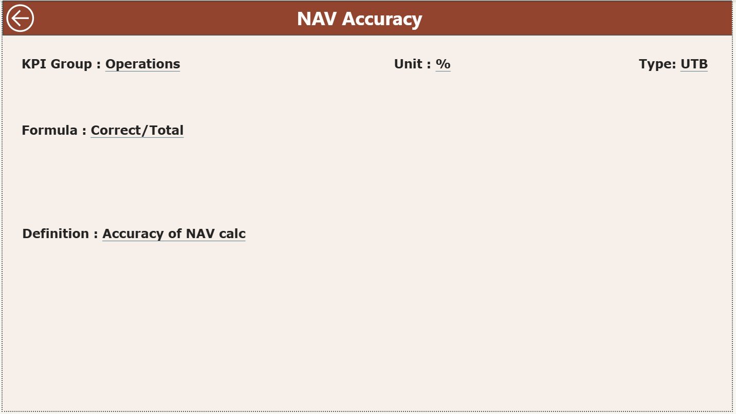
The KPI Definition Page works as a drill-through page. Users can right-click on any KPI in the Summary Page and jump to this hidden page.
This page shows:
-
KPI Number
-
KPI Group
-
KPI Name
-
Unit
-
Formula
-
Definition
-
Type (LTB or UTB)
Users can return to the Summary Page using the back button on the top-left corner. This page helps new users understand KPIs without confusion.
Excel Data Structure Behind the Dashboard
The dashboard uses an Excel file with three worksheets. Each sheet supports an important part of the Power BI model.
1. Input_Actual Sheet – Enter Actual Monthly Performance
This sheet contains:
-
KPI Name
-
Month (set as first date of the month)
-
MTD Actual
-
YTD Actual
Teams update this sheet every month. It works as the main performance data source.
2. Input_Target Sheet – Enter Monthly and Annual Targets
This sheet contains:
-
KPI Name
-
Month
-
MTD Target
-
YTD Target
Users fill this sheet for all KPIs. Because targets stay clear, performance analysis becomes easy.
3. KPI Definition Sheet – Complete Metadata for KPIs
This sheet includes:
-
KPI Number
-
KPI Group
-
KPI Name
-
Unit
-
Formula
-
Definition
-
Type (LTB / UTB)
This sheet makes KPI structure clear and consistent.
Advantages of Using an Investor Services KPI Dashboard in Power BI
Below are the biggest advantages of using this dashboard:
1. Better Transparency for Investor Relations
The dashboard gives a clear picture of service levels. Teams understand which KPIs perform well and which need improvement.
2. Faster Query Resolution
Because the dashboard shows response time and issue resolution metrics, teams fix delays quickly.
3. Improved Investor Satisfaction
Accurate tracking helps teams deliver better service. When teams meet their KPIs, investors trust the process more.
4. Quick and Easy Reporting
Teams save hours because the dashboard updates instantly. Power BI does not require manual report formatting.
5. Strong Team Accountability
Red and green icons show performance status visually. Every team member understands the expectations and acts accordingly.
6. Better Planning and Forecasting
The Trend Page reveals seasonal patterns and long-term movement. Managers use this insight for planning resource allocation.
Click to Purchases Investor Services KPI Dashboard in Power BI
Best Practices for Using the Investor Services KPI Dashboard in Power BI
Follow these best practices to get the maximum value from this dashboard:
1. Update Excel Sheets Consistently
Enter actual and target values regularly. Clean and timely data ensures accurate visuals.
2. Use KPI Groups Smartly
Organize KPIs under relevant categories. This makes slicers more meaningful and clear.
3. Review the Trend Page Every Month
This helps you catch performance declines early and plan corrective actions.
4. Create Clear KPI Definitions
Simple definitions reduce confusion. They help users interpret dashboards correctly.
5. Train New Users on Drill-Through Features
Teach them how to access the KPI definition page. It improves understanding.
6. Keep KPI Count Practical
Do not overcrowd the dashboard with too many KPIs. Choose the most important ones.
Conclusion
The Investor Services KPI Dashboard in Power BI helps teams track performance with clarity and confidence. It organizes KPIs, shows trends, compares actuals with targets, and highlights improvements instantly. Teams can use slicers, combo charts, and drill-through pages to understand their service levels in detail. With a structured Excel data source and easy-to-read visuals, this dashboard becomes a powerful tool for every investor services function.
If your organization needs accuracy, transparency, and faster reporting, this dashboard delivers all three. It boosts efficiency, increases investor confidence, and supports smarter decision-making across the team.
Click to Purchases Investor Services KPI Dashboard in Power BI
Frequently Asked Questions (FAQs)
1. Why should investor services teams use a KPI dashboard?
The dashboard helps them track actual performance, compare it with targets, and solve issues quickly.
2. Can beginners understand this dashboard?
Yes. The dashboard uses simple visuals, clear slicers, and easy navigation.
3. How often should the actual data be updated?
Teams should update the Excel file every month to get accurate insights.
4. Can the dashboard support more KPIs?
Yes. You can add new KPIs by expanding the KPI Definition, Actual, and Target worksheets.
5. Does the dashboard help with investor satisfaction?
Yes. When teams track KPIs well, they respond faster and deliver better service, which increases satisfaction.
Click to Purchases Investor Services KPI Dashboard in Power BI
Visit our YouTube channel to learn step-by-step video tutorials