In today’s fast-paced digital era, keeping your IT and tech teams well-trained is no longer optional—it’s a strategic necessity. But how do you track whether your training programs are actually making an impact? That’s where an IT and Tech Training and Development KPI Dashboard in Excel comes into play.
In this detailed guide, you’ll discover what this dashboard is, how it works, why it’s essential, and how to make the most of it in your organization. Whether you’re an HR manager, training coordinator, or IT leader, this article will help you master your training performance tracking with Excel.
Click to Purchases IT and Tech Training and Development KPI Dashboard in Excel
What is an IT and Tech Training and Development KPI Dashboard in Excel?
An IT and Tech Training and Development KPI Dashboard is a powerful tool created in Excel that helps you measure, track, and visualize key performance indicators (KPIs) related to employee training in IT and tech departments. It gives you a bird’s-eye view of the effectiveness, efficiency, and outcomes of your training programs.
From tracking the number of courses completed to analyzing certification pass rates, Excel dashboards provide real-time insights without needing any complex software.
Why Use Excel for Your Training KPI Dashboard?
You might wonder, “Why Excel when there are so many HR tech tools available?”
Well, here’s why Excel stands out:
-
✅ Familiar and easy to use
-
✅ Fully customizable to your team’s needs
-
✅ No monthly subscription fees
-
✅ Quick data entry and editing
-
✅ Powerful formulas, charts, and conditional formatting
In short, Excel gives you full control—minus the learning curve.
Key Features of the IT & Tech Training KPI Dashboard in Excel
This ready-to-use dashboard consists of seven well-designed worksheets, each serving a specific purpose for tracking and analysis. Let’s walk through them one by one.
Home Sheet – Central Navigation
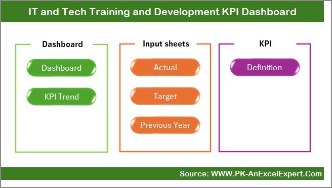
The Home sheet is like your mission control panel. It features six clickable buttons that instantly take you to the corresponding sheets. You don’t need to scroll endlessly or search for tabs—just click and go.
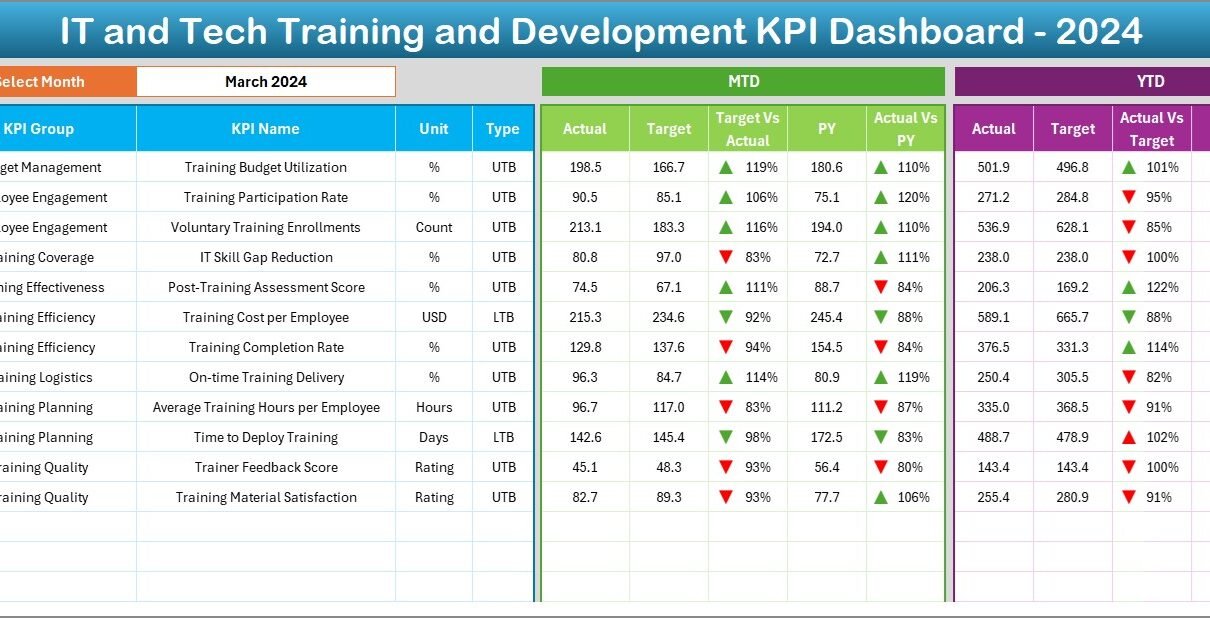
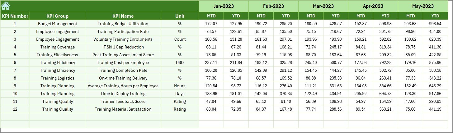
Dashboard Sheet – One View to Rule Them All
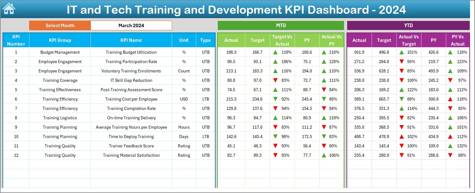
This is the main dashboard page. It allows you to select any month from a drop-down list in cell D3. Instantly, all performance metrics update based on your selection.
This sheet shows:
📊 MTD (Month-to-Date) Actuals, Targets, and Previous Year data
📈 YTD (Year-to-Date) performance for the same KPIs
🔺 Conditional formatting with up/down arrows to show trends
🎯 Side-by-side comparisons of Target vs Actual and Previous Year vs Actual
This real-time visualization helps you quickly identify gaps, improvements, or areas needing intervention.
KPI Trend Sheet – Zoom into Each KPI
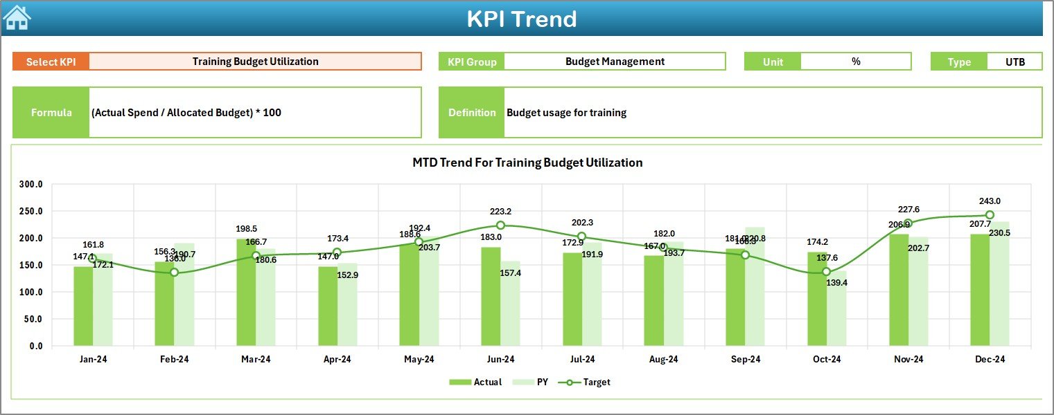
This sheet allows you to select a KPI name from the drop-down menu (cell C3). Once selected, you can:
Click to Purchases IT and Tech Training and Development KPI Dashboard in Excel
-
View KPI group, unit, formula, and type (LTB/UTB)
-
Analyze both MTD and YTD trends
-
See line charts for Actual vs Target vs PY (Previous Year)
It’s your go-to place when you want to dig deeper into one KPI’s history.
Actual Numbers Input Sheet – Feed the Engine
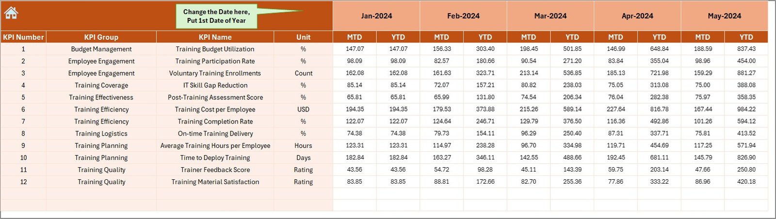
Here, you enter monthly actual values for MTD and YTD. This data is what drives the rest of the dashboard. You can even change the first month of the financial year in cell E1.
It’s intuitive and designed for quick data entry—no formulas or tech skills needed.
Target Sheet – Set Your Goals
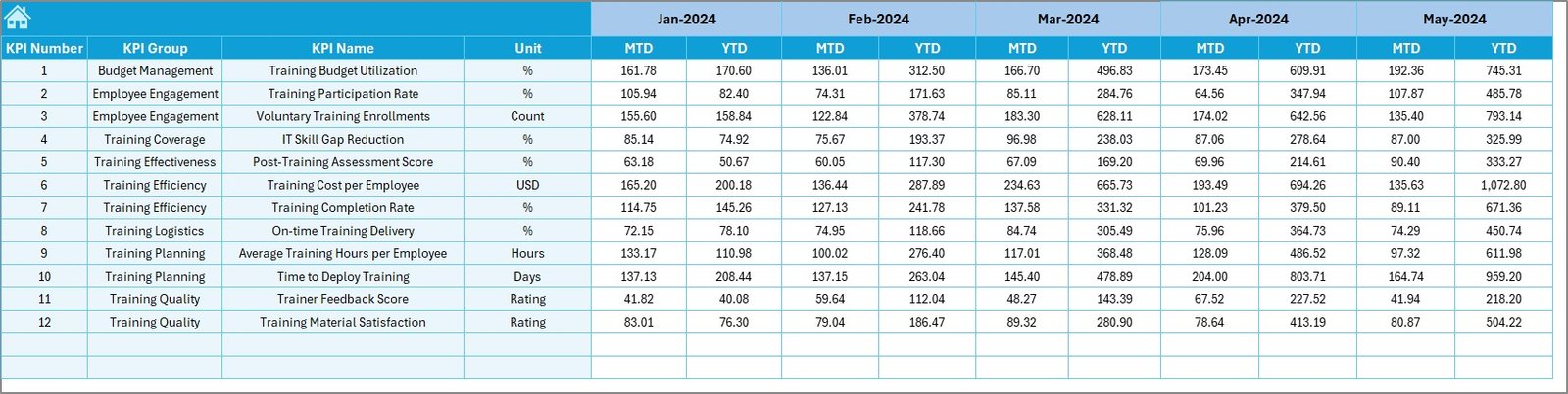
This is where you input monthly target values for each KPI—both MTD and YTD. These numbers help assess whether your training efforts are on track or falling short.
Previous Year Sheet – Track Past Performance
To analyze growth or decline, this sheet captures last year’s KPI data. Having this historical view side-by-side with current performance enhances decision-making.
KPI Definition Sheet – Know What You Measure
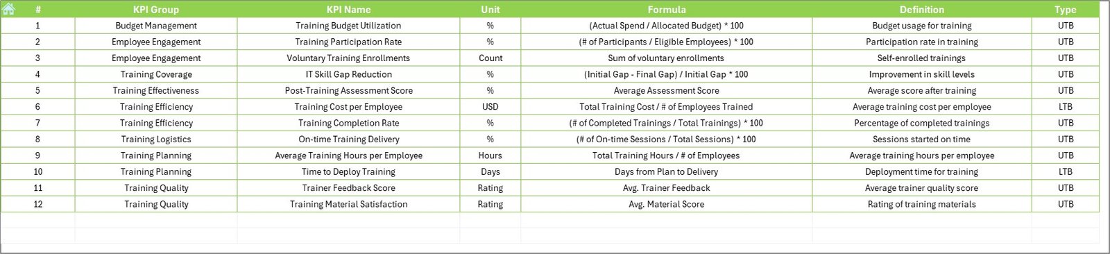
This reference sheet lists:
-
KPI Names
-
Groups
-
Units
-
Calculation formulas
-
Short, clear definitions
-
Type: LTB (Lower the Better) or UTB (Upper the Better)
It ensures everyone on your team speaks the same language when discussing performance.
Click to Purchases IT and Tech Training and Development KPI Dashboard in Excel
Advantages of Using an IT and Tech Training KPI Dashboard
Now that you’ve seen the structure, let’s understand how it can benefit your organization.
1. Improved Visibility
Get a clear snapshot of how well your training programs perform at any point in time.
2. Faster Decision-Making
Make data-driven decisions faster with easy access to monthly and yearly trends.
3. Increased Accountability
Assign owners to KPIs and make everyone responsible for results.
4. Better Resource Allocation
Know where to invest more time, money, and effort based on underperforming KPIs.
5. Enhanced Motivation
When employees see their training metrics improve, it fosters a culture of continuous learning.
Best Practices for IT and Tech Training KPI Dashboard in Excel
To get the most out of your dashboard, follow these proven best practices:
1. Define Clear and Actionable KPIs
Avoid vague KPIs like “Training is good.” Instead, use clear metrics like:
-
Training Completion Rate
-
Certification Pass Rate
-
Avg. Training Hours per Employee
2. Update Data Monthly
Block time each month to update Actual, Target, and Previous Year values. Timely data leads to more accurate analysis.
3. Use Conditional Formatting for Visual Cues
Arrows, color codes, and bars help readers quickly interpret results without reading numbers.
4. Protect Data Input Fields
Lock calculated cells and allow editing only in data entry areas to avoid accidental changes.
5. Keep Definitions Updated
Your KPI definition sheet is the guidebook. Review and update it regularly to reflect evolving training goals.
🎓 Real-Life Use Case: How It Helps an IT Team
Imagine a company rolling out a new cybersecurity platform. They want the IT staff trained and certified in the next 3 months.
Using the dashboard:
-
The team tracks training completion weekly
-
They compare certification pass rate against the target
-
Managers identify those falling behind and offer support
As a result, the company hits its goal on time, with measurable proof of improved team readiness. All thanks to structured KPI tracking.
How to Customize the Dashboard for Your Needs
The best part? This dashboard is fully editable in Excel. You can:
🖊 Change KPI names or add more
📅 Add more months or extend to multi-year view
🌐 Use slicers to filter by team, location, or program
📥 Connect it to a live data source for auto-updates (via Power Query)
You don’t need a data science degree—just basic Excel knowledge and a clear objective.
Conclusion
An IT and Tech Training and Development KPI Dashboard in Excel is more than just a spreadsheet—it’s a smart management tool that can transform how you evaluate and improve your training programs.
Visit our YouTube channel to learn step-by-step video tutorials
Click to Purchases IT and Tech Training and Development KPI Dashboard in Excel
Watch the step-by-step video tutorial: