In today’s fast-moving digital world, every organization relies on its IT department to keep systems running smoothly, solve user issues, and ensure secure and efficient operations. However, managing IT performance, tickets, and service levels can become complex when data is spread across multiple systems or reports.
That’s where an IT Dashboard in Power BI comes in — an interactive, visual, and data-driven solution that helps IT managers monitor performance, track tickets, and identify improvement areas in real time.
This article explains everything you need to know about the IT Dashboard in Power BI — its purpose, key features, advantages, best practices, and how it empowers teams to make data-backed IT decisions effectively.
Click to Purchases IT Dashboard in Power BI
What Is an IT Dashboard in Power BI?
An IT Dashboard in Power BI is a powerful visualization tool built using Microsoft Power BI that consolidates IT data from various sources like Excel files, ticketing systems, or helpdesk software into a single, interactive dashboard.
It allows IT professionals to track performance metrics such as ticket resolution times, service level adherence, customer satisfaction, and agent performance — all through dynamic visuals, charts, and KPIs.
By using this dashboard, IT managers can easily:
-
Identify recurring issues and bottlenecks
-
Monitor SLA (Service Level Agreement) compliance
-
Improve customer satisfaction levels
-
Manage IT resources more effectively
With Power BI’s interactive slicers, filters, and drill-through features, you can analyze IT performance at every level — from department trends to individual agent performance.
Why Use Power BI for IT Management?
Power BI is one of the most powerful business intelligence tools available today. It allows users to transform raw data into actionable insights without needing complex coding or IT expertise.
When applied to IT management, Power BI helps teams:
-
Visualize complex data: Easily convert data from Excel or databases into dashboards and reports.
-
Monitor performance in real time: Automatically refresh dashboards to show the latest metrics.
-
Simplify reporting: Replace manual reports with automated and interactive visuals.
-
Empower decision-making: Use insights to identify areas needing improvement quickly.
Power BI also integrates seamlessly with Excel — allowing IT departments to continue using familiar data sources while gaining advanced analytical capabilities.
Key Features of the IT Dashboard in Power BI
This IT Dashboard in Power BI contains five analytical pages, each designed to give unique insights into the IT department’s performance. The data feeding this dashboard is captured in an Excel file, which makes it easy to maintain and update.
Let’s explore each page in detail.
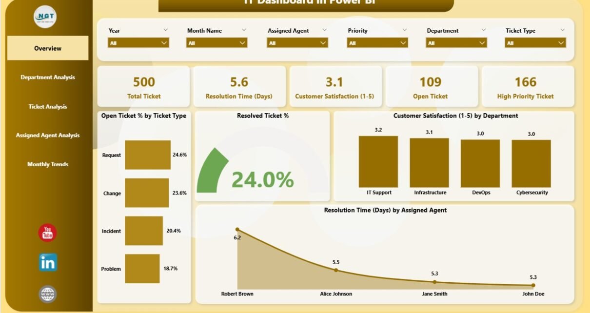
1. Overview Page
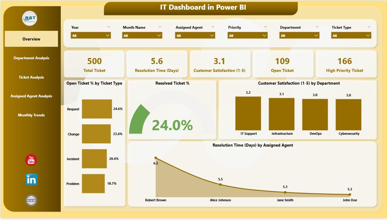
The Overview Page acts as the central hub of the dashboard. It provides a top-level snapshot of key IT metrics and performance indicators.
Key Elements on This Page:
-
5 KPI Cards: These highlight essential figures like open ticket count, resolved percentage, SLA adherence, and customer satisfaction score.
4 Charts:
- Open Ticket % by Ticket Type: Displays the ratio of open tickets for each category, helping to identify high-volume issue types.
- Resolved Ticket %: Shows resolution performance to assess team efficiency.
- Customer Satisfaction (1–5) by Department: Measures how departments are performing based on user feedback.
- Resolved Time (Days) by Assigned Agent: Evaluates how long agents take to resolve issues.
With slicers placed on the side, users can filter by date, department, or agent to focus on specific data points. This makes it simple to compare month-to-month or agent-wise performance.
2. Department Analysis Page
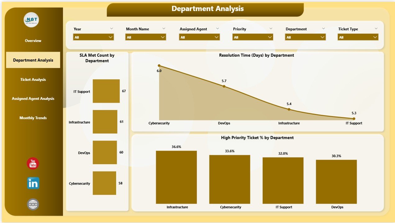
The Department Analysis Page provides insights into how different departments within the organization handle IT requests.
Key Visuals on This Page:
-
SLA Met Count by Department: Displays the number of tickets resolved within SLA timelines per department.
-
Resolved Ticket (Days) by Department: Tracks average resolution time by department, helping managers identify areas that need process improvement.
-
High Priority Ticket % by Department: Highlights departments that report the highest proportion of critical tickets.
By examining these charts, IT leaders can pinpoint which departments may require additional support, training, or resource allocation to handle workloads efficiently.
Click to Purchases IT Dashboard in Power BI
Click to Purchases IT Dashboard in Power BI
3. Ticket Analysis Page
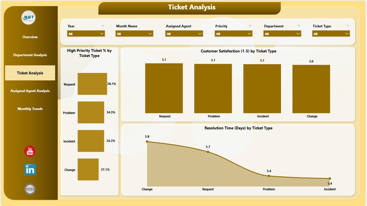
The Ticket Analysis Page focuses on understanding trends across ticket types, categories, and urgency levels.
Charts Included:
-
High Priority Ticket % by Ticket Type: Shows which ticket categories most frequently involve urgent issues.
-
Customer Satisfaction (1–5) by Ticket Type: Evaluates feedback on how well different ticket types are being handled.
-
Resolved Time (Days) by Ticket Type: Compares resolution time across categories to detect process inefficiencies.
This page helps IT teams analyze which ticket types are consuming more time and how effectively each issue type is being resolved.
4. Assigned Agent Analysis Page
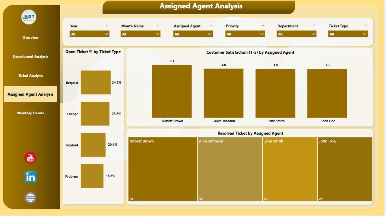
The Assigned Agent Analysis Page highlights the performance of individual IT agents. It provides a transparent view of workload distribution, response efficiency, and service quality.
Charts Displayed:
-
Open Ticket % by Ticket Type & Assigned Agent: Indicates how each agent manages their workload.
-
Customer Satisfaction (1–5) by Assigned Agent: Measures user satisfaction per agent, promoting accountability.
-
Resolved Ticket Count by Assigned Agent: Displays the total number of resolved tickets to recognize high performers.
Managers can use this data to reward consistent performers and identify agents who may need additional training or support.
5. Monthly Trends Page
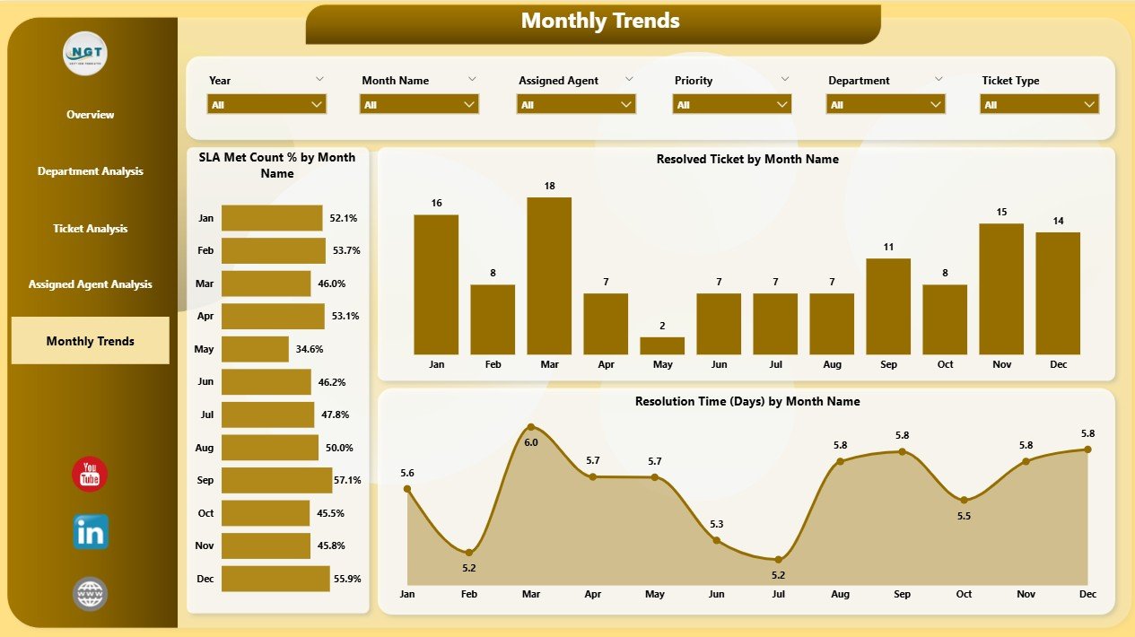
The Monthly Trends Page provides a time-based perspective of IT performance across the year.
Main Charts on This Page:
-
SLA Met Count % by Month: Tracks SLA adherence trends month over month.
-
Resolved Tickets by Month Name: Shows ticket resolution volume, allowing managers to identify peak workload months.
-
Resolved Time (Days) by Month Name: Highlights how resolution time has changed throughout the year.
By tracking performance trends, teams can plan resource allocation, identify seasonal patterns, and improve service response time.
Advantages of IT Dashboard in Power BI
Implementing an IT Dashboard in Power BI brings multiple benefits to an organization. Let’s explore the most impactful ones below.
1. Real-Time Visibility
The dashboard provides instant access to critical IT data, allowing managers to make faster and smarter decisions. Real-time updates mean you can respond to rising issues without waiting for manual reports.
2. Improved SLA Compliance
With automated tracking of SLA metrics, the IT department can easily monitor adherence and take corrective actions before SLAs are breached.
3. Enhanced Decision-Making
Power BI’s visualization capabilities make it simple to understand performance metrics and identify problem areas. Decision-makers can act proactively instead of reactively.
4. Streamlined Reporting
No more creating manual reports or combining Excel sheets. With Power BI, reports auto-refresh and display the latest insights in a few clicks.
5. Increased Transparency and Accountability
Managers can view agent-wise and department-wise performance clearly. This promotes fairness, transparency, and a results-driven culture.
6. Higher Customer Satisfaction
The dashboard tracks satisfaction scores and identifies areas for service improvement, ensuring end-users get faster and better support.
7. Scalable and Customizable
The IT Dashboard can easily scale with organization size and can be customized to include additional KPIs like network uptime, server downtime, or software compliance.
How to Use the IT Dashboard Effectively
To get the most value from your Power BI IT Dashboard, you need a structured approach. Here’s how to make the most of it:
-
Update Data Regularly: Ensure that your Excel data source or ticketing system updates automatically for real-time tracking.
-
Set Clear KPIs: Define what success looks like — e.g., “Resolve 90% of tickets within SLA.”
-
Use Filters & Slicers: Narrow down the visuals to analyze specific departments, time periods, or ticket types.
-
Monitor Agent Performance: Regularly review individual performance metrics to improve accountability.
-
Review Monthly Trends: Use the trends page to identify recurring issues or performance dips.
-
Communicate Findings: Share dashboard insights with stakeholders for continuous improvement.
Who Can Benefit from an IT Dashboard in Power BI?
An IT Dashboard in Power BI is beneficial for a wide range of professionals and teams, including:
-
IT Managers: To oversee department performance and resource utilization.
-
Helpdesk Teams: To track and improve ticket resolution efficiency.
-
Executives: To monitor IT health and support strategic decisions.
-
Service Desk Analysts: To evaluate workload and personal performance.
-
Business Leaders: To assess how IT contributes to organizational goals.
Essentially, any organization looking to improve IT service quality, reduce downtime, and enhance responsiveness can benefit from this dashboard.
Best Practices for the IT Dashboard in Power BI
Click to Purchases IT Dashboard in Power BI
Implementing best practices ensures your dashboard remains accurate, efficient, and insightful over time.
1. Keep Data Clean and Consistent
Use standardized naming conventions for ticket types, departments, and agents. This prevents duplication and ensures reliable analytics.
2. Automate Data Refresh
Set up scheduled refreshes in Power BI to ensure you always see the most recent information without manual intervention.
3. Use Conditional Formatting
Highlight critical metrics, such as SLA breaches or high-priority tickets, using color codes or icons for quick visual alerts.
4. Leverage Drill-Through Features
Allow users to click on visuals (like ticket categories) and view detailed insights, improving interactivity and understanding.
5. Protect Sensitive Data
Apply row-level security and access controls in Power BI to ensure sensitive IT data stays confidential.
6. Visualize the Right KPIs
Focus on KPIs that truly impact performance — such as resolution time, SLA met %, and customer satisfaction.
7. Encourage Collaboration
Share dashboards with department heads and team members. Encourage feedback to continuously improve your metrics and visuals.
8. Monitor Dashboard Performance
Avoid overloading your dashboard with too many visuals or filters, as it can slow down performance.
Common Challenges in IT Dashboard Implementation
While the benefits are vast, implementing an IT Dashboard may face some challenges. Knowing them helps you prepare better.
-
Data Quality Issues: Inconsistent data formats can cause inaccuracies in reports.
-
Resistance to Change: Some team members may prefer traditional reporting methods.
-
Performance Lag: Large data volumes may slow dashboard refresh time.
-
Overcomplication: Too many visuals can confuse users. Keep it simple and focused.
-
Lack of Training: Ensure teams understand how to use filters, slicers, and visuals effectively.
Addressing these early ensures smooth adoption and long-term success.
Conclusion
An IT Dashboard in Power BI is more than just a reporting tool — it’s a strategic asset for modern IT departments. By transforming raw data into visual insights, it helps teams monitor ticket performance, improve SLA adherence, boost satisfaction, and optimize operations across departments and agents.
Whether you’re an IT manager tracking performance metrics or a business leader looking to enhance service delivery, this dashboard offers everything you need to make data-driven decisions that truly matter.
With Power BI’s intuitive design, interactivity, and integration capabilities, you can turn IT data into a continuous improvement engine that drives business success.
Frequently Asked Questions (FAQs)
1. What is an IT Dashboard in Power BI used for?
It is used to visualize and monitor IT performance metrics such as ticket resolution time, SLA compliance, and customer satisfaction in real time.
2. How does Power BI help IT departments?
Power BI helps IT departments by automating reporting, improving visibility, identifying trends, and simplifying decision-making through interactive visuals.
3. Can I connect live IT systems to this dashboard?
Yes. Power BI can connect to live databases, ticketing tools like ServiceNow or Jira, and Excel files for real-time updates.
4. Is technical expertise required to use the dashboard?
No. Power BI’s interface is user-friendly and designed for business users. Basic understanding of filters and charts is sufficient.
5. How often should the dashboard data be refreshed?
For accurate results, you should refresh data daily or set up an automatic refresh schedule within Power BI.
6. Can this dashboard be customized for different teams?
Absolutely. You can customize visuals, KPIs, and pages based on team roles, such as infrastructure, support, or application management.
7. What are the main KPIs in an IT Dashboard?
Typical KPIs include ticket resolution time, SLA met percentage, open ticket percentage, customer satisfaction score, and high-priority ticket ratio.
8. Does Power BI support role-based access control?
Yes. You can apply row-level security to restrict data visibility based on user roles or departments.
9. What makes Power BI better than Excel for dashboards?
While Excel is great for data entry and calculations, Power BI provides superior visualization, automation, and interactivity — ideal for real-time performance tracking.
10. Can small businesses use this IT Dashboard?
Yes. The dashboard is fully scalable and works perfectly for small, medium, and large enterprises alike.
Visit our YouTube channel to learn step-by-step video tutorials