The jewellery and watches industry runs on precision, trust, and refined customer experience. Because of this, businesses in this sector depend on meaningful data that helps them understand sales patterns, product performance, customer preferences, and store-level trends. Yet, many brands still struggle with scattered spreadsheets, slow reporting methods, and limited visibility across product lines.
A Jewellery & Watches Dashboard in Power BI solves these challenges. It brings every important metric together and turns raw data into smart visuals. As a result, business leaders, analysts, and store managers can make faster and better decisions.
In this detailed guide, you will learn everything about this dashboard, how it works, what each page contains, and how you can use it to grow your jewellery and watches business. You will also explore its advantages, best practices, and answers to common questions.
What Is a Jewellery & Watches Dashboard in Power BI?
Click to Purchases Jewellery & Watches Dashboard in Power BI
A Jewellery & Watches Dashboard in Power BI is an interactive analytics solution that displays all key performance metrics of jewellery and watches retail operations. It uses charts, summary cards, slicers, and visuals to show data across brands, collections, gemstones, stores, and monthly trends.
Users can track:
-
Net sales
-
Gross profit
-
Cost values
-
Stone performance
-
Collection-wise revenue
-
City-level store output
-
Monthly growth patterns
Because the dashboard uses Power BI, it updates fast, supports large datasets, and provides drill-down capabilities. Even non-technical users can understand their business performance at a glance.
Why Do Jewellery and Watches Businesses Need a Power BI Dashboard?
Jewellery and watches are high-value products. Small changes in pricing, customer preferences, or stock movement can create big impacts. A dashboard reduces risk and improves clarity. It helps teams identify what sells, why it sells, and where improvement is needed.
Most importantly, it brings all insights into one place, so teams avoid working on separate files or waiting for manual reports.
Key Features of the Jewellery & Watches Dashboard in Power BI
The dashboard contains 5 powerful pages, each designed to analyze a specific area of business performance. Let’s explore each page in detail.
1. Overview Page: What Does It Show?
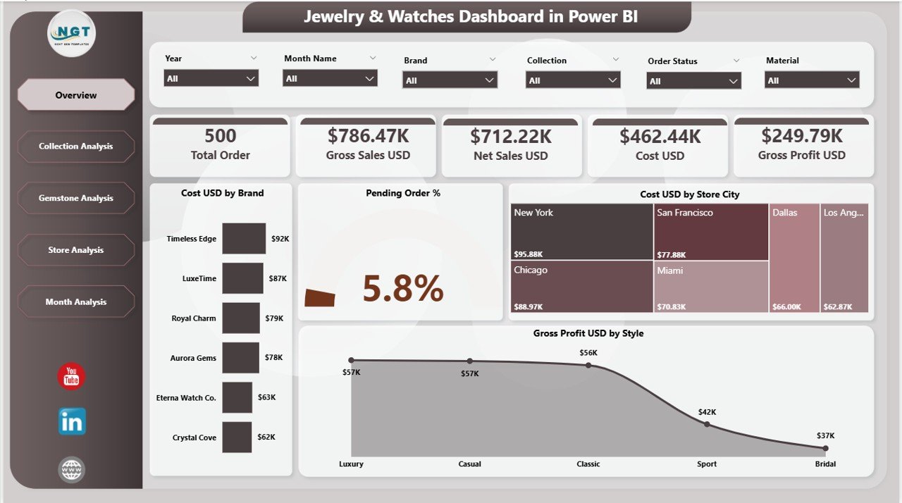
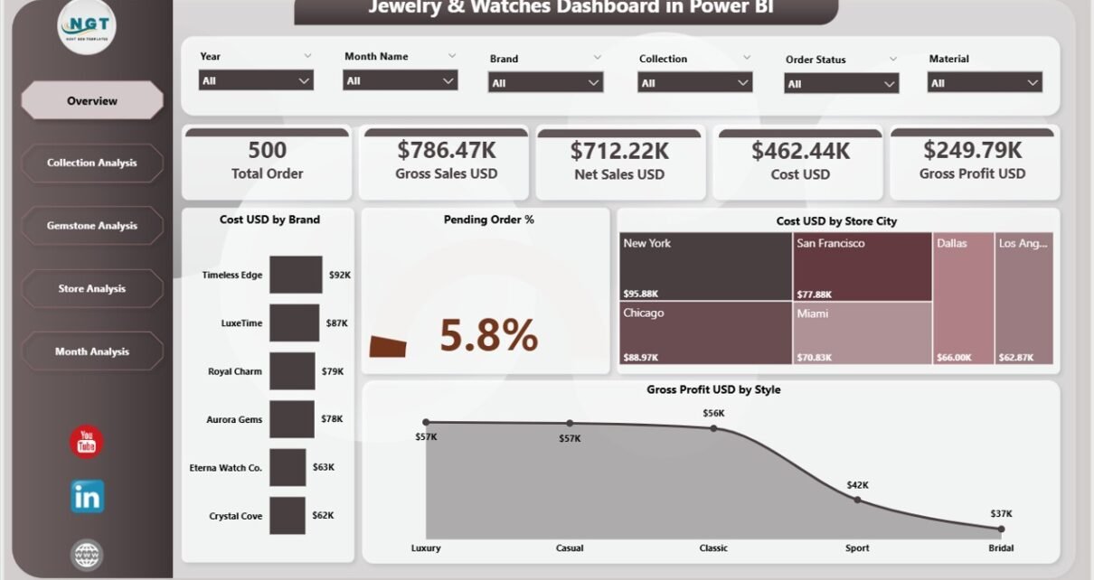
The Overview Page works as the main control center of the dashboard. Users land here first because it provides quick insights into the big picture. This page includes slicers, summary cards, and charts that help users understand total performance in just a few seconds.
Key Highlights of the Overview Page
-
Slicers
These filtering tools help users select a specific brand, store, collection, gemstone type, or month. Because of this, the dashboard shows only meaningful and filtered results. -
4 Summary Cards
These cards show high-level metrics such as:-
Total Cost (USD)
-
Total Pending Orders (%)
-
Gross Profit
-
Other KPI values based on your data
-
-
4 Insightful Charts
-
Cost (USD) by Brand – Identifies which brand contributes the most to cost.
-
Pending Order % – Helps track fulfilment performance.
-
Cost (USD) by Store City – Shows which cities generate the highest cost.
-
Gross Profit (USD) by Style – Displays profit performance across jewellery styles.
-
The Overview Page gives a clear snapshot of what is happening in your business at any time.
Click to Purchases Jewellery & Watches Dashboard in Power BI
2. Collection Analysis: How Do Collections Perform?
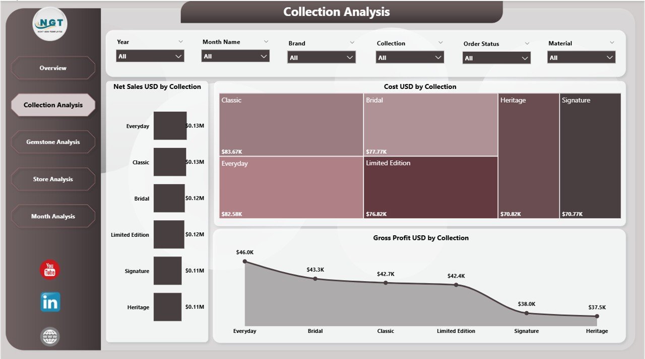
Every jewellery and watch business manages multiple collections such as Premium, Bridal, Classic, Daily Wear, Diamond, Gold, or Limited Edition. Because customers behave differently across collections, this page helps you understand which collections drive revenue and which ones need improvement.
What You See on the Collection Analysis Page
This page includes slicers and three major charts:
-
Net Sales (USD) by Collection
Helps you identify top-selling collections. -
Cost (USD) by Collection
Shows production or procurement cost for each collection. -
Gross Profit (USD) by Collection
Helps you compare profitability across collections.
These visuals reveal how customers react to different styles and price brackets. As a result, you can improve pricing, promotions, and product focus.
3. Gemstone Analysis: Which Gemstones Perform Best?
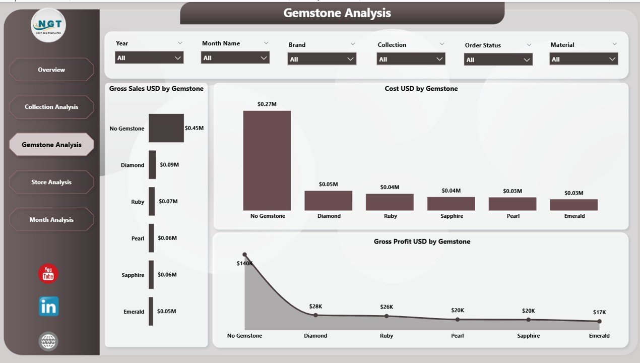
Jewellery businesses often deal with multiple gemstones such as diamonds, emeralds, sapphires, rubies, pearls, and more. Some gemstones sell faster, while others generate more profit. The Gemstone Analysis Page shows exactly that.
Charts Included on This Page
-
Cost (USD) by Gemstone
Helps control cost based on gemstone type. -
Gross Profit (USD) by Gemstone
Highlights which gemstones deliver higher profit margins. -
Gross Sales (USD) by Gemstone
Shows best-selling gemstones and their demand patterns.
With this information, you can adjust your inventory mix, plan promotions, and negotiate better deals with gemstone suppliers.
4. Store Analysis: Which Stores Perform Well?
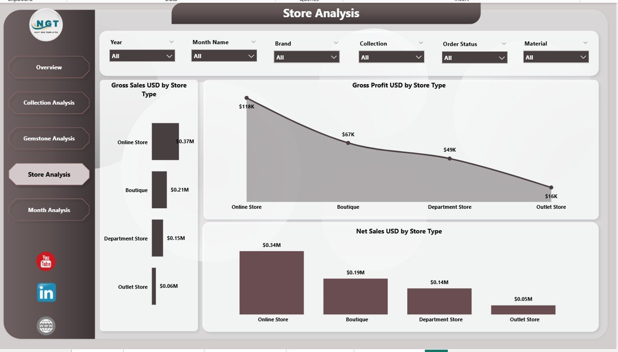
Every city has different buying patterns. Some stores may show strong demand for luxury watches. Others may sell more gold jewellery. The Store Analysis Page helps compare store performance across different regions.
What This Page Includes
This page contains slicers and three major charts:
-
Net Sales (USD) by Stone Type
Shows which store sells which stone types. -
Gross Profit (USD) by Stone Type
Helps compare profit contribution by store. -
Gross Sales (USD) by Stone Type
Displays overall store performance by stone type.
The Store Analysis Page helps identify top-performing stores, underperforming locations, and cities with strong market demand.
Click to Purchases Jewellery & Watches Dashboard in Power BI
5. Monthly Trends: How Has Performance Changed Over Time?
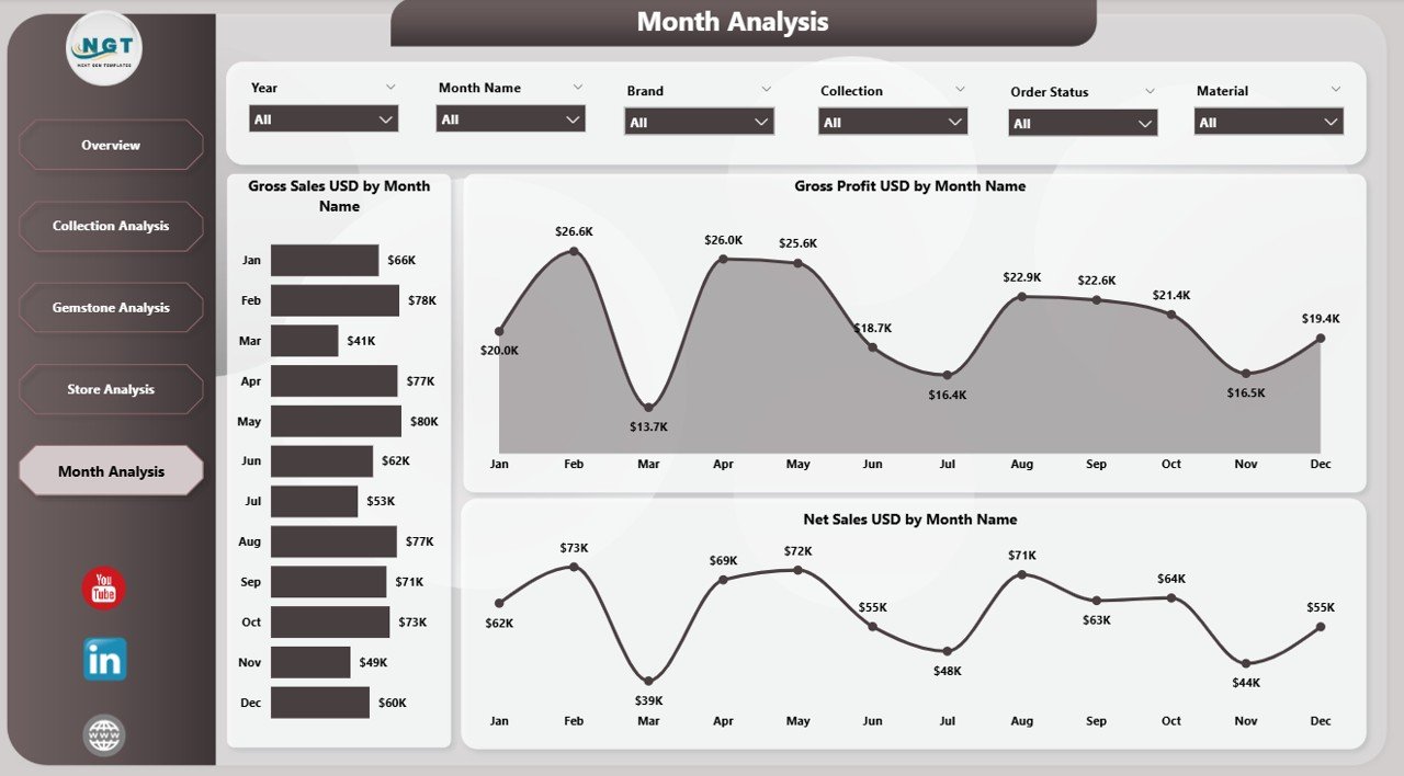
The final page of the dashboard focuses on monthly trend analysis. This helps leaders understand how their jewellery and watches business performs across different months. It supports seasonal planning, event-based promotions, and year-end strategy development.
What the Monthly Trends Page Shows
-
Net Sales (USD) by Month
Helps observe revenue patterns across the year. -
Gross Profit (USD) by Month
Shows changing profit performance over time. -
Gross Sales (USD) by Month
Tracks how sales grow or drop month by month.
Because jewellery sales often increase during festivals, wedding seasons, or New Year periods, this page reveals those patterns clearly.
How Does Power BI Improve Jewellery and Watch Retail Reporting?
Power BI brings speed, automation, and clarity. It transforms complex datasets into clean visuals. It also lets users explore data in real time, which helps teams avoid waiting for manual reports.
Some Important Improvements Include:
-
Instant dashboard refresh
-
Simple drill-down navigation
-
Attractive charts and tables
-
Real-time visibility
-
Better decision-making
-
Automated reporting
-
Seamless sharing across teams
Power BI helps build an efficient data culture where everyone uses insights to make decisions faster.
Advantages of Jewellery & Watches Dashboard in Power BI
When a business uses this dashboard, it gains several benefits. These advantages create a strong foundation for scalable growth.
1. Faster Decision-Making
Managers can see the latest data and take action quickly. They do not wait for manual updates.
2. Clear Performance Visibility
The dashboard shows what works and what does not. Because of this, teams stay aligned and focus on the right priorities.
3. Better Control Over Cost and Profit
Users can track cost, gross sales, and gross profit in one place. This improves pricing, budgeting, and cost control.
4. Improved Store and Collection Management
Store-wise and collection-wise tracking helps brands understand which areas need attention.
5. Data Accuracy and Transparency
Power BI minimizes human error and ensures consistency across reports.
6. Stronger Inventory and Demand Planning
Trend insights help plan festive sales, wedding season promotions, and stock requirements.
7. Reliable Supplier and Product Decisions
Gemstone-wise and style-wise insights support smarter supplier negotiations.
Best Practices for the Jewellery & Watches Dashboard in Power BI
To get the best output from this dashboard, follow these best practices:
1. Keep Data Clean and Updated
Clean and structured data ensures accurate visuals. Update the source file regularly.
2. Use Slicers for Deep Insights
Slicers help you filter data and understand specific scenarios. Always explore different slicer combinations.
3. Track Top KPIs Daily
Focus on metrics like cost, net sales, gross profit, and pending orders.
4. Compare Results Month-to-Month
Monthly trend charts show how your business evolves. These insights help plan seasonal strategies.
5. Review Store Performance Frequently
Store analysis helps identify strong and weak locations. Make changes early.
6. Analyze Collections Carefully
Collection-wise profit helps businesses focus on high-potential product lines.
7. Monitor Gemstone Profitability
Gemstones have different cost structures. Tracking this ensures better pricing and inventory control.
8. Use Conditional Formatting
Highlighting performance gaps helps detect issues quickly.
9. Share Reports With Teams
Power BI allows online sharing. Encourage teams to use the dashboard daily.
Conclusion
A Jewellery & Watches Dashboard in Power BI transforms retail reporting. It shows brand-wise, gemstone-wise, store-wise, and month-wise insights in a clear and simple format. Because of this, leaders can make smarter decisions, plan better promotions, optimize inventory, and improve performance in every store.
This dashboard supports the entire jewellery and watches business. It covers collections, gemstones, costs, sales, profits, and seasonal trends. When businesses use these insights consistently, they grow faster and serve customers better.
Frequently Asked Questions (FAQs)
1. What is the Jewellery & Watches Dashboard in Power BI?
It is an interactive dashboard that tracks sales, profit, cost, collection performance, gemstone trends, and store performance using Power BI visuals.
2. Who should use this dashboard?
Business owners, retail managers, store supervisors, finance teams, and analysts can use this dashboard to monitor performance.
3. Does this dashboard help with pricing and profit planning?
Yes. Gross profit analysis and cost breakdown help users create better pricing and profit strategies.
4. Can I customize the dashboard?
Yes, you can modify visuals, add new KPIs, or adjust slicers based on your business requirements.
5. What makes this dashboard better than Excel reporting?
Power BI updates faster, handles large data, supports drill-downs, and provides visually rich insights, unlike manual Excel reports.
6. Does it support store-level comparisons?
Yes. The Store Analysis Page compares stores across cities and stone types.
7. How often should I update data?
Daily or weekly updates offer the most accurate insights.
8. Are monthly trends important?
Yes. Monthly trends help understand demand cycles, seasonal peaks, and overall growth patterns.
Visit our YouTube channel to learn step-by-step video tutorials
Click to Purchases Jewellery & Watches Dashboard in Power BI
Watch the step-by-step video tutorial:
