Luxury brands operate in a highly competitive, data-driven, and experience-focused market. Customers expect premium quality, personalized service, and consistent brand value. At the same time, leadership teams must track revenue, pricing, discounts, regions, brands, and channels without delay. However, when businesses rely on scattered reports or static spreadsheets, they lose clarity and control.
That is exactly where a Luxury Goods Dashboard in Power BI becomes a game-changing solution.
This detailed and SEO-friendly guide explains what a Luxury Goods Dashboard in Power BI is, why luxury brands need it, how it works, and how each dashboard page supports smarter decision-making. Moreover, this article covers the advantages, best practices, and frequently asked questions to help you fully understand its real business value.
By the end of this article, you will clearly see how a ready-to-use Power BI dashboard helps luxury brands improve profitability, brand performance, and strategic planning.
Click to Purchases Luxury Goods Dashboard in Power BI
What Is a Luxury Goods Dashboard in Power BI?
A Luxury Goods Dashboard in Power BI is an interactive analytics and reporting tool designed to monitor, analyze, and visualize key performance metrics related to luxury products, brands, regions, and sales channels.
Instead of switching between multiple reports, users view all critical insights in one centralized dashboard. As a result, executives, sales leaders, brand managers, and analysts gain instant visibility into business performance.
This dashboard typically tracks:
-
Gross revenue
-
Net revenue
-
Discount percentage
-
Product category performance
-
Brand-level insights
-
Sales channel contribution
-
Monthly revenue trends
-
Regional and country-wise performance
Because Power BI updates visuals dynamically, users can filter data using slicers and analyze trends in real time. Consequently, decision-makers act faster and with more confidence.
Why Do Luxury Brands Need a Power BI Dashboard?
Luxury goods businesses deal with high-value products, premium pricing, and brand-sensitive discounting. Therefore, even small data gaps can lead to revenue loss or brand dilution.
A Luxury Goods Dashboard in Power BI solves these challenges effectively.
Key reasons luxury brands rely on dashboards:
-
They need real-time revenue visibility
-
They must control discount levels carefully
-
They track brand performance across regions
-
They analyze customer type behavior
-
They evaluate sales channel effectiveness
Moreover, leadership teams prefer visual insights over raw data tables. Power BI delivers exactly that through clean, interactive, and executive-ready dashboards.
How Does a Luxury Goods Dashboard in Power BI Work?
A Luxury Goods Dashboard in Power BI works by connecting raw sales data to interactive visuals. Once the data loads into Power BI, the dashboard automatically calculates KPIs and updates charts.
Here is how the process flows:
-
Import sales and transaction data
-
Define revenue, discount, and pricing measures
-
Create slicers for filtering
-
Build visuals using charts and cards
-
Publish the dashboard for analysis
Because Power BI handles large datasets efficiently, users can analyze multiple years of luxury sales data without performance issues.
Key Features of the Luxury Goods Dashboard in Power BI
This ready-to-use Luxury Goods Dashboard includes five structured pages, each designed to answer specific business questions.
Let us explore each page in detail.
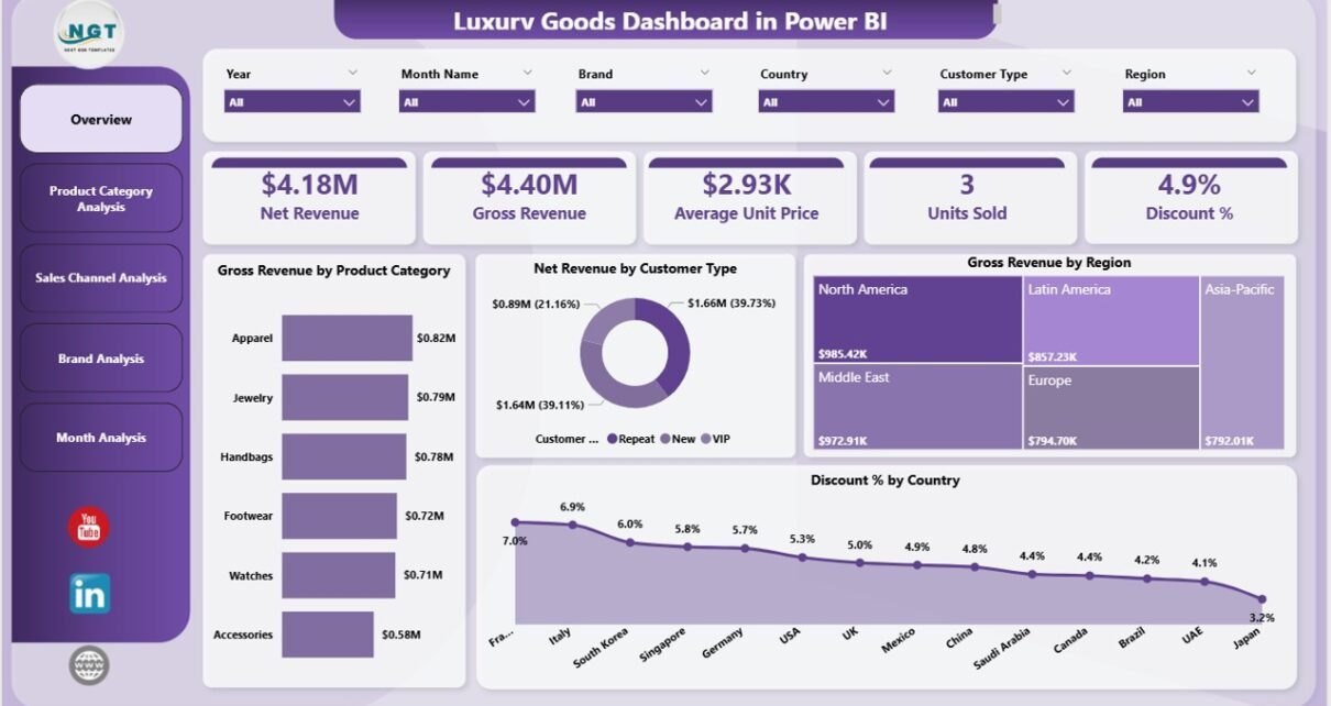
Overview Page: How Can You Get a High-Level View of Luxury Performance?
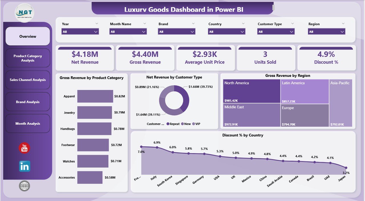
The Overview Page acts as the central control panel of the dashboard. It gives leadership an instant snapshot of business performance without scrolling through multiple reports.
What does the Overview Page show?
This page includes slicers that allow users to filter data by time, category, brand, region, or channel. As a result, users focus only on relevant insights.
Key cards and visuals on the Overview Page:
-
Gross Revenue by Product Category
-
Net Revenue by Customer Type
-
Gross Revenue by Region
-
Discount % by Country
These visuals help users quickly identify:
-
Which product categories generate the highest revenue
-
How different customer types contribute to net revenue
-
Which regions perform best
-
Where discounts remain high or controlled
Because this page summarizes everything at once, executives use it during leadership meetings and performance reviews.
Product Category Analysis: Which Product Categories Drive Luxury Sales?
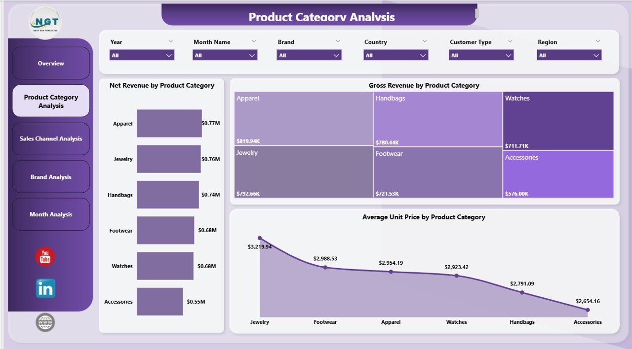
The Product Category Analysis Page focuses on category-level performance. Luxury brands often manage multiple categories such as watches, handbags, apparel, footwear, accessories, and jewelry.
This page helps users compare these categories side by side.
Charts included on this page:
-
Net Revenue by Product Category
-
Average Unit Price by Product Category
-
Discount % by Product Category
Why does this analysis matter?
-
It shows which categories deliver maximum profitability
-
It highlights pricing strength across categories
-
It identifies categories with excessive discounting
As a result, category managers adjust pricing, inventory, and promotions more effectively.
Click to Purchases Luxury Goods Dashboard in Power BI
Sales Channel Analysis: Which Sales Channels Perform Best for Luxury Goods?
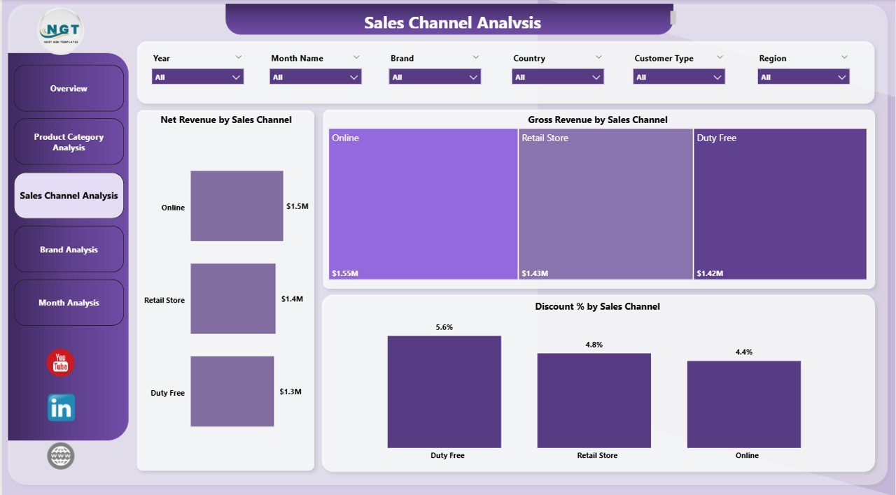
Luxury brands sell products through multiple channels such as retail stores, online platforms, exclusive boutiques, and partner outlets. Therefore, channel analysis becomes critical.
The Sales Channel Analysis Page provides clarity on channel performance.
Key visuals on this page:
-
Net Revenue by Sales Channel
-
Gross Revenue by Sales Channel
-
Discount % by Sales Channel
How does this page help decision-makers?
-
It compares online versus offline performance
-
It highlights channels with high discount dependency
-
It helps allocate marketing and inventory budgets wisely
Because luxury brands protect exclusivity, this page ensures that discount strategies do not harm brand value.
Brand Analysis: How Do Individual Luxury Brands Perform?
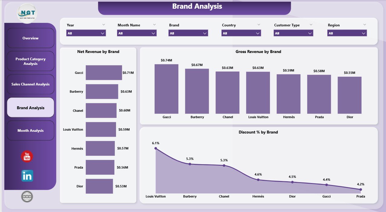
Luxury companies often manage multiple premium brands under one portfolio. Each brand carries a unique identity, pricing structure, and customer base.
The Brand Analysis Page focuses on brand-level insights.
Charts included:
-
Net Revenue by Brand
-
Gross Revenue by Brand
-
Discount % by Brand
Why is brand analysis important?
-
It reveals top-performing brands
-
It highlights underperforming brands
-
It shows which brands rely heavily on discounts
Consequently, leadership teams decide where to invest, reposition, or restructure brand strategies.
Click to Purchases Luxury Goods Dashboard in Power BI
Month Analysis: How Do Luxury Sales Trend Over Time?
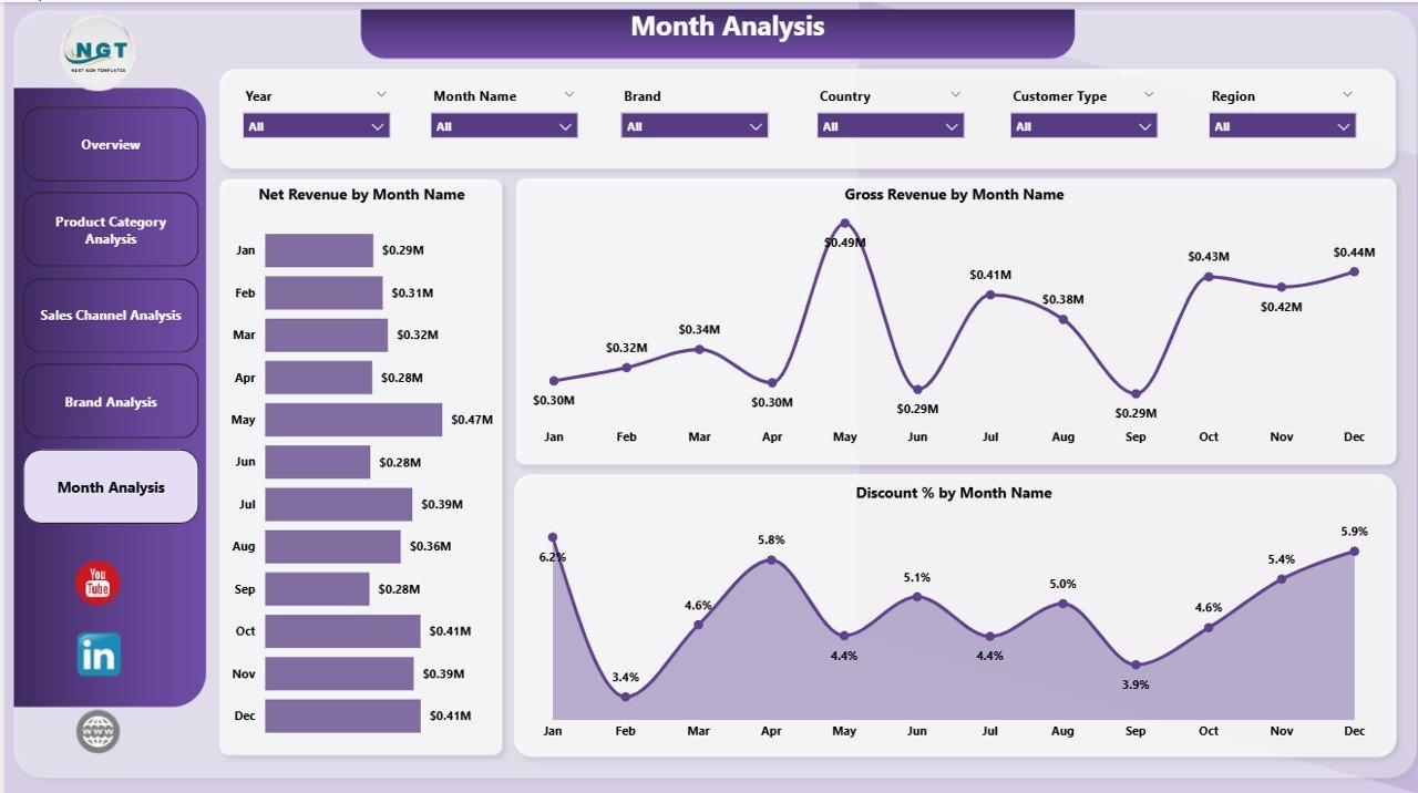
Luxury sales often fluctuate due to seasons, festivals, fashion cycles, and promotions. Therefore, monthly trend analysis becomes essential.
The Month Analysis Page provides time-based insights.
Key charts on this page:
-
Net Revenue by Month
-
Gross Revenue by Month
-
Discount % by Month
What insights does this page deliver?
-
It highlights peak and slow months
-
It tracks the impact of campaigns
-
It identifies discount spikes over time
Because trends become visible instantly, teams plan inventory and marketing campaigns more accurately.
Advantages of Luxury Goods Dashboard in Power BI
A Luxury Goods Dashboard in Power BI delivers measurable benefits across departments.
Strategic Advantages
-
Provides a single source of truth
-
Improves executive decision-making
-
Enhances data transparency
Operational Advantages
-
Reduces manual reporting effort
-
Speeds up analysis time
-
Improves collaboration between teams
Financial Advantages
-
Tracks revenue and profitability clearly
-
Controls discount leakage
-
Supports pricing optimization
Brand Management Advantages
-
Protects brand value
-
Tracks brand-wise performance
-
Identifies discount misuse
Because of these advantages, luxury brands gain a strong competitive edge.
Click to Purchases Luxury Goods Dashboard in Power BI
Best Practices for the Luxury Goods Dashboard in Power BI
To maximize dashboard value, teams should follow proven best practices.
1. Use Clean and Structured Data
Ensure data consistency across brands, regions, and channels. Clean data improves accuracy and trust.
2. Limit the Number of KPIs
Focus only on metrics that drive decisions. Too many KPIs reduce clarity.
3. Design Executive-Friendly Layouts
Keep visuals simple, readable, and aligned with luxury brand aesthetics.
4. Use Slicers Strategically
Add slicers for time, brand, region, and channel to improve interactivity.
5. Monitor Discount Metrics Closely
Track discount percentages regularly to protect premium positioning.
6. Refresh Data Frequently
Schedule data refreshes to maintain real-time insights.
Who Should Use a Luxury Goods Dashboard in Power BI?
This dashboard suits multiple stakeholders:
-
Luxury brand owners
-
Sales and revenue managers
-
Brand managers
-
Marketing teams
-
Finance teams
-
Business analysts
-
Executive leadership
Because the dashboard adapts to different filters, every role extracts relevant insights.
How Does This Dashboard Improve Decision-Making?
A Luxury Goods Dashboard in Power BI improves decisions by:
-
Turning raw data into visuals
-
Highlighting patterns and trends
-
Reducing guesswork
-
Supporting data-backed strategies
As a result, organizations shift from reactive decisions to proactive planning.
Conclusion: Why Is a Luxury Goods Dashboard in Power BI Essential?
Luxury brands cannot afford slow decisions, unclear data, or uncontrolled discounts. A Luxury Goods Dashboard in Power BI delivers clarity, control, and confidence.
By combining revenue, brand, channel, and time-based insights into one interactive dashboard, businesses gain complete visibility into performance. Moreover, decision-makers act faster, plan smarter, and protect brand value effectively.
In today’s luxury market, this dashboard is not optional—it is essential.
Frequently Asked Questions About Luxury Goods Dashboard in Power BI
1. What is the main purpose of a Luxury Goods Dashboard in Power BI?
The main purpose is to track and analyze luxury sales performance across products, brands, channels, regions, and time.
2. Can this dashboard handle large datasets?
Yes, Power BI efficiently handles large volumes of luxury sales data without performance issues.
3. Does this dashboard support real-time analysis?
Yes, once connected to live data sources, the dashboard updates automatically.
4. Can users customize slicers and visuals?
Yes, users can filter data using slicers for deeper analysis.
5. Is this dashboard suitable for global luxury brands?
Absolutely. It supports region-wise, country-wise, and brand-wise analysis.
6. Does this dashboard help control discounts?
Yes, discount percentage analysis across categories, brands, channels, and months helps prevent excessive discounting.
7. Can this dashboard be used by non-technical users?
Yes, the visuals remain intuitive and user-friendly for all roles.
8. How often should data refresh occur?
Ideally, businesses should refresh data daily or in real time for best results.
Visit our YouTube channel to learn step-by-step video tutorials