Mobile app development moves fast. New features launch every week. User feedback changes daily. Competition grows every month. Therefore, you must track performance consistently and clearly.
However, many app development teams still rely on scattered Excel sheets and manual updates. As a result, they lose visibility. They miss targets. They fail to see user behavior trends in time.
So, how can you measure app performance, productivity, and growth in one structured system?
The answer is simple.
Click to Purchases Mobile App Development KPI Dashboard in Power BI
You need a Mobile App Development KPI Dashboard in Power BI.
This ready-to-use dashboard centralizes your mobile app KPIs into one powerful reporting solution. Moreover, it helps product managers, developers, and executives track performance using real-time insights. In addition, it compares MTD and YTD performance against targets and previous year results.
In this complete guide, you will learn:
-
What a Mobile App Development KPI Dashboard in Power BI is
-
Why your app team needs it
-
Detailed explanation of all 3 dashboard pages
-
How Excel data integrates with Power BI
-
Advantages of using this dashboard
-
Best practices for implementation
-
Frequently Asked Questions with answers
Let us explore everything step by step.
What Is a Mobile App Development KPI Dashboard in Power BI?
A Mobile App Development KPI Dashboard in Power BI is an interactive reporting system that tracks key performance indicators related to mobile applications.
Instead of reviewing static reports, you can:
-
Monitor KPI performance Month-to-Date (MTD)
-
Track Year-to-Date (YTD) progress
-
Compare current year vs previous year
-
Evaluate target achievement instantly
-
Drill through to view KPI definitions
Since the dashboard connects to an Excel data source, you can easily update numbers every month. Once you refresh the Power BI file, the dashboard automatically updates all visuals and indicators.
Therefore, you gain clarity without complexity.
Why Do Mobile App Development Teams Need a KPI Dashboard?
Mobile app development includes many moving parts:
-
Feature releases
-
Bug fixes
-
App store ratings
-
User acquisition
-
Retention metrics
-
Revenue tracking
-
Crash reports
If you do not track these metrics in one place, confusion increases. Moreover, decision-making slows down.
However, when you use a structured KPI dashboard:
-
You identify performance gaps quickly
-
You compare targets vs actual results
-
You align technical and business teams
-
You drive continuous improvement
Therefore, this dashboard becomes a strategic tool, not just a reporting file.
Key Features of Mobile App Development KPI Dashboard in Power BI
This dashboard contains 3 powerful pages in the Power BI desktop file:
-
Summary Page
-
KPI Trend Page
-
KPI Definition Page
Let us examine each page in detail.
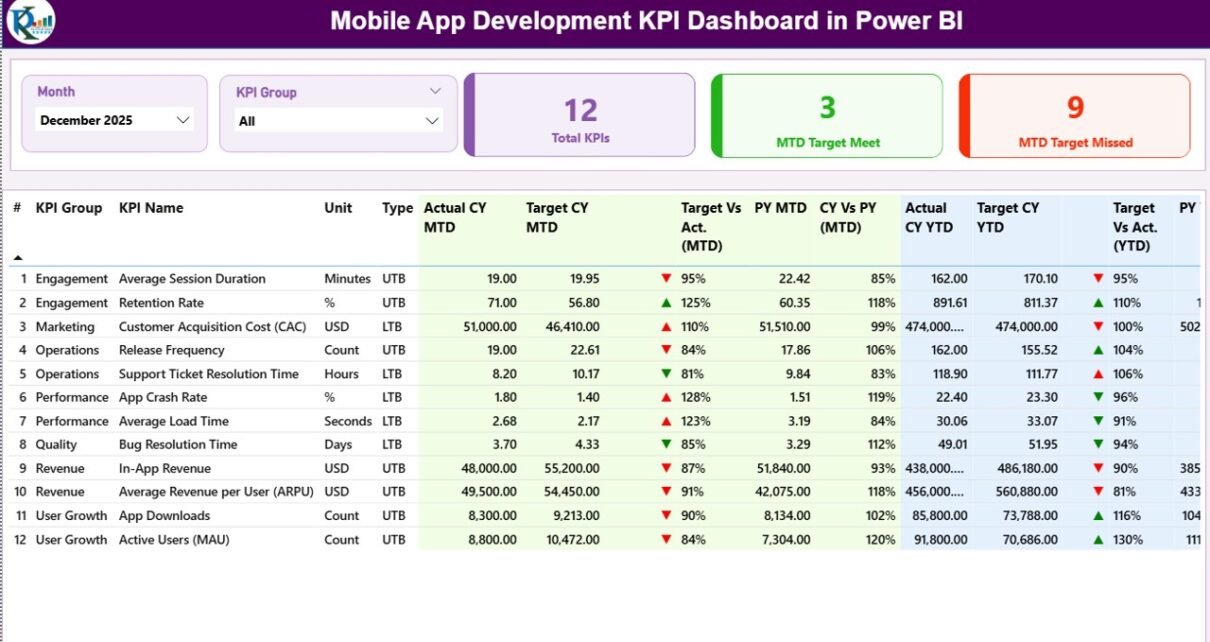
1) What Does the Summary Page Show?

The Summary Page acts as the control center of the dashboard.
Top Section – Smart Slicers
At the top, you see:
-
Month Slicer
-
KPI Group Slicer
These slicers allow you to filter the entire dashboard instantly. Therefore, you can analyze specific months or KPI categories without changing any formulas.
KPI Performance Cards
Below the slicers, you see three powerful cards:
-
Total KPIs Count
-
MTD Target Meet Count
-
MTD Target Missed Count
These cards immediately show overall performance status. As a result, leadership can quickly understand whether the app performs well or not.
Detailed KPI Performance Table
This section provides a complete breakdown of each KPI.
Here is what you see:
KPI Identification Columns
-
KPI Number – Sequence number of KPI
-
KPI Group – Category of KPI (Performance, Quality, Growth, etc.)
-
KPI Name – Name of the metric
-
Unit – Measurement unit (%, Number, Hours, etc.)
-
Type – LTB (Lower the Better) or UTB (Upper the Better)
This structure ensures clarity and consistency.
MTD Performance Columns
-
Actual CY MTD – Current year actual MTD value
-
Target CY MTD – Current year target MTD value
-
MTD Icon – ▲ (Green) or ▼ (Red) to show performance
-
Target Vs Act. (MTD) – Actual / Target percentage
-
PY MTD – Previous year MTD value
-
CY Vs PY (MTD) – Current vs previous year comparison
Because of these comparisons, you understand not only whether you meet targets but also whether performance improves year over year.
YTD Performance Columns
-
Actual CY YTD
-
Target CY YTD
-
YTD Icon
-
Target Vs Act. (YTD)
-
PY YTD
-
CY Vs PY (YTD)
This section provides a long-term performance view. Therefore, you avoid short-term bias.
2) What Does the KPI Trend Page Show?
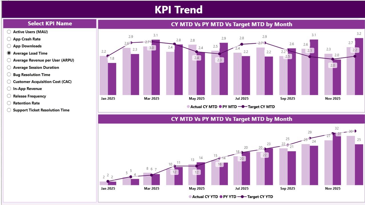
While the summary page shows numbers, the KPI Trend page shows patterns.
Here you see:
-
Two Combo Charts
-
MTD Trend
-
YTD Trend
-
These charts display:
-
Current Year Actual
-
Previous Year Actual
-
Target Values
Additionally, a KPI Name slicer appears on the left side. Therefore, you can select any KPI and analyze its monthly movement.
Because of visual comparison, you can quickly identify:
-
Growth trends
-
Declining metrics
-
Target gaps
-
Seasonal behavior
As a result, teams make faster and smarter decisions.
Click to Purchases Mobile App Development KPI Dashboard in Power BI
3) What Is the KPI Definition Page?
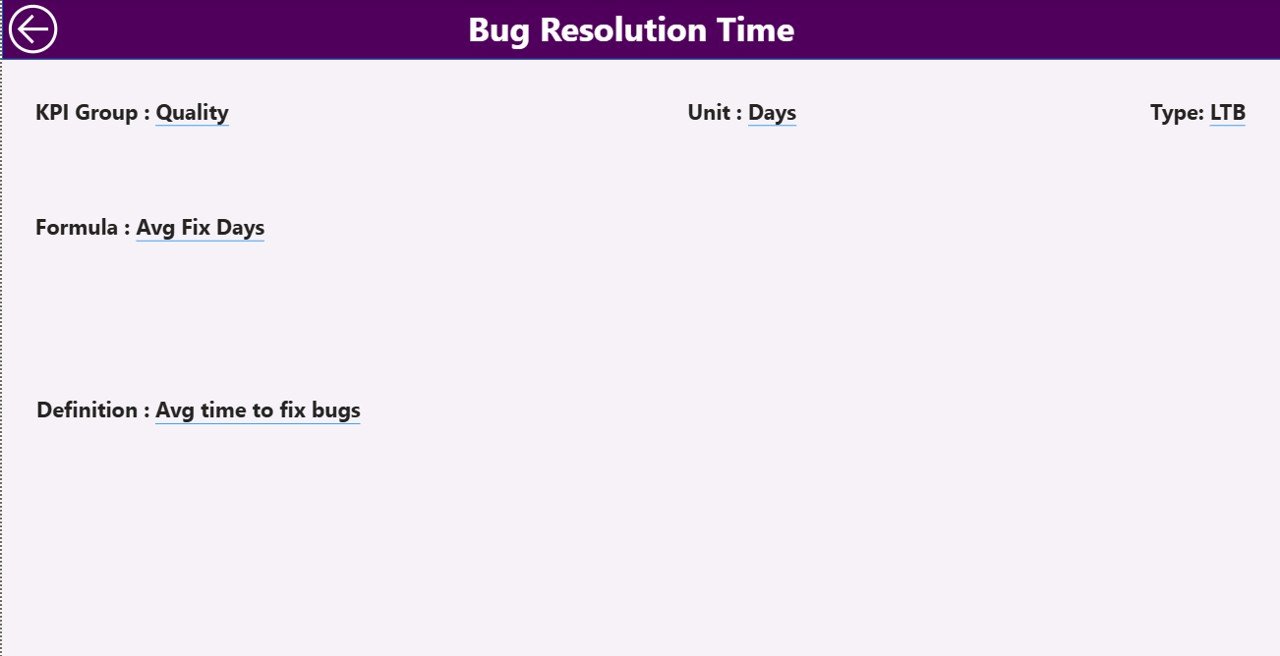
The KPI Definition Page works as a drill-through page. Although it remains hidden, it plays a critical role.
From the summary page, you can drill through to:
-
View KPI Formula
-
Understand KPI Definition
-
See KPI Group
-
Confirm KPI Type
After reviewing details, you simply click the Back button on the top left corner to return.
Therefore, transparency increases. Moreover, confusion reduces.
How Does Excel Data Connect to the Dashboard?
The dashboard uses an Excel file as the data source. This approach ensures flexibility and ease of maintenance.
You must fill three worksheets in Excel:
1) Input_Actual Sheet
Here you enter:
-
KPI Name
-
Month (First date of month)
-
MTD Numbers
-
YTD Numbers
This sheet stores actual performance data.
2) Input_Target Sheet
Here you enter:
-
KPI Name
-
Month
-
MTD Target
-
YTD Target
This sheet stores planned performance data.
3) KPI Definition Sheet
Here you define:
-
KPI Number
-
KPI Group
-
KPI Name
-
Unit
-
Formula
-
Definition
-
Type (LTB or UTB)
Because you structure data clearly, Power BI generates accurate visuals.
Examples of Mobile App Development KPIs
To make the dashboard powerful, you can include KPIs such as:
-
Daily Active Users (DAU)
-
Monthly Active Users (MAU)
-
App Store Rating
-
Crash Rate
-
User Retention Rate
-
Feature Release Cycle Time
-
Bug Resolution Time
-
App Revenue
-
Customer Acquisition Cost
-
Conversion Rate
-
Session Duration
-
Uninstall Rate
These KPIs help product and technical teams align goals.
Advantages of Mobile App Development KPI Dashboard in Power BI
Click to Purchases Mobile App Development KPI Dashboard in Power BI
Using this dashboard offers several strong benefits.
1) Real-Time Visibility
You instantly see performance gaps. Therefore, you respond quickly.
2) Target Tracking Made Easy
Because the dashboard compares actual vs target, you stay focused on goals.
3) Year-over-Year Comparison
You evaluate growth using CY vs PY comparisons. As a result, you measure progress accurately.
4) Clear Visual Indicators
Green ▲ and Red ▼ icons simplify decision-making.
5) Structured Data Management
Excel input sheets keep data organized and controlled.
6) Better Team Alignment
Product, development, and marketing teams view the same performance data. Therefore, collaboration improves.
7) Faster Decision-Making
Since all KPIs appear in one place, executives avoid lengthy review meetings.
Best Practices for the Mobile App Development KPI Dashboard
To maximize results, follow these best practices.
1) Define Clear KPI Ownership
Assign each KPI to a responsible person. Therefore, accountability increases.
2) Update Data Monthly
Update the Excel sheets regularly. In addition, refresh Power BI after each update.
3) Use Meaningful Targets
Set realistic targets based on historical performance.
4) Keep KPI Definitions Clear
Write simple formulas and definitions in the KPI Definition sheet.
5) Review Trends, Not Just Numbers
Do not focus only on MTD results. Instead, analyze YTD and trend charts.
6) Avoid Too Many KPIs
Select 15–20 strong KPIs instead of 50 weak metrics.
7) Conduct Monthly Performance Reviews
Use the dashboard during review meetings. Therefore, discussions stay data-driven.
How Does This Dashboard Improve Mobile App Strategy?
When you use this dashboard:
-
You reduce guesswork
-
You improve sprint planning
-
You prioritize high-impact features
-
You reduce app crashes
-
You increase user retention
-
You optimize marketing spend
Because you track measurable KPIs, strategy becomes objective, not emotional.
Who Should Use This Dashboard?
This dashboard benefits:
-
Product Managers
-
Mobile App Developers
-
QA Teams
-
Marketing Teams
-
Startup Founders
-
CTOs
-
App Growth Analysts
Therefore, any organization developing mobile apps can use it.
How to Implement This Dashboard Step by Step?
Click to Purchases Mobile App Development KPI Dashboard in Power BI
-
Define your KPIs
-
Prepare Excel data sheets
-
Fill Actual and Target numbers
-
Enter KPI definitions
-
Connect Excel to Power BI
-
Refresh the dashboard
-
Review monthly performance
Once implemented, maintain consistency in updates.
Conclusion
Mobile app development requires precision. Teams must track performance clearly. However, scattered data causes confusion.
The Mobile App Development KPI Dashboard in Power BI solves this challenge. It centralizes data. It compares actual vs target. It analyzes trends. It improves transparency.
Moreover, it supports both short-term and long-term evaluation through MTD and YTD comparisons.
Therefore, if you want structured performance tracking, faster decisions, and stronger app growth, this dashboard offers the perfect solution.
Frequently Asked Questions with Answers
What is a Mobile App Development KPI Dashboard in Power BI?
It is an interactive reporting tool that tracks mobile app performance metrics using structured Excel data and Power BI visuals.
How often should I update the dashboard?
You should update the Excel data monthly. However, you can also update weekly if required.
What does LTB and UTB mean?
LTB means Lower the Better. UTB means Upper the Better. These types define whether a KPI should decrease or increase.
Can I customize KPIs in the dashboard?
Yes. You can add or modify KPIs in the KPI Definition sheet and update input sheets accordingly.
Do I need advanced Power BI skills to use this dashboard?
No. Since it is ready-to-use, you only need basic knowledge of Excel data entry and Power BI refresh.
Why compare Current Year vs Previous Year?
Because year-over-year comparison shows real growth trends instead of short-term fluctuations.
Is this dashboard suitable for startups?
Yes. Startups benefit greatly because they must track growth, user engagement, and performance efficiently.
Visit our YouTube channel to learn step-by-step video tutorials